SciFig 3.0 · Save up to 40% yearly

SciFig

Turn your data into a publication-ready chart

Drop in a CSV, TSV, or Excel file — optional significance tests, export to PNG, PDF, EPS, or TIFF.

Import a data file to continue.

Start with up to 100 free credits|No credit card required

Get up to 300 free credits on day one when you join through an invite.

3 workspaces · Dozens of scientific chart typesCharts from table data · Editable SVG diagramsSVG conversion and editing · PPTX export

Forest Plot Generator for Effects and Intervals— templates & examples

Make effects and intervals readable

Forest Plot Generator for Effects and Intervals

Put each estimate, interval, and subgroup label in one clear comparison.

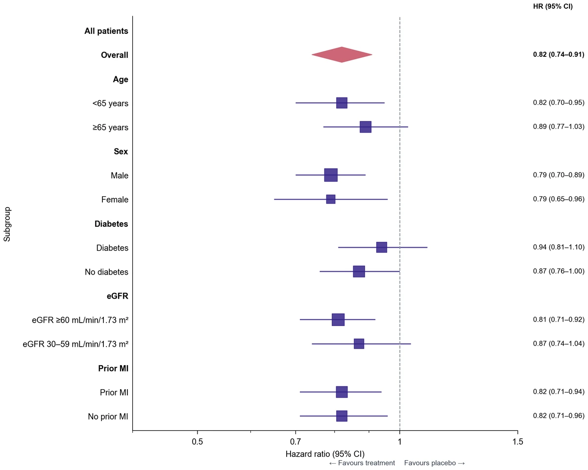
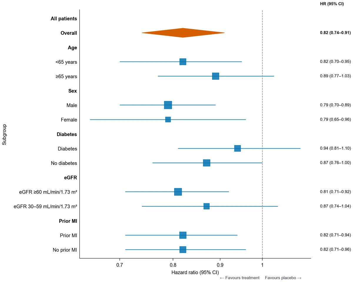
This forest plot generator draws the effect estimates and confidence-interval bounds you provide in a CSV or Excel table. Map the row labels, effect, lower bound, and upper bound, then choose a linear or logarithmic axis and a reference value. Add a numeric interval column or, for study-level results, show normalized weight percentages across all non-summary rows. The examples use subgroup hazard ratios with a reference line at 1, giving you a working starting point for study summaries, clinical results, or other prepared estimates.

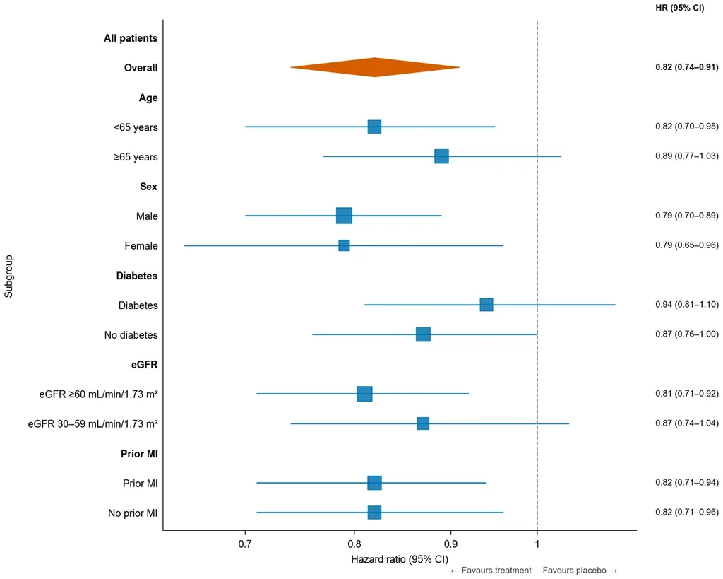
Subgroup hazard ratios with 95% intervals, a reference at 1, and a numeric values column
  • Map labels, effects, and interval bounds
  • Choose a linear or logarithmic effect axis
  • Show values, group labels, and normalized study weights
  • Export PNG, PDF, EPS, TIFF, and Python code

Forest Plot Features for Effect Comparisons

Connect the values in your results table to the marks and labels that readers need to interpret the comparison.

Map an estimate and its interval

Give each row a label, effect estimate, lower bound, and upper bound. The forest plot maker draws the point and its interval from these supplied columns. A group column can distinguish related subgroups, while a summary indicator identifies a prepared overall row within the same figure.

  • Provide separate lower and upper interval columns
  • Map a study or subgroup label to each row
  • Use group and summary fields where appropriate
Use the subgroup example

Set the scale and reference

Choose a linear scale for differences or a logarithmic scale for positive ratio estimates. Set the reference at the value that means no effect for your measure, commonly 0 for a difference or 1 for a ratio. The forest plot generator places that line on the same axis as the estimates.

  • Use linear or logarithmic effect spacing
  • Set the reference value for your measure
  • Add direction labels that explain either side
Compare axis scales

Keep values beside the intervals

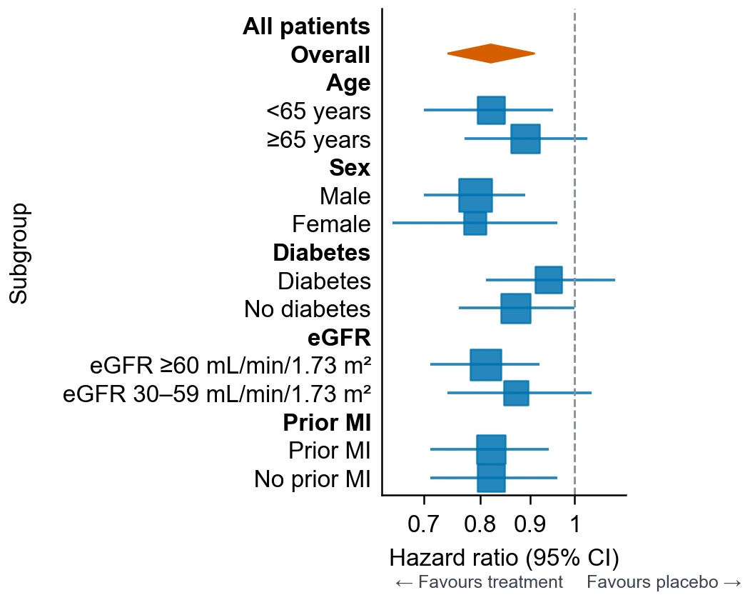
Display an Effect (95% CI) column when readers need exact values alongside the intervals. Choose a coordinated style and palette, or a compact view that gives the interval panel more space. The forest plot template demonstrates these display choices with the same subgroup hazard ratios, keeping the numerical results fixed as you compare presentations.

  • Show or hide the numeric interval column
  • Compare figure styles and palettes
  • Choose input order or sort by effect
Try values and styles

Adapt the plot to your document

Refine labels, palette, figure width, and row order for the space available. Describe revisions in the workspace, then export a vector document or a 300-DPI raster image. Keep the Python code with the project to preserve the relationship between the supplied table and the drawn figure.

  • Download PNG, PDF, EPS, or TIFF
  • Choose a compact or wider figure preset
  • Retain the generated Python plotting code
Explore the compact view

Forest Plot Steps from Estimates to Figure

Bring a prepared results table, then choose the axis, labels, and columns that make the estimates understandable.

  1. Prepare the effect table

    Put one study, subgroup, or comparison on each row. Include a label, effect estimate, lower interval bound, and upper interval bound. Add group, weight, or summary columns when they are part of your prepared results, then upload CSV or Excel.

  2. Map the columns and axis

    Select Forest and assign the label, effect, lower, and upper columns. Choose a logarithmic axis for positive ratios or a linear axis for differences, and set the reference value for your measure. Read the mapped rows in the table preview.

  3. Describe the result display

    Ask for the comparison you want readers to see, such as subgroup hazard ratios with a reference at 1 and a numeric 95% CI column. Generate the figure, then use the row labels and reference line to locate each estimate and its interval.

  4. Refine labels and download

    Choose row order, group colors, direction labels, and whether exact values or normalized study weights appear beside the panel. For study-level weights, the displayed percentages use all non-summary rows as their total. Adjust the width for your document and export PNG, PDF, EPS, or TIFF. Save the Python code together with the prepared table.

Forest Plot Uses for Prepared Estimates

A shared effect axis makes several kinds of results easier to compare when estimates and bounds are already available.

Subgroup hazard ratios with 95% intervals, a reference at 1, and a numeric values column

Present clinical subgroup results

Arrange prepared hazard ratios or odds ratios by subgroup, with a common reference at 1. Place the numeric estimate and interval beside each row so readers can connect the plotted position to the reported result. Group labels can distinguish age, sex, or another recorded characteristic.

Explore this example
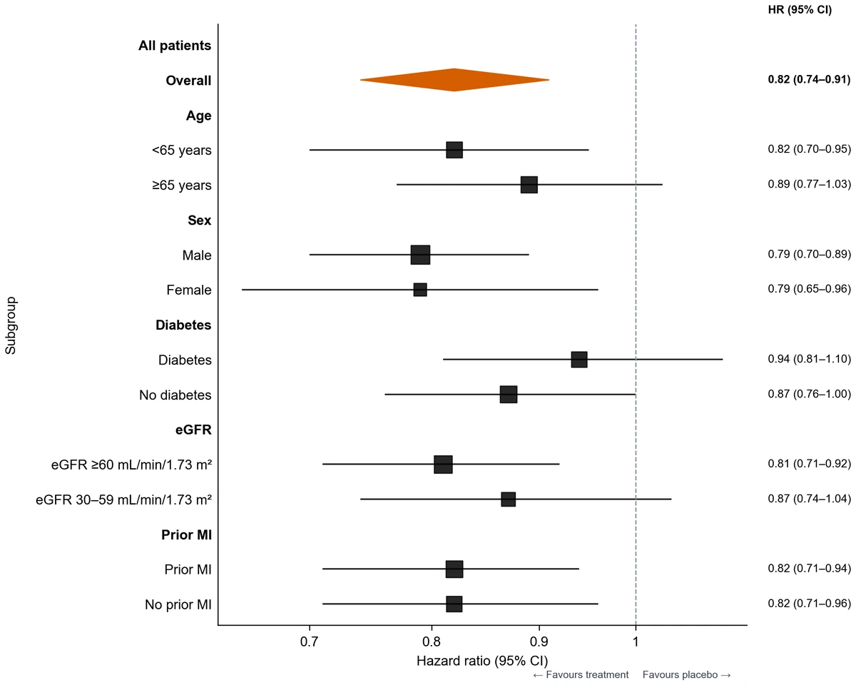
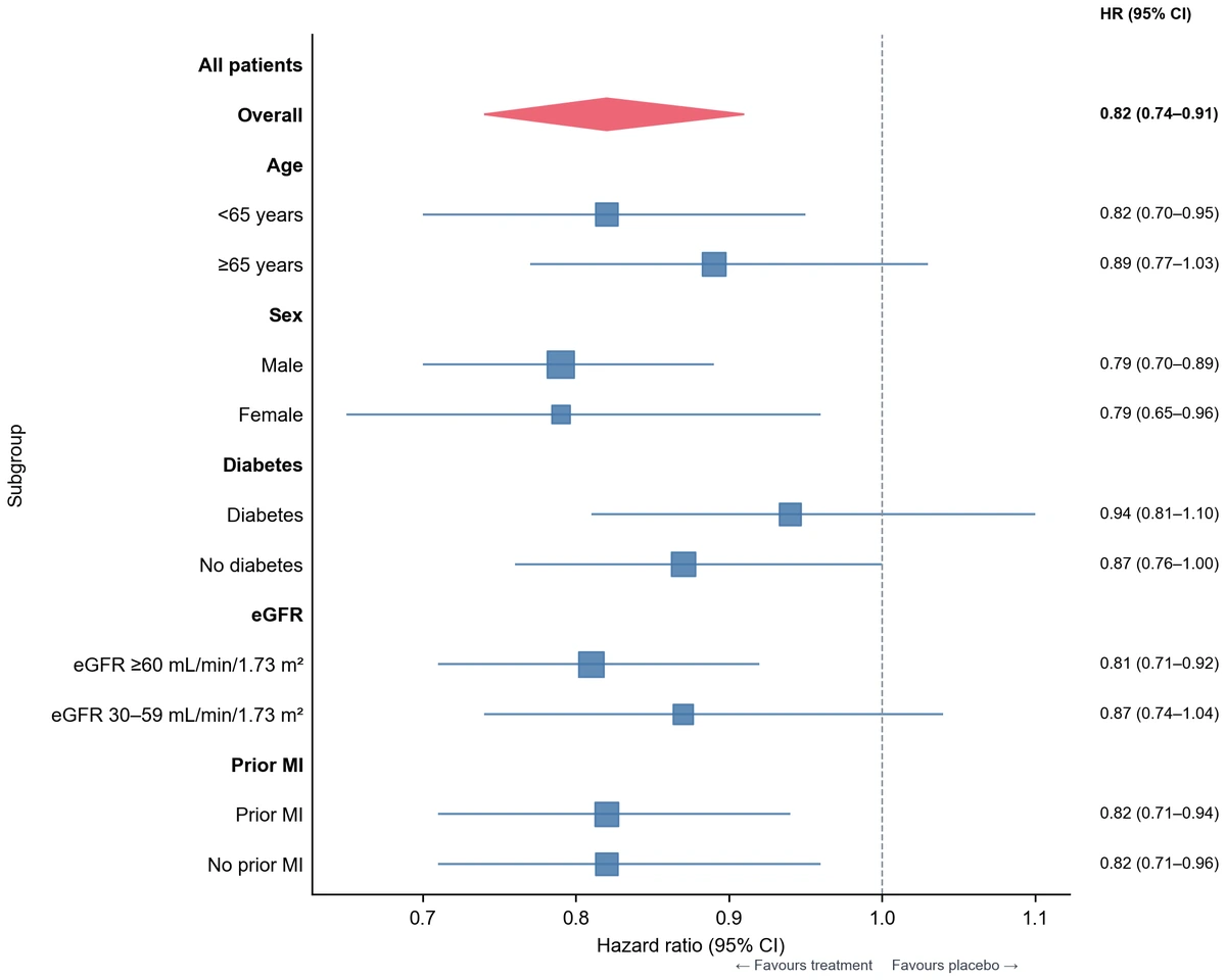
Subgroup hazard ratios and confidence intervals in the Science style, with a numeric values column

Visualize a meta-analysis result table

Bring the study estimates, confidence intervals, and a prepared pooled result from your analysis. The forest plot maker arranges those values in one figure; a mapped study-weight column can show normalized percentages across the non-summary rows. Keep the measure, reference, and subgroup structure aligned with the results table.

Explore this example
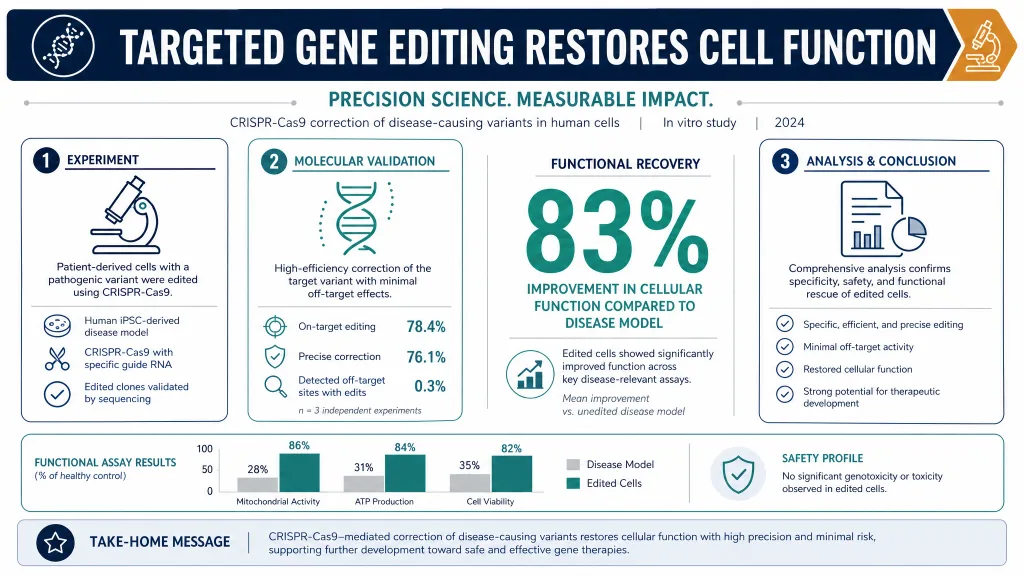
Hazard ratios and confidence intervals displayed on a linear effect axis

Compare differences on a linear scale

Use a linear axis with a reference at 0 for mean differences or other additive effects. Each row shows the direction and interval of a prepared comparison. Choose wording on either side of the reference that explains the outcome and the groups being contrasted.

Explore this example
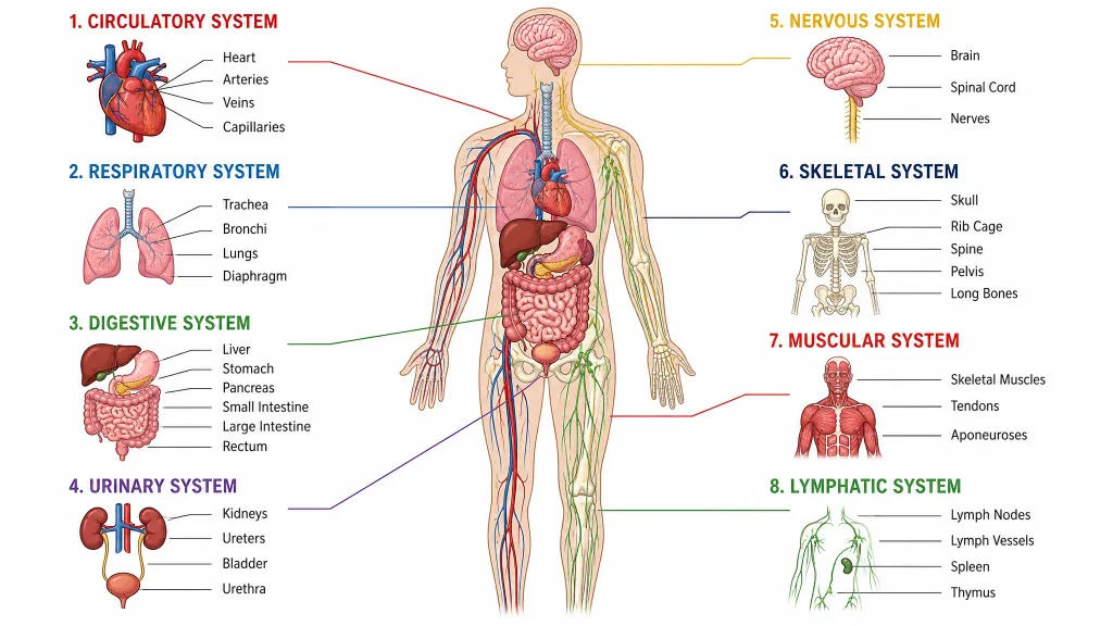
Subgroup hazard ratios and confidence intervals on a fixed logarithmic axis from 0.4 to 1.5

Set a consistent comparison range

Set the effect-axis range to give a related set of plots the same viewing window. Retain the input subgroup order and the reference line so readers can compare prepared estimates across panels. The fixed-range example uses a logarithmic axis from 0.4 to 1.5 for the supplied hazard ratios.

Explore this example
Compact hazard-ratio forest plot with intervals and a reference line at 1

Build a compact manuscript panel

Use the compact forest plot template when space is limited, keeping subgroup labels and intervals visible while selecting which numeric columns to include. Set the figure width and export PDF or EPS for document placement. A short caption can identify the effect measure and reference value.

Explore this example

Hazard ratios and confidence intervals displayed on a linear effect axis

Teach reference lines and intervals

Use the sample subgroup table to explain how an estimate and its confidence interval sit relative to the reference line. Compare linear and logarithmic displays of the same positive ratios. Students can make a forest plot online and connect the exact values to their plotted positions.

Explore this example
Forest Plot Scenarios for Results Tables

Examples of turning prepared estimates into a figure that supports a specific discussion.
For a subgroup-results discussion, I would bring the hazard ratios and their interval bounds in separate columns. The forest plot generator places the rows against a reference at 1. Having exact values beside the intervals helps me connect the visual comparison to the numbers in the results table.

Amira P.

Clinical research analyst

These are illustrative use scenarios with fictional names, not verified customer reviews.

Drawing tools

Tools for scientific figures

85 focused generators for the scientific figure you need — each opens in the right workspace with a matching example.

Forest Plot Questions about Data and Display

1.

2.

3.

4.

5.

6.

Call to action background

Make your prepared effects easy to compare

Forest Plot: Start with Your Estimates

Create a forest plot

Free to start · No credit card required · Built for researchers