Describe your radar chart
Tell SciFig what to draw in plain language — no design tools required.
Create professional radar charts for multi-dimensional data comparison — describe your axes and values, generate an online radar chart, and export for papers or presentations.
Core Subject (e.g., Cas9 protein cutting DNA)
Action / Details (e.g., Double strand break, detailed molecular view)
Start with 200 free credits|No credit card required
Get up to 400 free credits on day one when you join through an invite.
A clear radar chart generator should handle four to eight axes without cluttering labels or distorting the polygon. Describe your variables, axis ranges, and group values in plain language, and SciFig produces an online radar chart with precisely spaced axes, clean tick marks, and distinct colors for each group — the standard your reviewers expect for ability radar chart figures in peer-reviewed work.
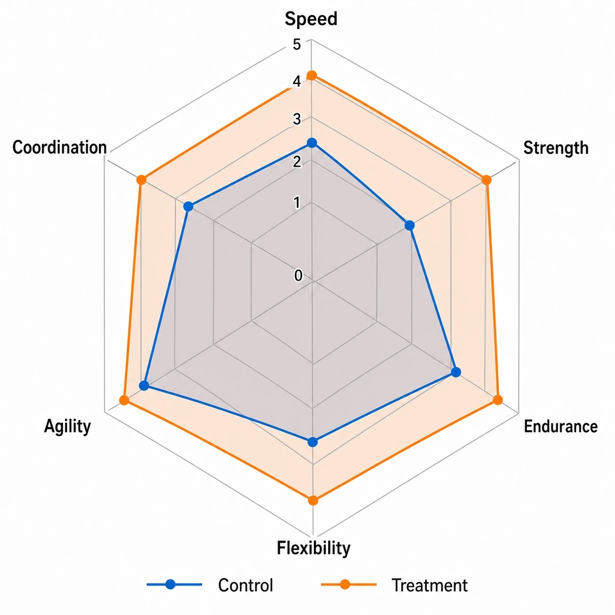
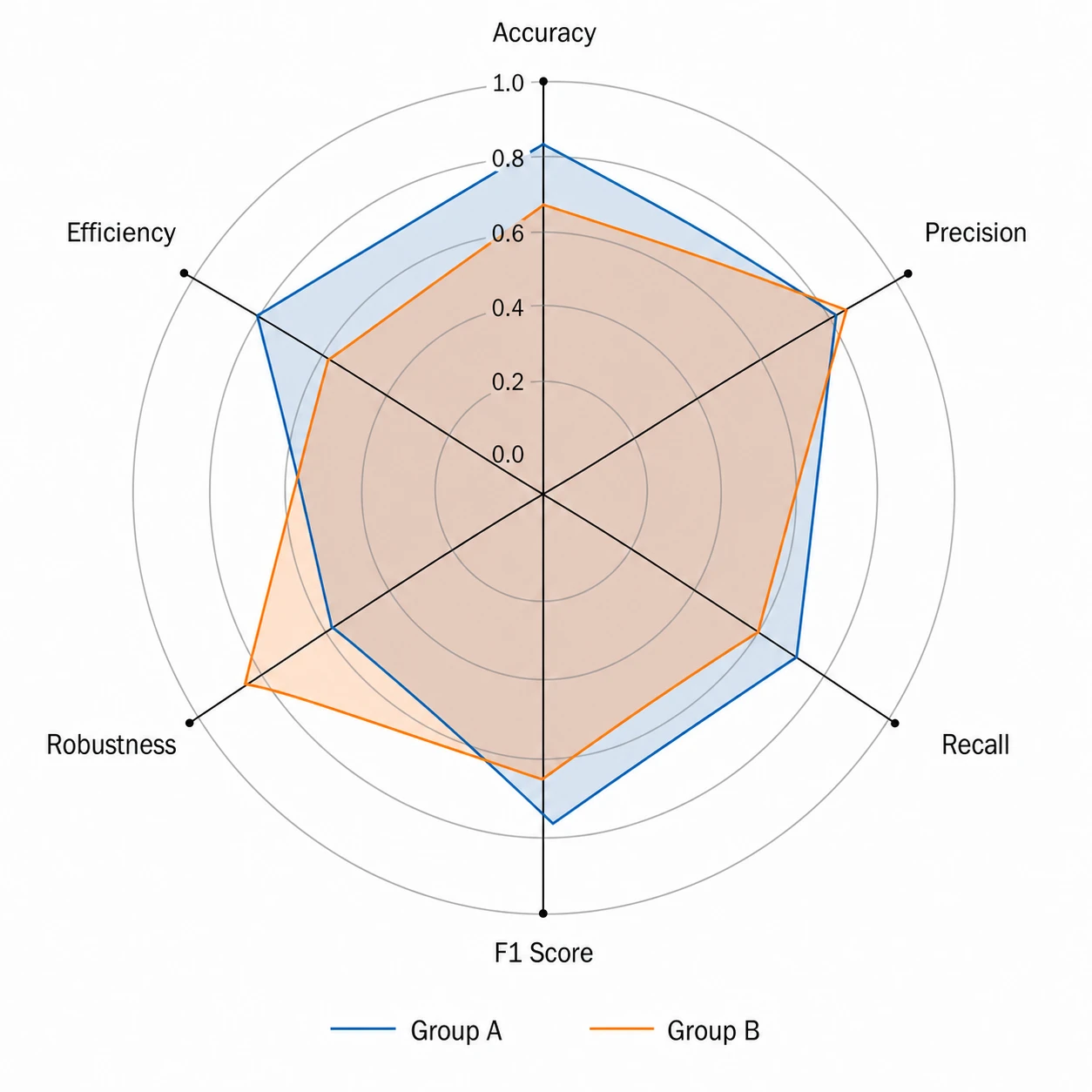
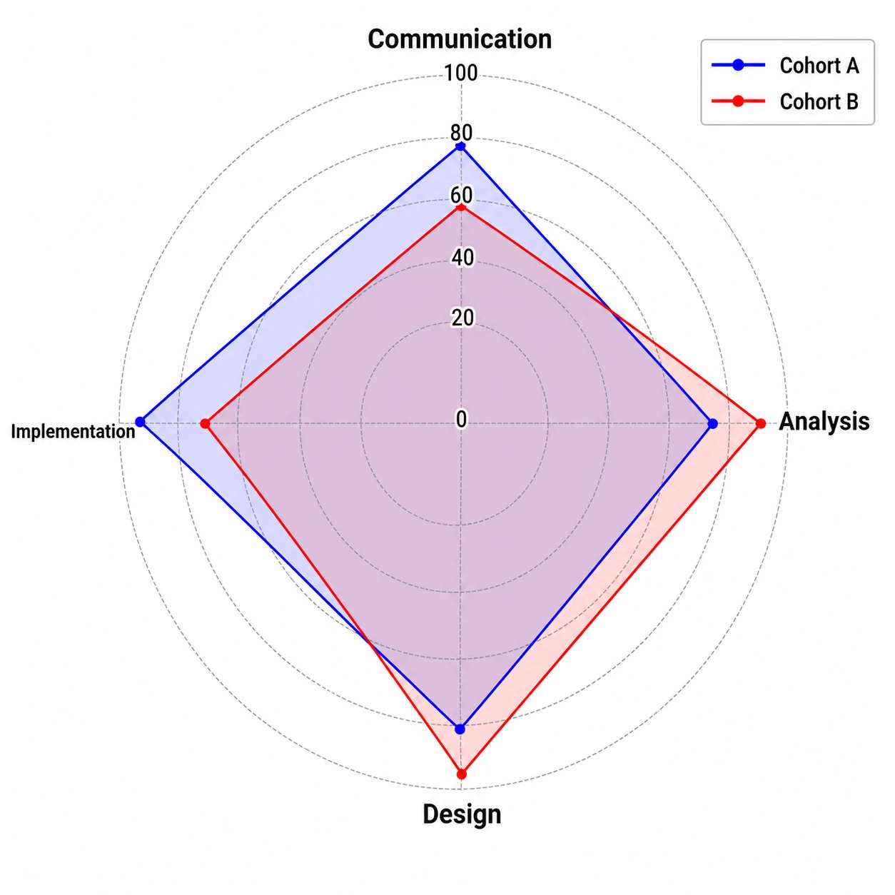
Multi-group radar charts let readers compare ability profiles or performance benchmarks at a glance. SciFig's radar chart generator overlays two or more polygons on the same axes with a crisp legend, uses accessible fill transparency so overlaps remain legible, and keeps axis labels readable at journal print sizes. Export as a radar chart example your colleagues can replicate.
Whether you need a simple online radar chart for a conference poster or a detailed ability radar chart for a dissertation chapter, SciFig outputs a fully editable figure at the resolution and aspect ratio you need. Relabel axes, adjust the color palette, and re-export without redrawing from scratch.
A radar chart — also called a spider web chart or ability radar chart — displays multivariate data on axes radiating from a central point, forming a polygon that reveals strengths and weaknesses across five or more dimensions. Researchers use radar charts to compare skill profiles or visualize composite scores. With SciFig's radar chart generator you describe your axes and values and receive a clean, labeled radar diagram ready for your journal, thesis, or presentation.
Tell SciFig what to draw in plain language — no design tools required.
Get a clean, publication-ready figure that matches your description in seconds.
Vectorize it into editable SVG, relabel everything, and export for your paper, poster, or slides.
Common questions about Radar Chart Generator.
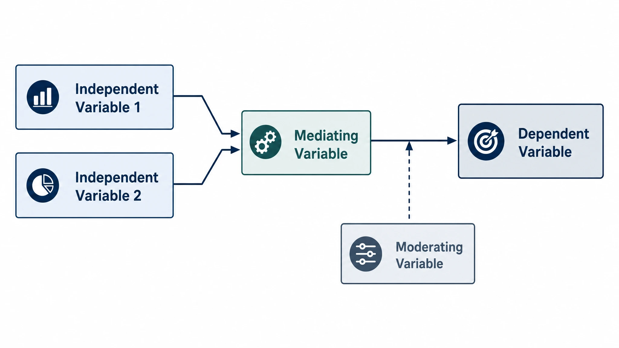
Create professional conceptual framework diagrams showing variable relationships, hypotheses, and theoretical models for your research.
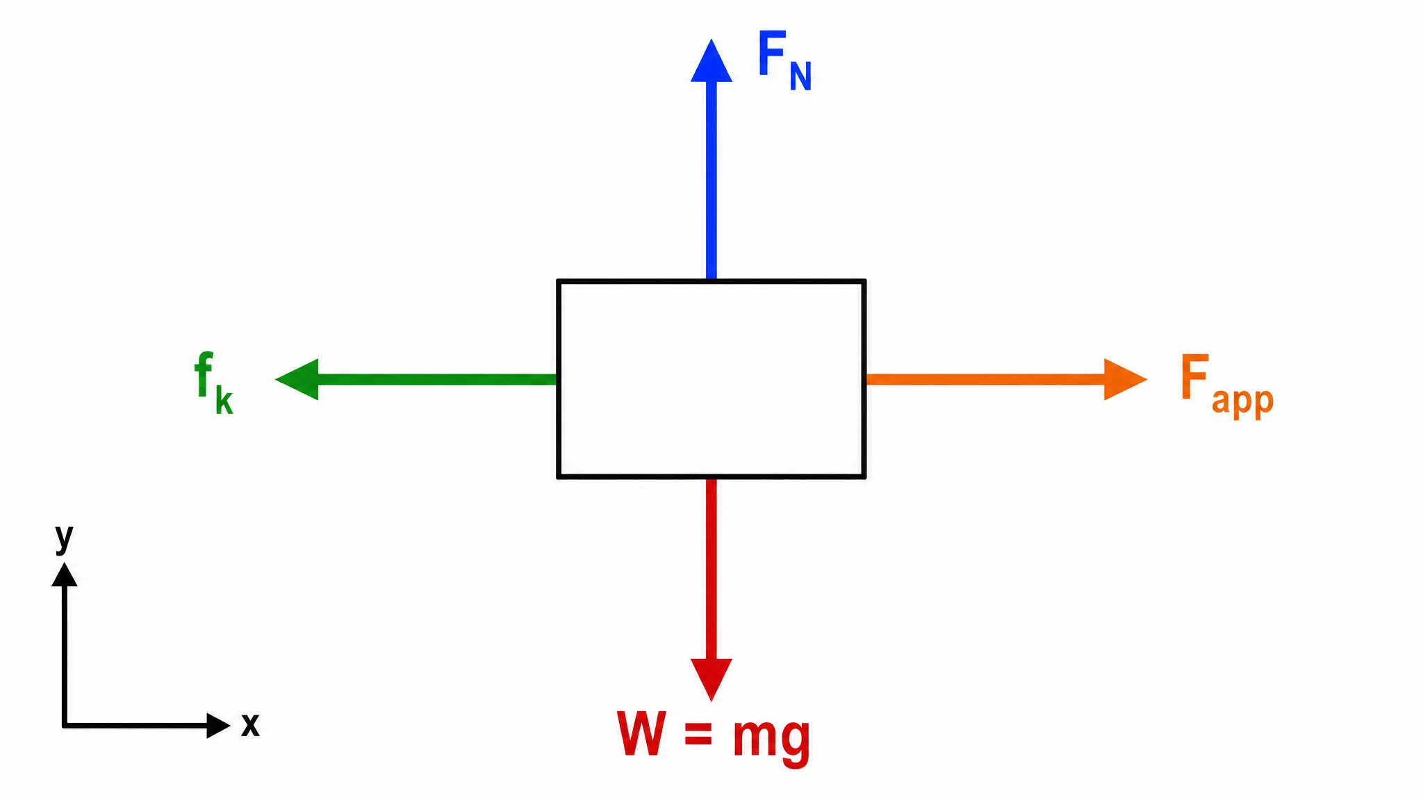
Create accurate, publication-ready free body diagrams with labeled force vectors for weight, normal force, friction, and tension in seconds.
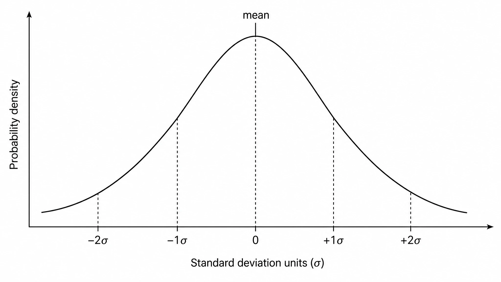
Generate a precise, fully labeled bell curve showing mean, standard deviations, and percentile regions — ready to export for your paper, thesis, or classroom.
Ready to publish?
Free to start · No credit card required · Built for researchers
