Bell Curve Generator
Generate a precise, fully labeled bell curve showing mean, standard deviations, and percentile regions — ready to export for your paper, thesis, or classroom.
Figure prompt
Core Subject (e.g., Cas9 protein cutting DNA)
Action / Details (e.g., Double strand break, detailed molecular view)
Start with 100 free credits|No credit card required
Get up to 300 free credits on day one when you join through an invite.
Reviewed by SciFig TeamUpdated
Bell Curve Generator— templates & examples
Everything you need to visualize your normal distribution
Set mean, standard deviation, and shaded regions
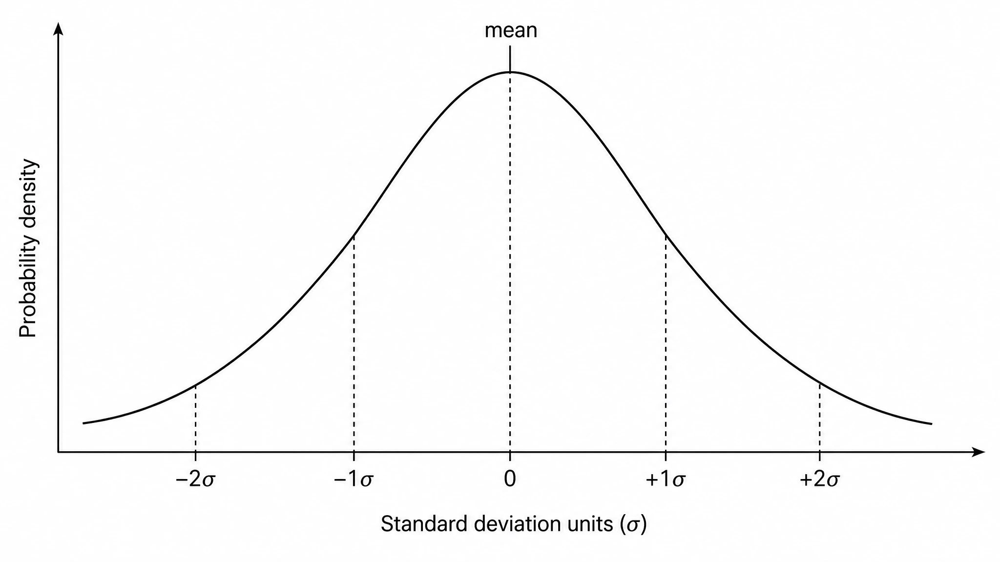
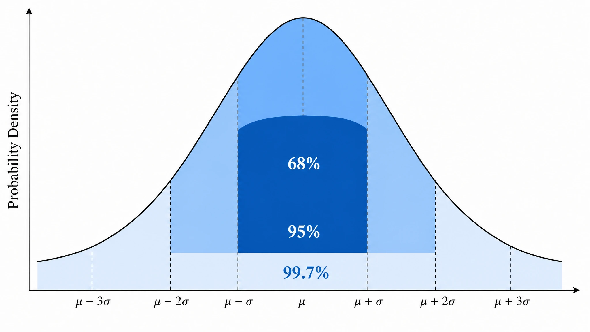
Describe your distribution parameters in plain language and the bell curve generator renders a labeled normal distribution graph with markers at each standard deviation interval. Add shaded percentile regions — including the full 68-95-99.7 rule bands — to communicate spread and probability at a glance. The statistics bell curve output is clean, publication-ready, and fully editable.
Build a percentile bell curve or z-score overlay
Convert your raw-score axis into a percentile bell curve generator output by adding cumulative percentile markers, or switch to a standard normal distribution with a z-score axis. This makes it straightforward to annotate critical regions for a hypothesis testing graph generator figure, highlight rejection zones, or show where an individual score falls relative to the population. Dual-axis layouts export cleanly at any resolution.
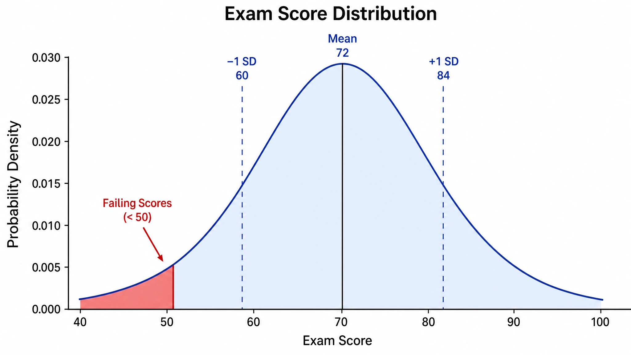
Visualize exam score distribution and grading curves
Enter your class mean and standard deviation to produce an exam score distribution visualizer figure with labeled grade-boundary lines and color-coded bands. The resulting normal distribution curve creator output is ideal for syllabi, educational research papers, and classroom presentations. Relabel axes, adjust color, and export at print resolution in seconds.
What is a bell curve?
A bell curve is the symmetric, bell-shaped plot of the normal distribution, defined by a mean and standard deviation. It appears wherever data cluster around a central value — exam scores, measurement errors, and biological traits. With SciFig's bell curve generator you describe your distribution in plain language and receive a clean, labeled normal distribution graph with annotated mean, SD markers, and optional shaded percentile regions, export-ready for papers or presentations.
Why you need a bell curve generator
- Communicates distributional spread and central tendency in a single, universally understood figure
- Required for methods sections describing normally distributed outcome variables in peer-reviewed papers
- Helps readers instantly interpret mean, standard deviation, and percentile cutoffs without reading tables
- Supports grade-distribution reporting and grading-on-a-curve decisions in educational settings
- Provides a visual anchor for hypothesis testing, showing critical regions and rejection zones on the normal distribution curve
- Eliminates manual plotting errors — a bell curve generator ensures mathematically precise, symmetrical output every time
- Saves time compared to building a statistics bell curve from scratch in general-purpose graphing software
Key components of a normal distribution curve
- Mean (μ) — the center and peak of the bell curve, marking the most probable value
- Standard deviation (σ) — controls the width; one σ on each side encloses 68% of the area
- Inflection points — located exactly one standard deviation from the mean, where the curve changes concavity
- Tails — the curve approaches but never touches zero, reflecting non-zero probability for extreme values
- Shaded percentile regions — visual bands for the 68%, 95%, and 99.7% intervals under the empirical rule
- Z-score axis — a secondary horizontal axis showing standardized units beneath the raw-score scale
- Area under the curve — total probability integrates to 1, making each shaded region directly interpretable as a percentage
Where normal distribution curves are used
- Statistics and probability courses — illustrating the central limit theorem and sampling distributions
- Educational assessment — exam score distribution visualizer reports for instructors and administrators
- Biomedical research — modeling physiological measurements such as blood pressure, height, and biomarker levels
- Quality control and manufacturing — plotting process variation and tolerance intervals on a normal distribution graph
- Psychological testing — percentile bell curve generator figures for IQ, personality, and achievement assessments
- Hypothesis testing and inferential statistics — marking critical regions, p-values, and rejection zones
- Social science research — visualizing survey scale aggregates and attitude measurement distributions
How to make a bell curve
Describe your bell curve
Tell SciFig what to draw in plain language — no design tools required.
Generate with SciFig
Get a clean, publication-ready figure that matches your description in seconds.
Edit & export
Vectorize it into editable SVG, relabel everything, and export for your paper, poster, or slides.
Bell Curve Generator — Frequently Asked Questions
Common questions about Bell Curve Generator.
More tools
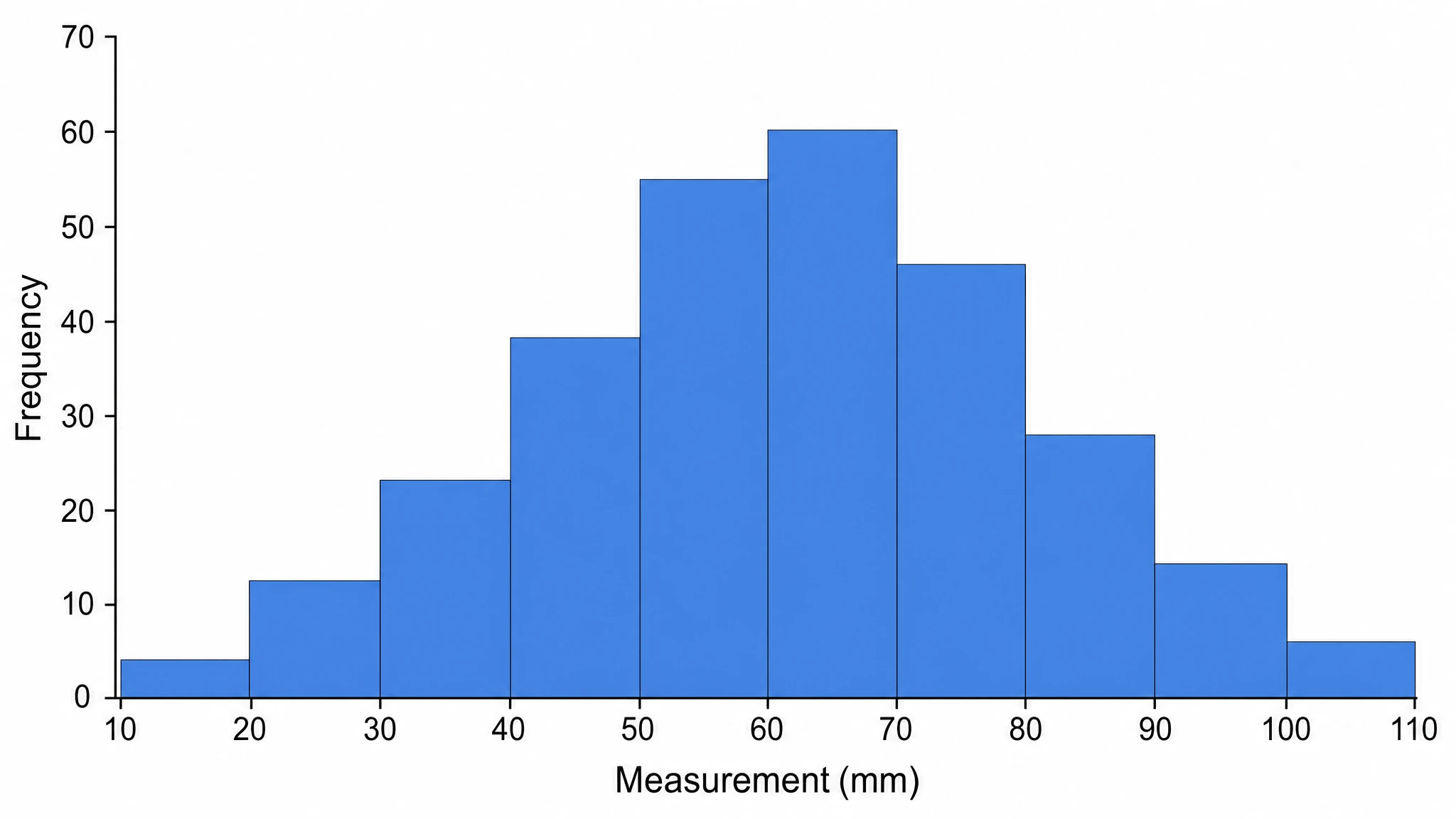
Histogram Maker
Turn a set of measurements into a clean, publication-ready histogram — choose your bins, label both axes, and show the real shape of your data distribution.
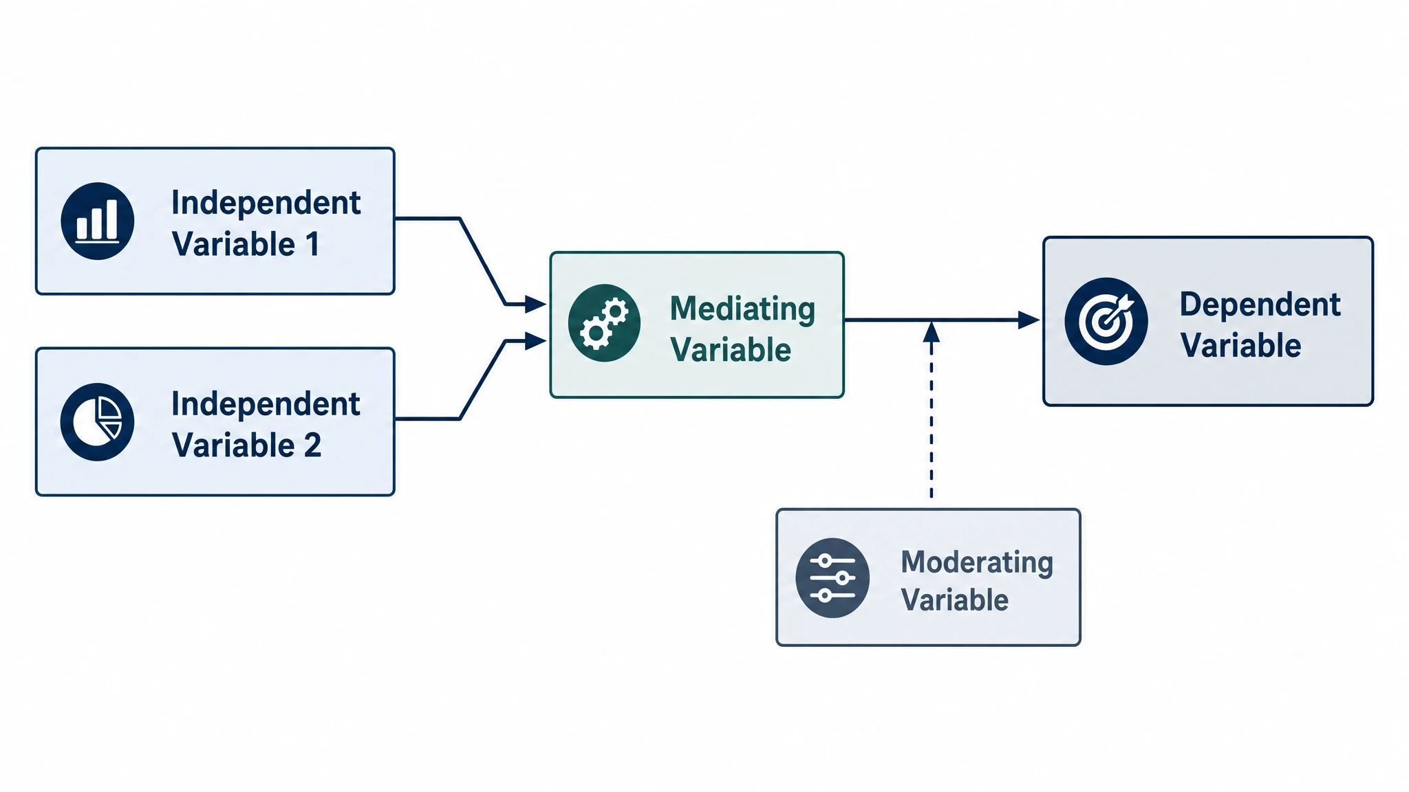
Conceptual Framework Generator
Create professional conceptual framework diagrams showing variable relationships, hypotheses, and theoretical models for your research.
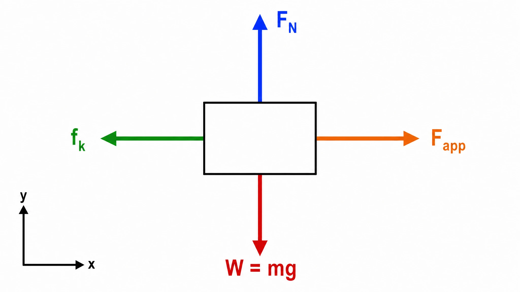
Free Body Diagram Generator
Create accurate, publication-ready free body diagrams with labeled force vectors for weight, normal force, friction, and tension in seconds.
Related links
Home
Turn text, sketches, references, PDFs, and photos into Scientific Figures
Text-to-Figure
Generate a figure from a plain-language description
Models
Default to GPT Image 2 for journal papers; switch to Nano Banana Pro for slides and posters; pick Nano Banana 2 for routine figure work
Tutorials
Seven short walkthroughs of the AI scientific figure generator
Blog
Tutorials, tool comparisons, and publication tips for researchers.
Inspiration
Explore publication-ready scientific figure examples, copy the prompts, and use them as starting points for your own work.

Ready to publish?
Make your own bell curve in minutes.
Start for freeFree to start · No credit card required · Built for researchers