Multi-Layer Pie Chart Maker
Generate a multi-layer pie chart in seconds — nested rings, concentric segments, and double pie comparisons with clean labeled slices for hierarchical data and reports.
Figure prompt
Core Subject (e.g., Cas9 protein cutting DNA)
Action / Details (e.g., Double strand break, detailed molecular view)
Start with 100 free credits|No credit card required
Get up to 300 free credits on day one when you join through an invite.
Reviewed by SciFig TeamUpdated
Multi-Layer Pie Chart Maker— templates & examples
Everything you need to build your multi-layer pie chart
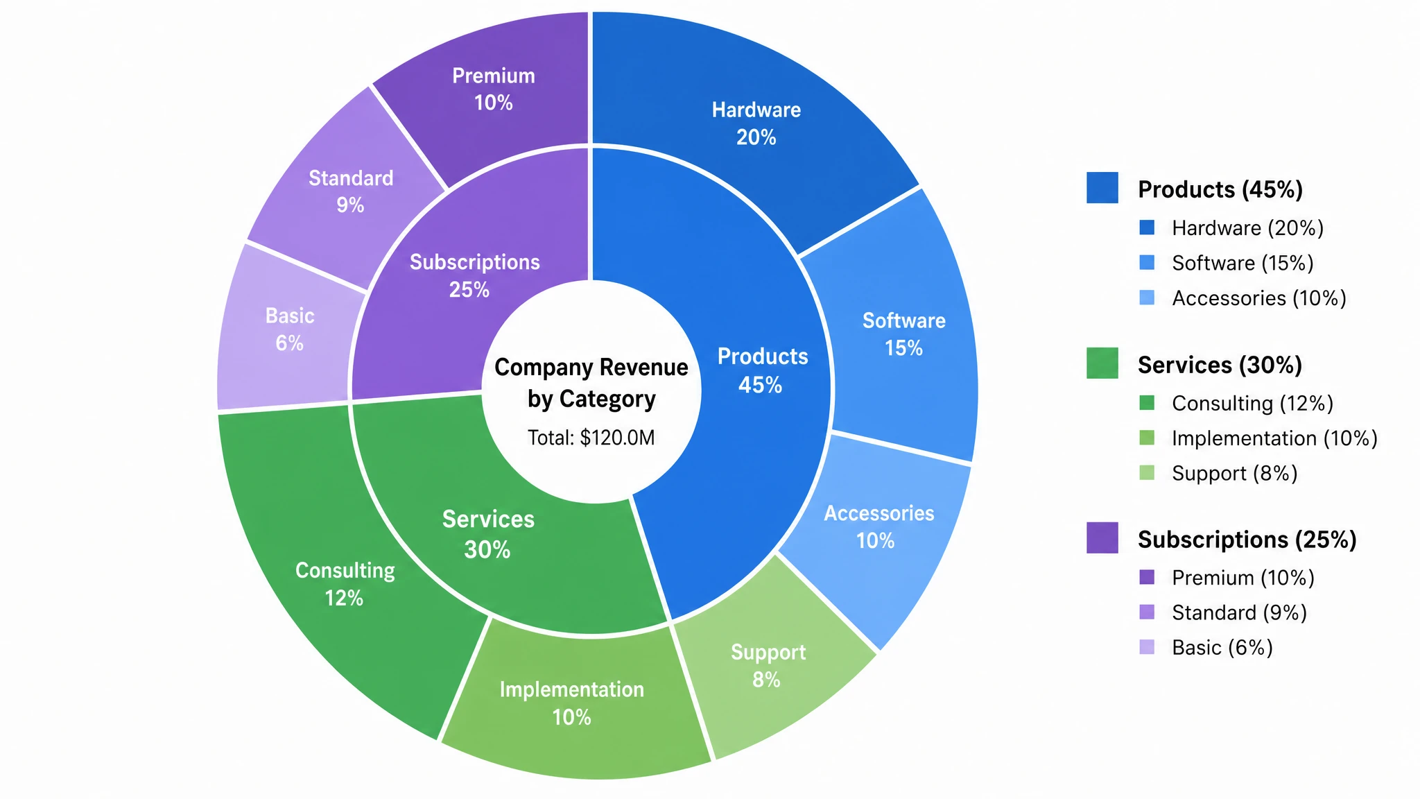
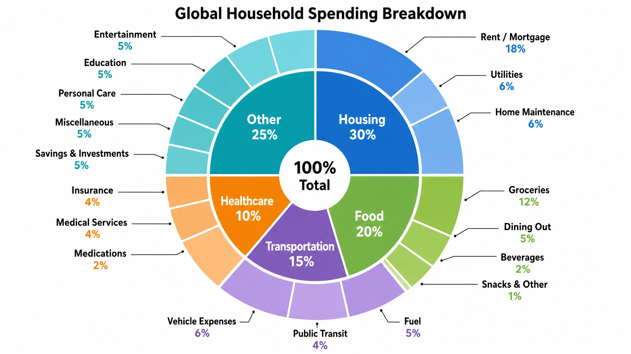
Nested rings from hierarchical data
Turn any hierarchical dataset into a clean multi-layer pie chart with concentric rings. The inner ring holds your top-level categories and every outer ring expands them into subcategories, all kept perfectly aligned with their parent slice. SciFig's multi layer pie chart maker handles the proportions automatically, so a two-ring nested pie chart or a three-ring concentric pie chart comes out balanced and readable without any manual angle math.
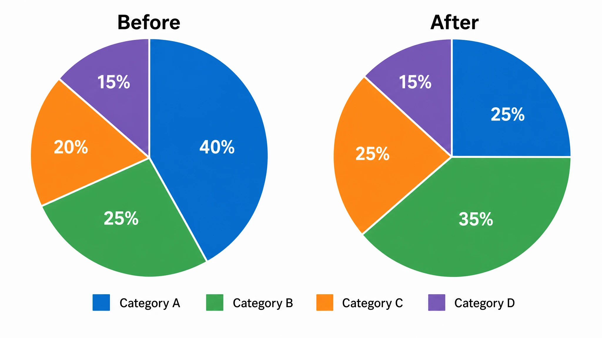
Double pie charts for comparison
Need to compare two datasets or two time periods? Generate a double pie chart with two pies side by side, sharing the same color legend so differences stand out at a glance. SciFig keeps both pies proportional and consistently labeled, making it easy to show before-and-after splits, region-versus-region breakdowns, or any paired comparison that a single nested pie chart cannot express as clearly.
Readable labels at every layer
More rings means more slices, so legible labeling is critical. SciFig positions labels inside or beside each segment, adds leader lines for thin outer slices, and lets you show category names, percentages, or raw values. The result is a fully labeled multi-layer pie chart — whether a compact nested pie chart or a deep sunburst chart — that stays clean enough for reports, slides, and publication-ready figures.
What is a multi-layer pie chart?
A multi-layer pie chart is a circular chart built from two or more concentric rings, where each ring breaks a category from the layer inside it into finer subcategories. Also called a nested pie chart, double pie chart, or sunburst chart, it is ideal for showing hierarchical data in one compact figure. SciFig's multi layer pie chart maker turns your categories and values into a fully editable figure with labeled slices, so you can compare proportions across layers.
Why use a multi-layer pie chart
- A multi-layer pie chart shows part-to-whole relationships at several levels of detail in a single compact figure
- Concentric rings reveal how each top-level category divides into subcategories without a second chart
- A nested pie chart keeps hierarchical data together, so viewers see parent and child proportions at once
- Color-coded layers make patterns across categories easier to spot than rows in a table
- A double pie chart places two datasets side by side for fast before-and-after or group comparisons
- Labeled slices and a sunburst layout scale to three or more levels without overwhelming the reader
- Editable figures let you update categories or values without rebuilding the entire chart
Parts of a multi-layer pie chart
- Inner ring — the top-level categories that account for the whole, sized by their share of the total
- Outer rings — concentric segments that break each inner category into its subcategories
- Concentric segments — wedges aligned across rings so every child slice sits within its parent angle
- Slice labels — category names, percentages, or values placed in or beside each segment
- Leader lines — thin connectors that keep labels readable for small outer slices
- Color legend — a shared key that ties colors to categories across all layers
- Center hub — an optional open center that turns the chart into a multi-ring donut or sunburst
Where multi-layer pie charts are used
- Business reports breaking revenue down by region and then by product line
- Survey analysis showing responses grouped by segment and then by answer choice
- Budget presentations splitting spending by department and then by line item
- Research figures displaying sample composition across nested classification levels
- Dashboards comparing two periods with a double pie chart of key proportions
- Education materials that teach hierarchy and part-to-whole reasoning with concentric pie charts
- Slide decks needing one compact figure instead of several separate pie charts
How to make a multi-layer pie chart
Describe your multi-layer pie chart
Tell SciFig what to draw in plain language — no design tools required.
Generate with SciFig
Get a clean, publication-ready figure that matches your description in seconds.
Edit & export
Vectorize it into editable SVG, relabel everything, and export for your paper, poster, or slides.
Multi-Layer Pie Chart Maker — Frequently Asked Questions
Common questions about Multi-Layer Pie Chart Maker.
More tools
Conceptual Framework Generator
Create professional conceptual framework diagrams showing variable relationships, hypotheses, and theoretical models for your research.
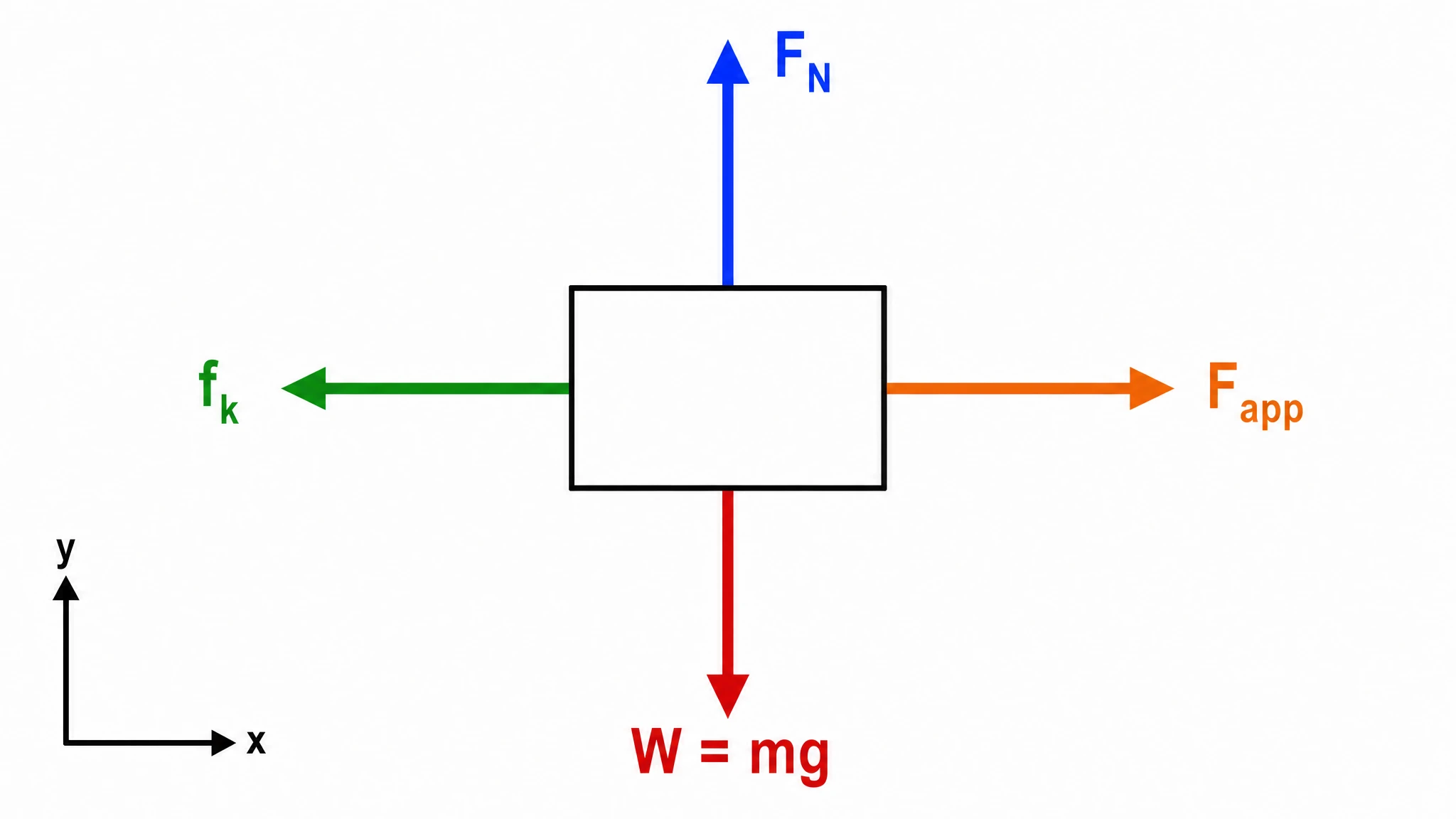
Free Body Diagram Generator
Create accurate, publication-ready free body diagrams with labeled force vectors for weight, normal force, friction, and tension in seconds.
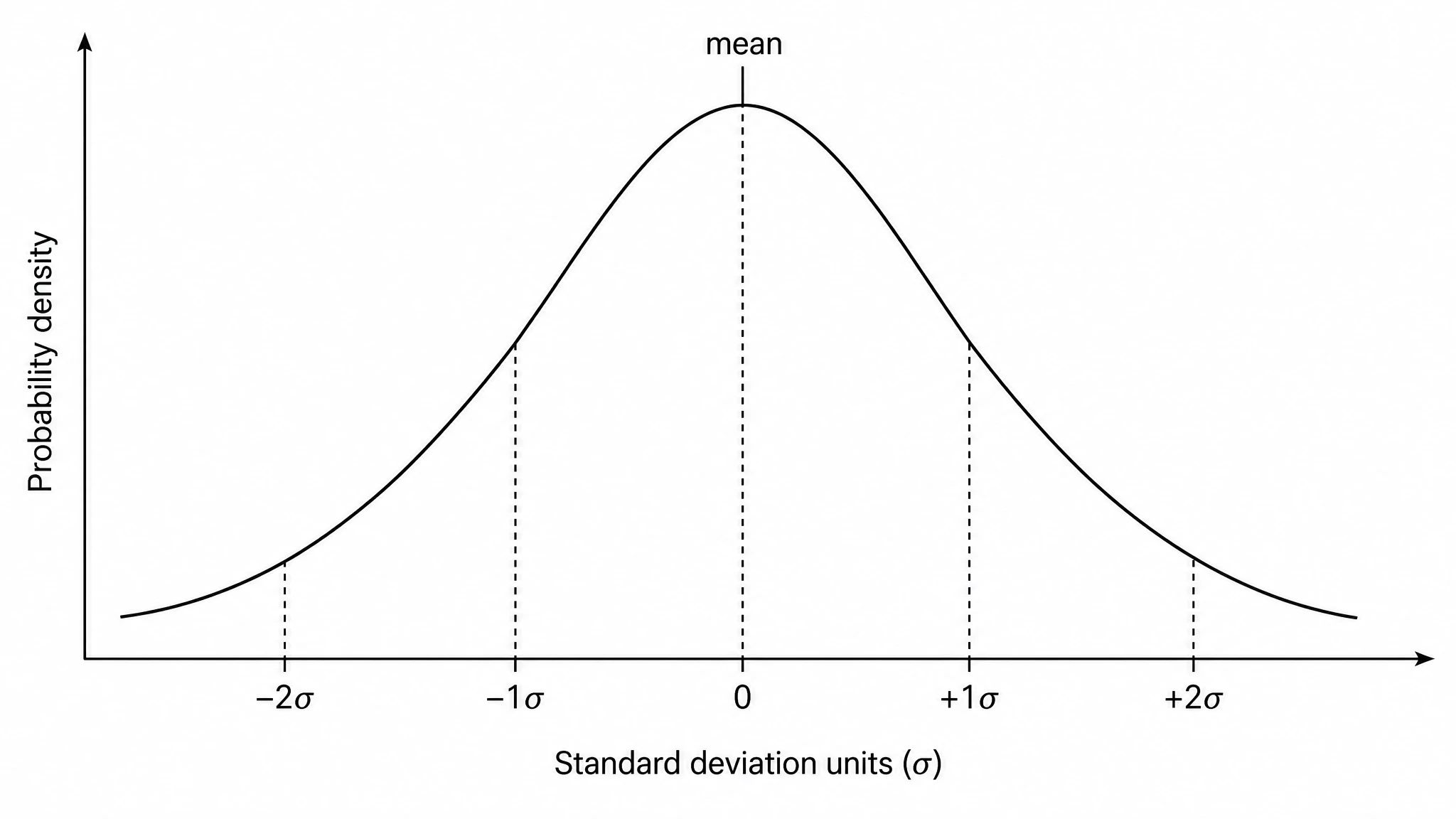
Bell Curve Generator
Generate a precise, fully labeled bell curve showing mean, standard deviations, and percentile regions — ready to export for your paper, thesis, or classroom.
Related links
Home
Turn text, sketches, references, PDFs, and photos into Scientific Figures
Text-to-Figure
Generate a figure from a plain-language description
Models
Default to GPT Image 2 for journal papers; switch to Nano Banana Pro for slides and posters; pick Nano Banana 2 for routine figure work
Tutorials
Seven short walkthroughs of the AI scientific figure generator
Blog
Tutorials, tool comparisons, and publication tips for researchers.
Inspiration
Explore publication-ready scientific figure examples, copy the prompts, and use them as starting points for your own work.

Ready to publish?
Make your own multi-layer pie chart in minutes.
Start for freeFree to start · No credit card required · Built for researchers