SciFig 3.0 · Save up to 40% yearly

SciFig

Turn your data into a publication-ready chart

Drop in a CSV, TSV, or Excel file — optional significance tests, export to PNG, PDF, EPS, or TIFF.

Import a data file to continue.

Start with up to 100 free credits|No credit card required

Get up to 300 free credits on day one when you join through an invite.

3 workspaces · Dozens of scientific chart typesCharts from table data · Editable SVG diagramsSVG conversion and editing · PPTX export

Line Chart Generator for Scientific Trends— templates & examples

From ordered values to clear trends

Line Chart Generator for Scientific Trends

Compare series across a numeric axis and show variation where it matters.

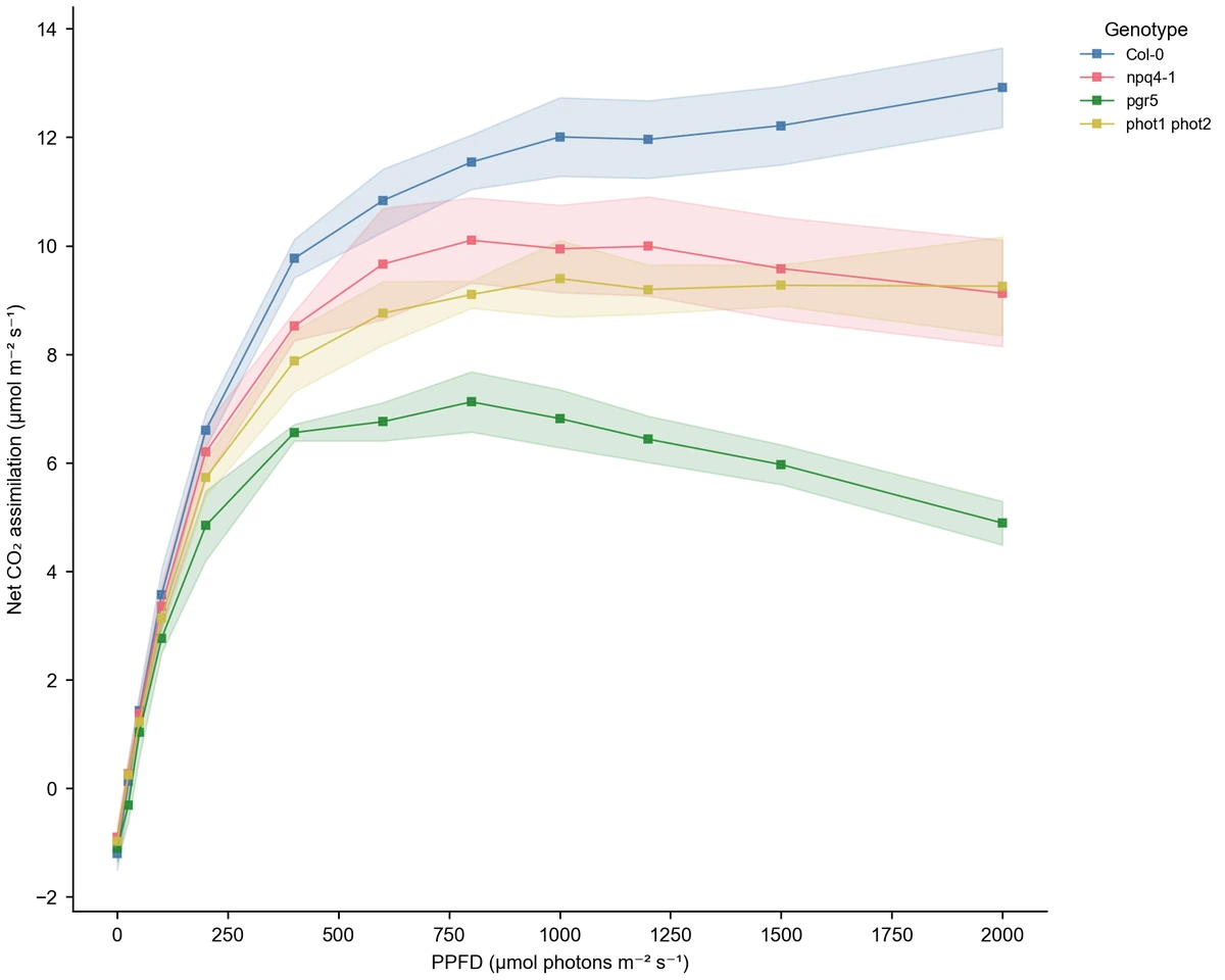
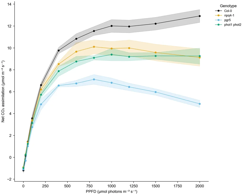
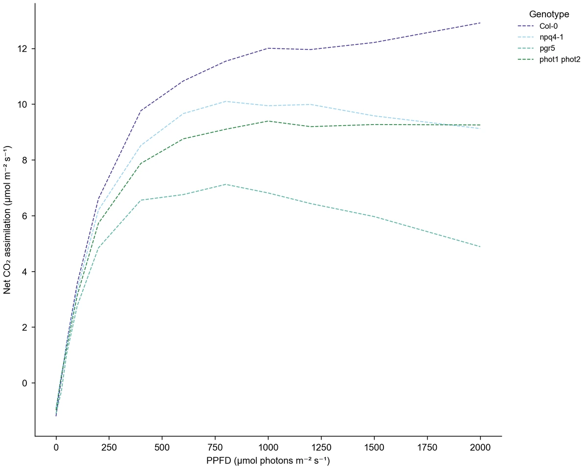
Use this line chart generator to show how measurements change across an ordered numeric variable such as dose, elapsed time, or light intensity. Upload CSV or Excel data, map the x and y columns, and use a group column for multiple series. Choose observation order or sort by x, then set line styles, markers, and mean intervals. The light-response examples compare genotypes using measured assimilation and numeric light intensity, giving you a complete data-and-settings starting point.

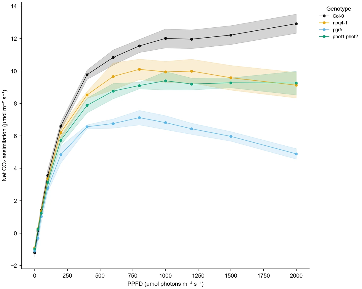
Genotype light-response lines of mean assimilation against numeric light intensity, with SD intervals
  • Map numeric x, measurement y, and series columns
  • Choose input order or ascending x order
  • Add markers and mean intervals from replicates
  • Export PNG, PDF, EPS, TIFF, and Python code

Line Chart Features for Numeric Trends

Match ordering, series, and interval choices to the measurements you want to compare.

Plot the numeric variable you measured

Upload a table with numeric x-values and y measurements, then identify the group column for distinct series. The line graph generator keeps the axis tied to those values, so unequal numeric spacing remains meaningful. Add units to both axis titles to explain variables such as light intensity, elapsed hours, or concentration.

  • Map x and y to separate numeric columns
  • Use a group field for multiple series
  • Keep variable units in the axis titles
Load the light-response data

Choose how the line connects values

Sort by x to follow a numeric progression, or keep input order when the recorded sequence is the task. Choose solid, dashed, or dotted lines and distinguish series with markers. The line chart generator also offers connect or break behavior for dropped rows when you preserve input order.

  • Select input order or ascending x order
  • Use circle, square, triangle, or no markers
  • Choose solid, dashed, or dotted lines
Try a different line style

Add intervals from replicate measurements

Select mean aggregation to summarize replicated measurements at the same x position within a series. Add SD, SEM, or 95% confidence intervals when the variation or uncertainty is part of the comparison. The example views use the same light-response data, so the visible difference comes from the interval and marker settings.

  • Summarize replicates at each x position
  • Choose SD, SEM, or 95% confidence intervals
  • Compare marker and interval variants on one dataset
Compare the interval examples

Prepare a figure for discussion and export

Choose the palette, axis scales, labels, and figure width for the comparison you want to explain. Request a revision in the workspace to refine the result. Use the line graph generator online to download a figure for your document and keep the generated Python code with the project.

  • Export PNG, PDF, EPS, or TIFF
  • Set linear or log axes for suitable numeric data
  • Download the generated Python code
Explore a compact figure

Line Chart Steps from Measurements to Figure

Choose the data and ordering first, then make the series and their variation visible.

  1. Prepare x, y, and series columns

    Put the numeric independent variable and measurement in separate columns. Add a series label for each group and keep replicate readings on separate rows when you want mean intervals. Upload the table, choose the worksheet if needed, and read the preview.

  2. Select the line settings

    Choose Line, map x and y, and assign the optional group column. Sort by x for a numeric progression or preserve the recorded input sequence. Choose raw values or mean aggregation, then select the line style, markers, and interval display you need.

  3. Describe the trend comparison

    Tell the line chart generator which variables, units, and groups to show. For example, compare genotype assimilation across light intensities with mean lines and SD intervals. Generate the figure and read each series using its legend, markers, and numeric axis.

  4. Refine the display and export

    Adjust labels, colors, axis scales, and width for the document. Try a revision if you want another interval or marker style, then download PNG, PDF, EPS, or TIFF. Retain the Python code as a record of the figure drawn from your data.

Line Chart Uses for Ordered Measurements

Use the x variable to explain the progression. The series and interval choices depend on the question behind your measurements.

Genotype light-response lines of mean assimilation against numeric light intensity, with SD intervals

Compare plant light-response measurements

Plot measured assimilation against numeric light intensity and map genotype to the series field. Mean lines summarize replicate readings at each intensity, while intervals show their variation. The sample data provides this structure with complete units for both axes, ready for a physiology discussion.

Explore this example
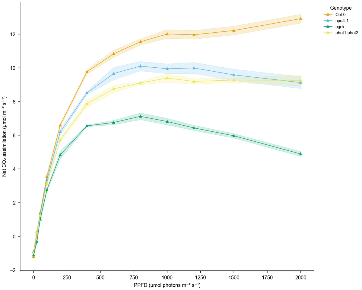
Light-response mean lines with SEM intervals and triangle markers

Track a response over elapsed time

Use elapsed minutes or hours as numeric x-values and a measured response as y. Separate experimental groups with a series column, then choose the recorded sequence or numeric ordering. This creates a view of change over your measured interval with a consistent unit on the time axis.

Explore this example
Dashed genotype light-response lines without markers or interval layers

Compare observations across concentrations

Arrange measured responses along a numeric concentration axis to compare groups across the tested range. Keep unequal spacing meaningful and select a log axis when appropriate to positive values. The line graph generator connects the plotted measurements so the progression can be discussed alongside the experimental table.

Explore this example
Light-response mean lines with 95% confidence intervals and square markers

Show variation along a progression

Keep repeated readings at each x position and select mean aggregation with SD, SEM, or 95% confidence intervals. The figure can then show both the series shape and its interval estimates. Use this view when differences between groups should be read together with variation in the measurements.

Explore this example
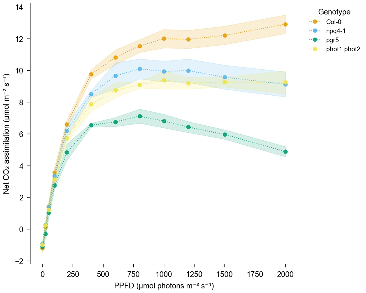
Dotted genotype light-response lines with SD intervals and circle markers

Teach series, markers, and ordering

Use a small numeric dataset to compare raw and mean displays, input order and x order, or solid and dashed lines. Students can connect each display choice to the table. A line graph generator online provides a common starting point for an exercise with multiple series and clear variable labels.

Explore this example
Genotype light-response lines of mean assimilation against numeric light intensity, with SD intervals

Prepare a research trend panel

Make a trend panel with consistent units, group colors, and marker styles for a report or poster. Choose an export format and width for the space available. When the primary question is a comparison between distinct categories rather than an ordered numeric progression, try the [bar chart generator](/tools/bar-chart-generator).

Explore this example
Line Chart Scenarios for Measured Trends

Examples of connecting a numeric data table to a figure for a particular audience.
I would start from the light-response data to compare assimilation across genotypes. The line chart generator lets me place light intensity on the numeric x-axis and show replicate-based intervals. Keeping units, markers, and the legend together makes the comparison useful for a discussion of the measured responses.

Elena F.

Plant physiology researcher

These are illustrative use scenarios with fictional names, not verified customer reviews.

Drawing tools

Tools for scientific figures

85 focused generators for the scientific figure you need — each opens in the right workspace with a matching example.

Line Chart Questions about Series and Axes

1.

2.

3.

4.

5.

6.

Call to action background

Give your measured trends a clear figure

Line Chart: Start with Your Measurements

Create a line chart

Free to start · No credit card required · Built for researchers