SciFig 3.0 · Save up to 40% yearly

SciFig

Turn your data into a publication-ready chart

Drop in a CSV, TSV, or Excel file — optional significance tests, export to PNG, PDF, EPS, or TIFF.

Import a data file to continue.

Start with up to 100 free credits|No credit card required

Get up to 300 free credits on day one when you join through an invite.

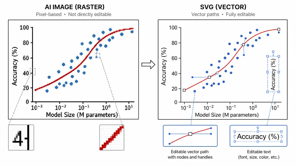
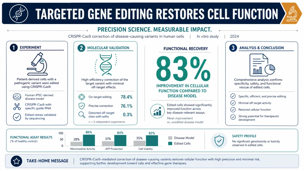
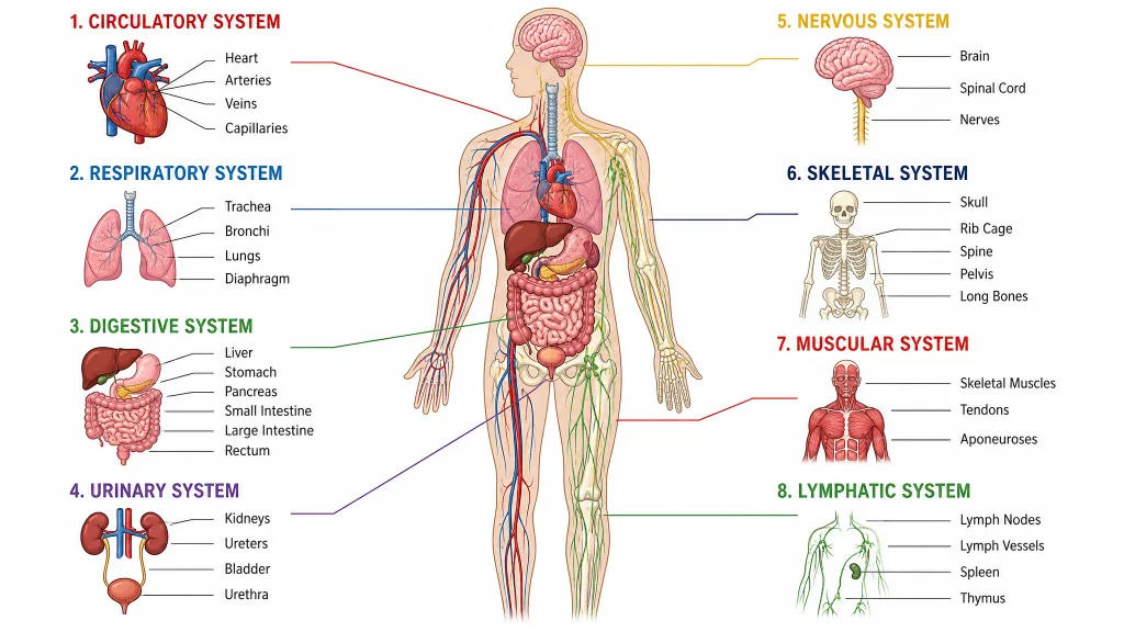
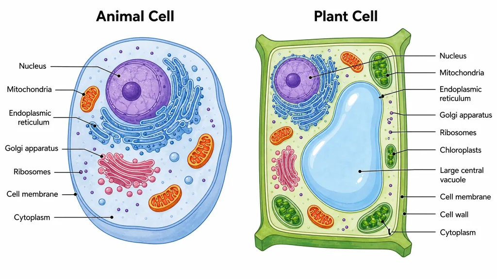
3 workspaces · Dozens of scientific chart typesCharts from table data · Editable SVG diagramsSVG conversion and editing · PPTX export

Bar Chart Generator for Scientific Comparisons— templates & examples

From tables to comparisons

Bar Chart Generator for Scientific Comparisons

Compare categories, show variation, and give each group a clear place in the figure.

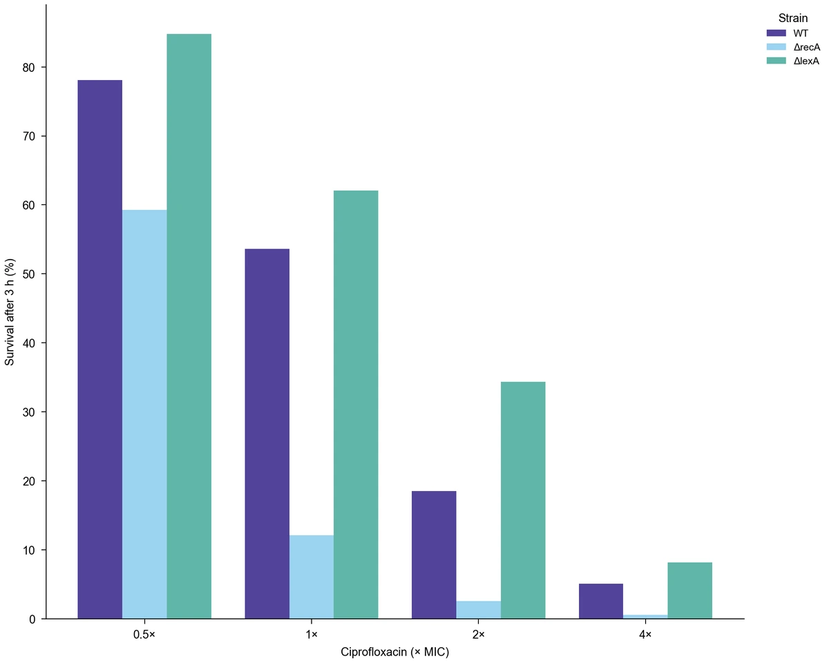
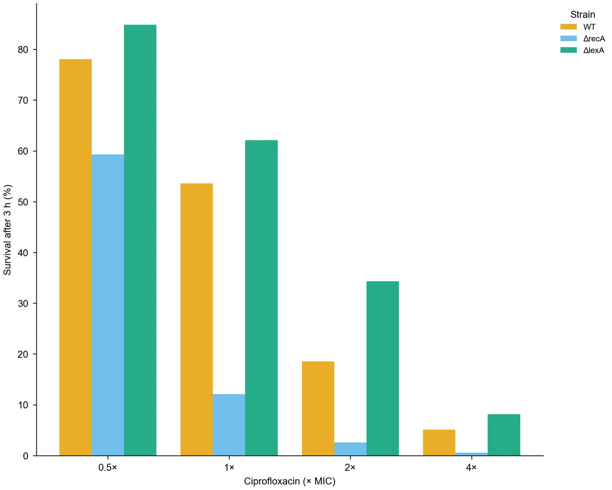
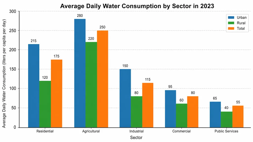
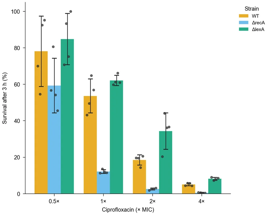
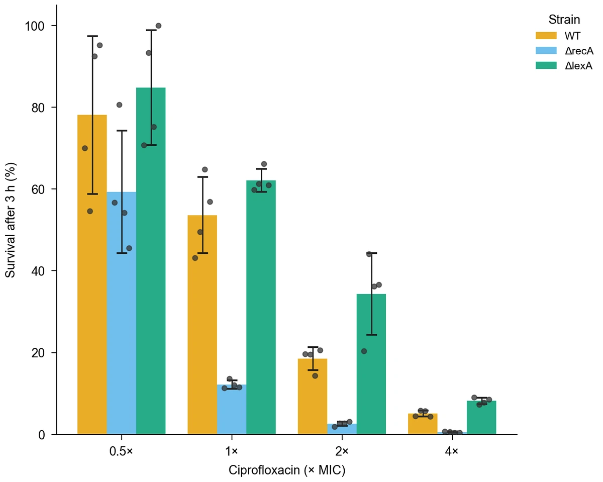
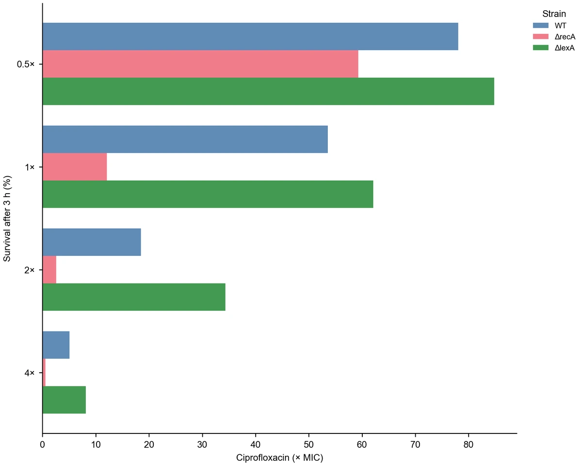
Use this bar chart generator to turn CSV or Excel measurements into a figure that explains differences between categories. Map a category, a numeric value, and an optional group, then choose grouped bars, stacked bars, or a horizontal layout. For replicate measurements, show the mean with SD, SEM, or 95% confidence intervals and add the individual observations. The examples compare bacterial survival across antibiotic doses; use their data and settings as a starting point for your own comparison.

Grouped bars of E. coli survival across ciprofloxacin doses, with SD intervals and replicate points
  • Map category, value, and group columns
  • Choose grouped, stacked, or horizontal bars
  • Show mean intervals and replicate points
  • Export PNG, PDF, EPS, TIFF, and Python code

Bar Chart Features for Clear Comparisons

Choose how values are summarized and displayed so the figure answers your comparison question.

Bring in category and group data

Upload a CSV or Excel worksheet with a category column and numeric measurements. The bar graph generator uses an optional group column to separate treatments, strains, or cohorts within each category. Read the table preview, then name the axes and legend so units and group definitions travel with the figure.

  • Use CSV, TSV, TXT, XLSX, or XLS files
  • Select the worksheet that contains your measurements
  • Map groups separately from category labels
Load sample data

Choose the comparison layout

Place groups side by side to compare them within each category, or stack compatible component values to show a total. Horizontal bars give long category labels more room. Use the bar chart generator to change orientation and category order while keeping the same dataset behind each view.

  • Arrange grouped or stacked bars
  • Order categories by input or aggregated value
  • Choose a vertical or horizontal orientation
Try a horizontal chart

Show variation behind the mean

Keep replicate rows in your table and select mean aggregation to show how measurements vary. Add SD, SEM, or 95% confidence intervals, and overlay observation points when the individual values matter. This AI bar graph generator connects your request to concrete plotting settings, giving the interval choice a visible role in the result.

  • Select the interval that matches your question
  • Overlay replicate points on grouped mean bars
  • Read the published summary values alongside the figure
Compare interval settings

Refine a figure for its destination

Set axis titles, legend wording, palette, and figure width to fit the report or presentation. Describe a change in the workspace to create a revised version. Download the finished image or vector document, and keep the Python code with the project when you want a record of how the chart was drawn.

  • Export PNG, PDF, EPS, or TIFF
  • Use journal-width presets and coordinated colors
  • Download the generated Python code
Explore a clean layout

Bar Chart Steps from Table to Figure

Start with your table or use an example, then shape the comparison around the question you want to explain.

  1. Prepare a category-value table

    Put one observation or prepared value on each row. Give category, value, and group columns distinct headers, and use a consistent unit for the numeric values. Upload the file and select the relevant worksheet to see the data before plotting.

  2. Choose a layout and summary

    Select Bar and map the columns. Choose grouped bars for comparisons within categories, stacked bars for components of a total, or horizontal bars for long labels. When you have replicates, select mean aggregation and the interval you want to display.

  3. Describe and generate the comparison

    Tell the AI bar graph generator which groups, units, and display choices matter. For example, ask for strain survival by antibiotic dose with mean bars, SD intervals, and replicate points. Generate the figure and use its legend and summary values to read the comparison.

  4. Adjust and export the figure

    Refine category order, labels, colors, and width for the final destination. Use a revised version to try another presentation of the same measurements, then download PNG, PDF, EPS, or TIFF and the Python code you want to retain.

Bar Chart Uses across Research Tasks

The same category-value structure serves different questions. Choose the view that makes your particular comparison explicit.

Grouped bars of E. coli survival across ciprofloxacin doses, with SD intervals and replicate points

Compare experimental treatments

Use treatment as the category and replicate measurements as the values. Mean bars with interval estimates summarize the response, while visible observations show the spread within each group. Give the value axis its measurement unit so the result can sit beside the experimental description.

Explore this example
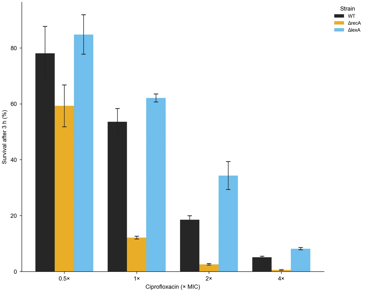
Grouped strain survival bars with SEM intervals

Compare groups at several doses

Map dose to category and strain or treatment arm to group. A grouped chart places each series beside its counterparts at the same dose, making it easier to discuss how the comparison changes across conditions. The survival example provides this exact data structure.

Explore this example
Horizontal grouped bars of strain survival by antibiotic dose

Rank categories with long labels

Compare named pathways, survey options, or specimen categories using horizontal bars. Keep the full labels readable, then order categories by the prepared or aggregated value when rank is part of the question. The bar graph generator can reuse your table for both orientations.

Explore this example
Grouped strain survival means with a compact legend and no intervals

Explain a composition by category

Supply component values and a group column, then stack the components within each category. The combined height communicates the total while colors distinguish contributions. This is useful for prepared counts, resource allocations, or composition summaries where the component values use the same unit.

Explore this example
Grouped strain survival bars with SEM intervals

Teach means and interval choices

Use a small replicate dataset to compare a mean chart with SD and SEM views. Students can connect each visible interval to a specific summary choice and observe how the display changes. Keep the example data in the exercise so discussion starts from the same measurements.

Explore this example

Survival bars ordered by the aggregated value of each dose category

Prepare a poster comparison panel

Make a compact comparison figure with consistent units, group colors, and typography. Choose the width and export format for your poster or presentation workflow, then place the panel next to its explanatory caption. For an ordered numeric trend, use the [line chart generator](/tools/line-chart-generator).

Explore this example
Bar Chart Scenarios from Table to Figure
Examples of how category comparisons can support a real communication task.

For a comparison of three strains at several antibiotic doses, I would start with replicate rows and grouped mean bars. The survival template gives me a concrete structure to follow. Adding SD intervals and the observation points puts the mean and the variation in the same figure for discussion.

Maya R.

Microbiology researcher

These are illustrative use scenarios with fictional names, not verified customer reviews.

Drawing tools

Tools for scientific figures

85 focused generators for the scientific figure you need — each opens in the right workspace with a matching example.

Bar Chart Questions before You Start

1.

2.

3.

4.

5.

6.

Call to action background

Give your comparison a clear figure

Bar Chart: Start with Your Data

Create a bar chart

Free to start · No credit card required · Built for researchers