SciFig

Turn your data into a publication-ready chart

Drop in a CSV, TSV, or Excel file — optional significance tests, export to PNG, PDF, EPS, or TIFF.

Import a data file to continue.

Start with up to 150 free credits|No credit card required

Get up to 350 free credits on day one when you join through an invite.

3 figure engines · 500+ templatesEvery label editable · 60+ color schemesEditable PPTX · Layered SVG · 8K PNG / JPG

Dot Plot Creator for Statistics and Research Data— templates & examples

One dot for every observation

Dot Plot Creator for Statistics and Research Data

Show the shape of a small sample, with every value visible as its own dot.

Use this dot plot creator when you have a single column of numbers, such as measurements from one group, scores from a class or repeated readings, and want readers to see every value. Upload the column as a CSV or Excel file, choose whether each exact value gets its own stack or values are grouped into bins, and add mean or median lines. The chart counts the observations at each position and keeps the stacks aligned on one axis. The examples use measured Palmer Penguins data, simulated dice rolls and a simulated set of quiz scores.

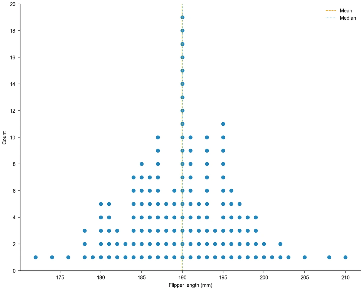
Frequency dot plot of flipper length for 151 Adelie penguins from 172 to 210 mm, tallest stack of 19 at 190 mm, with mean and median lines at about 190 mm
  • Stack one dot per observation from one column
  • Group values into bins of any width
  • Mark the mean and median with reference lines
  • Export PNG, PDF, EPS, TIFF and Python code

Dot Plot Creator Features for Small Samples

Each setting decides how the observations are counted and how the stacks read on the page.

Stack every observation at its exact value

With no bin width set, the dot plot generator places one dot for each row at its exact value and stacks repeated values upward. Readers can count the observations directly, see gaps and spot an outlier at once. The penguin example stacks 151 flipper lengths, measured in whole millimetres, with the tallest stack of 19 birds at 190 mm.

  • Map one numeric column to the axis
  • Stack repeated values upward
  • Plot up to 2000 observations
Load the flipper length data

Group continuous values into bins

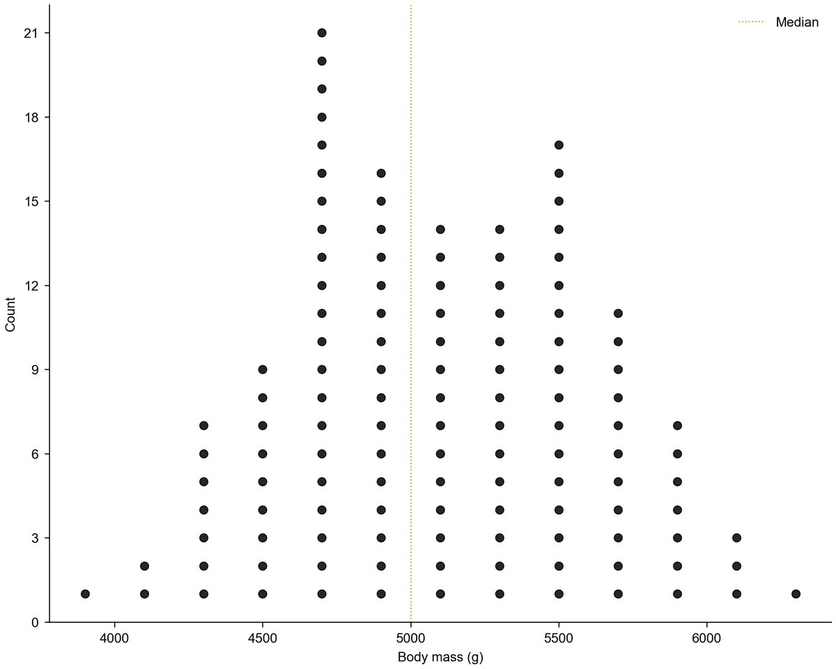
When values are measured to a decimal or spread over a wide range, set a bin width and a starting point. Each dot then counts one observation inside that interval, which includes its lower edge and excludes its upper edge, and the stack sits at the middle of the bin. The Gentoo example groups 123 body masses into 200 g bins starting at 3800 g, which shows the shape without hiding any bird.

  • Set any positive bin width
  • Choose where the first bin starts
  • Keep one dot for every observation
Try the binned body mass

Mark the mean and median

Turn on a mean line, a median line or both to put a centre on the distribution. The two lines sit almost on top of each other for a symmetric sample and move apart for a skewed one, which is a quick visual check before choosing a summary statistic. The dot plot creator computes both from your full column, not from the bins.

  • Add a dashed mean line
  • Add a dotted median line
  • Compute both from every observation
Compare mean and median

Choose dots or crosses and export

Draw each observation as a filled circle or as a cross, set the marker size, and pick a palette, journal style and figure width. You can request a revision in the workspace to adjust the result. Download the dot plot as PNG, PDF, EPS or TIFF, with PNG and TIFF at 300 DPI, and keep the generated Python code with your analysis.

  • Switch between circles and crosses
  • Set marker size, palette and width
  • Export PNG, PDF, EPS, TIFF and code
See the cross markers

Dot Plot Creator Steps from Column to Figure

A dot plot needs only one column of numbers; the settings decide how they are counted.

  1. Put the values in one column

    List one observation per row in a single numeric column with a header, such as flipper_length_mm or score. Save it as a CSV, TSV, TXT or Excel file and upload it to the dot plot maker online, then check the preview of the imported rows. Pasted text needs at least two columns, so a single column goes in as a file.

  2. Choose the dot plot and map the column

    Select the frequency dot plot type and map your column to the x-axis. Leave the bin width empty to stack exact values, or enter a width and a starting value to group continuous measurements into bins.

  3. Describe the chart and generate

    Tell the dot plot maker what the values are, which unit the axis uses and whether to show the mean or median. For example, describe flipper lengths of one penguin species in millimetres with both lines. Generate the figure; every stack is counted from your rows.

  4. Refine the display and export

    Adjust the marker shape and size, the palette and the figure width for the page where it will appear. Request a revision for another style, then download PNG, PDF, EPS or TIFF and keep the Python code with your data.

Dot Plot Creator Uses in Teaching and Research

A dot plot suits samples small enough that each observation is worth showing. These tasks show the column each one needs.

Frequency dot plot of flipper length for 151 Adelie penguins from 172 to 210 mm, tallest stack of 19 at 190 mm, with mean and median lines at about 190 mm

Show a measured sample from one group

Plot a morphological measurement, an assay readout or a reaction time from one group so that readers see the sample size, the spread and any outlier at once. With fewer than a few hundred values, a dot plot shows more than a single bar with an error bar.

Explore this example
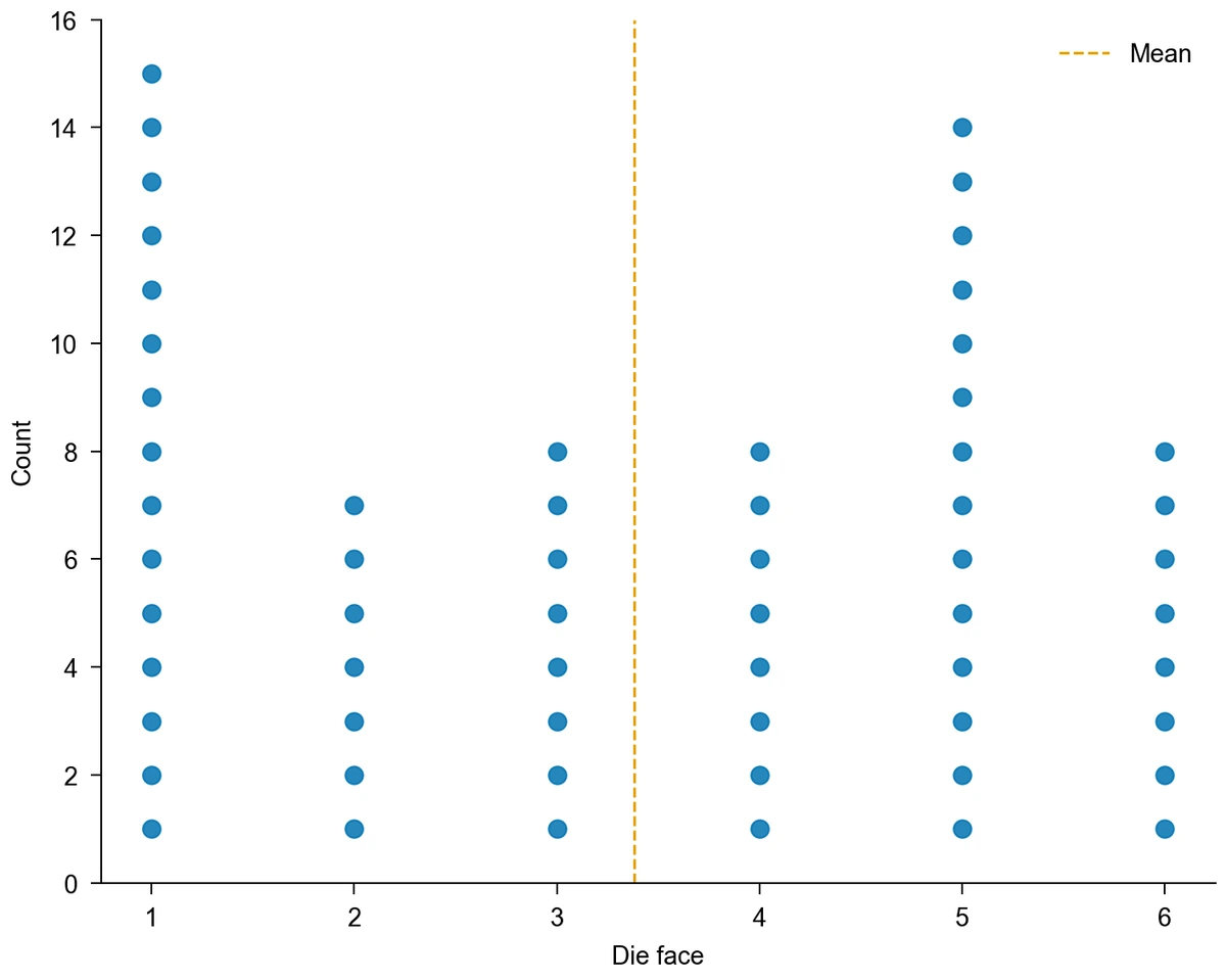
Frequency dot plot of 60 simulated rolls of a six-sided die with stacks of 15, 7, 8, 8, 14 and 8 for faces 1 to 6 and a mean line at 3.38

Teach distributions in a statistics class

Students can collect a small data set, such as dice rolls or quiz scores, and see its shape, centre and spread in one figure. Rolling a die 60 times rarely gives six equal stacks, which opens a discussion of sampling variation, and a mean line on the dot plot graph shows the centre of the rolls.

Explore this example
Frequency dot plot of body mass for 123 Gentoo penguins in 200 g bins from 3800 g, tallest stack of 21 between 4600 and 4800 g, median line at 5000 g

Compare a binned measurement with its median

For continuous measurements such as body mass, a bin width turns scattered values into readable stacks while still counting each individual. The median line shows where half of the sample lies, and a second peak or a long tail becomes visible before you choose a test.

Explore this example
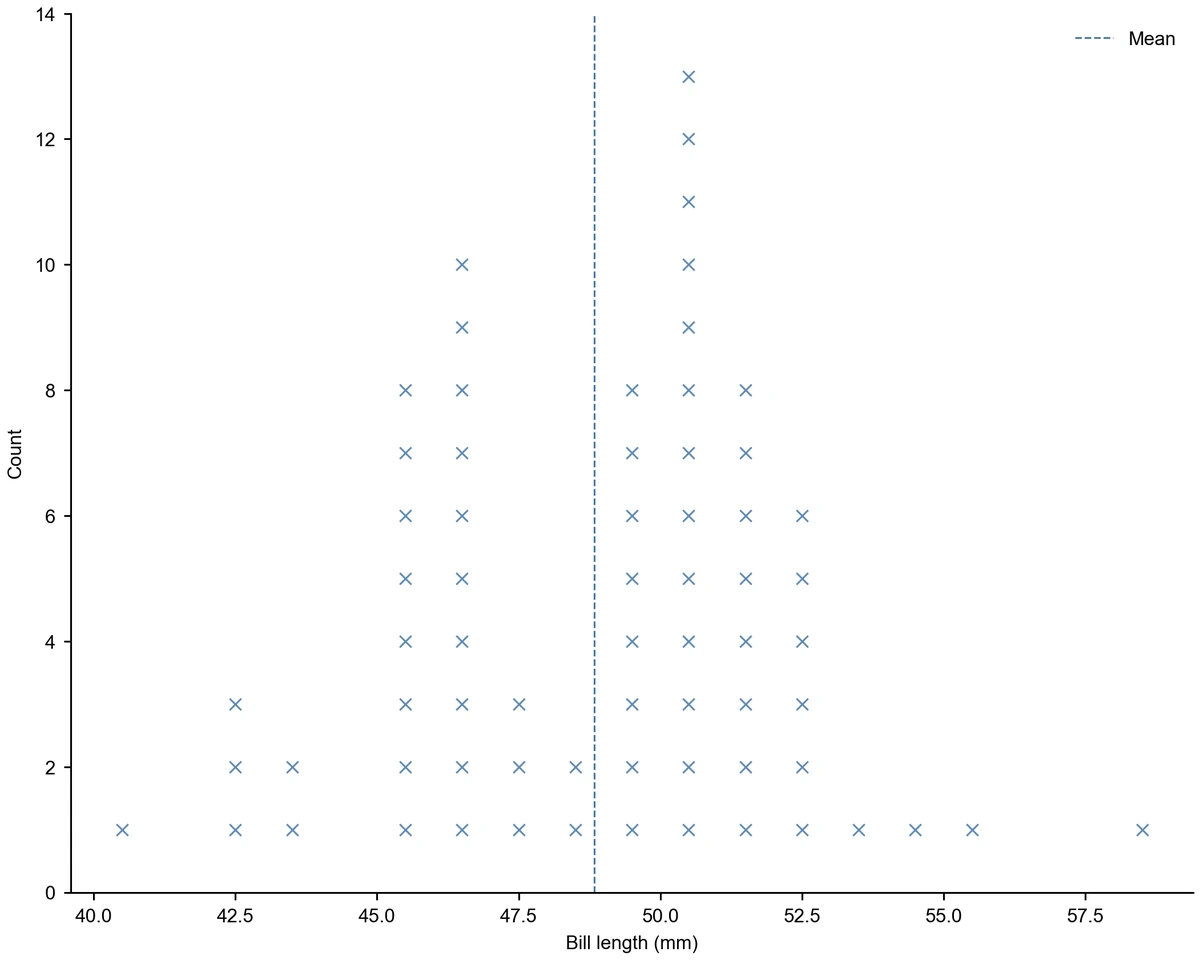
Frequency dot plot of bill length for 68 Chinstrap penguins in 1 mm bins drawn as crosses, two peaks near 46 and 50 mm, mean line at 48.8 mm

Check data before an analysis

A quick dot plot of each variable reveals entry errors, impossible values and clusters that a summary table hides. The bill length example shows two peaks, which suggests looking at subgroups such as sex before reporting one mean.

Explore this example
Frequency dot plot of body mass for 123 Gentoo penguins in 200 g bins from 3800 g, tallest stack of 21 between 4600 and 4800 g, median line at 5000 g

Switch to a histogram for large samples

Above 2000 observations the dot plot is not drawn, and well before that individual dots become too small to read while bars summarise the distribution better. Use the histogram generator for those data, and keep the dot plot for samples where each observation matters.

Explore this example
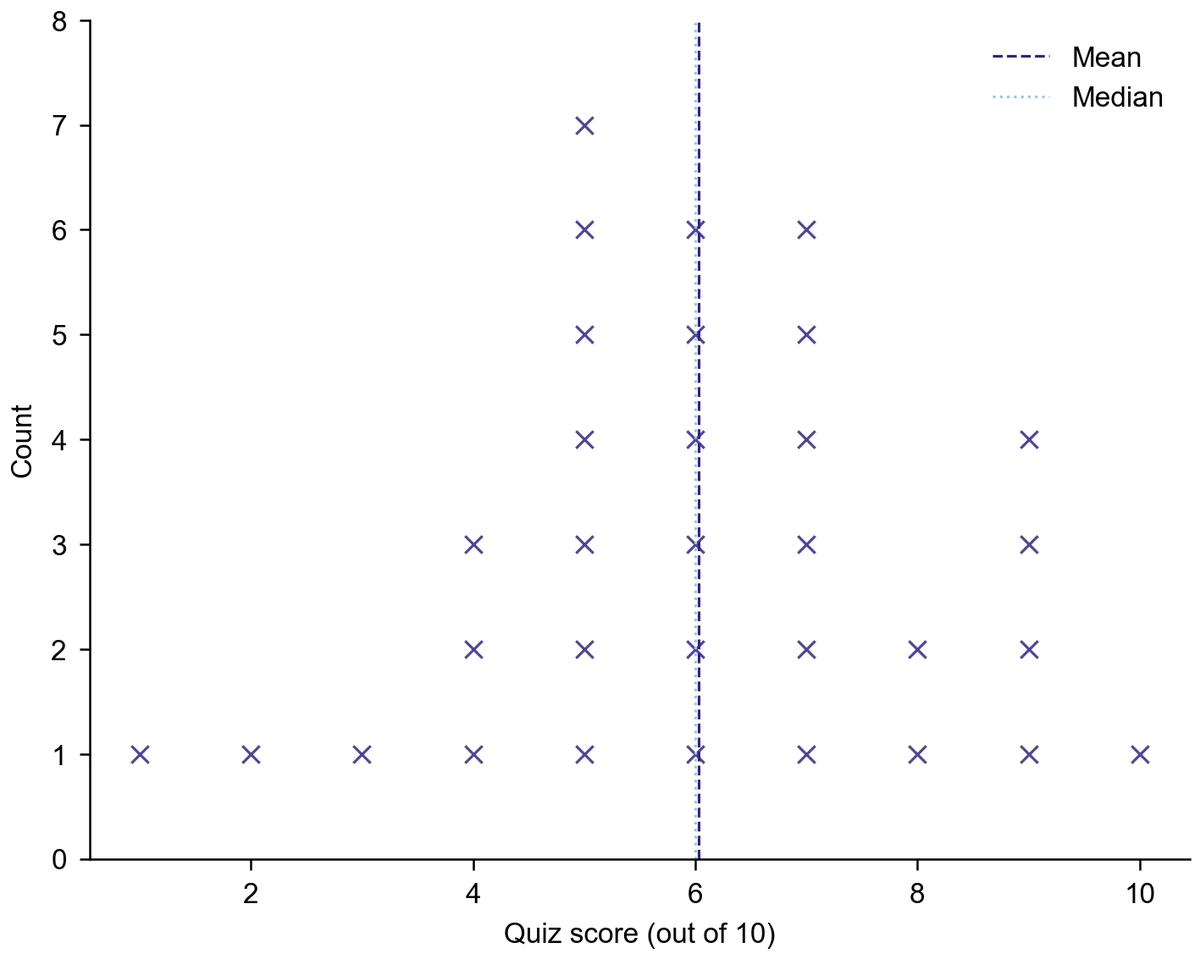
Frequency dot plot of simulated quiz scores out of 10 for 32 students drawn as crosses, most between 5 and 7, with mean and median lines near 6

Plot two variables against each other instead

A frequency dot plot shows one variable. If each observation has two measurements, such as bill length and bill depth, place one dot per observation at both values with the scatter plot maker, which shows the relationship rather than the distribution.

Explore this example
Dot Plot Creator Scenarios for Classes and Labs

Examples of turning one column of observations into a figure for a particular audience.

I would have each student roll a die ten times, pool the results in one column and build the dot plot in class. The uneven stacks start a better discussion of chance than any table of counts.
Rachel M.

High school statistics teacher

These are illustrative use scenarios with fictional names, not verified customer reviews.
Free tools

A tool for every scientific figure

90 focused generators for the scientific figure you need — each opens in the right workspace with a matching example.

Dot Plot Creator Questions before You Start

1.

2.

3.

4.

5.

6.

Call to action background

Show every observation

Dot Plot Creator: Start with Your Column

Make a dot plot

Free to start · No credit card required · Built for researchers