SciFig

Turn your data into a publication-ready chart

Drop in a CSV, TSV, or Excel file — optional significance tests, export to PNG, PDF, EPS, or TIFF.

Import a data file to continue.

Start with up to 150 free credits|No credit card required

Get up to 350 free credits on day one when you join through an invite.

3 figure engines · 500+ templatesEvery label editable · 60+ color schemesEditable PPTX · Layered SVG · 8K PNG / JPG

Waterfall Chart Maker for Scientific Data— templates & examples

From a starting value to a final total

Waterfall Chart Maker for Scientific Data

Show how each increase and decrease moves a starting value to its final total.

Use this waterfall chart maker when a result is easier to explain as a sequence of gains and losses than as a single number. Upload CSV or Excel data with a label column and a signed value column, mark the rows that are totals or subtotals, and the chart places every change at its running total. Rises and falls can take different colors, and connector lines link each bar to the next. The examples cover a grant budget, a carbon footprint, a purification yield, an energy balance and an efficiency loss budget.

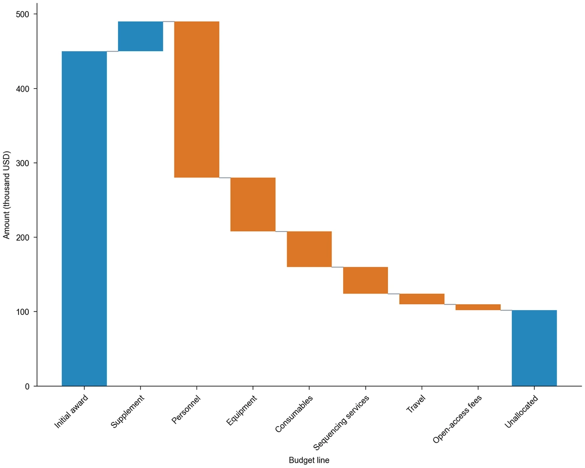
Waterfall chart of a grant budget: 450k USD award, 40k USD supplement, six spending falls in a contrast color and a 102k USD unallocated total
  • Map a step label column and a signed value column
  • Mark start, subtotal and end rows as totals
  • Color rises and falls and add connector lines
  • Export PNG, PDF, EPS, TIFF and Python code

Waterfall Chart Features for Totals and Changes

Each setting answers one question about your sequence: where it starts, how each step moves it and where it ends.

Build the chart from labels and signed values

A waterfall chart needs only two columns: the name of each step and its value. Enter increases as positive numbers and decreases as negative numbers, in the order readers should follow. The waterfall chart generator keeps that row order on the axis and computes each floating position from the running total of your table.

  • Map one label column and one value column
  • Keep the row order of your table
  • Use positive rises and negative falls
Load the grant budget data

Mark start, subtotal and end bars as totals

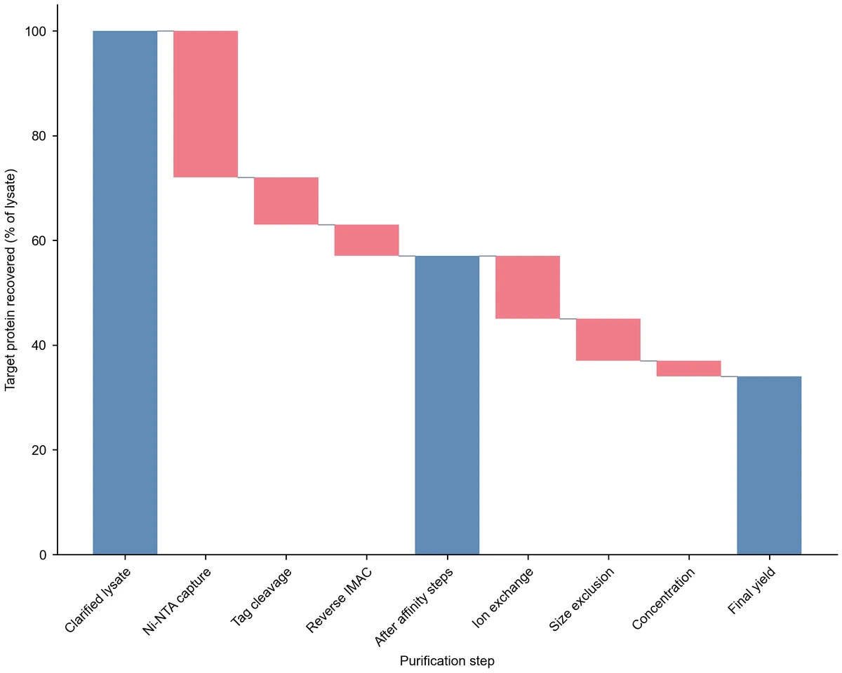
List the rows that hold an absolute level, such as an opening budget, a subtotal after a group of steps or a final yield. Those bars stand on zero at the value you supply, and the running total continues from there. The purification example uses a subtotal after the affinity steps to separate two stages of the process.

  • Mark up to 100 rows as totals
  • Restart the running total at a subtotal
  • See at once when a table does not balance
Try the purification subtotal

Show direction with sign colors and connectors

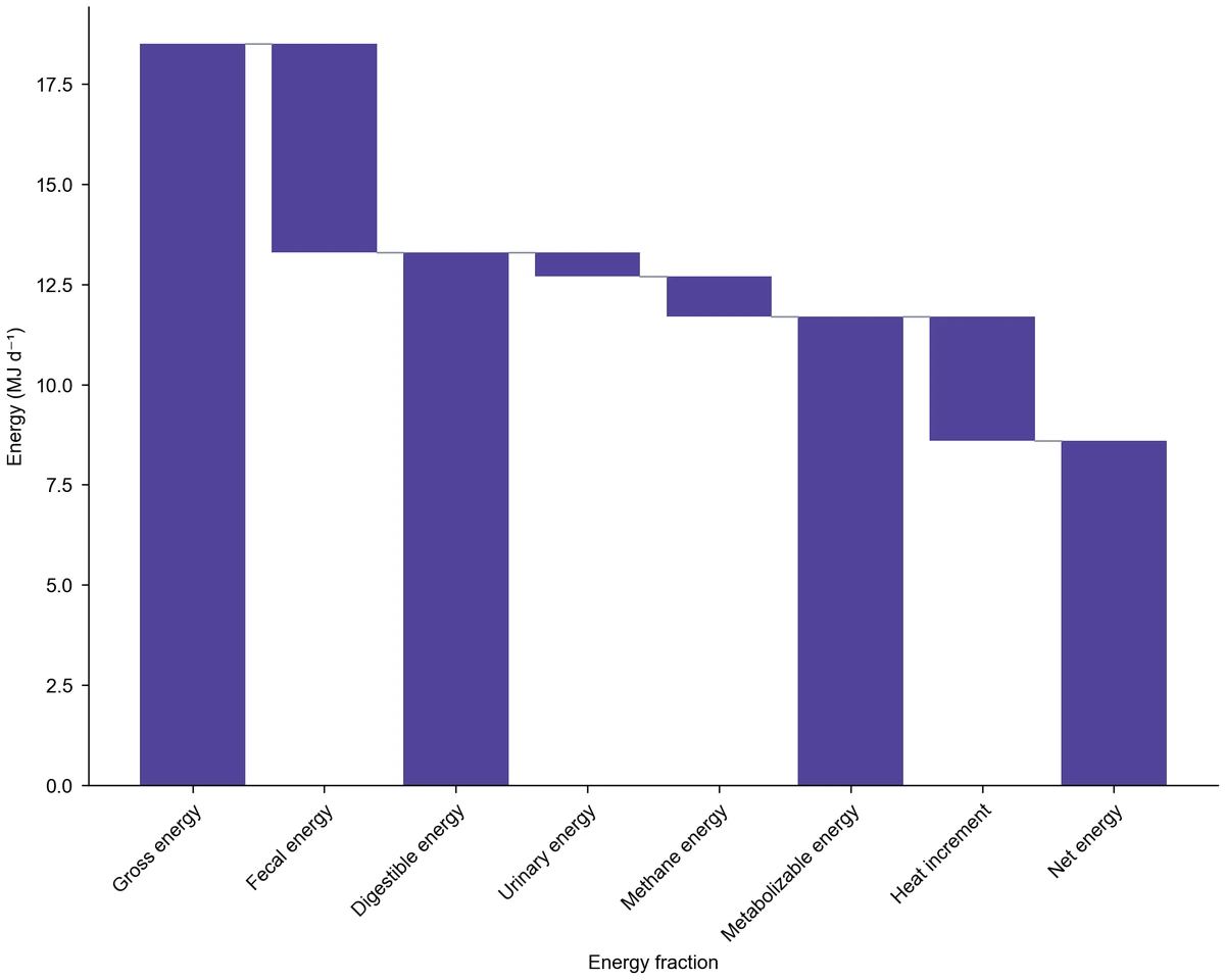
With sign colors on, falls take a contrasting color while rises and totals keep the main color. Turn them off when every step is a loss and a single color reads more calmly, as in the energy example. Connector lines join the end of each bar to the start of the next, and you can hide them for a lighter figure.

  • Give falls a contrasting color
  • Switch to one color for all bars
  • Show or hide connector lines
Compare the color examples

Prepare the figure for a paper or report

Choose a palette, journal style and figure width, set a y-axis range if needed, and give both axes clear titles with units. You can request a revision in the workspace to adjust the result. Use the waterfall chart maker online to download a figure for your manuscript or slides and keep the generated Python code with your project.

  • Export PNG, PDF, EPS or TIFF
  • Set axis titles, range and figure width
  • Download the generated Python code
Explore a compact figure

Waterfall Chart Steps from Table to Figure

Arrange the sequence in the table first; the chart then follows the order and the totals you define.

  1. Write the sequence as rows

    Start with the opening total, then add one row per change with a positive or negative value, then any subtotal and the closing total. Keep units consistent across rows. Upload the CSV or Excel file to the waterfall graph maker, or paste the rows, and check the preview.

  2. Choose the waterfall chart and map the columns

    Select the waterfall chart type, map the label column to the x-axis and the value column to the y-axis, and list the rows that are totals. Decide whether falls should use a contrasting color and whether connector lines should join the bars.

  3. Describe the chart and generate

    Tell the waterfall chart maker what the sequence shows, which rows are totals and what the axis titles and units are. For example, describe a grant budget from the initial award to the unallocated balance. Generate the figure; positions are computed from every row of your table.

  4. Refine the display and export

    Adjust colors, connectors, axis titles and width for the page where the figure will appear. Request a revision for another style, then download PNG, PDF, EPS or TIFF and retain the Python code as a record of how the chart was drawn.

Waterfall Chart Uses in Research

A waterfall chart fits any result that is a sum of named contributions. These tasks show the table structure each one needs.

Waterfall chart of a grant budget: 450k USD award, 40k USD supplement, six spending falls in a contrast color and a 102k USD unallocated total

Break down a research grant budget

Start from the award, add any supplement and subtract personnel, equipment, consumables and other spending lines to reach the unallocated balance. The waterfall chart generator shows which lines take most of the money and how much remains, which helps in progress reports and budget justifications.

Explore this example
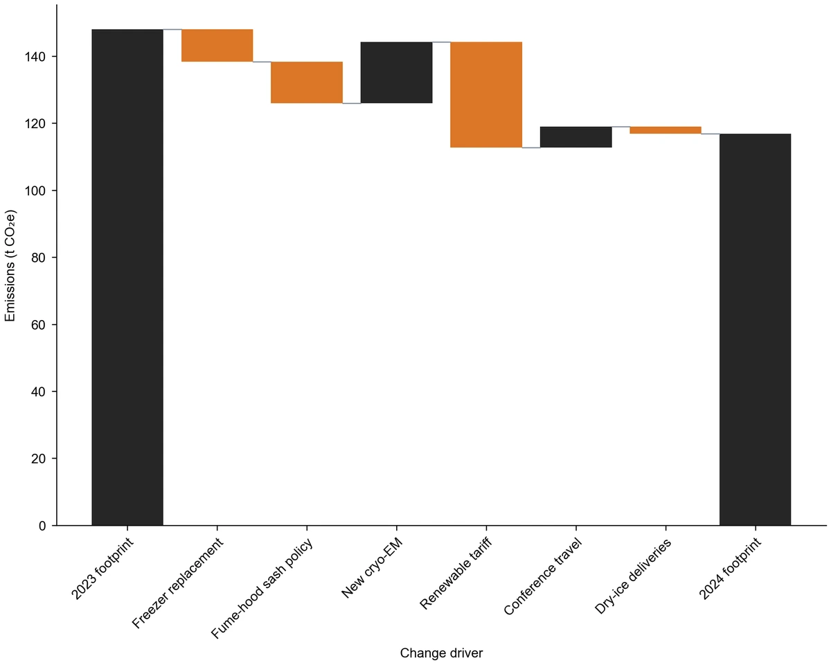
Waterfall chart of lab emissions from 148.0 t CO₂e in 2023 to 116.9 t CO₂e in 2024: four reductions in orange, two increases in dark

Explain a change between two years

Put last year's total and this year's total at the ends and each change driver in between, such as equipment, energy contracts or travel for a laboratory carbon footprint. When you want to follow the same quantity month by month as a trend, use the line chart generator.

Explore this example
Waterfall chart of protein recovery from 100% lysate through a 57% subtotal after affinity steps to a 34% final yield

Follow yield losses through a process

Enter the starting amount, the loss at each purification or synthesis step and the final yield. A subtotal after a group of steps separates stages, so readers can see whether capture, polishing or concentration costs the most material.

Explore this example
Single-color waterfall chart splitting 18.5 MJ/day gross energy into digestible, metabolizable and net energy totals with losses between

Close a mass or energy balance

Show how an input divides into outputs and losses, such as gross energy into digestible, metabolizable and net energy, or a feed stream into products and waste. Listing each intermediate level as a total makes the partitioning explicit and shows whether the balance closes.

Explore this example
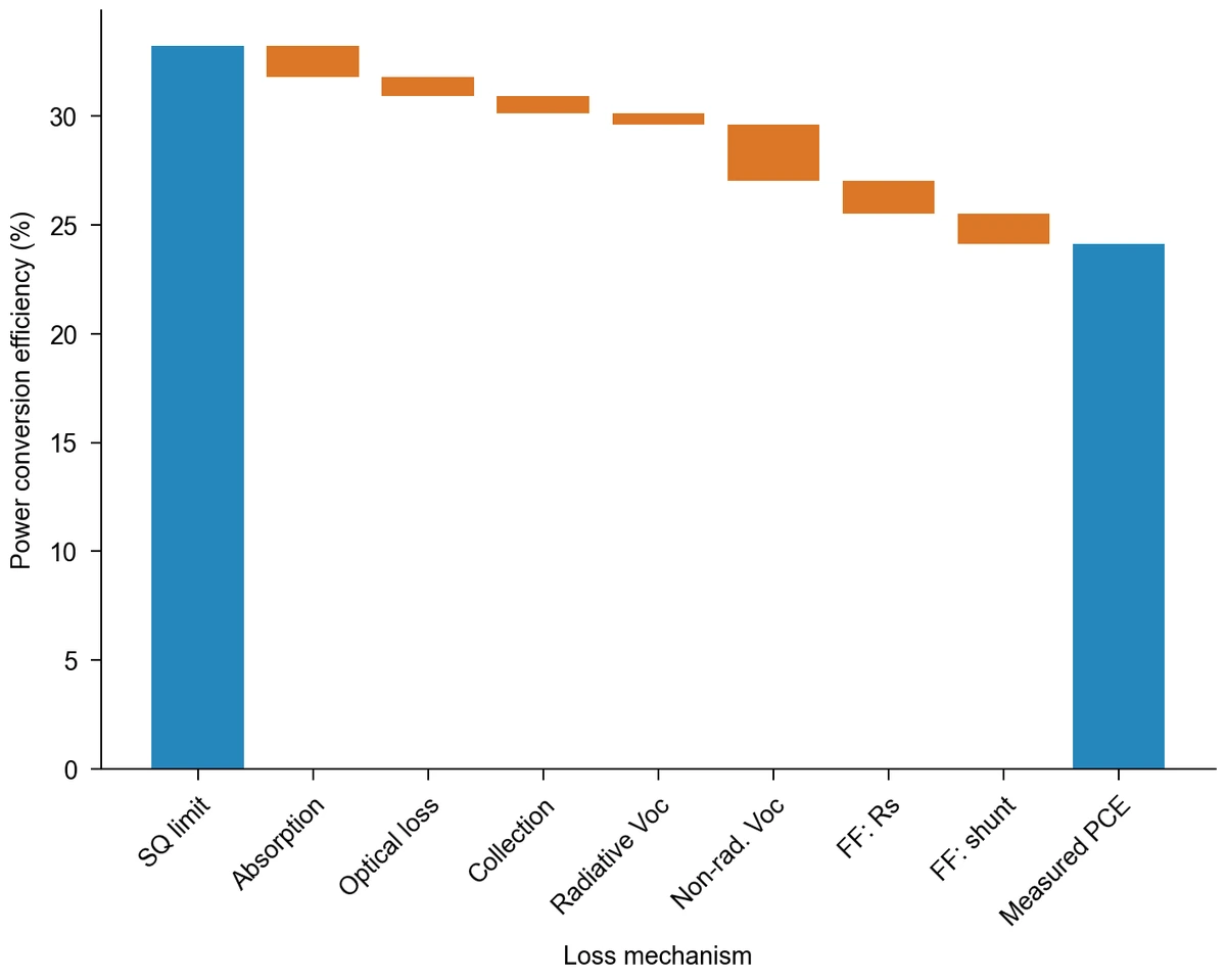
Waterfall chart without connectors from a 33.2% Shockley–Queisser limit to 24.1% measured perovskite efficiency via seven losses

Present an efficiency or effect decomposition

Go from a theoretical or reference value to the measured one through named contributions, as in a photovoltaic loss budget or a decomposition of a difference into components. The length of each bar shows which mechanism matters most, and the totals anchor both ends of the explanation.

Explore this example

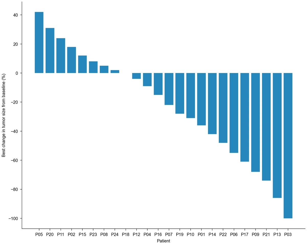
Bar chart of best percentage change in tumor size for 24 patients, sorted from a 42% increase to a 100% decrease, each bar starting at zero (example data)

Sort patient-level responses instead

A clinical waterfall plot of tumor response shows one bar per patient sorted by value rather than accumulated steps. If you need a waterfall plot maker for that task, arrange one row per patient with the percentage change and order the bars from largest to smallest with the bar chart generator.

Explore this example
Waterfall Chart Scenarios for Research Data

Examples of turning a sequence of contributions into a figure for a particular audience.
For an interim grant report I would start from the award, add the supplement and subtract each spending line. The waterfall chart maker shows the remaining balance next to the lines that used the most, which answers the question a program officer usually asks first.

Miriam K.

Principal investigator

These are illustrative use scenarios with fictional names, not verified customer reviews.

Free tools

A tool for every scientific figure

87 focused generators for the scientific figure you need — each opens in the right workspace with a matching example.

Waterfall Chart Questions before You Start

1.

2.

3.

4.

5.

6.

Call to action background

Turn a sequence of changes into a clear figure

Waterfall Chart: Start with Your Values

Make a waterfall chart

Free to start · No credit card required · Built for researchers