Practical guide to producing journal-quality scientific illustrations without expensive software — AI tools, free alternatives, smart workflows.
SciFig Team
SciFig editorial team
Publishing in Nature or Science shouldn't require a design budget. Yet walk into any research group and you'll find the same exhausted PhD student spending three days in Illustrator trying to make a pathway diagram look "journal-ready." The gap between "good enough" and "publication-ready" is shrinking fast — and the tools driving that change are more accessible than most researchers realize.
This SciFig-curated guide breaks down every realistic option available in 2026, from the industry gold standard to AI-powered alternatives like SciFig itself, with honest assessments of cost, quality, and learning curve. If you're working with a lab budget that barely covers pipette tips, this is for you.
What Makes a "Nature-Level" Figure?
Before comparing tools, it helps to define the target. Editors and reviewers at top journals aren't evaluating your scientific figures on aesthetics alone — they're looking at a specific set of technical and design criteria.
Clarity is the first gate. A scientific figure should communicate its conclusion within a few seconds of viewing. Clutter, over-labeling, and competing visual elements are the most common reasons figures get flagged during review. Every element should serve a purpose.
Consistency across the manuscript matters more than people expect. Font sizes, line weights, color palettes, and arrow styles should be uniform across all figures. Inconsistency signals rushed preparation and undermines confidence in the underlying data.
Vector quality is a hard technical requirement. Journals like Nature require figures submitted as high-resolution EPS, PDF, or SVG — raster images exported at 72 dpi from PowerPoint simply will not pass production checks. Vector formats are infinitely scalable and editable, which is why professional designers default to them.
Resolution standards are unforgiving: 300 dpi minimum for halftone images, 600–1200 dpi for line art. Many figures get rejected at the production stage — not peer review — because the source files can't meet these specs.
Color accessibility is increasingly scrutinized. Approximately 8% of men have some form of color vision deficiency. Nature's author guidelines explicitly ask that figures be interpretable to colorblind readers. This means avoiding red-green combinations and using perceptually uniform colormaps (like Viridis or Cividis) for data visualizations.
Clean typography means using a single sans-serif font family (Helvetica or Arial are standard), keeping labels at 6–8 pt at final print size, and avoiding decorative fonts entirely.
Option 1 — Adobe Illustrator (The Gold Standard)
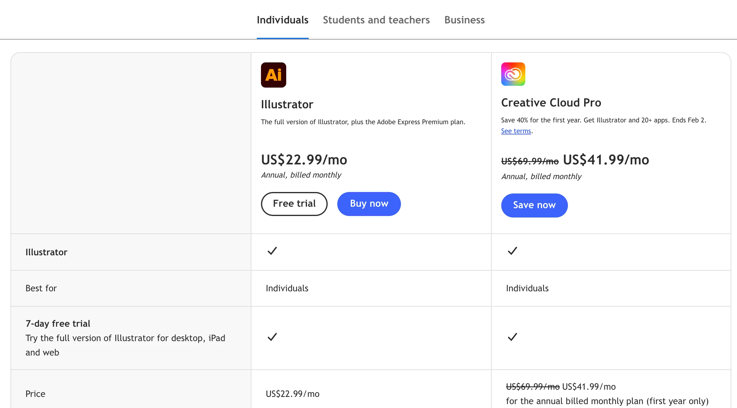
Illustrator has been the default tool for scientific figures for over two decades. It handles vector graphics natively, supports all required export formats, has mature typographic controls, and integrates with the broader Adobe Creative Cloud ecosystem.
Adobe Illustrator for science
The output quality ceiling is essentially unlimited. Illustrator can produce figures that meet the strictest journal production requirements without compromise. Many professional scientific illustrators still use nothing else.
The trade-offs are significant, though. Illustrator costs $263.88 per year on the individual plan as of 2026, or $599.88 per year for the full Creative Cloud suite. For a postdoc earning $55K, that's a meaningful expense — especially for a tool that requires 40–60 hours of focused learning before you produce anything better than what you could make in PowerPoint.
The learning curve is the bigger barrier. Bézier curves, anchor points, pathfinder operations, artboard management — the conceptual overhead is real. Most researchers who "use Illustrator" are actually using 10% of its capabilities while fighting with the other 90%. The payoff is there, but it takes time that most researchers don't have in the middle of writing a manuscript.
Best for: Researchers who regularly produce complex multi-panel figures, labs with illustrator access already, or anyone willing to invest the learning time for a long-term workflow.
Option 2 — BioRender (The Library Approach)
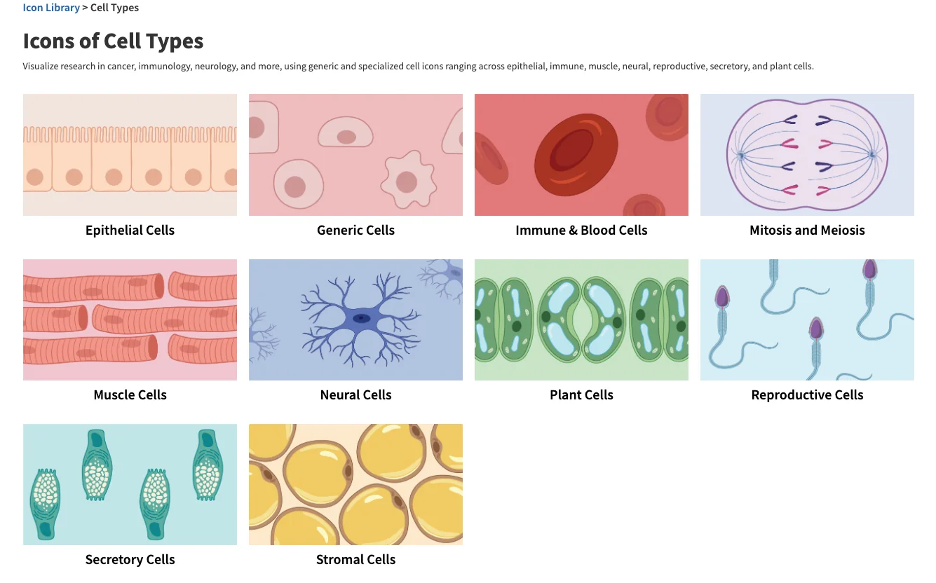
BioRender carved out a specific niche: it provides a curated library of over 50,000 pre-drawn scientific icons (organelles, cells, proteins, lab equipment) that users drag and drop to build figures. If you need to illustrate a cell signaling pathway or a CRISPR protocol diagram, BioRender can get you to a draft very quickly.
BioRender scientific interface
The quality of the icon library is genuinely good — consistent style, clean lines, accurate scientific representations. For life sciences figures that rely heavily on these visual vocabularies, BioRender is arguably faster than Illustrator for many common use cases.
The limitations become apparent quickly, though. BioRender operates on a template-and-icon paradigm — you're assembling from parts rather than creating from scratch. When your scientific figure doesn't fit the library's vocabulary (novel organisms, unusual assay formats, custom data visualizations), you hit a wall fast.
Pricing is the other constraint. The academic plan runs approximately $99/year for individual researchers, but the free tier is severely limited — figures created on free accounts display a watermark and cannot be legally used in publications. Many researchers discover this after spending hours building a scientific figure. The institutional pricing model makes it more accessible if your university has a site license, but individual access remains expensive for what it offers.
Best for: Life sciences researchers building standard pathway diagrams, protocol illustrations, or figures that map cleanly onto BioRender's icon library.
See AI Scientific Figure Generation in Action
Watch how researchers create publication-ready scientific figures from text descriptions.
The emergence of image-generation AI has inevitably led researchers to ask: can I just describe my figure and get something usable? The short answer is no — not for publication, and not reliably even for presentations.
General-purpose image AI has three fundamental problems for scientific figures. First, it hallucinates. Ask Midjourney for a scientific figure showing "CD8+ T cell activation with TCR-MHC interaction" and you'll get something that looks vaguely biological and is scientifically wrong in specific, hard-to-spot ways. Proteins will have impossible structures, pathways will have incorrect directionality, labels will be misspelled or nonsensical.
Second, general AI produces raster images. There is no SVG output, no layer structure, no editability. The file you get is a flat JPEG or PNG — exactly the format journals reject.
Third, the outputs lack the visual conventions that make scientific figures readable to domain experts. Arrows mean specific things. Color conventions carry meaning. The spatial grammar of a Western blot or a flow cytometry plot is learned and standardized. General AI doesn't know these conventions.
The appropriate use case for Midjourney or DALL-E in scientific contexts is narrow: conceptual cover art, graphical abstracts intended more as marketing than technical communication, or early-stage ideation. For publication figures, they are not a viable option.
Best for: Conceptual illustrations and graphical abstracts where scientific accuracy is secondary to visual impact.
Option 4 — AI Scientific Illustration Tools
A newer category of AI-native scientific illustration tools is purpose-built for scientific figures — trained on scientific literature, tuned to understand domain terminology, and designed to produce outputs that meet journal technical requirements.
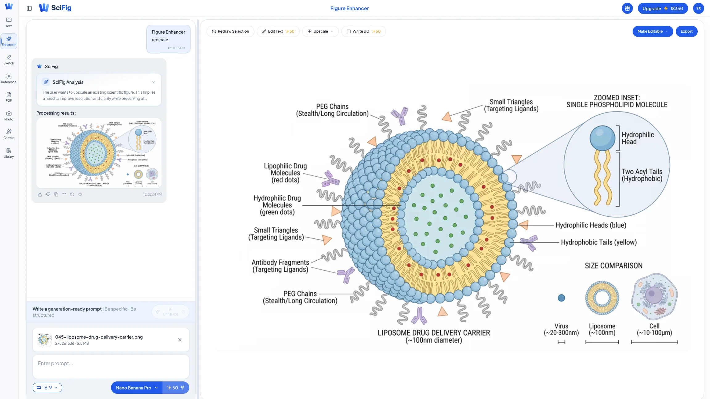
AI scientific figure generation
The core difference from general AI is domain specificity. When you describe a "T cell exhaustion pathway showing PD-1/PD-L1 checkpoint inhibition," a scientific illustration AI understands the biological entities, their spatial relationships, and the visual conventions used to represent them in publications. It won't hallucinate a random protein complex in the wrong location.
Vector output is the other critical differentiator. Purpose-built scientific illustration tools export SVG and EPS — editable, scalable, journal-ready. This means the AI-generated figure is an editable vector file where you can modify any element, not a flat image you're stuck with.
Pricing is generally more accessible than Illustrator or BioRender, with free tiers available for low-volume use and paid plans structured around per-figure or monthly credit models. For researchers producing 5–10 figures per paper, the economics are substantially better. Paid credits never expire. Unused paid subscription credits roll over, and you keep them even after you cancel.
Tip
Most AI scientific illustration tools offer a free tier that covers 3–10 figures per month. For a single paper, this is often enough to handle supplementary figures and let you trial the platform before committing to a paid plan. SciFig is free to start, no card required: 150 credits on day one (3 figures) and up to about 44 figures in your first month with daily check-ins.
Many AI scientific figure tools are strongest for schematic figures — pathways, mechanisms, workflows, anatomical diagrams — and leave complex data visualization (heatmaps, volcano plots, survival curves) to R/ggplot2 or Python/matplotlib. SciFig covers both in one workspace: SciFig DataChart (data-driven charts) generates heatmaps, volcano plots, and survival curves precisely from your data table, while SciFig AI Illustration (AI scientific illustration) and SciFig FlowChart (flowcharts and diagrams) cover pathways, mechanisms, and workflows, all editable.
Best for: Researchers producing schematic and mechanism figures who want publication-ready vector output without a steep learning curve or significant software cost.
Head-to-Head Comparison
Here's how the major options stack up across the criteria that matter most for publication figures:
SciFig (AI Illustration, DataChart, FlowChart)
Adobe Illustrator
BioRender
General AI
AI Scientific Tools
Annual cost
Free to start; Starter $100/year ($8.33/mo)
$264
$99 (with limitations)
$20–30/mo
Free tier + from $15/mo
Learning curve
Low
Very high (40–60 hrs)
Medium (10–15 hrs)
Very low
Low (1–2 hrs)
Output quality
High: schematics, charts generated from your data, native SVG flowcharts
Unlimited ceiling
Good (within library)
Unpredictable
High for schematics
Vector export
Yes (vectorize to editable SVG; SciFig FlowChart is native SVG)
Yes (native)
Yes
No
Yes
Scientific accuracy
High; every element editable
User-dependent
Good for bio icons
Poor
High
Edit after export
Full (SVG)
Full
Partial
No
Full (SVG)
Free tier
Yes: 3 figures on day one, up to ~44 in your first month; free publication license
No
Limited (watermark)
Limited
Yes (3–10 figs/mo)
The honest summary: Illustrator has the highest manual ceiling if you're willing to learn it. BioRender is fast for its specific use case. General AI is not a solution for publication figures. Among AI scientific illustration tools, SciFig offers the best cost-to-quality ratio for most researchers: SciFig AI Illustration for schematics, SciFig DataChart for charts generated from your data, and SciFig FlowChart for native SVG diagrams, all editable.
Create Scientific Figures Now
Describe your scientific figure in natural language — get publication-ready illustrations in minutes.
The most practical approach for researchers who need publication-quality figures without a large budget or significant time investment is a two-phase workflow: generate with SciFig, then edit any element in SciFig's vector canvas.
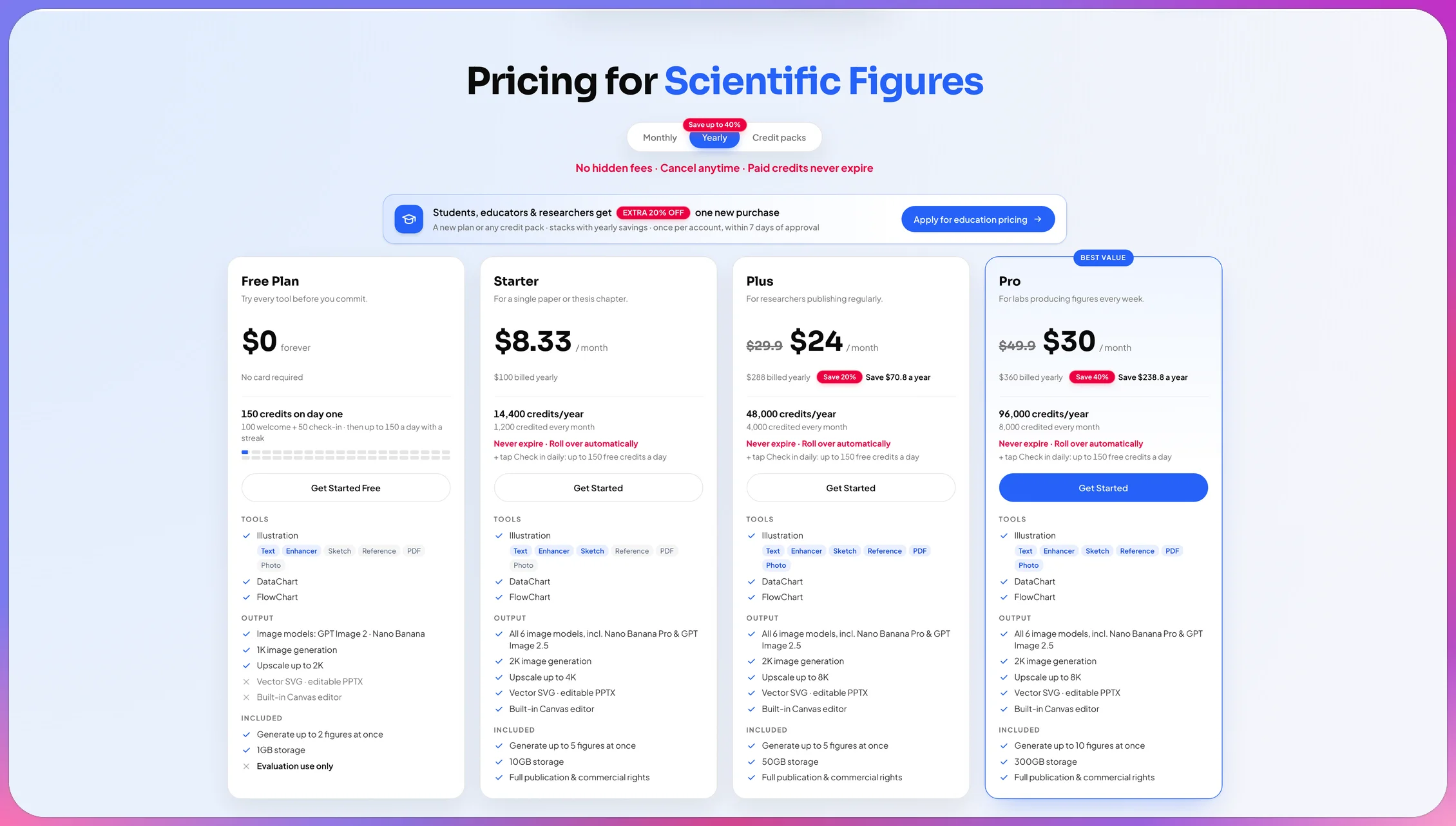
SciFig pricing tiers for budget-conscious researchers
Even on SciFig's Free or Starter tier, the included credits (a daily check-in on Free, 1,200 credits a month on yearly Starter or 2,000 on monthly Starter) are enough for most students and early-career researchers to create an entire manuscript's figure set. Here's how the two-phase workflow runs in practice:
Phase 1 — AI Generation (20–30 minutes)
Start with a text description of your scientific figure. Be specific about the biological entities, their relationships, and the visual format you want. Our S.S.V.D. prompt framework walks through the exact pattern for scientific figures. For example:
"Schematic of CRISPR-Cas9 genome editing. Show the Cas9 protein guided by a single guide RNA (sgRNA) recognizing a target DNA sequence with the PAM motif, then creating a double-strand break. Mark the cut site clearly and use distinct colors for protein, RNA, and DNA strands."
A purpose-built AI tool will produce a figure from this description in under a minute. SciFig AI Illustration gets the core structure right — entity relationships, directionality, key elements — and after vectorization you can adjust labels, spacing, and styling element by element.
Phase 2 — Edit in SciFig's vector canvas (30–60 minutes)
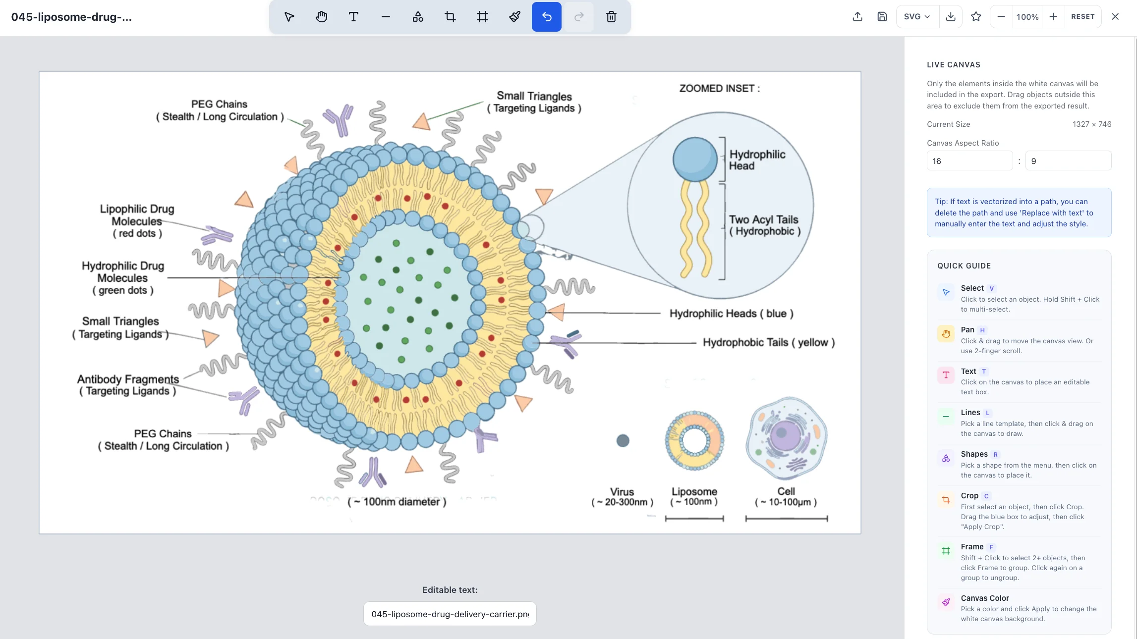
Vectorize the figure to editable SVG and open it in SciFig's vector canvas to handle the tasks you'll actually need for figures: adjusting font sizes, changing colors to match your journal's style guide, repositioning labels, and fine-tuning line weights. If you prefer a desktop editor, Inkscape is a free, open-source alternative that opens and edits SVG files natively.
Vectorization feature
If your existing figures are raster images (from older manuscripts, collaborators, or data output), SciFig's vectorization feature converts PNG/JPEG to editable SVG you can modify element by element. This is particularly useful for bringing older lab figures up to current journal standards without recreating them from scratch.
The total time investment for a publication-ready schematic figure using this workflow is typically 1–2 hours. Compare this to 6–12 hours for an equivalent Illustrator workflow if you're not already fluent in the software.
Export settings for submission: SciFig AI Illustration exports SVG, PNG, JPG, and PPTX; SciFig DataChart exports charts directly as PDF, EPS, or 300 DPI TIFF. When a journal asks for an illustration as PDF (for multi-panel figures) or 600 dpi TIFF (for line art), open the SVG in Inkscape and export from there. Check your target journal's specific requirements — Nature journals maintain detailed figure preparation guidelines that specify format and resolution by figure type.
Frequently Asked Questions
Check the target Nature journal’s current requirements for each image type and final panel size. Pure vector artwork scales without pixelation, while embedded raster panels still need the required effective resolution. Keep SVG as an editable master where useful, and export the file format the journal accepts.
Policies vary, so the specific journal's current AI policy and its disclosure and editorial-approval requirements are the reference for your figure. In SciFig, DataChart generates supported chart types precisely from your original table (AI plans the chart), while FlowChart and AI Illustration use AI to generate editable visual content; knowing which SciFig module made each figure keeps disclosure simple, and every output stays editable. See our 2026 journal AI-figure policy guide for publisher-specific requirements.
Inkscape is genuinely capable for the refinement tasks most researchers need: editing SVG files, adjusting typography, changing colors, and exporting to publication formats. It lacks Illustrator's polish and some advanced features, but for figure refinement rather than from-scratch illustration, the quality ceiling is the same. The main practical limitation is that Inkscape's UI has a steeper learning curve relative to Illustrator's for users already familiar with Adobe software.
Avoid red-green color combinations as your primary data encoding. Use perceptually uniform colormaps (Viridis, Magma, Cividis) for continuous data. For categorical data, combine color with shape or pattern so information isn't color-only. Tools like Color Oracle (free desktop app) simulate different types of color vision deficiency so you can preview your scientific figures before submission.
If you have a clean original raster figure at reasonably high resolution, vectorization is the most direct path. SciFig's AI vectorization converts PNG/JPEG to editable SVG, preserving the structure while making it scalable and editable. For figures where the original source files are lost or were never vector, this is often faster than recreating from scratch. After vectorization, you can adjust any element and the typography directly in SciFig's vector canvas to meet current journal standards.
Keep going
Recommended resources
Templates, tools, and further reading for your research