Publication-grade and colorblind-safe color palettes for scientific figures, graphs, pie charts, combo charts, and diagrams, with HEX values.
SciFig Team
Scientific Illustration Experts
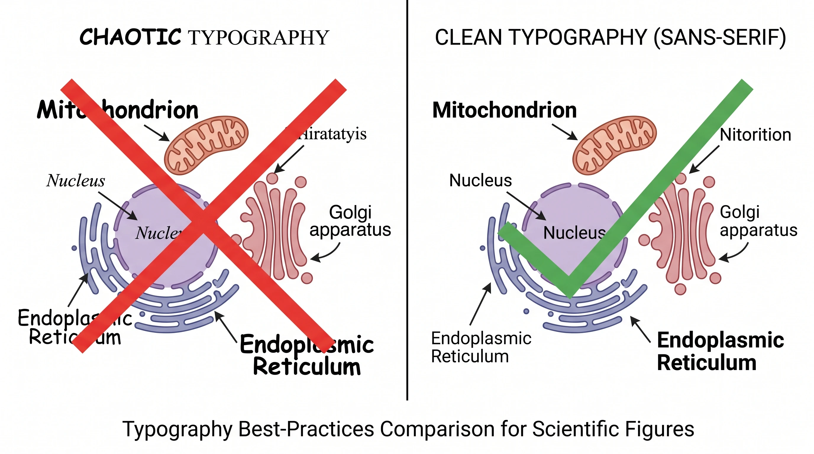
Color is the fastest way to make a scientific figure look professional — and the fastest way to make it look amateur. The same data, plotted with a default Excel rainbow versus a restrained four-color palette, reads as either a high-school project or a Nature submission. Reviewers form that impression in the first second, before they read a single axis label.
This guide gives you publication-grade color palettes with HEX values you can copy, the journal conventions worth knowing, and use-case guidance for scientific plots, graphs, pie charts, heatmaps, posters, and pathways. It also covers the one constraint too many figures still ignore: roughly 8% of men and 0.5% of women have some form of color vision deficiency, which means a palette that fails colorblind-safe testing is unreadable to a meaningful slice of your audience — including reviewers.
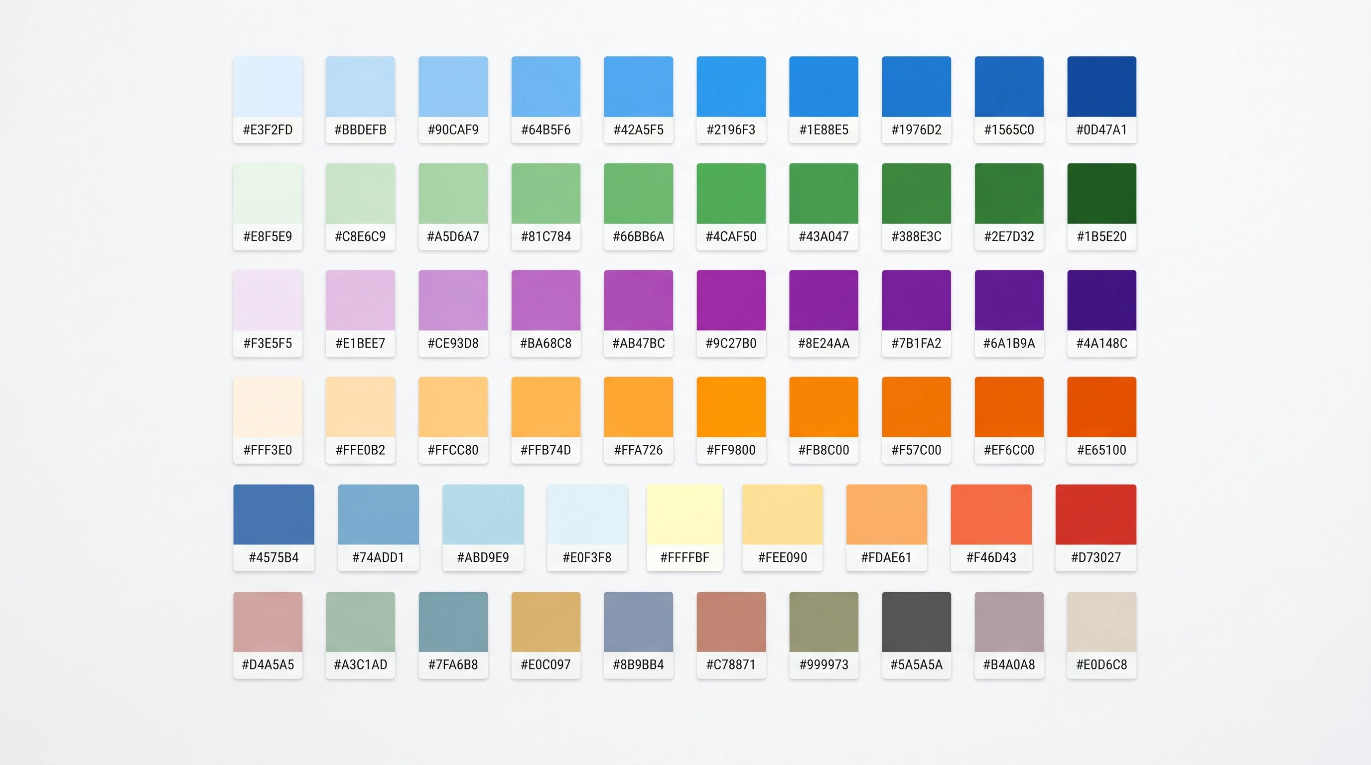
A grid of scientific color palette swatches with HEX values, spanning sequential, diverging, and categorical schemes (Figure generated with SciFig)
Why Color Decides Figure Readability and Acceptance
Color in a scientific figure is not decoration — it's an encoding channel, and it either carries information or it adds noise. A well-chosen palette makes categories instantly distinguishable, guides the eye to the key result, and survives both grayscale printing and colorblind viewing. A poorly chosen one forces the reader to work, and a tired reviewer who has to work tends to disengage.
Three failure modes recur. The rainbow palette (the old jet colormap) creates false boundaries where the data is continuous, because the human eye doesn't perceive its color steps as equal. Red-green encoding is invisible to the most common form of color blindness, yet it's still the default for "good vs bad." And too many categories — more than about eight distinct colors — exceeds what anyone can hold in working memory, so a legend with twelve colors becomes a lookup table the reader abandons. The palettes below are chosen to avoid all three.
Top journals don't mandate exact palettes, but their published figures converge on a recognizable house style: muted, low-saturation colors with strong value contrast. Matching that style signals "this belongs here" before a reviewer reads the caption. Below are starting palettes aligned to common journal aesthetics.
Palette
Use case
Example HEX values
Muted categorical
Up to 6 groups in bar/line plots
#4E79A7#F28E2B#59A14F#E15759#B07AA1#76B7B2
Nature-style cool
Two-to-three group comparisons
#386CB0#7FC97F#BEAED4
Sequential (single hue)
Ordered data, density, magnitude
#F7FBFF#9ECAE1#4292C6#08519C
Diverging
Data with a meaningful midpoint (e.g. log-fold change)
#B2182B#F4A582#F7F7F7#92C5DE#2166AC
Two rules carry most of the benefit. Use sequential palettes (light-to-dark of one hue) for ordered or continuous data, and diverging palettes for data centered on a meaningful zero. Reserve categorical palettes for unordered groups, and cap the count near six — beyond that, distinguish groups with shape or texture, not more colors.
If you need a fast decision rule, think in three buckets. Qualitative palettes are for distinct categories in scientific plots and graphs, sequential palettes are for increasing magnitude, and diverging palettes are for values that split around a meaningful midpoint. If you need a palette for a scientific diagram, keep the palette even tighter: assign colors to semantic roles such as molecule classes, compartments, or states, rather than using extra hues as decoration.
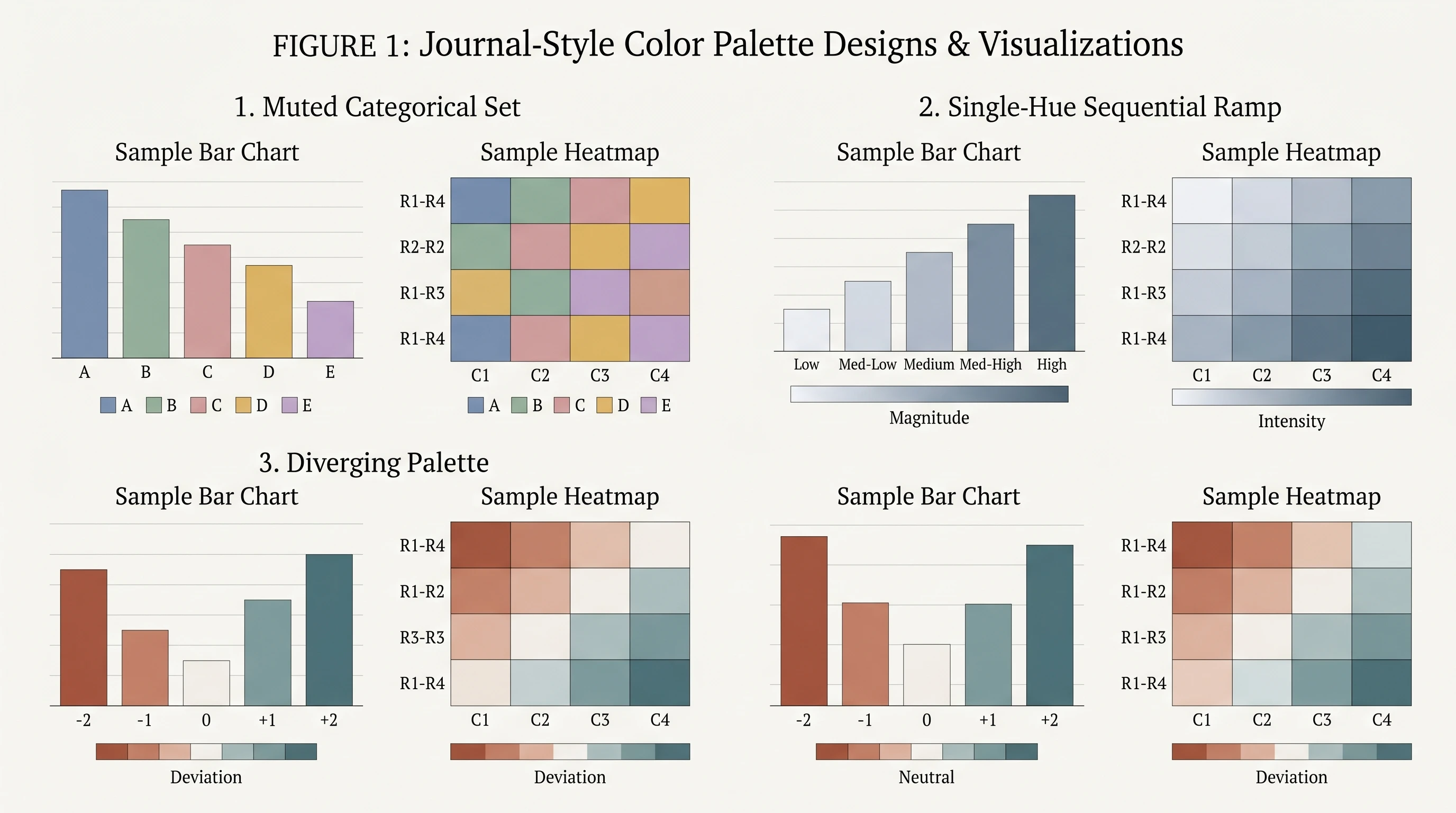
Side-by-side journal-style palettes — muted categorical, sequential, and diverging — applied to the same bar chart and heatmap (Figure generated with SciFig)
A colorblind-safe palette isn't an accessibility nicety — it's a requirement for your figure to be read correctly by everyone, and several journals now explicitly recommend it. The two best-tested options are the Okabe-Ito palette and Wong's palette, both designed so that every pair of colors stays distinguishable across the common forms of color vision deficiency.
The Okabe-Ito eight-color set is the most widely cited: #000000 (black), #E69F00 (orange), #56B4E9 (sky blue), #009E73 (bluish green), #F0E442 (yellow), #0072B2 (blue), #D55E00 (vermillion), and #CC79A7 (reddish purple). It's intentionally not a rainbow — the colors were selected for contrast under deficiency, not visual prettiness, which is exactly why it works.
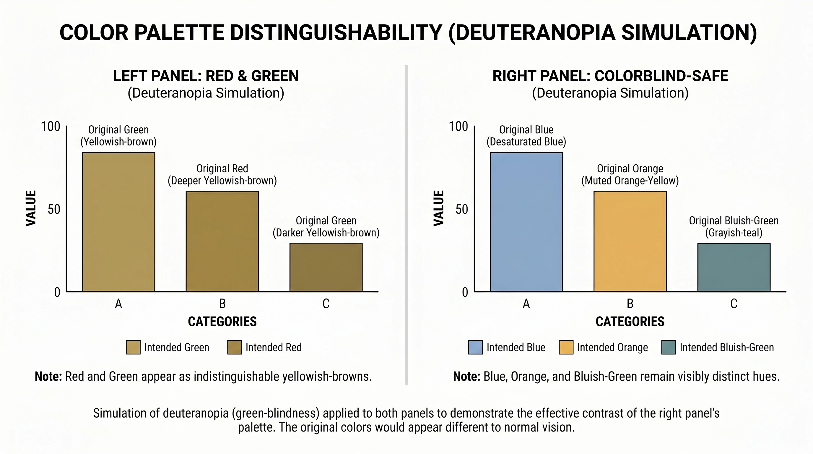
Two habits make any palette safer. First, never encode meaning with red-vs-green alone — pair color with a second channel like position, shape, or a direct label. Second, test in grayscale: if your figure still reads when desaturated, it will survive both colorblind viewing and the black-and-white printing some journals still use. The example below shows the same figure in a red-green encoding versus an Okabe-Ito encoding, simulated under deuteranopia. That matters just as much for pie charts, combo charts, and figure panels as it does for classic bar graphs.
A figure shown twice — red-green encoding versus Okabe-Ito palette — each simulated under deuteranopia to show which stays readable (Figure generated with SciFig)
See Figure Enhancement in Action
Upscale, recolor, or relabel any existing scientific figure to 8K journal-ready quality.
The right palette depends on what the figure does, not on personal taste. Matching palette type to data type is the single highest-leverage decision in figure color.
Line, bar, and other scientific plots — use a muted categorical palette, capped at about six colors. If you have more series than that, split into small multiples rather than adding colors.
Box plots and grouped comparisons — two to four high-contrast categorical colors; keep the within-group fill light so the median line stays visible.
Heatmaps — a sequential palette for one-directional magnitude, or a diverging palette when there's a meaningful center (zero, baseline, control). Avoid rainbow heatmaps entirely.
Pie charts — if you must use one, cap at five slices, order them clearly, and rely on strong luminance contrast between adjacent wedges. The best pie chart colors are distinct but not loud.
Combo charts — use one saturated accent for the primary series, then keep supporting bars, areas, or lines muted. The best colour combination for a combo chart is usually one dominant accent plus restrained support colors, so the hierarchy stays obvious instead of letting every series compete at full intensity.
Pathway and mechanism diagrams — use a small palette where color means something (one hue per molecule class, for example), not a different color per object. Consistency across the figure matters more than variety.
The unifying principle: color should reduce the reader's work, not add to it. Good color palettes for graphs do not just look attractive; they make categories, order, and emphasis legible at a glance. When a palette makes you reach for the legend repeatedly, it's doing the opposite of its job. For the broader set of avoidable figure errors, see 5 common mistakes when creating scientific figures.
How to Choose a Color Palette for Scientific Plots and Graphs
If you are choosing a color palette for scientific plots rather than illustration-style figures, the safest workflow is procedural rather than aesthetic. Start by identifying the data relationship: categories call for a qualitative palette, magnitude calls for a sequential palette, and deviation around a center calls for a diverging palette.
Then decide what the reader should notice first. In a combo chart, that usually means assigning one accent color to the dominant series and keeping the supporting series quieter. In a pie chart, it means using fewer slices with clearer contrast rather than trying to make eight similar wedges coexist.
Finally, test the palette in context. Check it against a white background, grayscale export, and color-vision-deficiency simulation. Good color palettes for graphs keep their hierarchy in all three views. If that hierarchy disappears in any of them, the palette is not ready for publication no matter how good it looked in the picker.
Poster-Specific Color Palettes
Posters change the color math because the viewing distance changes. A palette that's elegant at journal-figure scale can wash out across a two-meter poster hall, so posters favor slightly higher contrast and a tighter palette — often just two or three colors plus neutrals. A common winning scheme pairs a deep navy or teal for structure with a single accent color reserved for the key finding, on a white or very light background. The same rule applies to graphs on a poster: fewer colors, stronger contrast, and one clearly dominant visual message.
The discipline is the same as for figures, only stricter: fewer colors, more contrast, and color reserved for meaning. For the full anatomy of a poster that works — hierarchy, hero figure, and how color supports both — see our guide to scientific poster examples.
Apply Palettes in One Click with SciFig
Choosing the right palette is one problem; applying it consistently across every figure in a paper is another. Manually re-coloring a multi-panel figure to a journal palette, then re-checking it for colorblind safety, is the kind of tedious work that gets skipped under deadline. SciFig's figure-enhancer handles the recoloring step: it applies a chosen palette across a figure's elements and keeps the scheme consistent, so you're not hand-matching HEX values panel by panel.
The workflow is straightforward — generate or import your figure, choose a palette (journal-aligned or colorblind-safe), and let the tool apply it uniformly. The figures stay publication-ready without the manual color bookkeeping. To see how real figures look with disciplined palettes applied, browse the inspiration gallery.
If you are still at the selection stage, start with SciFig's scientific color palette generator. Tell it whether you need colors for bar graphs, pie charts, combo charts, or scientific diagrams, and it returns a palette with HEX codes you can apply directly before moving into recoloring or final figure polish. If your immediate need is a palette for a scientific diagram, it is the quickest way to get an accessible starting point without over-coloring the figure.
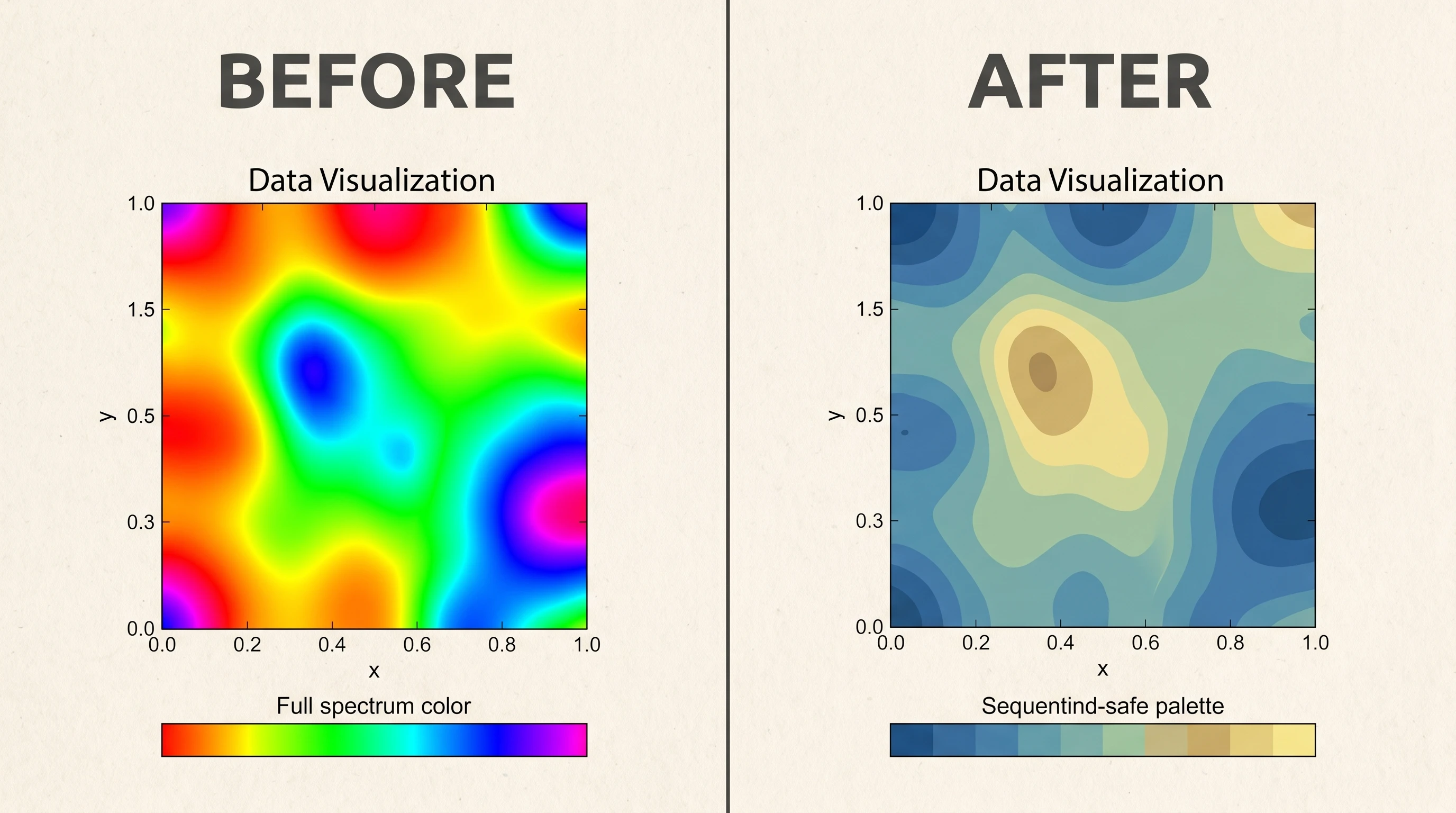
Before and after: a figure recolored from a default rainbow palette to a colorblind-safe journal palette in SciFig's figure-enhancer (Figure generated with SciFig)
Enhance Any Existing Figure
Upload your figure — fix labels, upscale to 8K, and export publication-ready results.
For most figures, a muted categorical palette capped at about six colors works best — it provides clear distinction without overwhelming the reader. For ordered data use a single-hue sequential palette, and for data with a meaningful midpoint use a diverging palette. If you want one palette that's both professional and accessible, the Okabe-Ito colorblind-safe set is the most widely recommended starting point.
A colorblind-safe palette is a set of colors chosen so that every pair stays distinguishable across the common forms of color vision deficiency, which affect roughly 8% of men. The two best-tested options are the Okabe-Ito palette and Wong's palette. The key habits are to never encode meaning with red-versus-green alone and to pair color with a second channel such as shape, position, or a direct label.
Nature, Cell, and similar top journals don't mandate exact palettes, but their published figures converge on muted, low-saturation colors with strong value contrast — not bright or rainbow schemes. A muted categorical palette (soft blues, oranges, greens, and muted reds) for grouped data, plus sequential and diverging palettes for continuous data, matches that house style closely.
Cap categorical colors at about six. Beyond that, the reader can't hold the legend in working memory, so distinguish additional groups with shape, texture, or small multiples instead of more colors. Sequential and diverging palettes use a continuous range rather than discrete categories, so the "count" rule doesn't apply to them — but they should still use a single hue (sequential) or two hues around a midpoint (diverging).
A good color palette for scientific diagrams uses a small number of semantically consistent colors, so each hue maps to a role such as molecule class, compartment, or state rather than to random decoration. In most cases, three to five carefully separated colors plus neutrals are enough. If you need a faster starting point, SciFig's scientific color palette generator can suggest a diagram-ready palette with HEX codes.
Good color palettes for graphs make category boundaries, ordering, and emphasis obvious without forcing the reader back to the legend. For grouped bar and line charts, that usually means a muted categorical palette; for continuous values, a sequential palette; and for deviations around a midpoint, a diverging palette. The best choice depends on the data relationship, not on which colors look most exciting in isolation.
The best pie chart colors use strong contrast, limited slice counts, and a restrained palette — usually three to five wedges with clearly separated hues and luminance values. Avoid rainbow ordering and avoid putting similar mid-tone colors next to each other. If the chart needs more than five categories, a bar chart is usually the better scientific choice.
First identify the data structure: qualitative palettes for categories, sequential palettes for increasing magnitude, and diverging palettes for values centered on a meaningful midpoint. Then limit the total number of colors, test the palette in grayscale and under color-vision-deficiency simulation, and make sure the most important series stands out immediately. A palette for scientific plots should clarify structure, not decorate it.
For most combo charts, the best combination is one saturated accent for the primary series and quieter companion colors for the supporting series. For example, a dark blue line can carry the main message while muted gray or soft teal bars provide context without competing for attention. The goal is visual hierarchy, not equal emphasis.
The rainbow or jet colormap creates false visual boundaries where the data is continuous, because the human eye doesn't perceive its color steps as perceptually equal — some transitions look sharper than the underlying data warrants. It also fails colorblind testing. Use a perceptually uniform sequential palette (light-to-dark single hue) instead, which represents magnitude honestly and stays readable in grayscale.
Define your palette once (as a set of HEX values) and apply it to every figure, keeping each data category mapped to the same color throughout. Doing this by hand across multi-panel figures is error-prone, so a tool that applies a palette uniformly — like SciFig's figure-enhancer — saves the manual color matching and keeps the whole figure set visually coherent for submission.
Recommended next
Related SciFig resources
Go deeper with the most relevant SciFig pages for this article.