18 Scientific Poster Examples to Learn From in 2026
18 scientific poster examples across biology, chemistry, medicine, and engineering — plus PhD examples, poster templates, and a poster-maker workflow.
SciFig Team
Scientific Illustration Experts
Walk any conference poster hall and the pattern is impossible to miss: a handful of posters pull a crowd, and the rest get a three-second glance on the way to coffee. The difference is almost never the science — it's the design. A brilliant result buried in 10-point text and eight cramped subfigures loses to a modest result presented with one clear hero figure and a headline you can read from across the room.
This guide collects 18 scientific poster examples — spanning biology, chemistry, medicine, and engineering — and breaks down exactly what makes each one work. You'll see the traits that recur in posters that win attention, the formats worth choosing between, and a concrete workflow for building your own. Every example here is an illustrative mockup, not a copy of a published poster, so you can study the design principles without the copyright tangle of lifting someone else's work.
A conference poster hall with rows of scientific research posters, attendees stopping at the ones with clear visual hierarchy (Figure generated with SciFig)
What Makes a Scientific Poster Work: 5 Shared Traits
The best scientific posters share five traits, and none of them is "more data." A poster works when a passerby can grasp the research question and the headline result in under ten seconds, then choose to read deeper. Everything below serves that single goal.
Trait
What it looks like
Common failure
Visual hierarchy
One dominant hero figure, a readable title, clear section order
Eight equal-weight panels competing for attention
Restraint with text
~300–800 words total, short blocks, generous whitespace
Walls of 10-point paragraphs copied from the manuscript
A single hero figure
One figure carries the core finding; everything else supports it
A grid of small figures with no focal point
Honest data visualization
Clean charts, labeled axes, color used to mean something
Question → approach → result → "so what" in a clear path
A flat dump of methods and figures with no narrative
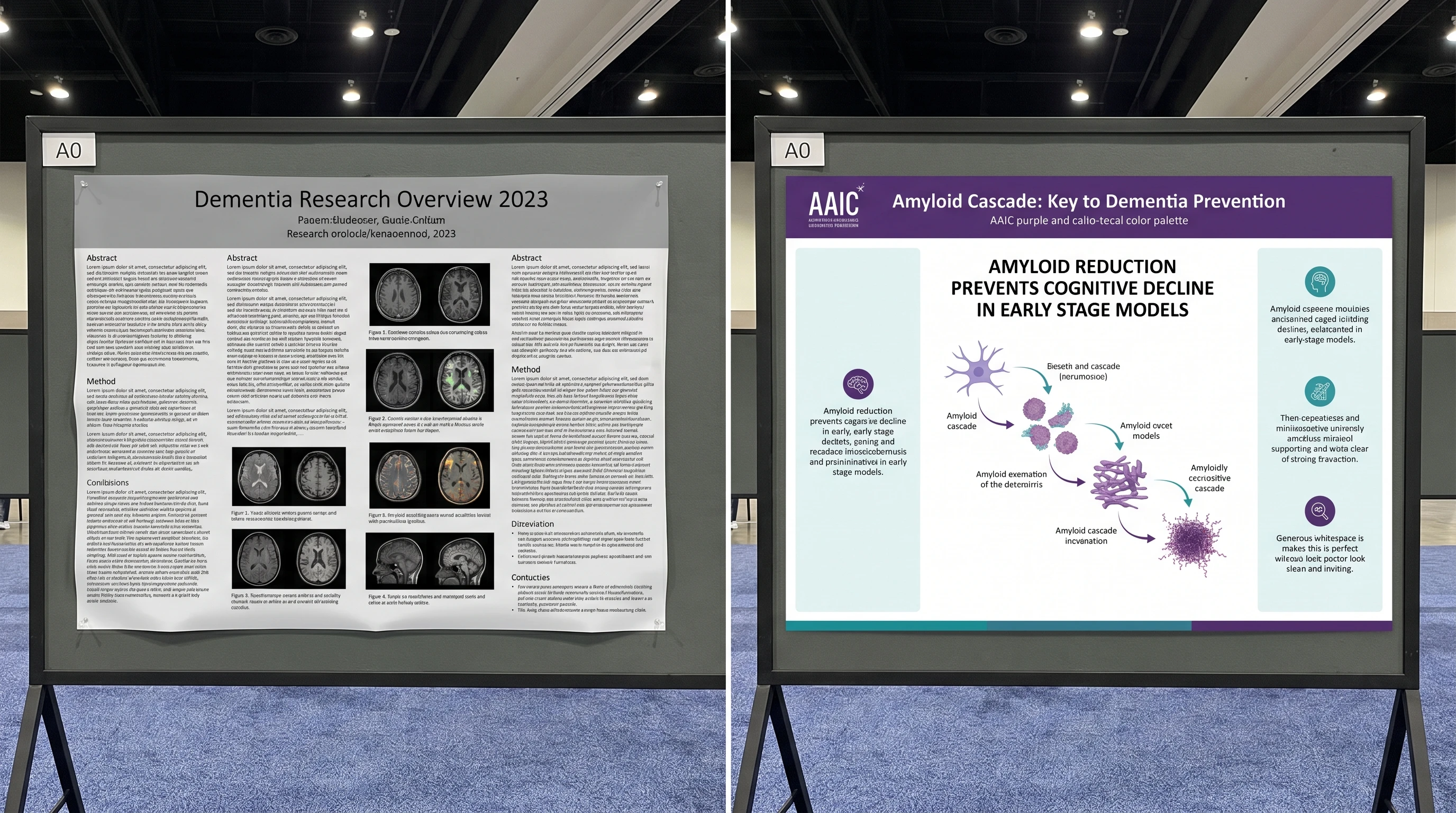
Notice that four of the five traits are about subtraction — removing text, removing competing figures, removing decorative color. The hardest part of a strong poster is deciding what to leave off. The example below puts a cluttered draft next to a disciplined one so the contrast is concrete.
Side-by-side comparison of a cluttered research poster versus a clean poster with one hero figure and a readable headline (Figure generated with SciFig)
18 Scientific Poster Examples by Discipline
Good poster design is universal, but the visual vocabulary changes by field. The 18 examples below are grouped into four disciplines so you can find the closest match to your own work. Each one is built around a single hero figure — the element that does the heavy lifting in a poster session.
Biology & Life Sciences (examples 1–5)
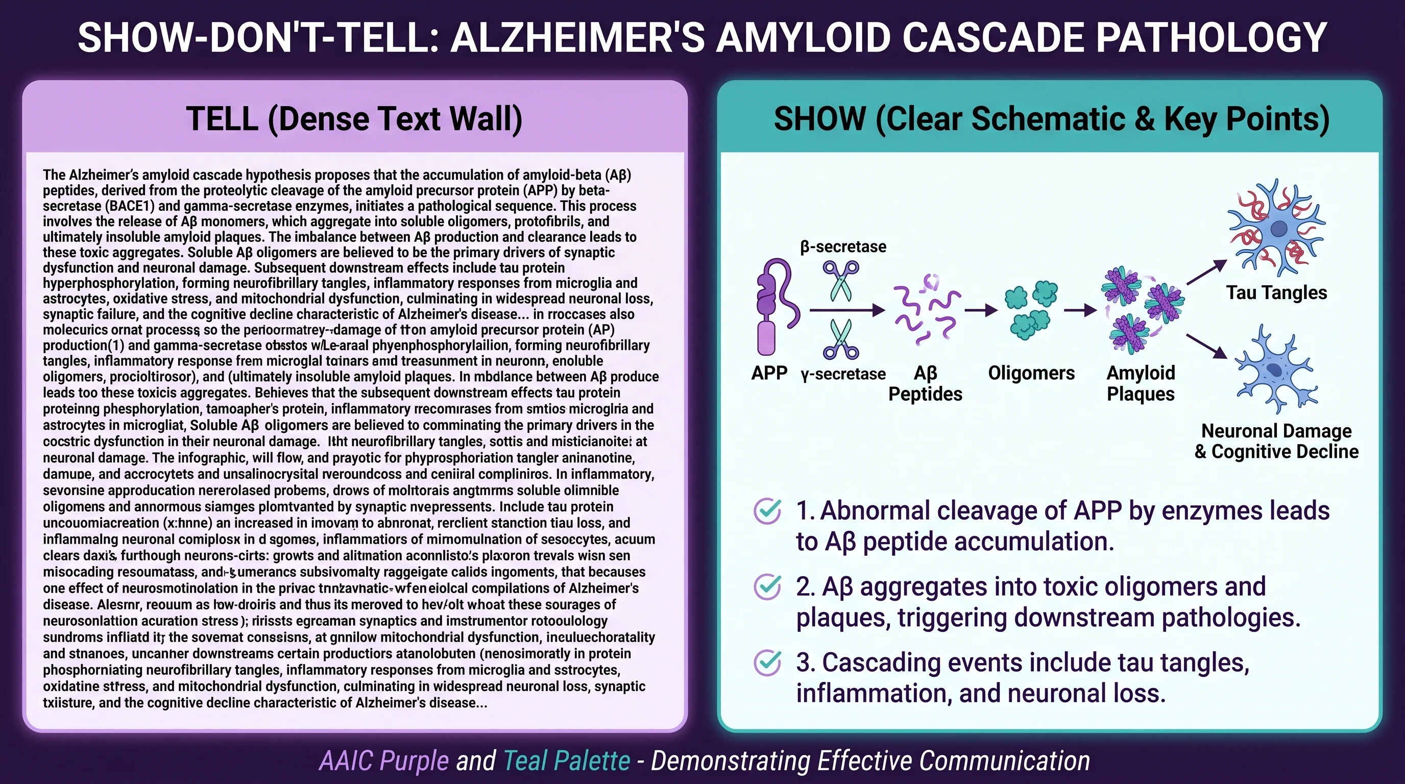
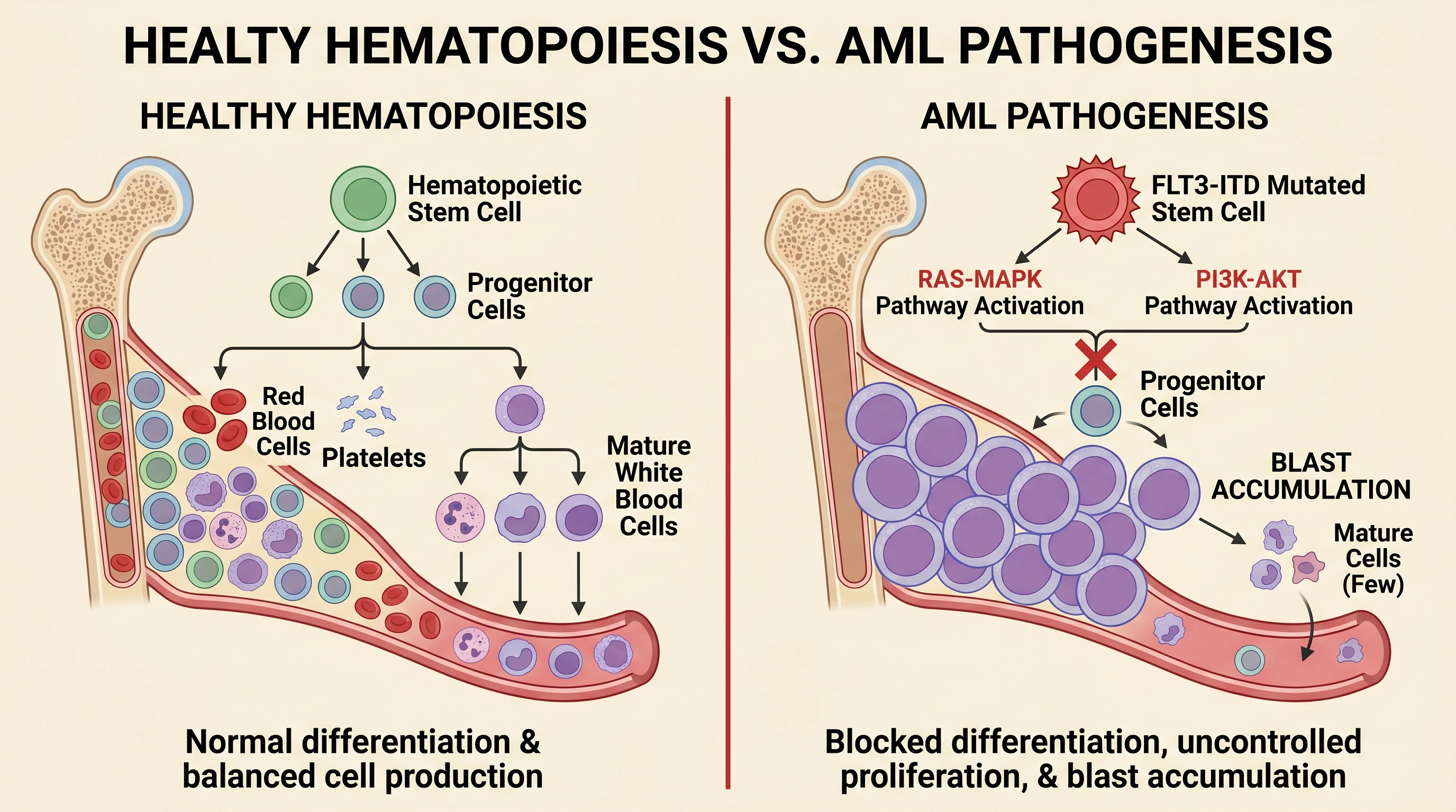
Biology posters live and die on mechanism clarity. The five strongest patterns here are: (1) a labeled signaling pathway with directional arrows that actually follow the canonical sequence; (2) a cell-type composition diagram with a legend instead of inline labels; (3) a CRISPR or gene-editing schematic with the molecular topology drawn correctly; (4) a before/after phenotype comparison; and (5) a model-organism life-cycle figure. The common thread is that the hero figure is a scientific figure — a diagram, not a photo — because diagrams scale to A0 without pixelating and read cleanly from two meters away.
A biology research poster built around a labeled cell signaling pathway as the hero figure, with supporting panels for methods and results (Figure generated with SciFig)
Chemistry & Materials (examples 6–9)
Chemistry posters succeed when the reaction scheme or structure-activity story is the visual anchor. Strong patterns: (6) a clean reaction mechanism with curved arrows; (7) a catalytic cycle as a circular hero figure; (8) a materials cross-section showing layered structure; and (9) a structure-property comparison table paired with one molecular render. The trap in chemistry is overloading the poster with every intermediate — the example posters that work pick the one transformation that matters and push the rest to a small "full scheme" inset.
Medicine & Clinical (examples 10–14)
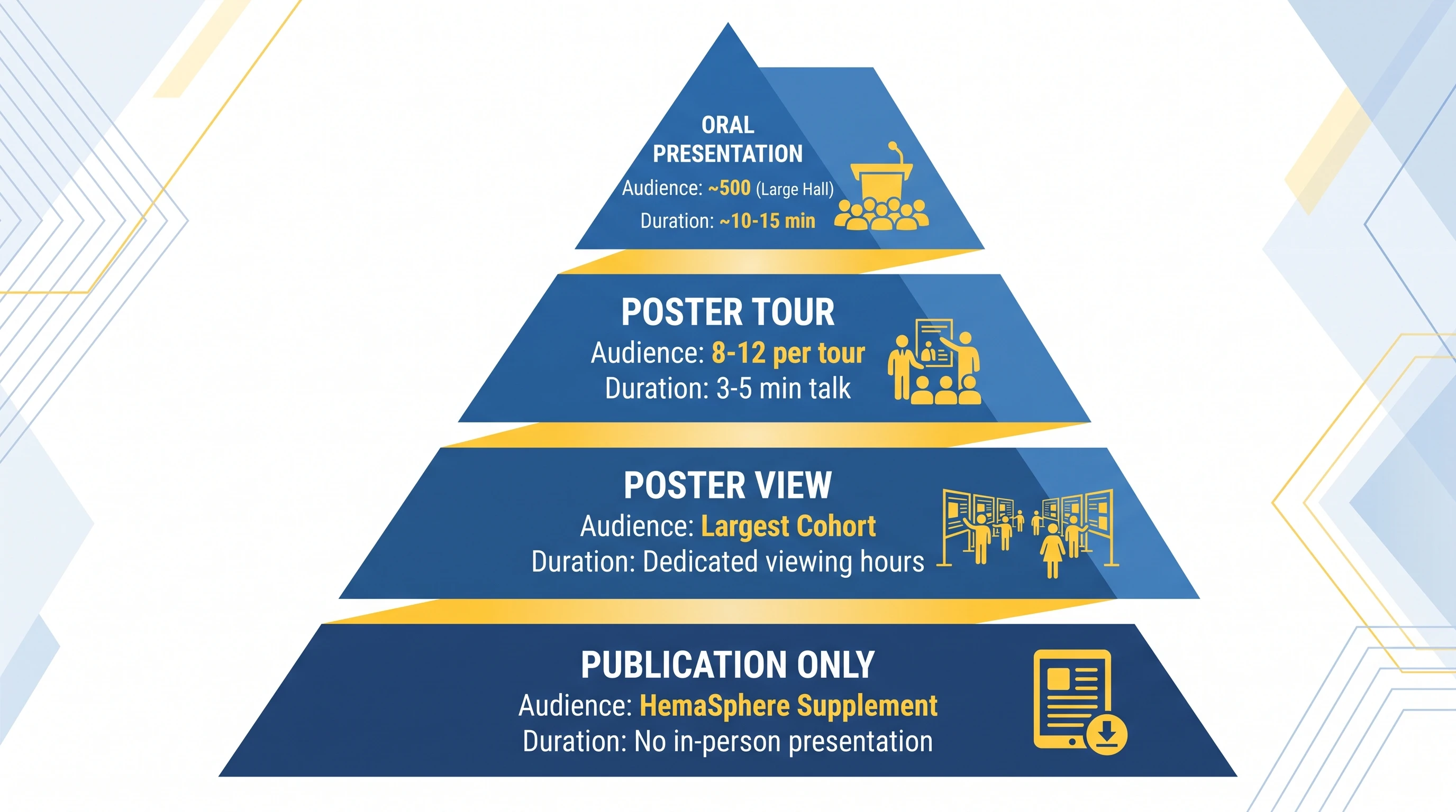
Clinical posters carry a specific obligation: a trial schema or CONSORT-style flow that a clinician can audit at a glance. The five patterns here are (10) a Phase 2/3 trial schema from screening to endpoints; (11) a mechanism-of-action diagram for the intervention; (12) a patient-flow CONSORT diagram; (13) an anatomical or pathology line drawing (journals like The Lancet often require drawings rather than patient photos); and (14) a Kaplan–Meier survival result presented as the single hero result. Statistical charts like survival curves and forest plots come from tools like GraphPad — they're not something an illustration tool generates, and the strongest clinical posters keep that division of labor clean.
Engineering & Physical Sciences (examples 15–18)
Engineering posters reward a system schematic that shows how the parts connect. Patterns: (15) a labeled system block diagram; (16) an experimental setup illustration; (17) a process-flow diagram with annotated stages; and (18) a cross-section of a device or apparatus. These fields tolerate more density than biology, but the winning examples still anchor everything to one schematic that answers "what did you build and how does it work."
See AI Scientific Figure Generation in Action
Watch how researchers create publication-ready scientific figures from text descriptions.
Award-winning posters are not the ones with the most results — they're the ones a judge understands fastest. Across conference "best poster" winners, three patterns repeat. First, a giant key-finding headline: instead of a generic title, the winner states the result ("Drug X cut relapse 41% in HER2-low disease") in text readable from three meters. Second, one figure occupies 40–60% of the canvas and everything else orbits it. Third, ruthless whitespace — the winner leaves room for the eye to rest, which paradoxically makes a poster feel more substantial, not emptier.
The judging reality drives all three. Reviewers spend roughly 60 seconds at a poster before deciding whether to engage the presenter. A poster designed for that 60-second scan — headline result, one clear figure, obvious path through the sections — wins over a denser poster that would reward five minutes nobody gives it. If you're preparing for a specific conference, our conference-specific guides go deeper on judging criteria; see how to design a winning poster for EHA 2026 for a worked example in hematology.
Examples by Format: Portrait, Landscape, Trifold, and Digital
The format decision is set by your conference, not your preference — confirm the required dimensions before you design. The four common formats each change how the hero figure sits on the page.
Format
Typical size
Hero figure placement
Best for
Portrait (A0)
841 × 1189 mm
Upper-center, eye-level
Most academic conferences (default)
Landscape
1189 × 841 mm
Center, with side columns
Wide schematics, engineering systems
Trifold
3 panels
Center panel
Undergraduate symposia, science fairs
Digital / ePoster
16:9 screen
Single screen, no scroll
Hybrid and virtual conferences
The fastest-growing format is the digital ePoster — a single 16:9 screen shown on conference displays and virtual platforms. It rewards the same discipline as a print poster but punishes density even harder, because a screen viewed from a phone or a hall monitor has far less effective resolution than a printed A0 sheet. Design the ePoster as one screen the viewer reads without scrolling, and the print version usually falls out of it.
Four scientific poster formats compared: portrait A0, landscape, trifold, and 16:9 digital ePoster, each with hero figure placement annotated (Figure generated with SciFig)
How to Build a Poster Like These with SciFig
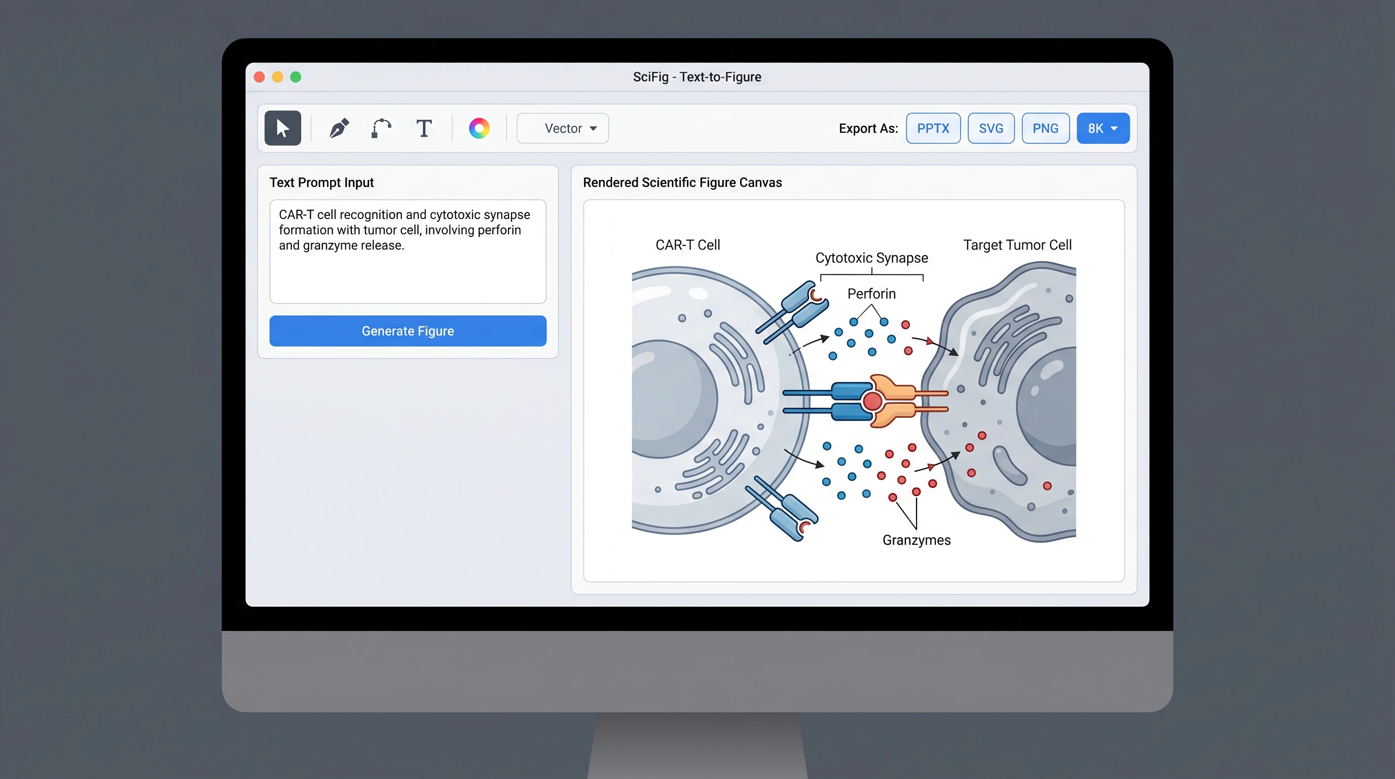
You don't need a design degree to build a poster like the examples above — you need one strong hero figure and the discipline to keep everything else quiet. The hero figure is where most posters are won or lost, and it's exactly the part researchers find hardest to produce. This is where an AI text-to-figure tool changes the workflow.
The path is four steps. First, draft the hero figure: describe the mechanism, pathway, or schematic in plain language and let SciFig generate it — "CAR-T cell engaging a CD19+ lymphoma cell with the immunological synapse labeled," for instance. Second, refine it in the vector canvas, where you edit labels, colors, and stroke width until it's publication-clean. Third, assemble the poster in PowerPoint or Keynote, dropping the hero figure into the upper-center and arranging short text blocks around it. Fourth, run the three-second test — step back, and if you can't read the headline and grasp the figure from across the room, cut more.
The reason this works is that SciFig produces the figure assets — the diagrams and schematics — and PowerPoint handles layout. You're not asking one tool to do everything; you're using the right tool for the hardest 20% — the accurate, publication-quality figure — and standard slide software for the rest. To see real figures other researchers have generated for posters and papers, browse the inspiration gallery, filterable by mechanism type.
SciFig text-to-figure interface generating a poster hero figure from a prompt, with the vector canvas editing toolbar visible (Figure generated with SciFig)
Create Scientific Figures Now
Describe your scientific figure in natural language — get publication-ready illustrations in minutes.
Three mistakes account for most weak posters. The first is treating the poster like a manuscript — pasting in abstract, full methods, and every result. A poster is an advertisement for a conversation, not the paper itself. The second is no focal point: a grid of equal-sized figures gives the eye nowhere to land, so it lands nowhere. The third is decorative color — rainbow palettes, gradient backgrounds, and color that doesn't encode information. For palette discipline specifically, see our guide to color palettes for scientific figures, which covers journal-grade and colorblind-safe options that apply directly to posters.
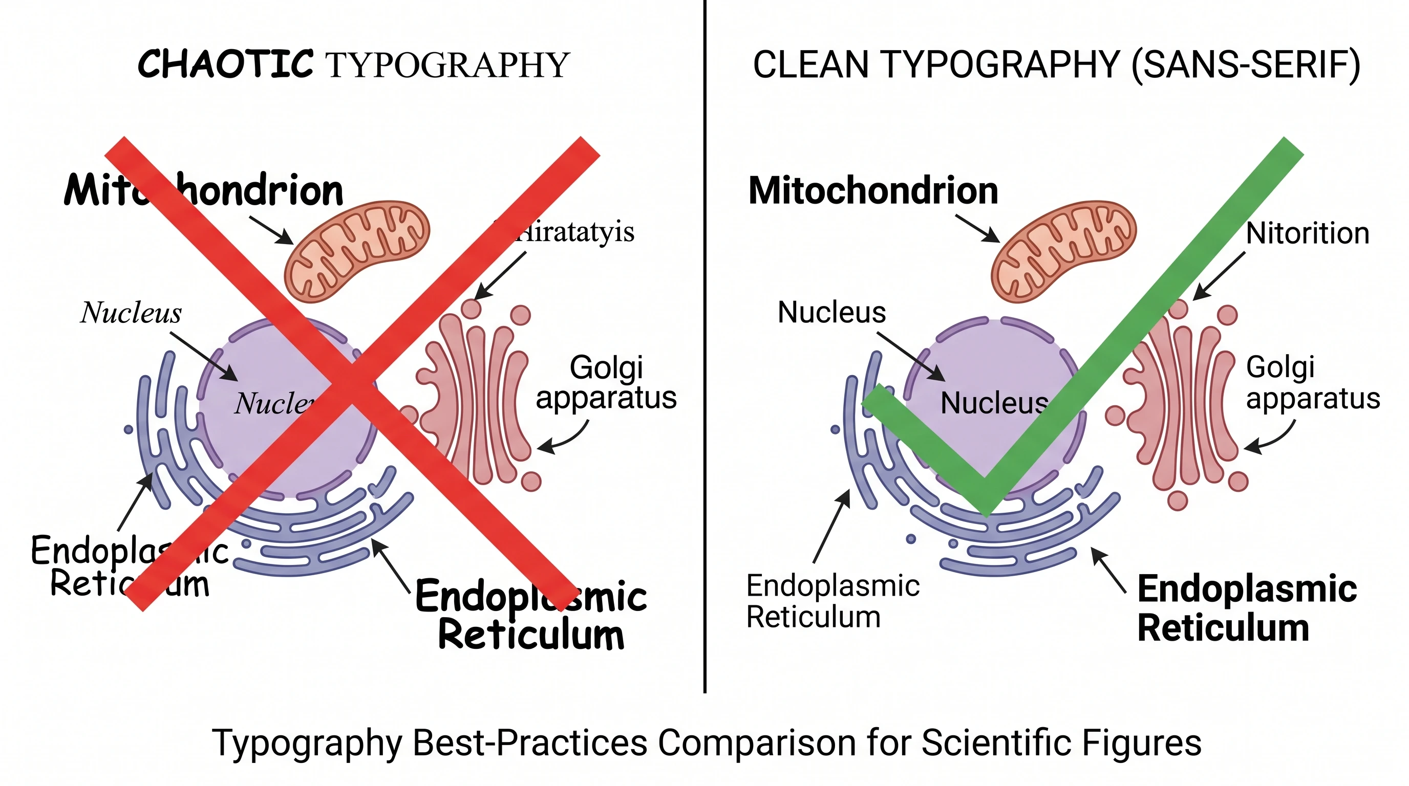
A fourth, quieter mistake is font that's too small. On an A0 portrait poster, body text should sit around 24–32 pt and the title around 72–100 pt, so the title reads from three meters and body text from one. If you're shrinking the font to fit more words, the answer is fewer words, not smaller type.
PhD Poster Examples, Templates, and Poster-Maker Workflow
The best PhD poster examples are not the ones with the most content. They are the ones that make one claim clear, place one hero figure at the center of attention, and use the rest of the layout to support that argument rather than compete with it. That is true whether you are designing a biology conference board, a medical research poster, or an engineering methods poster.
If you are starting from a research poster template or looking for a scientific poster maker, treat the examples in this article as structural references, not as posters to imitate literally. Start with SciFig's scientific poster generator, choose the visual hierarchy you want, and then replace placeholders with your own data, figures, and conclusion. A good template speeds up layout; a good poster maker helps you turn that layout into a finished research poster instead of a blank grid with too many boxes.
Frequently Asked Questions
Conference websites often publish "best poster" galleries from past years, and institutional repositories sometimes archive student posters. For design study, the examples in this guide are built specifically to isolate the principles — visual hierarchy, one hero figure, restrained text — without the copyright issues of reusing a published poster. You can also browse the SciFig inspiration gallery for real figures researchers have generated.
A journal figure is one tightly cropped visual designed to be read at small size in a printed or PDF article, usually as a vector file. A conference poster is a large-format layout (often A0) that combines several figures, short text blocks, and a headline into a single standalone display meant to be read from one to three meters away. The poster's hero figure is often a scaled-up version of a journal figure, but the poster adds layout, hierarchy, and a story arc the journal figure doesn't need.
You can study published posters for design inspiration, but copying layout, figures, or text from another researcher's poster risks both copyright and academic-integrity problems. The safer path is to learn the recurring design patterns — hero figure, headline result, whitespace — and build your own from a blank template. Generate your own hero figure with a tool like SciFig's text-to-figure rather than lifting one.
On an A0 portrait poster, a common starting point is roughly 72–100 pt for the title, 36–48 pt for section headers, and 24–32 pt for body text. The test is distance: the title should be legible from about three meters and body text from about one meter. If your text doesn't pass that test, reduce the word count rather than the font size.
Most strong posters use one dominant hero figure plus two to four supporting visuals — enough to tell the story, few enough that the eye knows where to land. A grid of eight equal-weight figures is the most common design failure because it removes the focal point. Decide which single figure carries your core finding, make it large, and keep the rest small and supportive.
Use a 16:9 digital ePoster designed as a single screen the viewer reads without scrolling. Hybrid and virtual conferences display posters on monitors and within virtual platforms where effective resolution is much lower than a printed A0 sheet, so density hurts more. If your conference also requires a print version, design the ePoster first — a clean single-screen layout usually scales up to print better than the reverse.
Use slide software (PowerPoint or Keynote) for the overall layout and a dedicated figure tool for the hard part — the accurate hero figure. Statistical charts (survival curves, forest plots) come from analysis tools like GraphPad. Mechanism diagrams, pathways, and schematics are where an AI tool like SciFig saves the most time, turning a plain-language description into a publication-quality figure you drop into your poster layout.
Good PhD poster examples usually share three traits: one clearly stated claim, one dominant visual that carries the result, and enough whitespace that the poster can be scanned from a few feet away. The exact discipline matters less than whether the poster guides the reader cleanly from question to evidence to conclusion. That is why the best examples in this article are useful even outside their original field.
You can start with a traditional research poster template if you already know the structure you want, but many researchers now prefer a guided poster-building workflow instead of editing a static template by hand. SciFig's scientific poster generator acts like a scientific poster maker: you choose the format, set the hierarchy, and then build your own poster around figures and findings instead of around empty boxes.
Recommended next
Related SciFig resources
Go deeper with the most relevant SciFig pages for this article.