From low-resolution exports to colorblind-hostile palettes — five figure mistakes that lead to journal rejection and how AI tools prevent each.
SciFig Team
Scientific Illustration Experts
Journal editors will tell you, if you ask them directly, that figure problems are among the most common reasons manuscripts bounce back before peer review even begins. Not the science — the scientific figures. Poorly prepared visuals cost researchers weeks of revision time, delay publication, and in some cases contribute to outright rejection. The frustrating part is that most of these problems are entirely avoidable. They follow predictable patterns, appear in labs at every career stage, and stem from the same handful of misunderstandings about what journals actually require from submitted figures.
Here are the five mistakes that show up most consistently — and how AI-assisted figure tools are eliminating them before the manuscript ever leaves your desk.
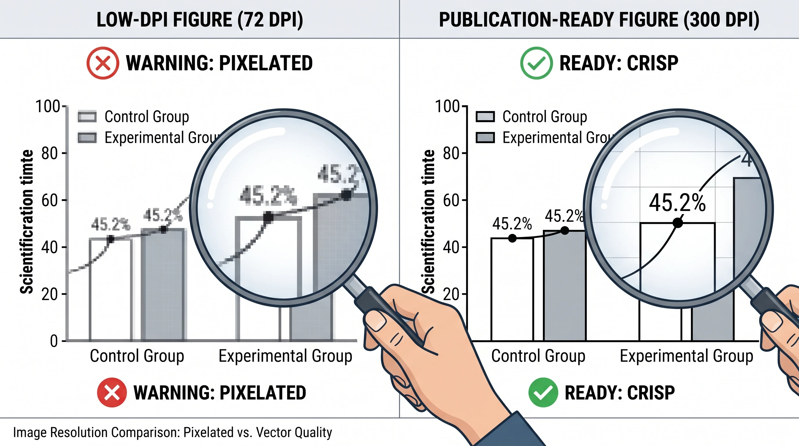
Mistake #1 — The Resolution Trap
The problem: You finish a scientific figure in PowerPoint, export it as a PNG or JPEG, and it looks perfectly sharp on your monitor. Then you submit it to the journal, and the editorial office emails back within 48 hours: "Figures do not meet minimum resolution requirements." Your 72 DPI screen export is rejected. The journal wants 300 DPI at minimum — and for line art, electron microscopy panels, or figures with fine detail, 600 DPI is the actual standard.
Resolution comparison: pixelated low-DPI scientific figure on left vs crisp 300 DPI publication-ready version on right with magnifying glass overlay (Figure generated with SciFig)
Why it happens: Computer screens display at 72–96 DPI. Every piece of software you use to build figures is calibrated for screen display by default, not print. When you export at "default" settings, you are exporting for a monitor. Print reproduction at the physical size journals require is an entirely different resolution demand. A scientific figure that is 4 inches wide needs to be at least 1,200 pixels wide for 300 DPI print quality. Most default screen exports produce a fraction of that.
The JPEG compression problem compounds this. JPEG is a lossy format — it introduces visible artifacts at boundaries, especially around text labels and fine lines. Journals that accept JPEG at all typically require it at maximum quality settings. Many prefer TIFF or PNG for figures with text.
Figure Type
Minimum Resolution
Line art
1000–1200 DPI
Grayscale
300–600 DPI
Color photos
300 DPI
How SciFig prevents it: SciFig and other AI figure generation platforms produce vector-quality output by default. Because the underlying figure is defined mathematically rather than as a fixed pixel grid, it can be rendered at any DPI without quality loss. When you export a scientific figure at 600 DPI for a Nature journal versus 300 DPI for a society publication, the same source file produces optimal quality for both. There is no resolution trap because there is no fixed pixel count to fall below. For a complete workflow that consistently hits Nature-level figure standards on a budget, see our guide.
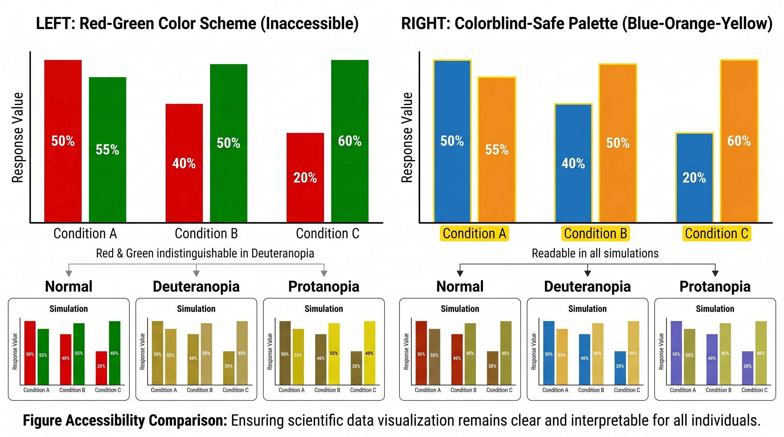
Mistake #2 — Colorblind-Hostile Palettes
The problem: Red and green are the default contrast colors in virtually every charting tool, every diagram software, and every design template built in the past 30 years. They look visually distinct on screen. They make intuitive sense — positive and negative, presence and absence, treated and untreated. They are also completely indistinguishable for approximately 8% of male readers and 0.5% of female readers with red-green color vision deficiency (deuteranopia and protanopia are the most common forms).
Colorblind accessibility comparison: red-green palette failing under deuteranopia vs colorblind-safe blue-orange palette readable across all vision types (Figure generated with SciFig)
This is not a minor edge case. In a field like cell biology or genetics — where quantitative figures are central to the paper's argument — a scientific figure that a significant fraction of reviewers and readers cannot interpret correctly is a scientific communication failure. Some journals now explicitly require colorblind-accessible palettes in their figure guidelines.
Why it happens: Red-green color opposition is deeply embedded in the default settings of MATLAB, R's base graphics, Excel, and most scientific visualization software. Unless you actively override the defaults, you are inheriting a palette designed for general graphic design, not inclusive scientific communication. Most researchers do not think about colorblind accessibility until they are told they have a problem.
How AI prevents it: Modern AI figure tools are trained on scientific communication best practices, which include colorblind-safe palette conventions. Rather than defaulting to red-green opposition, they default to palettes like viridis, cividis, and inferno — perceptually uniform color scales that remain distinguishable across all common forms of color vision deficiency and also print well in grayscale. Accessibility is baked into the output rather than requiring post-hoc correction.
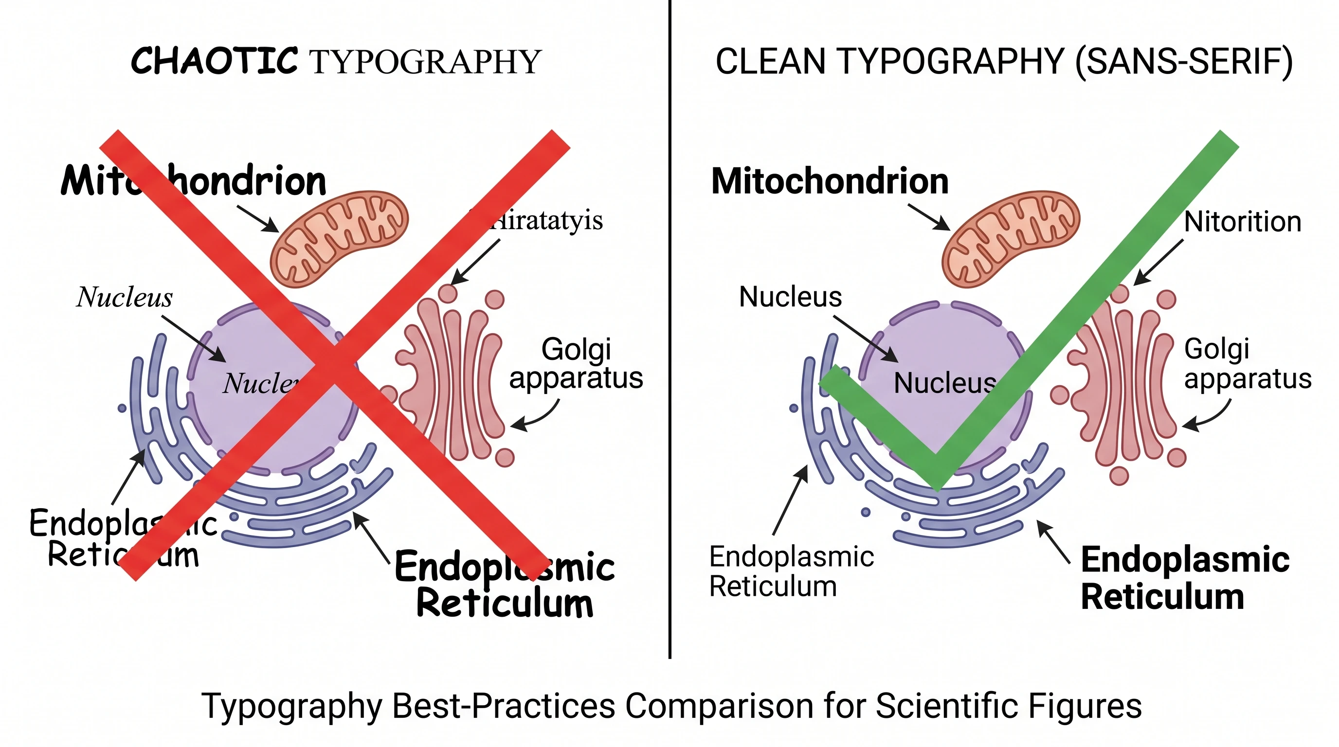
Mistake #3 — Typography Chaos
The problem: Open any multi-panel figure that was assembled over several weeks or months — panels from different lab members, panels exported from different software, panels added during revision — and you will almost certainly see inconsistent fonts, mismatched label sizes, mixed typefaces, and variable weight treatments across what is supposed to be a unified figure. Arial in panel A, Times New Roman in panel B, default MATLAB font in panel C. 10pt labels in some panels, 8pt in others. Bold axis labels next to regular-weight panel labels.
Typography comparison: chaotic mixed fonts and inconsistent sizing on left vs clean consistent sans-serif hierarchy with proper alignment on right (Figure generated with SciFig)
Why it happens: Multi-panel figures are almost never built in a single sitting. They are assembled from components produced at different times, in different software, by different people. Every software tool has its own default font settings. When those components are collected and laid out together, the typographic inconsistency that was invisible when each panel was built in isolation becomes immediately obvious. Typography that is inconsistent signals a scientific figure that was assembled rather than designed — and reviewers and editors notice.
The more subtle version of this problem is scale inconsistency: labels that are technically the same font size but appear at different visual sizes because the panels they belong to were exported at different pixel dimensions and then resized to fit a layout.
How SciFig prevents it: When a complete figure — multiple panels, labels, legends, and annotations — is generated from a single SciFig natural language description, the typography system is consistent by definition. The same font, the same weight hierarchy, and the same label sizing rules apply across every element because they all come from the same generation process. There is no assembly step where inconsistencies can creep in.
See AI Scientific Figure Generation in Action
Watch how researchers create publication-ready scientific figures from text descriptions.
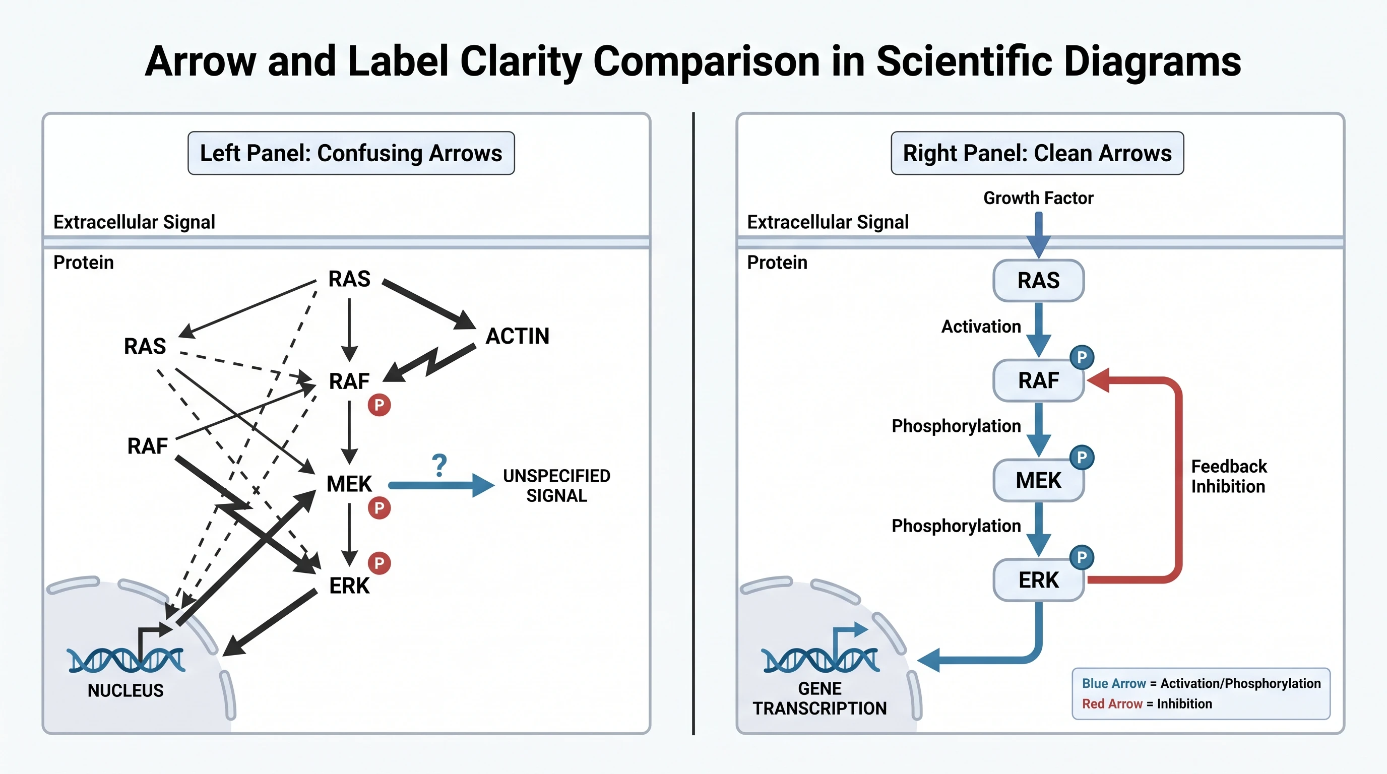
The problem: Annotations — arrows, brackets, callout labels, scale bars — are the visual vocabulary researchers use to direct attention within a figure. Used well, they create a clear hierarchy that guides the reader through the visual argument. Used poorly, they create overlapping text boxes, arrows pointing at ambiguous targets, callout labels that collide with data elements, and annotation styles that change from panel to panel without reason.
Arrow clarity comparison: confusing crossing arrows in cell signaling pathway on left vs clean color-coded directional arrows with proper arrowheads on right (Figure generated with SciFig)
Why it happens: Annotation is typically the last step in figure preparation, done under deadline pressure after the underlying data and illustration work is finished. It is treated as a finishing step rather than a design decision. Labels get placed wherever there is visual whitespace, not where they create the clearest reading path. Arrows get dropped to point at regions rather than specific features. When panels are revised — data updated, scale changed, elements repositioned — annotations that were placed manually often end up pointing at the wrong location or overlapping newly repositioned elements.
The deeper problem is that annotation requires active visual design decisions: what deserves to be labeled, how prominently, with what contrast against the background, and in what spatial relationship to what it is identifying. Most researchers are not trained in these decisions and default to whatever looks approximately right at normal screen zoom — not at print scale or during journal review.
How AI prevents it: AI figure generation integrates annotation as part of the design process rather than a post-hoc addition. Labels, arrows, and callouts are positioned relative to the scientific figure elements they identify, with collision detection and visual hierarchy built into the generation logic. The result is an annotated figure where every label is legible, every arrow targets its subject unambiguously, and the overall annotation density is calibrated to the scientific figure's complexity rather than to whatever fit in the remaining whitespace.
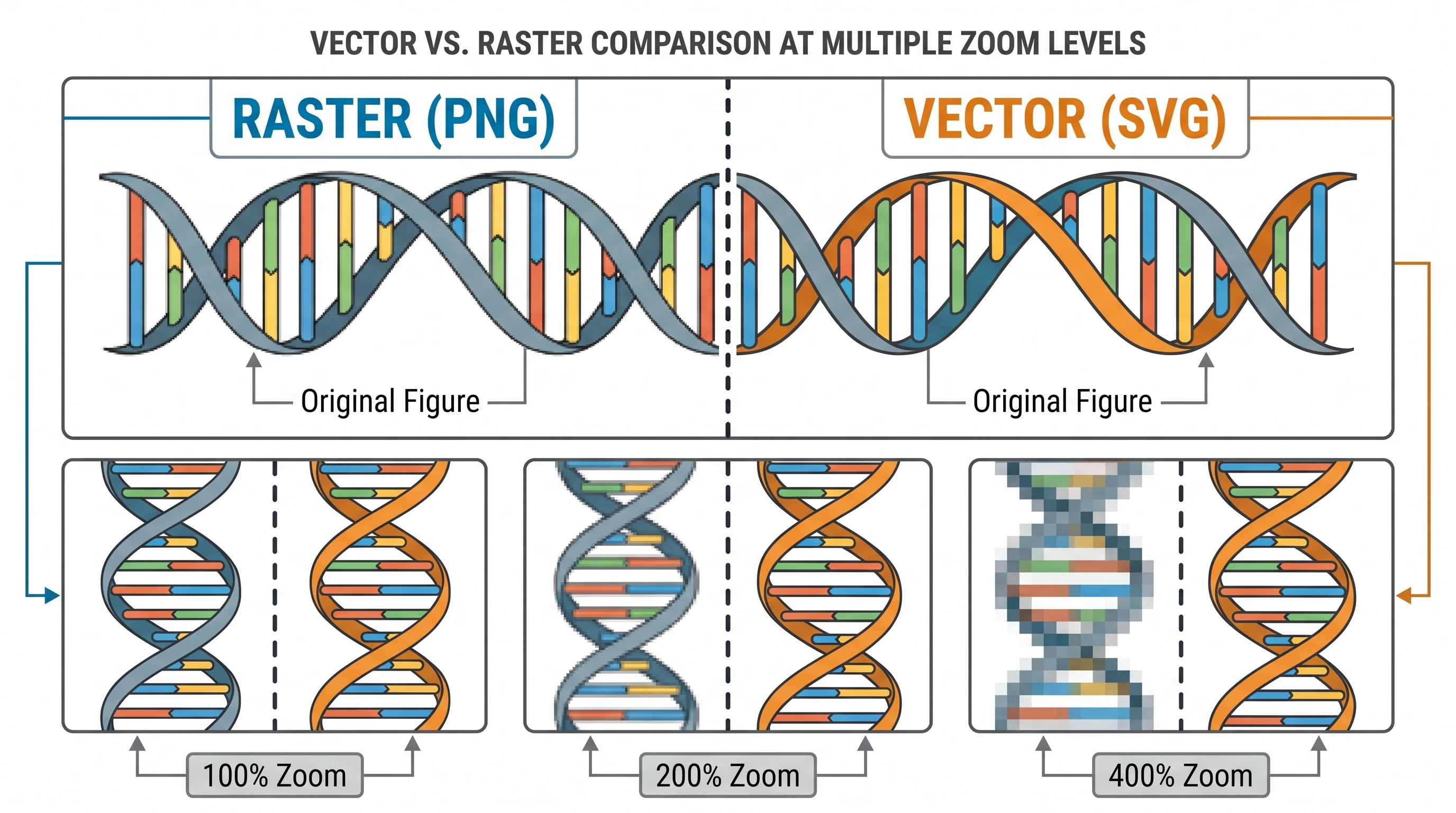
Mistake #5 — The Vector Void
The problem: You submit your figures as PNG or TIFF files. The paper gets accepted — congratulations — and the journal's production team emails a revision request. They need one panel recolored to match house style. Or they need a label translated for the international edition. Or the copyeditor changed a term in the text and now the scientific figure legend does not match. With a raster export, none of these changes can be made without rebuilding the scientific figure from scratch. If you no longer have the source file, you are rebuilding from a flattened image.
Vector vs raster comparison at 100%, 200%, 400% zoom: PNG becomes pixelated while SVG remains crisp at all magnifications (Figure generated with SciFig)
Why it happens: Most researchers export figures as raster images because that is the default export format of the software they use and because the submission portal accepts raster files. The distinction between raster (pixel-based, fixed resolution) and vector (mathematically defined, infinitely scalable) is not part of standard research training. Vector formats — SVG, EPS, PDF, AI — are often perceived as "designer formats" that are more complicated than necessary. Until a revision request arrives that requires editing a flattened file.
This problem scales with seniority. The more papers you publish, the more likely you are to face a production revision on a figure from a paper submitted two years ago whose source files are on a hard drive that is no longer accessible.
How AI prevents it: AI-generated figures natively produce layered, editable vector output. Every element — paths, text labels, color fills, arrows — exists as a separate, editable object in the output file. Open the result in SciFig's vector canvas (or any SVG-compatible editor), change the fill color on the relevant layer, and export a new TIFF in three minutes. When a label needs to change, you edit the text object. There is no flattening step, no pixel grid, and no destructive export that eliminates your ability to make future edits.
Refine Figures in the Vector Canvas
Open any AI-generated figure in the editable canvas — layered SVG, 8K PNG, or editable PPTX.
Before any figure goes into a manuscript submission, run through this validation list. Every item on this list corresponds to a real journal rejection reason.
Resolution and format
All raster figures exported at 300 DPI minimum (600 DPI for figures with fine detail or small text)
No JPEG compression artifacts visible at 100% zoom
Vector source files saved separately from the submission exports
Color accessibility
No red-green only color distinctions in figures that encode categorical or comparative data
Color choices verified with a colorblind simulation tool (e.g., Coblis or Color Oracle)
Figures remain interpretable when converted to grayscale
Typography
Font consistent across all panels of each figure
Label sizes consistent — physically the same point size at print dimensions
Font family matches journal requirements (many specify sans-serif only)
Annotation
All arrows point at specific, unambiguous targets
No label text overlaps with data elements or other labels
Scale bars present and labeled in all micrographs
Panel letters (A, B, C) consistently positioned — typically top-left
Format requirements
File format matches journal specification (not just "any image format")
Figure legends are complete and match figure content
Warning
Every journal has its own specific figure requirements — and they differ in ways that matter. Nature journals, Cell Press journals, PLOS journals, and society publications each have distinct specifications for file format, minimum DPI, maximum file size, color mode (RGB vs CMYK), and font requirements. Always download and read the target journal's author guidelines before preparing figures for submission. Generic best practices are a starting point, not a substitute for journal-specific requirements. If the scientific figure is AI-generated, see our 2026 journal AI-figure policy guide for disclosure templates across major publishers.
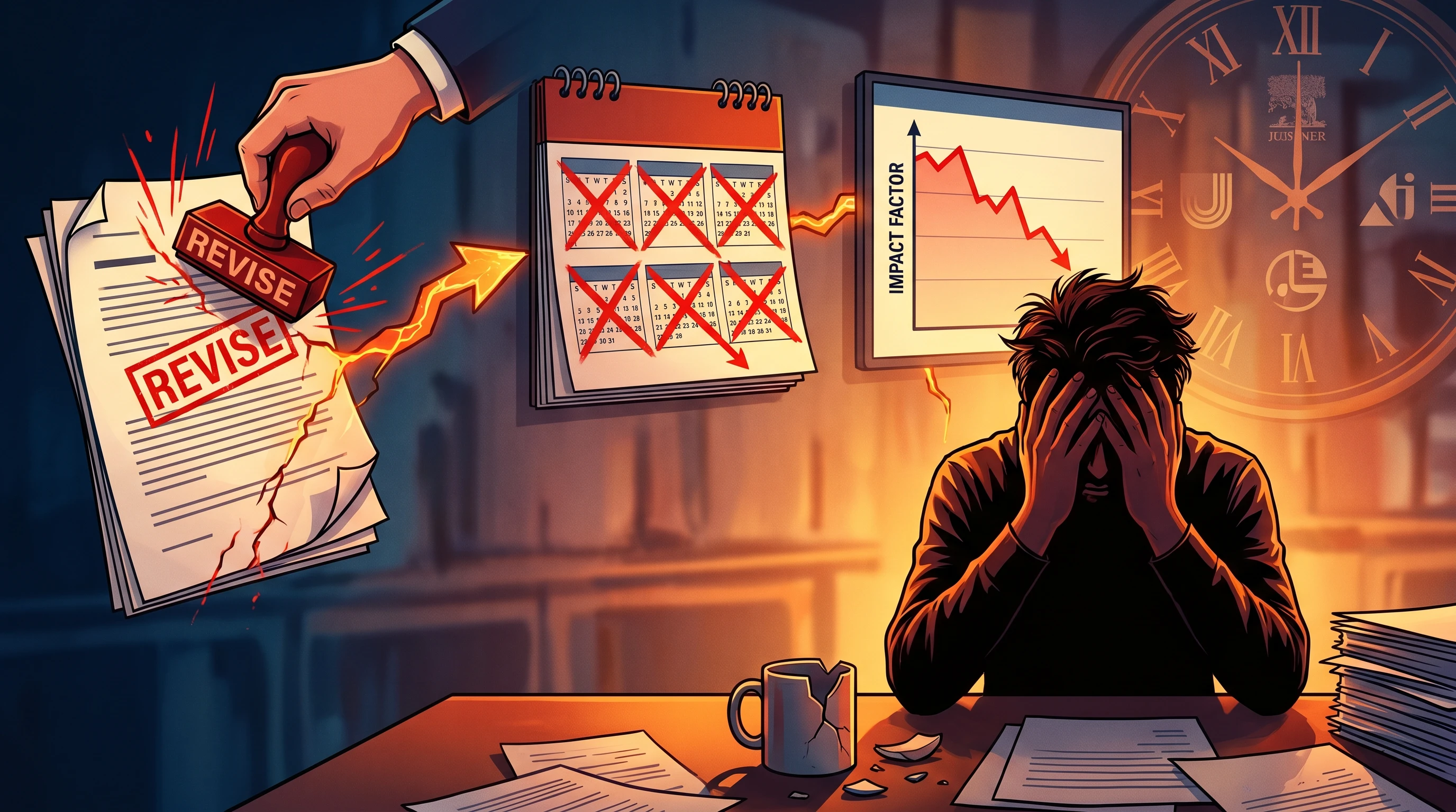
The Real Cost of Figure Mistakes
Time is the resource researchers are most consistently short of. Consider what figure problems actually cost in practice.
Editorial illustration of manuscript rejection cost: red REVISE stamp → 6-month delay calendar → impact factor loss graph → frustrated researcher (Figure generated with SciFig)
A single revision round triggered by figure quality issues — editorial rejection before review, a reviewer comment requesting higher-resolution exports, a production request for an editable file — typically costs two to five days. Locating source files, rebuilding elements, re-exporting at correct specifications, re-uploading to the submission portal, and waiting for editorial confirmation all consume time that was not budgeted.
Multiply that by the number of figures in a typical paper (four to eight for a standard research article, more for methods-heavy work) and a figure problem that seems like a minor technical issue becomes a material delay in the publication timeline. For researchers under pressure to publish before a grant renewal, a job market season, or a priority claim situation, a preventable two-week delay has real consequences.
The compounding effect is worse. A paper that goes back for figure revisions re-enters the queue at whatever position the editorial office assigns it. If the revision takes longer than the allowed window, the editorial decision may need to be re-issued. What started as a DPI problem can become a two-month delay.
Getting figures right before submission is not perfectionism — it is the more efficient path. The time invested in producing correct figures is consistently less than the time lost managing avoidable revision cycles.
Frequently Asked Questions
Most journals require a minimum of 300 DPI for color and grayscale photographs, and 600 DPI for line art (figures with thin lines, small text, or high-contrast details). Some high-impact journals specify 1,200 DPI for combination figures (part photo, part line art). Always verify the specific requirement in the journal's author guidelines — "minimum 300 DPI" is a common floor, not a universal standard.
The most practical approach is to run your figure through a colorblind simulation tool before submission. Free tools like Color Oracle (desktop app) and Coblis (web-based) show you exactly how your figure appears to readers with deuteranopia, protanopia, and tritanopia. If the visual distinction you are encoding — between treatment groups, between cell types, between experimental conditions — disappears under any simulation, the palette needs to change.
It depends on the journal. Many journals accept PDF as a figure format, and for vector figures, PDF preserves editability and scales without quality loss. However, some journals specifically exclude PDF figures from their accepted formats, or require TIFF/EPS for production. Check the specific journal's accepted figure formats before choosing PDF as your submission format.
Raster figures are made of pixels — a fixed grid of colored dots. They have a maximum resolution, and enlarging them beyond that resolution degrades quality. JPEG, PNG, and TIFF are raster formats. Vector figures are defined mathematically — lines, curves, and fills are described as equations rather than pixel grids. They can be rendered at any size without quality loss. SVG, EPS, PDF, and AI files are vector formats. Journals prefer vector for figures with text, lines, and geometric elements because they can resize without degradation and are easier for production teams to edit during typesetting.
There is no fixed rule, but 4–8 figures is typical for a standard research article in most fields. Each figure should convey a distinct point that cannot be made as effectively in the text. The more relevant question is whether each figure earns its place — whether a reader who skips all the text and reads only the scientific figures would still understand the paper's main argument. Figures that are redundant with the text, that show data better presented as a table, or that exist primarily to increase the visual density of the manuscript are candidates for the supplement or the cutting room floor.
Recommended next
Related scientific figure resources
Go deeper with the most relevant SciFig pages for this article.