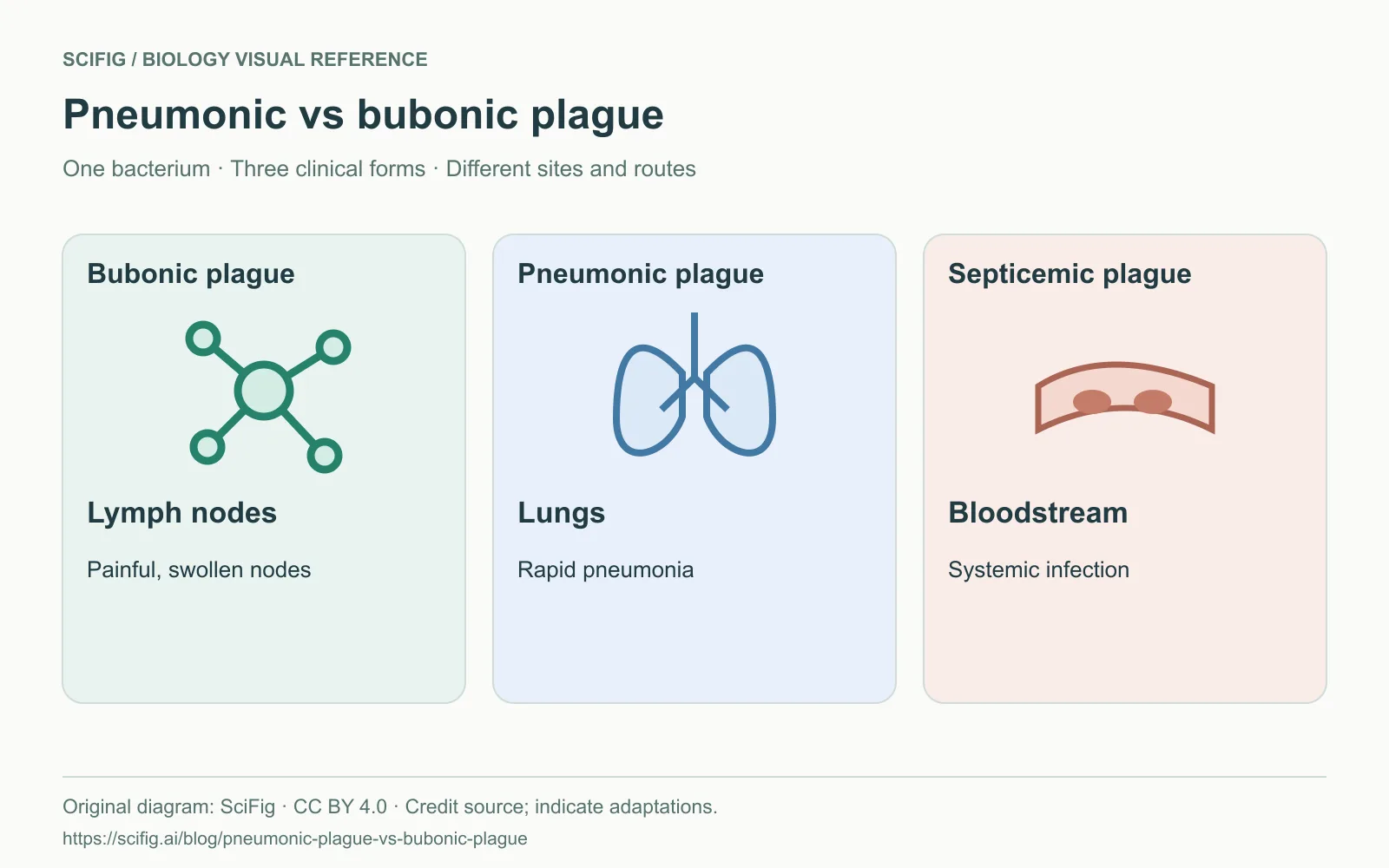
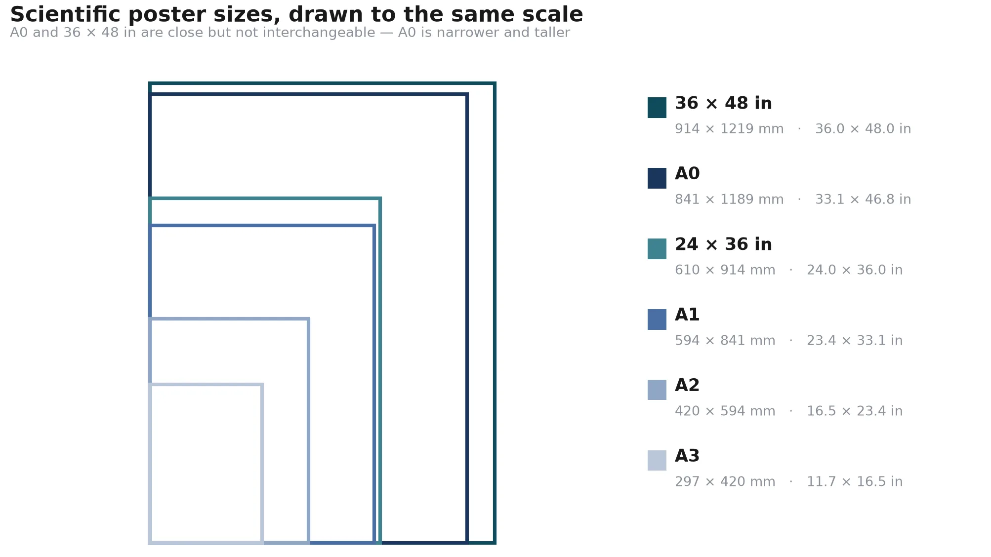
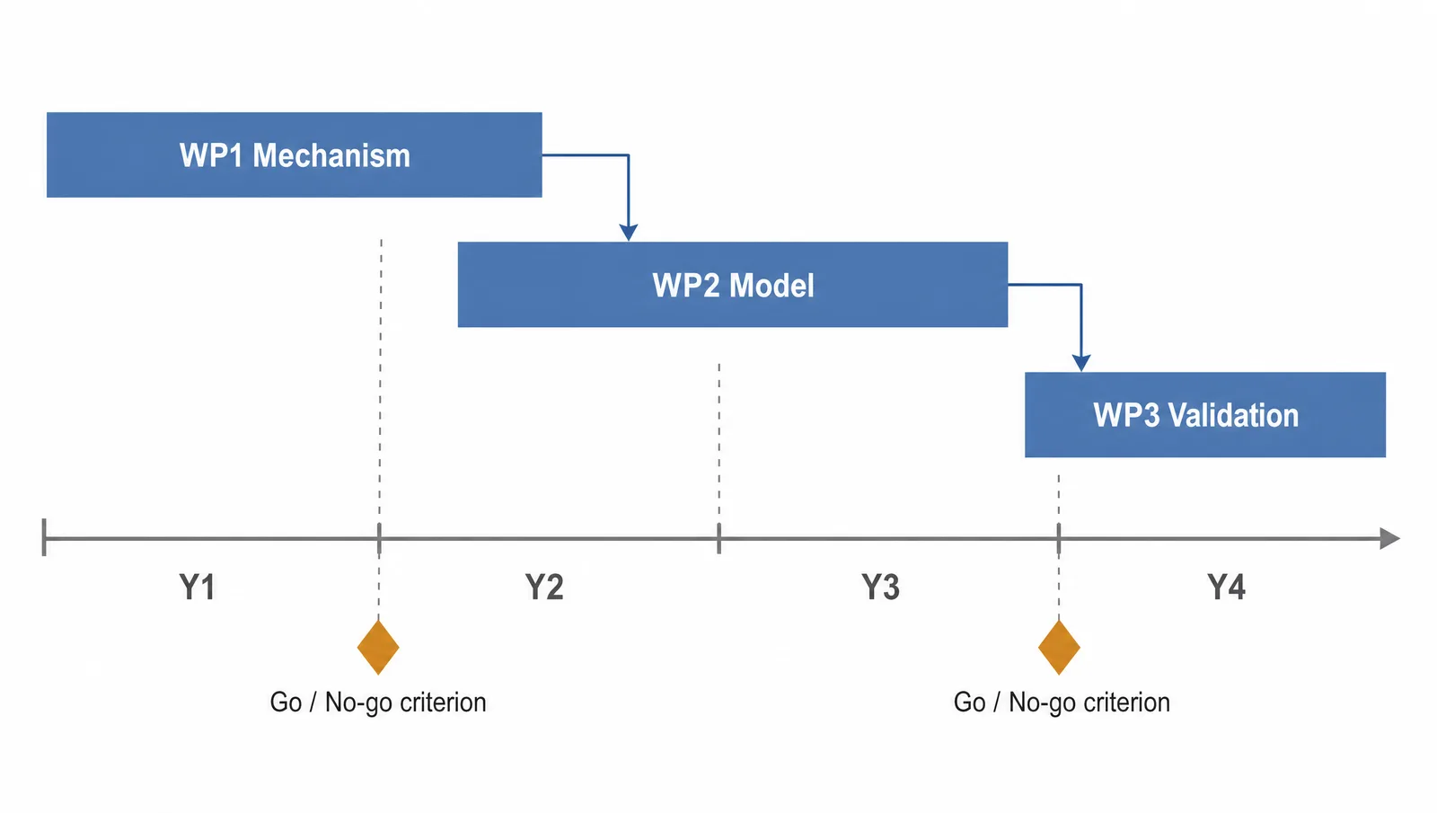
To make a graphical abstract, reduce your paper to one take-home sentence, choose a layout that matches the scientific story, remove everything that does not support that sentence, establish a clear visual hierarchy, check the target journal's rules, and review the export at its final display size. This scientific figure should let a reader follow the context, method, and main outcome without reading the paper first.
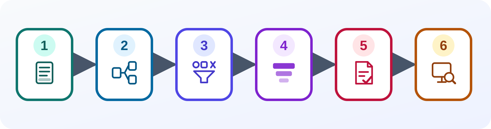
Step 1: State the One-Sentence Conclusion
Write one complete sentence that states the paper's main result and why it matters; this sentence is the content boundary for the graphical abstract, so every later element must help a reader understand it.
Use a concrete result rather than a topic. “Nanoparticle delivery in tumors” names a subject; “Ligand X increased tumor-cell uptake relative to the control” states a result. Keep essential comparison language such as increased, reduced, or unchanged, and preserve the condition that makes the conclusion scientifically accurate.
Then list three supporting items underneath the sentence:
- the minimum context needed to understand the question;
- the method or intervention that connects context to result;
- the evidence that supports the conclusion.
If an element does not fit one of those three jobs, leave it out of the first draft. A graphical abstract is a selective explanation, not a visual inventory of the manuscript.
Step 2: Choose a Layout That Matches the Story
Translate the one-sentence conclusion into a reading path that matches the logic of the study, because a familiar left-to-right, top-to-bottom, comparison, or cycle layout lets readers infer relationships before they inspect labels.
| Scientific story | Useful layout | What the reader should follow |
|---|---|---|
| Intervention leads to an outcome | Left to right | Input → mechanism → result |
| Screening or selection workflow | Top to bottom | Starting pool → filters → final set |
| Treatment versus control | Two-column comparison | Same measures under two conditions |
| Feedback or repeated process | Cycle | Each stage returns to the starting state |
Start with boxes and arrows in PowerPoint, Keynote, Figma, or on paper. Do not choose icons yet. The layout should still make sense as plain geometry. Use one direction for the main narrative and reserve side branches for details a reader can safely skip.
Step 3: Remove Nonessential Elements
Delete repeated labels, decorative icons, secondary experiments, and method detail that does not change the conclusion, then keep only the smallest set of objects needed to reconstruct the study's logic accurately.
The fastest editing method is subtraction. Duplicate the draft, remove one element, and ask whether the main claim is still understandable. If it is, keep the simpler version. Preserve controls, uncertainty, and comparison groups when removing them would make the result misleading; simplification is not permission to overstate the science.
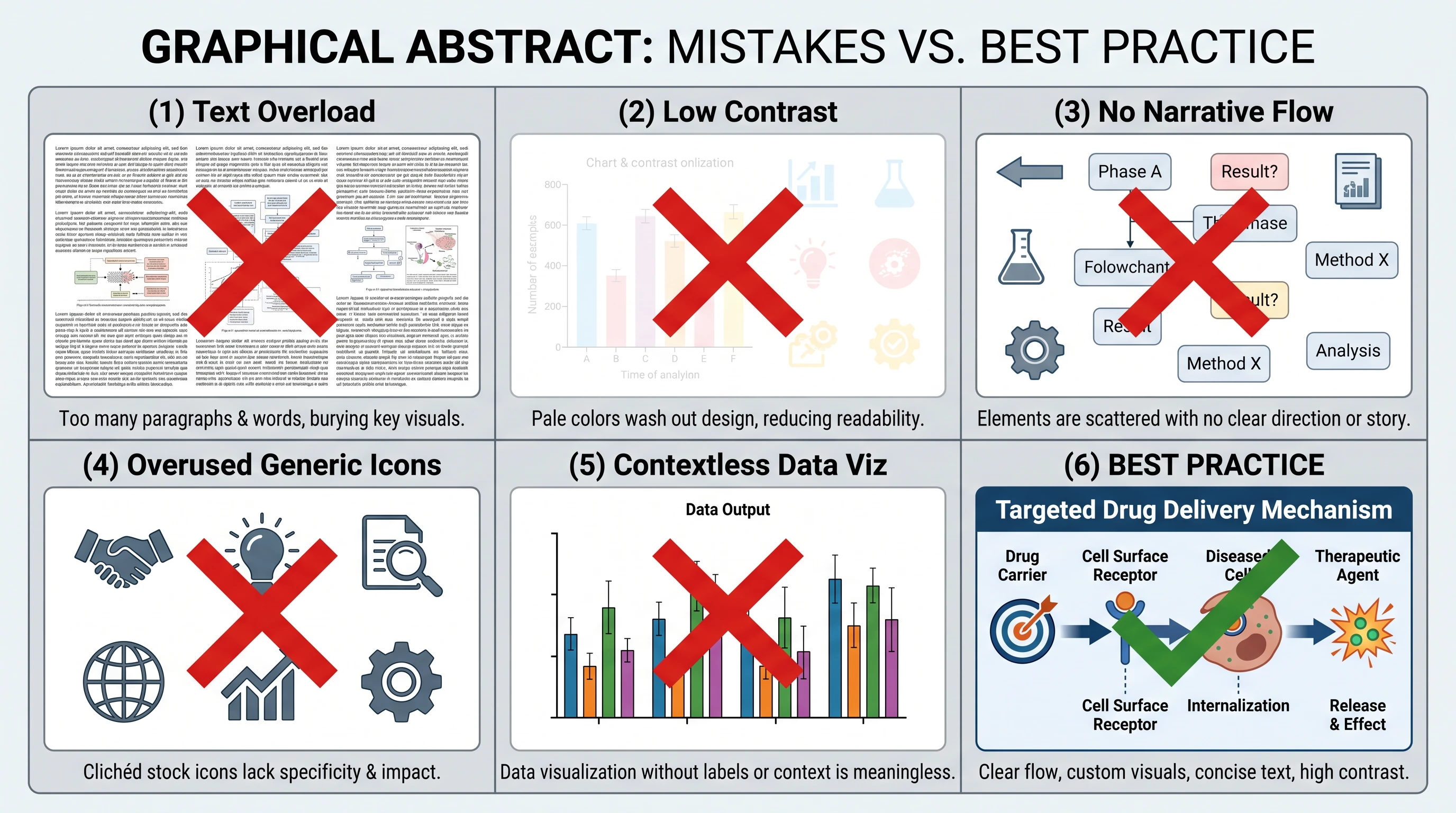
Common problems to remove before polishing include:
- paragraphs copied from the abstract;
- legends that force readers to decode many colors or symbols;
- multiple arrow styles with no defined meaning;
- stock icons that add decoration but no scientific information;
- data panels too small to read at table-of-contents size;
- a second or third “main result” competing with the actual conclusion.
Step 4: Build a Clear Visual Hierarchy
Make the central finding the strongest visual anchor, then use size, position, contrast, spacing, and arrow weight to make context and method visibly subordinate without hiding information the conclusion depends on.
The reader's first glance should land on the outcome, the second should reveal how the study reached it, and the third should supply necessary context. Use a limited palette with sufficient contrast, consistent icon and line styles, and whitespace between logical groups. Do not use color as the only way to distinguish conditions; combine it with labels, shapes, line styles, or direct annotation.
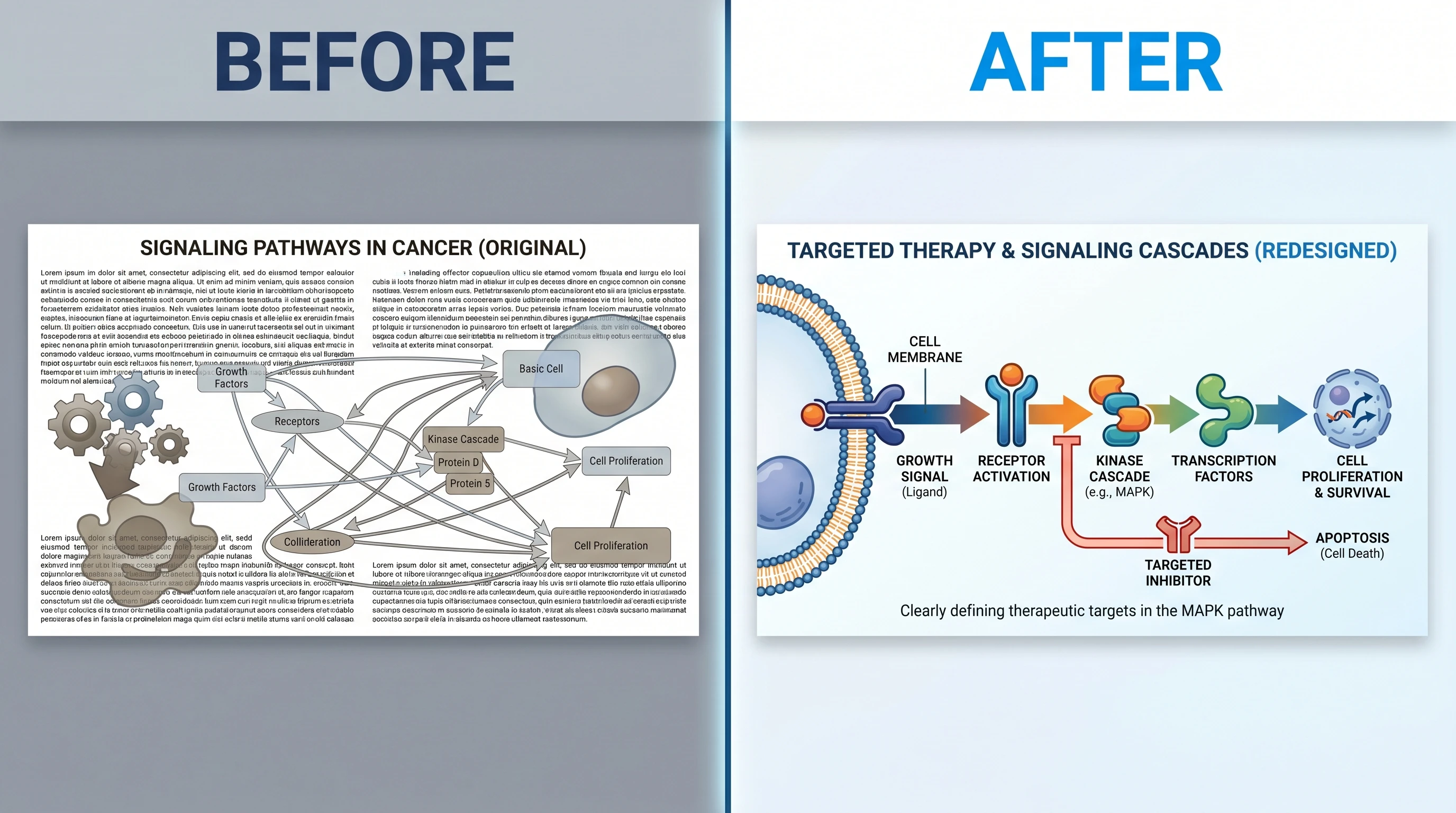
In the crowded version, synthesis chemistry, particle structure, cell uptake, a bar chart, and an animal model all ask for equal attention. A better version can preserve the scientific comparison while centering one result, showing only the input and outcome needed to understand it, and moving supporting detail back into the paper. This is the pattern to look for when studying graphical abstract examples: not the most decorative design, but the clearest information hierarchy.
Step 5: Check the Target Journal's Requirements
For example, Elsevier's general guidance asks for an original image submitted as a separate file, a clear start and end that reads top-to-bottom or left-to-right, and reduced clutter. It lists a minimum 1328 × 531 pixels at 300 dpi, prefers TIFF, EPS, PDF, or MS Office files, and tells authors to check the journal's own policy. Those are useful defaults for an Elsevier submission, not universal specifications for every publisher.
Step 6: Export and Review at Final Size
Export the graphical abstract in the target journal's required format, then inspect that exact file at the size and background on which readers will encounter it, checking legibility, contrast, cropping, embedded fonts, and scientific accuracy.
For a PowerPoint workflow, set the slide size to the required aspect ratio before arranging the figure. Keep editable source objects on the slide, use only fonts you can embed or safely substitute, and export the requested PDF, TIFF, or other accepted format. Reopen the exported file rather than trusting the editing canvas. Zoom out to thumbnail size, print in grayscale when print use is possible, and ask a colleague outside the specialty to describe the result after a brief look.
Use this final gate:
- Does the export communicate the same one-sentence conclusion from Step 1?
- Is the reading order obvious without a caption?
- Are labels readable at the journal's display size?
- Do colors and symbols remain distinguishable in grayscale and for common color-vision differences?
- Are units, signs, comparison directions, and statistical labels accurate?
- Does the file meet the current journal guide rather than a remembered specification?
Graphical Abstract Examples, Templates, and a Maker
Examples, templates, and makers solve different problems. Journal examples show what editors in a field already publish. A template supplies a starting grid and slide dimensions. A graphical abstract maker turns a study description into a first visual composition. None of them decides which result your paper should foreground.
| Starting point | Best next tool | Main risk to check |
|---|---|---|
| You know the conclusion but not the composition | SciFig graphical abstract maker | Editable output: adjust any object or label to match your paper |
| You know the layout and want editable objects | PowerPoint template | Placeholder structure may not fit the study |
| You need a field-specific visual benchmark | Recent journal examples | Published style may not equal current file rules |
Create Scientific Figures Now
Describe your scientific figure in natural language — get publication-ready illustrations in minutes.
Try FreeDo Graphical Abstracts Increase Citations?
The defensible goal is therefore clarity and qualified attention: help the right reader recognize the question, method, and result quickly enough to decide whether the paper is relevant. Citations depend on many later factors, including study quality, field size, indexing, access, and the paper's relevance to subsequent work.