A research roadmap figure shows how the parts of a project fit together and in what order.
That is a question your prose cannot answer quickly, and reviewers read proposals under time pressure. The roadmap figure is often the first thing they look at and the last thing they check before scoring. A good one lets someone reconstruct your whole plan in fifteen seconds. A bad one — and most are bad — is a box-and-arrow diagram that restates the aims headings without adding a single piece of information.
What the Figure Is Actually For
It is not decoration and it is not a summary. It carries three specific pieces of information that are awkward to express in prose:
- Dependency. Which work cannot start until something else finishes.
- Timing. What happens in which year or phase, and where the effort concentrates.
- Risk. Where the plan branches, what the decision criterion is, and what the fallback is.
Prose can state any one of these. Stating all three at once, for six or eight pieces of work, produces a paragraph nobody can hold in their head. That is exactly the job a figure does well.
Tip
Before you draw anything, write one sentence per work package in the form "X cannot start until Y produces Z." If you cannot write those sentences, the figure will not fix the plan — the plan itself is not yet specific enough.
Three Layouts That Work
Almost every effective roadmap figure is one of three shapes. Pick by what your reviewers most need to see, not by what looks impressive.
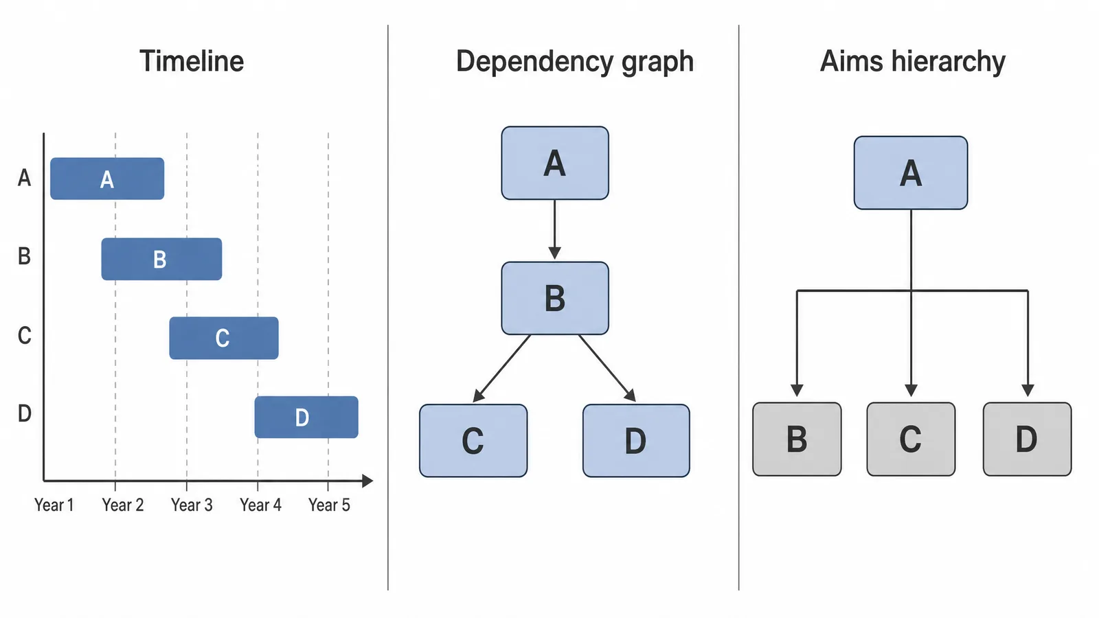
| Layout | Shows best | Use when | Weakness |
|---|---|---|---|
| Timeline / Gantt | Timing and effort distribution | Multi-year projects with staged deliverables | Hides logical dependency |
| Dependency graph | What blocks what | Aims that feed each other's inputs | Hides schedule |
| Aims hierarchy | Logical structure of the argument | Aims are conceptually parallel | Hides both timing and risk |
See AI Scientific Figure Generation in Action
Watch how researchers create publication-ready scientific figures from text descriptions.
Explore the ToolTimeline
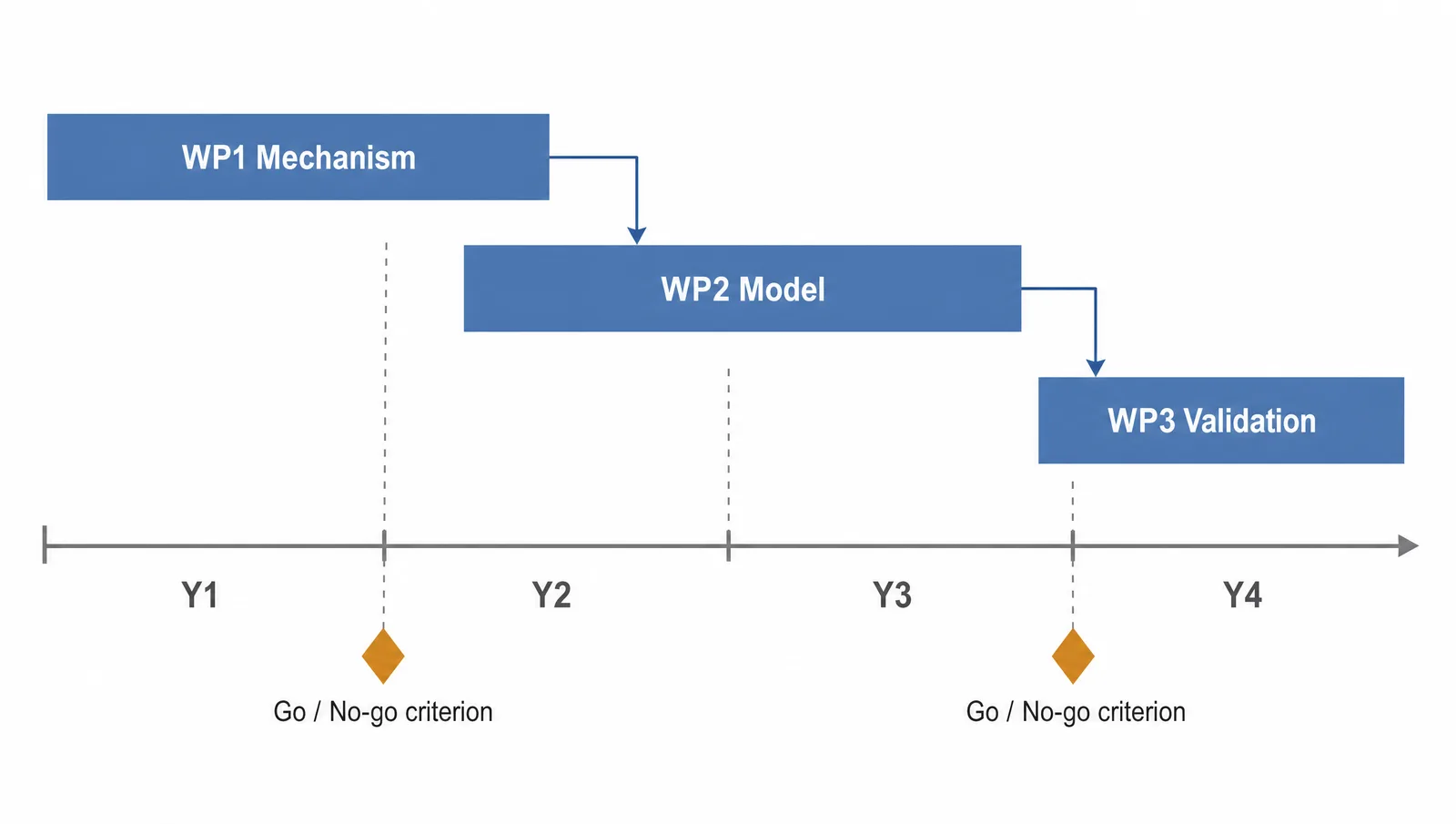
Work packages as horizontal bars against years or quarters, milestones as markers. This is the layout funders expect for anything with staged deliverables, and it is the only one that makes uneven effort visible — a reviewer can see at a glance that year two is overloaded.
Add dependency arrows between bars if you need them, but sparingly. A timeline dense with crossing arrows becomes unreadable, and at that point the dependency graph is the better choice.
Dependency Graph
Nodes are work packages, edges are "produces the input for." This is the right layout when the intellectual risk lives in the sequence — when Aim 2 is only meaningful if Aim 1 returns a particular result.
Its advantage is that it makes the critical path obvious. Its cost is that time disappears: a reviewer cannot tell whether an edge represents three weeks or two years unless you label it.
Aims Hierarchy
A central objective with aims branching from it, each aim with its sub-tasks. Use it when the aims are genuinely parallel and the story is about logical coverage rather than sequence.
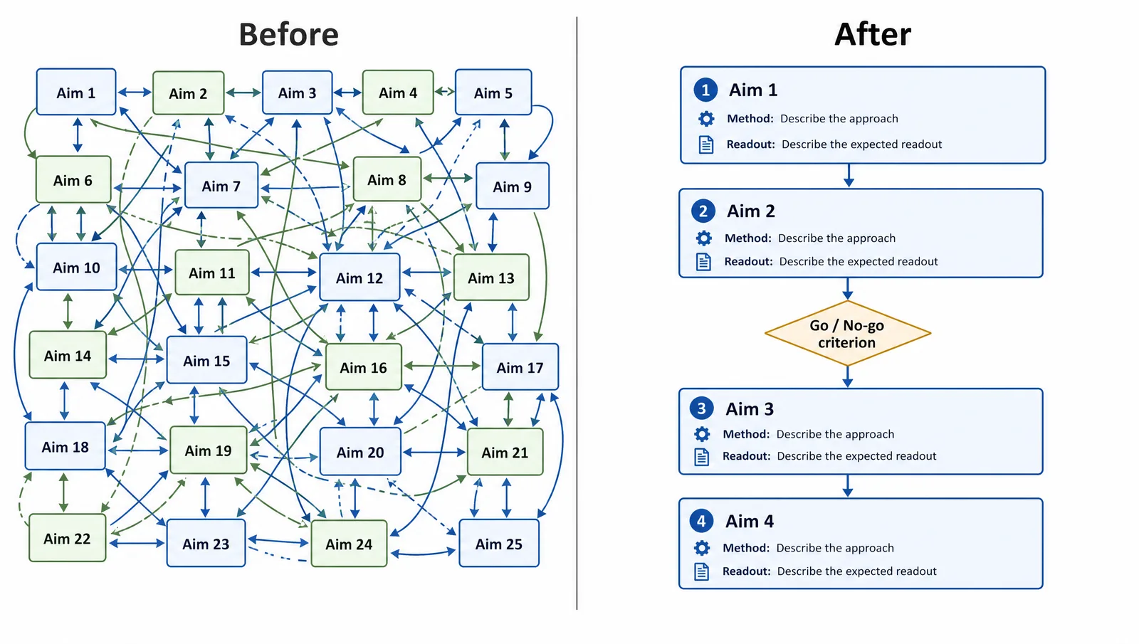
This is the weakest of the three, because it usually restates the headings. It earns its place only when each branch carries something the headings do not — the method, the readout, the expected outcome.
What to Leave Out
The most common failure is not an ugly figure. It is a figure so full that no single thing stands out.
Where Roadmap Figures Actually Fail
Three failure modes account for most weak roadmap figures, and none of them is about drawing skill.
Building One
The order matters, because most of the work is decided before you open any drawing tool.
- List the work packages and give each one a verb, a method, and a readout.
- Write the dependency sentences — "X cannot start until Y produces Z." Only pairs that survive this test get an arrow.
- Choose the layout from the table above, based on what carries the risk.
- Place the decision points, with the criterion written on the figure, not left to the caption.
- Draft it, then delete a third of what you drew.
- Check it against the final text — every date, every aim number, every dependency.
Create Scientific Figures Now
Describe your scientific figure in natural language — get publication-ready illustrations in minutes.
Try FreeConventions Worth Following
Nothing here is a rule from a funder, but reviewers see thousands of these and read fluently in the conventional forms.
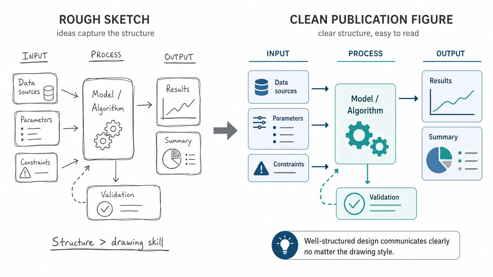
Time runs left to right. Dependency arrows point in the direction of the flow, never backwards. Aim numbers in the figure match the aim numbers in the text exactly, including their order. Milestones are diamonds or markers, not more boxes. The caption states what the figure shows, not what the project is about.
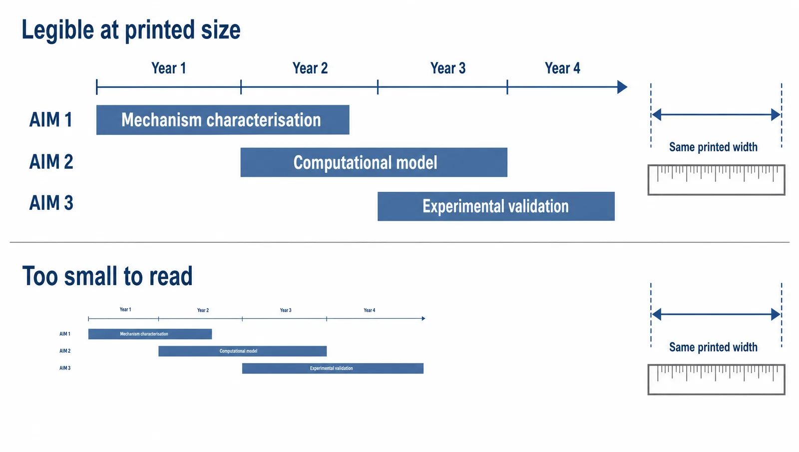
Keep the figure legible at the size it will actually be printed — reviewers often read on paper or on a tablet, and a roadmap set in seven-point type is a roadmap that does not get read. The same typographic discipline that governs any scientific figure applies here, and it matters more, because a roadmap is mostly text.
Related Reading
Related reading: How to Write a Conceptual Framework, How to Add Figures to a Research Paper.