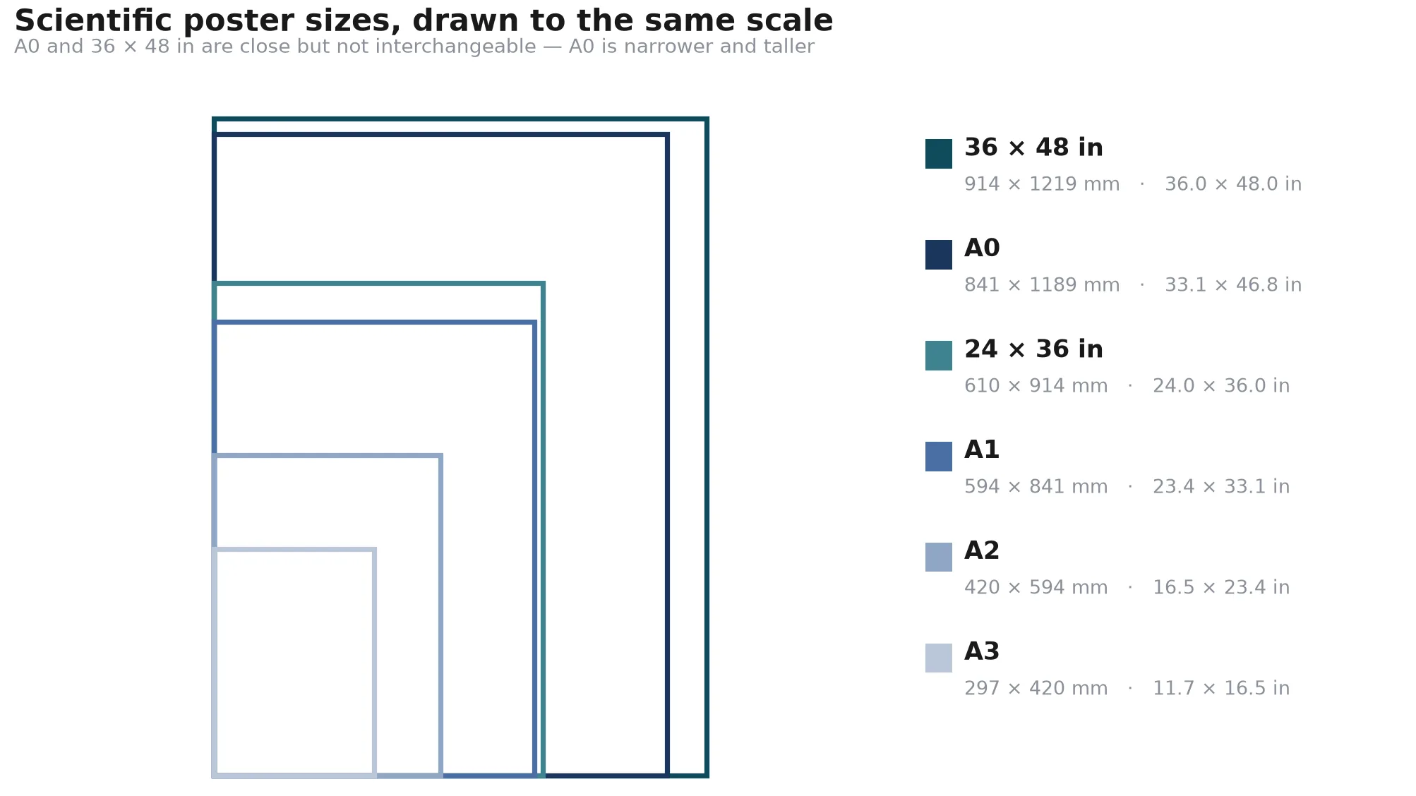
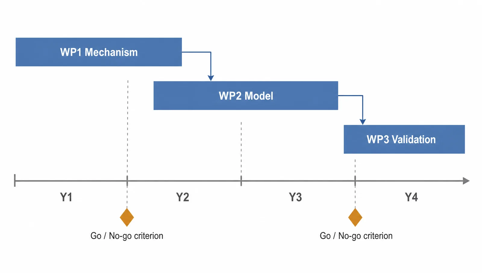
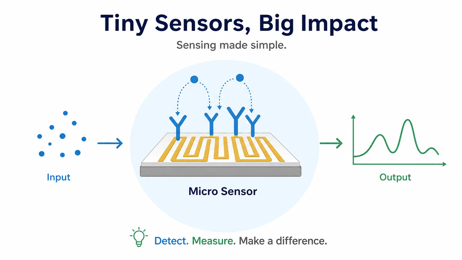
To make scientific figures well, treat the figure as a short visual argument rather than a decoration.
If you are learning how to make a scientific figure, start with the claim and the reading order before choosing a visual style.
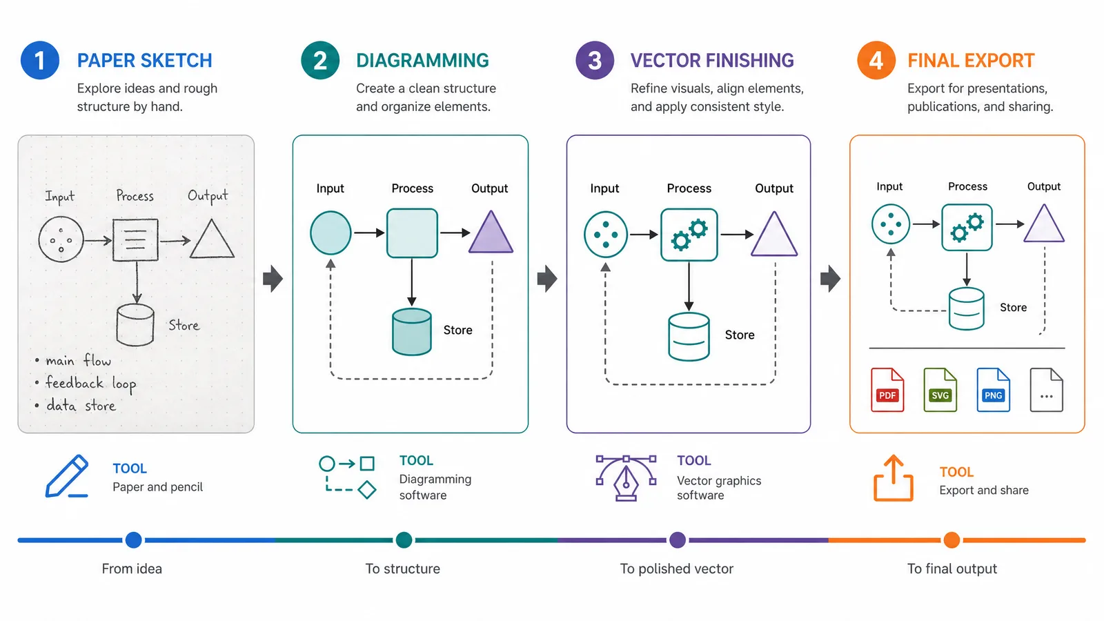
How to make scientific figures: the 7-step workflow
The shortest answer is to move from message to structure to polish, in that order; do not begin by decorating an empty canvas.
- Write the one-sentence claim the reader should remember.
- Choose a figure type and a left-to-right or top-to-bottom reading order.
- Select software that matches the figure, not software that happens to be familiar.
- Build a rough layout with panels, labels, arrows, and whitespace.
- Add the scientific details, scale cues, color system, and caption-ready labels.
- Test the figure at the size readers will see and remove anything that does not help.
- Keep an editable source, then export the required publication format.
See AI Scientific Figure Generation in Action
Watch how researchers create publication-ready scientific figures from text descriptions.
Explore the ToolStep 1: Define the one-sentence message
A scientific figure is ready to build when you can state its main takeaway in one sentence without listing every detail it contains.
Write the sentence before opening Illustrator, PowerPoint, or an online editor. For example: “The treatment reduces pathway activity after the stimulus.” That sentence determines which comparison deserves the largest panel, which labels are essential, and which measurements belong in the caption instead of the artwork.
Use one figure for one connected argument. If a figure tries to explain the mechanism, prove the result, and summarize the entire project at once, split it into panels or separate figures. A clear scope is the fastest way to improve a crowded scientific figure.
Step 2: Choose the figure type and reading order
Choose the visual form that makes the relationship easiest to read: a graph for measured values, a diagram for parts and connections, a schematic for a process, and an illustration for structure or spatial context.
Plan the reading order before choosing colors. Number panels consistently, place the main comparison early, and use arrows only when their direction adds information. A reader should know where to start without hunting through the page or following decorative lines.
For a multi-panel figure, give every panel a job. A useful sequence is context, method, result, and interpretation, but the order should follow the claim rather than a fixed template. Keep panel widths, margins, and label positions consistent so the eye can compare instead of re-learning the layout.
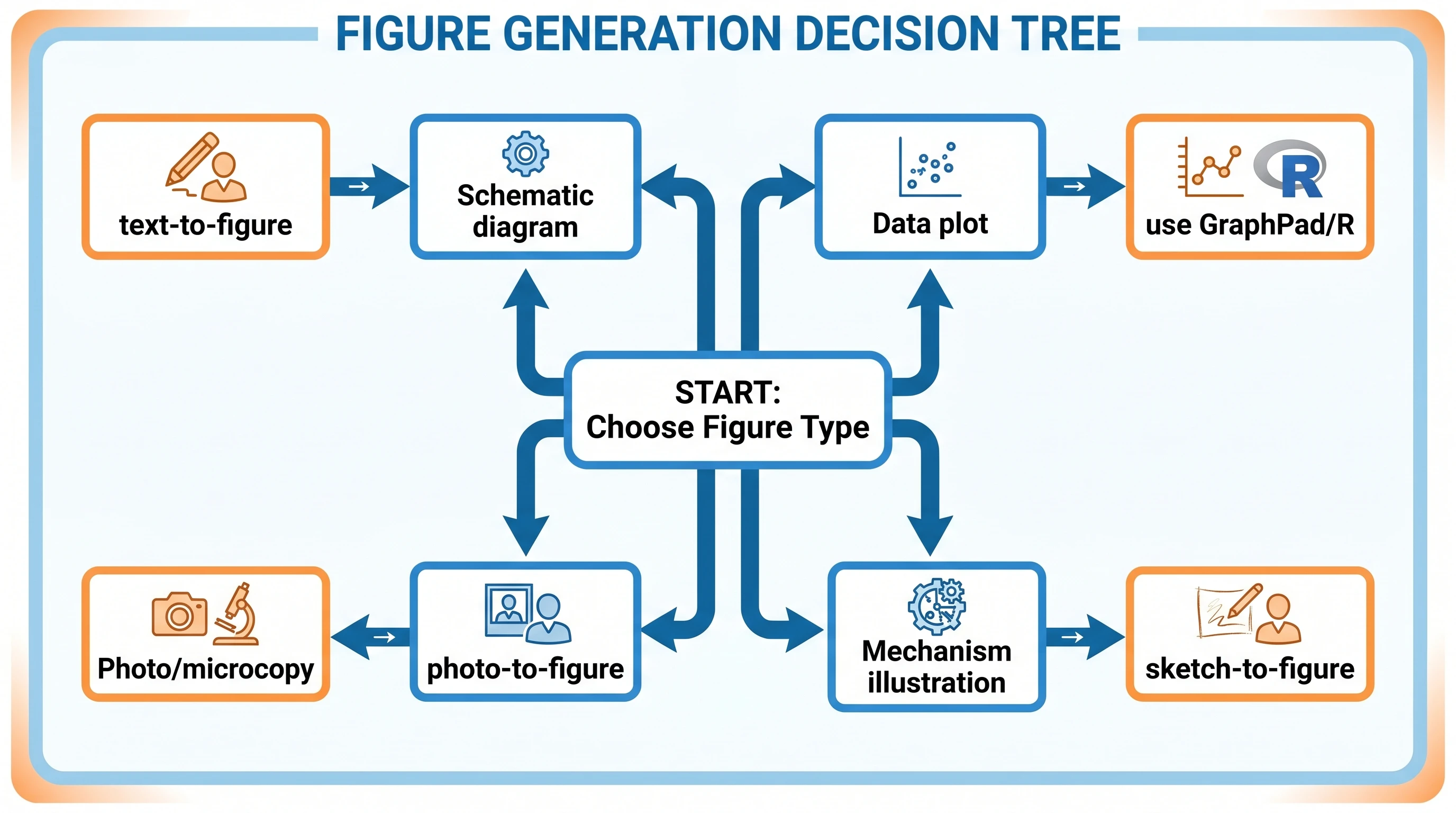
Step 3: Choose software for scientific figures
The right software is the one that lets you keep scientific relationships accurate, labels editable, and the final export readable at its actual size.
| Software | Use it when | Check before export |
|---|---|---|
| Illustrator | You need precise vector drawing, reusable styles, and detailed panel composition in Illustrator. | Keep text as editable text and save the source file. |
| Inkscape | You want a capable vector workflow in Inkscape with an open-source tool. | Inspect SVG text, clipping paths, and embedded fonts. |
| PowerPoint | You need to assemble a quick schematic or presentation-ready overview in PowerPoint. | Test the exported PDF or SVG; grouped objects can shift. |
| Photoshop | You are preparing photographs, microscopy panels, or pixel-based image corrections in Photoshop. | Keep the original resolution and do not use it as the only home for vector labels. |
| Excel | You are making a simple chart from tabular measurements in Excel. | Remove default chart clutter and verify axis units and uncertainty. |
| Word | You are placing a finished figure and caption in Word during manuscript assembly. | Insert the exported figure at full quality instead of rebuilding it with shapes. |
How to use Illustrator or Inkscape to make scientific figures
To use Illustrator or Inkscape to make scientific figures, build a small style system first: one body font, one label size, one arrow style, and a limited color palette.
Create guides for panel edges and align repeated elements rather than nudging them by eye. Use separate layers for background, data or structures, annotations, and labels. Save a vector source file even if the submission portal ultimately asks for TIFF or PNG; the source is what makes later corrections affordable.
Step 4: Build the layout before polishing
Build the figure in grayscale first so hierarchy comes from size, spacing, and position rather than from color alone.
Set the intended canvas ratio, place the largest comparison, and reserve space for labels before drawing small details. Work from large shapes to small annotations. A rough block-in should already make the argument understandable when viewed as a thumbnail.
Use whitespace as a boundary between concepts. Equal gaps imply relatedness; larger gaps imply a change of stage or category. Avoid filling every empty area with icons, borders, or explanatory sentences. Those additions increase visual noise without increasing evidence.
Step 5: Add labels, scale, and color
Add labels next to the element they describe, state units where a value appears, and use color to encode a relationship rather than to make the page look busy.
Every arrow should have one unambiguous destination. Every scale bar should have a unit. Every abbreviation should be defined in the caption or in the figure itself. If relative size is not measured, mark the drawing as schematic or not to scale instead of implying a physical measurement.
Choose colors that remain distinguishable in grayscale and under common color-vision simulations. Use shape, line style, or direct labels as a second signal so the meaning does not depend on red versus green alone.
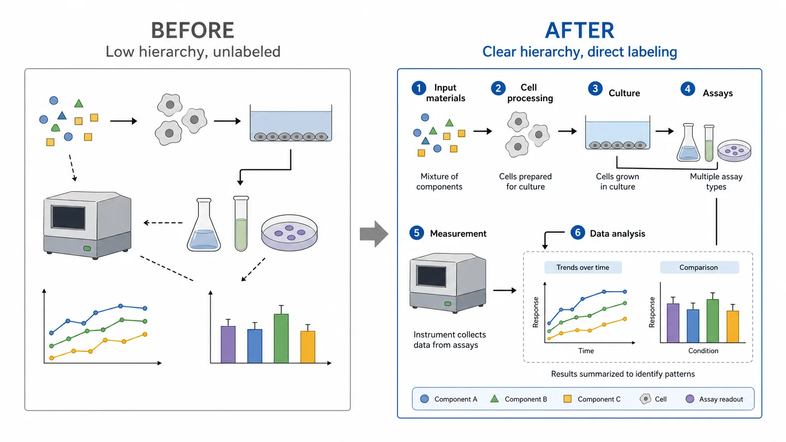
How to make good, beautiful, and nice scientific figures
To make good, beautiful, and nice scientific figures, prioritize one readable message, consistent spacing, legible labels, honest scale, and restrained decoration.
People phrase this need as how to make good scientific figures, how to make beautiful scientific figures, or how to make nice scientific figures; all three searches point to the same foundation of clear hierarchy and readable evidence.
A polished figure is not merely attractive; it reduces the effort needed to verify the claim. Use this five-point quality check:
- Hierarchy: the main result is visible first, and supporting details are visually quieter.
- Legibility: labels remain readable at the final manuscript or slide size.
- Consistency: repeated symbols, arrows, colors, units, and panel labels mean the same thing everywhere.
- Honesty: scale bars, axes, error marks, and illustrative elements do not imply evidence they do not contain.
- Accessibility: meaning survives grayscale printing and a color-vision check.
Ask someone unfamiliar with the experiment to describe the figure in ten seconds. If they can identify the comparison but not the conclusion, strengthen the hierarchy. If they cannot identify the comparison, simplify the figure before adding detail.
Examples of bad scientific figures
Examples of bad scientific figures usually share a structural problem: the reader must decode the layout before they can understand the science.
| What you see | Why it fails | Better fix |
|---|---|---|
| Ten colors with no direct labels | The legend becomes a lookup exercise. | Label the important elements directly and reserve color for meaningful groups. |
| Arrows crossing several panels | The destination is ambiguous. | Shorten arrows, add a clear endpoint, or use numbered steps. |
| Tiny text beside a large empty margin | The figure was designed at the wrong scale. | Rebuild the layout at the final print or slide size. |
| A 3D effect on a flat comparison | Perspective suggests a difference that was not measured. | Use a flat chart or a schematic with an explicit scale. |
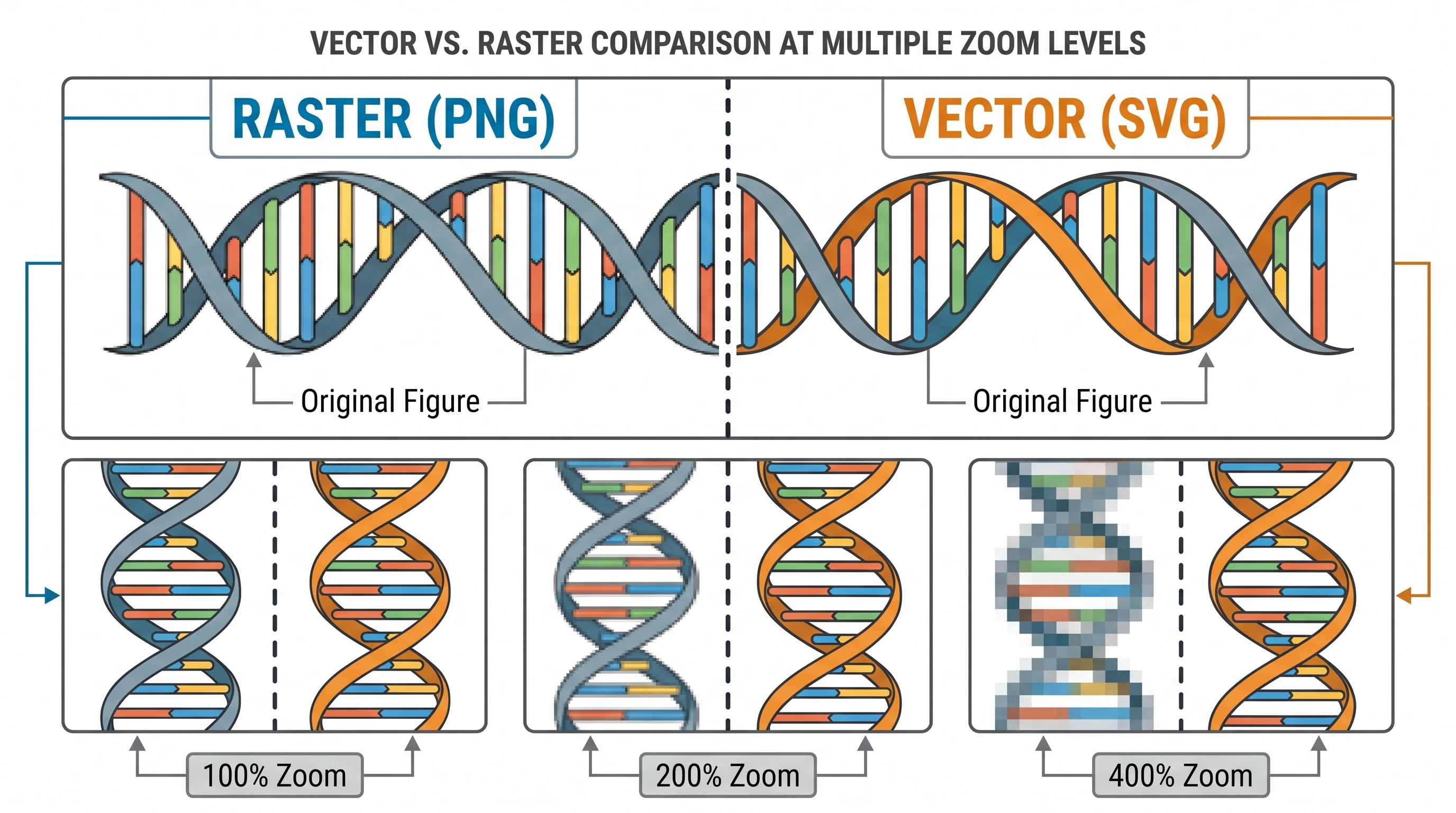
| A raster screenshot of editable artwork | Revision becomes slow and quality can degrade. | Keep a vector source and export a delivery copy. |
These examples are useful as a pre-submission test: if a reader needs a separate explanation to find the claim, the figure is not finished.
Step 6: Make scientific figures for publication, free, or online
The output route changes the production details, but every route still needs a clear message, readable labels, and an editable source.
Refine Figures in the Vector Canvas
Open any AI-generated figure in the editable canvas — layered SVG, 8K PNG, or editable PPTX.
Try FreeStep 7: Export, inspect, and preserve the source
Export only after checking the figure at the size readers will see, and keep the editable source next to the delivery file.
Zooming in on a large monitor hides problems that appear in a manuscript. Open the exported file at 100%, print a test page when print matters, and inspect small labels, thin lines, clipping, transparent backgrounds, and color conversions. Compare the export with the source panel by panel.
Keep a versioned vector master and a short note that records the export settings. A journal revision, a translated label, or a changed result should require an edit, not a complete redraw.
How to draw scientific diagrams on a computer
To draw scientific diagrams on a computer, map entities and relationships first, then choose shapes and connectors that make those relationships explicit.
Start with a list of the objects, states, or steps the diagram must show. Connect only relationships that support the message. Use a consistent shape vocabulary: for example, rectangles for stages, circles for entities, and arrows for transitions. Add a legend only when the shape language cannot be understood from the diagram itself.
The same method explains how to make illustrations, graphs, or schematics for scientific papers: define the claim, select the visual grammar, place the evidence, and then polish the surface. A drawing application is only the last part of that decision.
A final checklist before you submit a scientific figure
A scientific figure is ready to submit when its claim, reading order, labels, scale, export, and source file all pass a deliberate review.
- Can you state the main takeaway in one sentence?
- Does the visual form match the relationship being shown?
- Can a reader identify the first panel or starting point immediately?
- Are labels, units, arrows, and scale cues unambiguous?
- Does the figure remain useful in grayscale and at final size?
- Did you inspect the exported file rather than only the source file?
- Did you keep an editable master and the values or data used to make it?
- Did you check the target journal's current delivery requirements?
FAQ
These answers cover the practical decisions people usually face when they make scientific figures for a paper, presentation, or online research page.