
Comparison Chart Maker
Create clear comparison charts and AI-generated comparison tables for research — describe your groups and attributes, and SciFig's comparison chart maker builds the figure.
Figure prompt
Describe the figure you want to create
Not sure where to start? Use Example.
Start with 100 free credits|No credit card required
Get up to 300 free credits on day one when you join through an invite.
Reviewed by SciFig TeamUpdated
Comparison Chart Maker— templates & examples
Everything you need to build your comparison chart
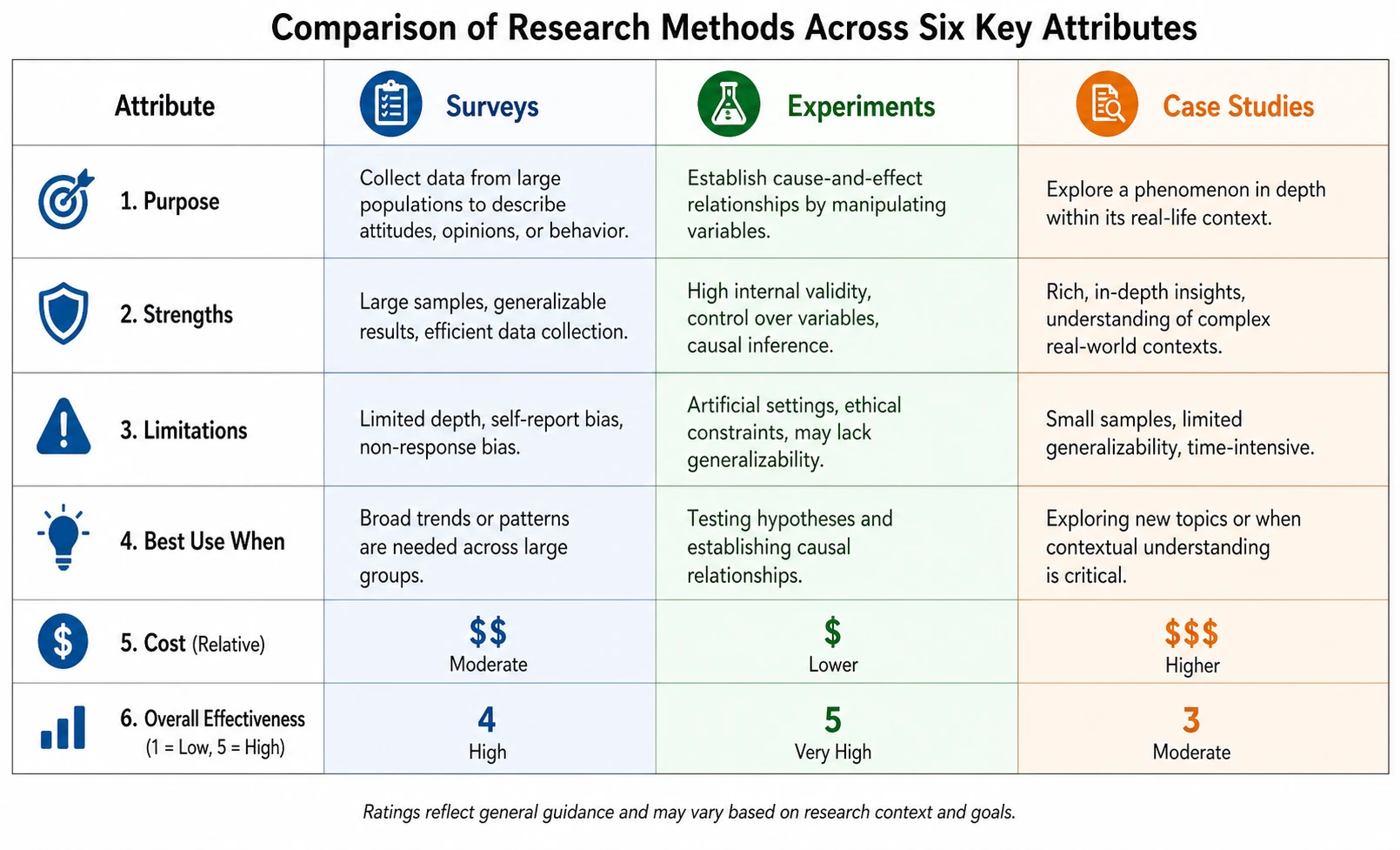
AI table comparison generator that works from plain English
Most comparison chart makers require manual table entry or spreadsheet imports. SciFig's AI table comparison generator accepts a plain-language description of your groups and attributes and produces a structured, labeled comparison chart in the format your manuscript needs. Whether that is a side-by-side comparison table or a visual comparison diagram, the AI comparison chart maker selects the right layout automatically.
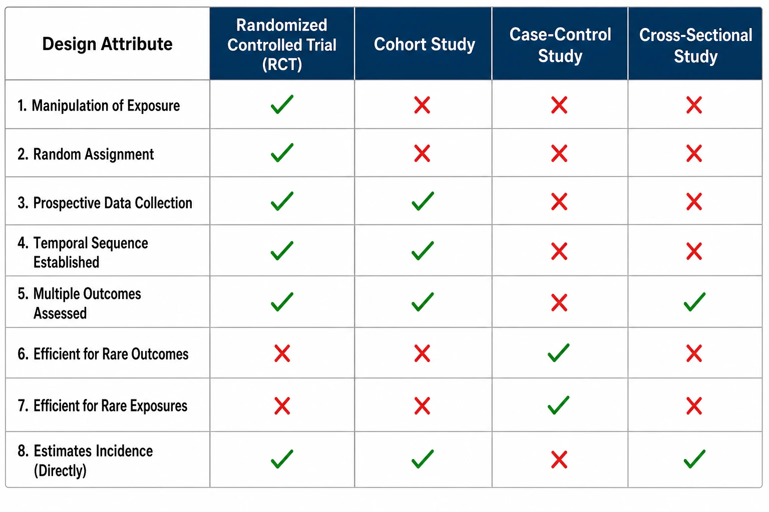
Side-by-side comparison chart for any number of groups
Comparison charts for two, three, or four groups each require different visual strategies. SciFig's comparison chart maker scales layout automatically — placing groups in parallel columns for tables, or in clustered positions for diagrammatic comparison figures — so your side-by-side comparison chart remains legible at any journal or poster size.
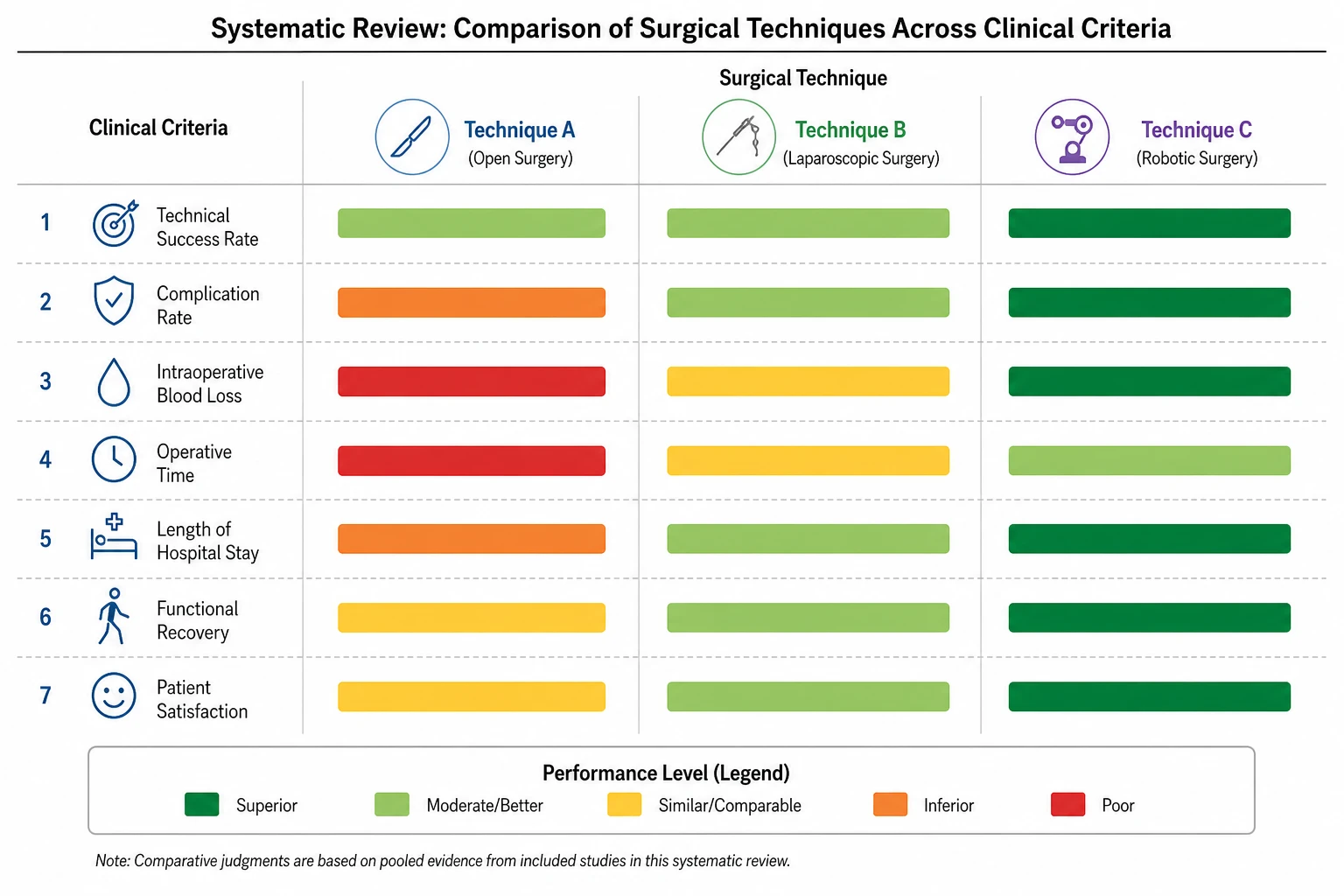
Export a publication-ready comparison figure instantly
Your comparison chart must match the figure standards of your target journal — white background, crisp labels, consistent line weights. SciFig outputs a fully editable comparison chart at any resolution. Adjust the attribute list, rename groups, and re-export your AI table comparison generator result without rebuilding from scratch.
What is a comparison chart?
A comparison chart is a structured visual that places two or more groups, methods, or conditions side by side so readers can evaluate differences across a consistent set of attributes. Comparison charts appear in methods and results sections as tables, grouped bars, or diagrammatic layouts. With SciFig's comparison chart maker you describe your groups and attributes and receive a labeled, publication-ready figure without manual formatting or design software.
Why researchers use a comparison chart maker
- Makes group differences visible at a glance instead of requiring readers to scan text
- Comparison charts compress information that would take paragraphs to describe verbally
- Side-by-side comparison layouts are required by systematic review and meta-analysis journals
- AI table comparison generator saves hours of manual table formatting in Word or LaTeX
- Comparison diagrams improve the visual clarity of methods and results sections
- Reviewers and editors consistently request comparison charts for multi-condition studies
Key components of a comparison chart
- Group headers — labels identifying each entity being compared across the top or side
- Attribute rows — the specific dimensions or criteria evaluated for each group
- Value cells — quantitative scores, qualitative ratings, or yes/no indicators per group–attribute pair
- Visual encoding — bars, icons, shading, or checkmarks that make differences immediately legible
- Legend or key — explains any symbols, color codes, or rating scales used in the comparison chart
- Title and caption — describes what is being compared and the data source
Where comparison charts are used in research
- Systematic reviews and meta-analyses summarizing study design characteristics in comparison tables
- Clinical trial results sections comparing outcome metrics across treatment arms side by side
- Algorithm benchmarking in computer science papers using feature comparison diagrams
- Education research contrasting curriculum designs or teaching interventions with comparison charts
- Product and usability studies comparing prototypes across multiple design attributes
- Grant proposals and thesis introductions positioning the current study against prior work
How to make a comparison chart
Describe your comparison chart
Tell SciFig what to draw in plain language — no design tools required.
Generate with SciFig
Get a clean, publication-ready figure that matches your description in seconds.
Edit & export
Vectorize it into editable SVG, relabel everything, and export for your paper, poster, or slides.
Comparison Chart Maker — Frequently Asked Questions
Common questions about Comparison Chart Maker.
More tools
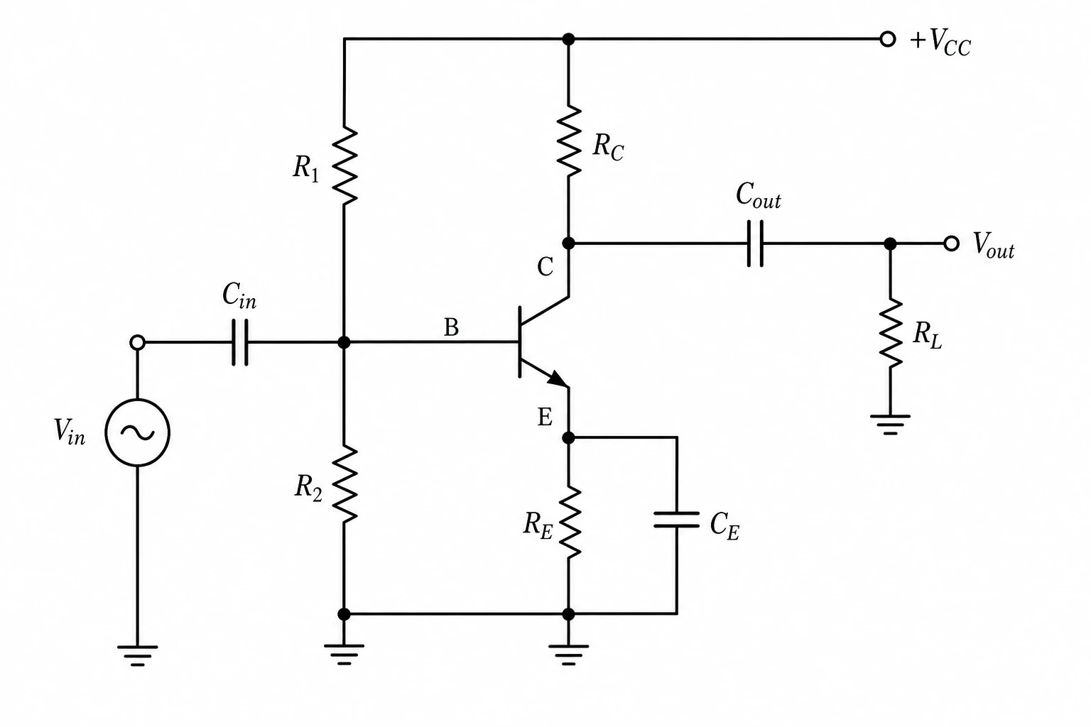
Circuit Diagram Maker
Generate accurate circuit diagrams with labeled schematic symbols for research papers, lab reports, and technical publications.
Free Body Diagram Generator
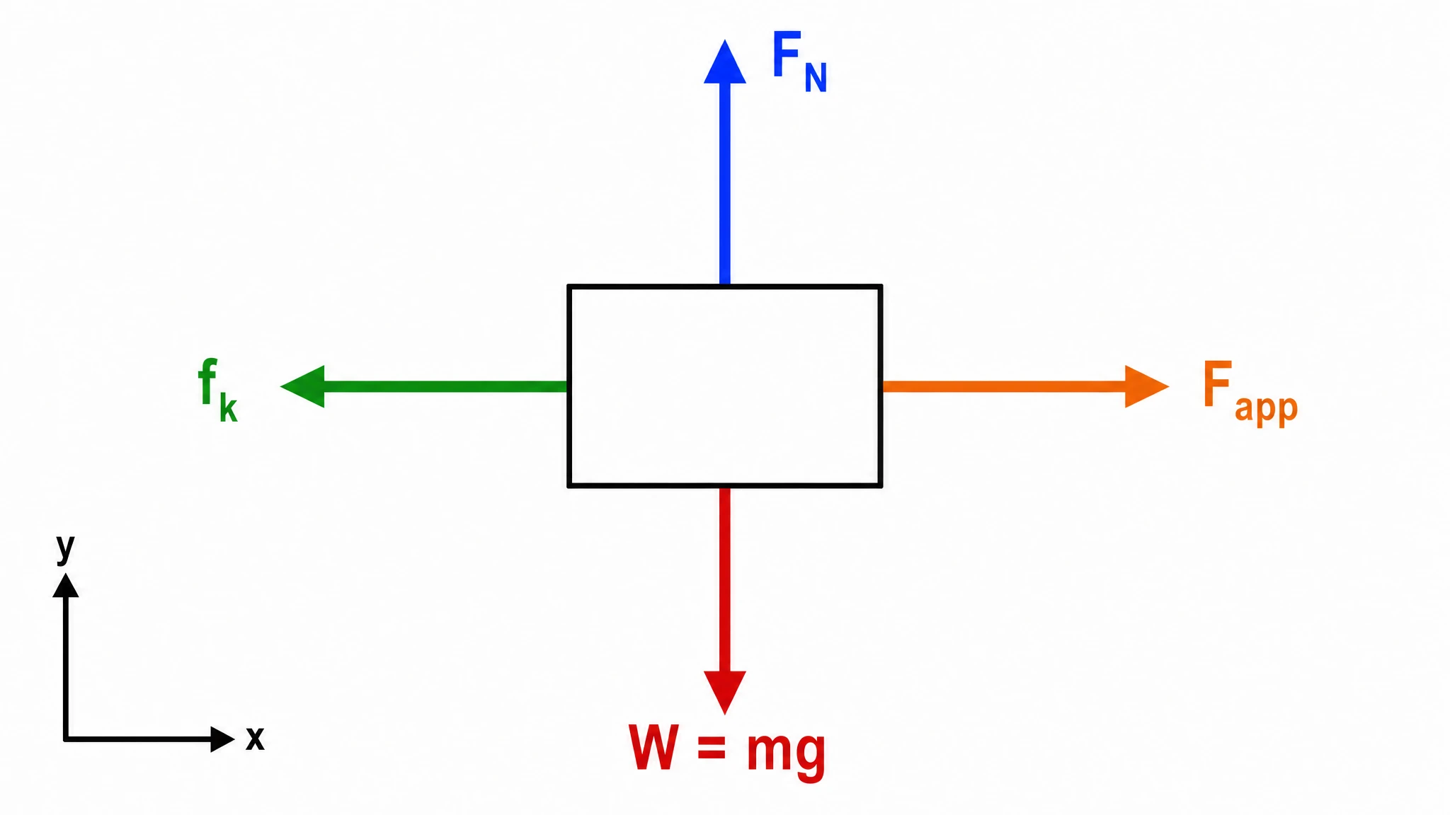
Create accurate, publication-ready free body diagrams with labeled force vectors for weight, normal force, friction, and tension in seconds.
Graphical Abstract Maker
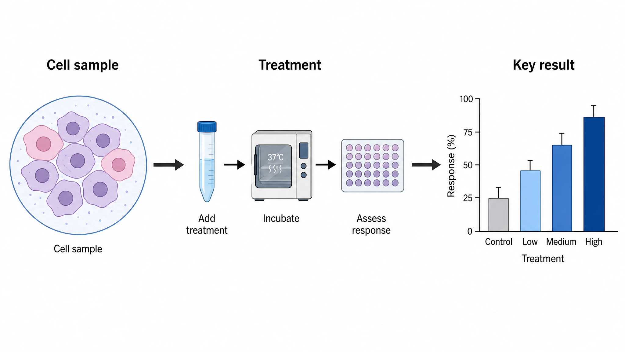
Generate a publication-ready graphical abstract — a single-panel visual summary that captures your study's methods, key finding, and result with clear icons and flow arrows.
Home
Free AI Scientific Figure Generator and Figure Maker — Create Research Figures, Images, Illustrations and Diagrams
Text-to-Figure
Generate a figure from a plain-language description
Models
Default to GPT Image 2 for journal papers; switch to Nano Banana Pro for slides and posters; pick Nano Banana 2 for routine figure work
Tutorials
Seven short walkthroughs of the AI scientific figure generator
Blog
Tutorials, tool comparisons, and publication tips for researchers.
Inspiration
Explore publication-ready scientific figure examples, copy the prompts, and use them as starting points for your own work.

Ready to publish?
Make your own comparison chart in minutes.
Start for freeFree to start · No credit card required · Built for researchers