
Compare category counts
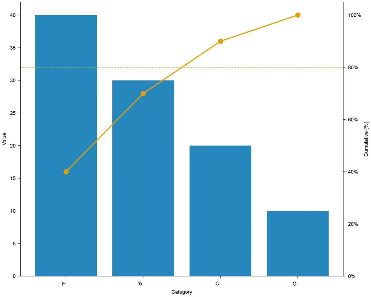
Compare A 40, B 30, C 20 and D 10, with cumulative shares of 40%, 70%, 90% and 100%.
Explore this exampleFree Pareto Chart Maker
A Pareto chart orders categories by value and adds a cumulative percentage line.
Start with up to 150 free credits|No credit card required
Get up to 350 free credits on day one when you join through an invite.
Free Pareto Chart Maker— templates & examples
Updated
pareto chart maker
A Pareto chart orders categories by value and adds a cumulative percentage line.
Use the Pareto chart maker to compare nonnegative counts or amounts across categories. DataChart merges repeated category labels, sorts totals from largest to smallest and calculates the cumulative share. A percentage axis and a threshold line help you find the categories that account for most of the total. Start with the example or provide a table, then refine the chart in DataChart and export it for a report, quality review or presentation.
The pareto chart maker combines these steps in one workflow.
Rows with the same category are summed before sorting, so recurring labels contribute to one bar.
The line starts at the share of the largest category and reaches 100% at the final category.
An 80% reference helps you find the smallest leading group reaching that share; the sample need not obey an 80/20 split.
Use the chart workflow to supply a table, adjust the appearance, save the project and export the result.
Start with the pareto chart maker example, replace its input and inspect the result before export.
Rows with the same category are summed before sorting, so recurring labels contribute to one bar.
The line starts at the share of the largest category and reaches 100% at the final category.
An 80% reference helps you find the smallest leading group reaching that share; the sample need not obey an 80/20 split.
Use the chart workflow to supply a table, adjust the appearance, save the project and export the result.
Choose an example and adapt it to your task.
Compare A 40, B 30, C 20 and D 10, with cumulative shares of 40%, 70%, 90% and 100%.
Explore this example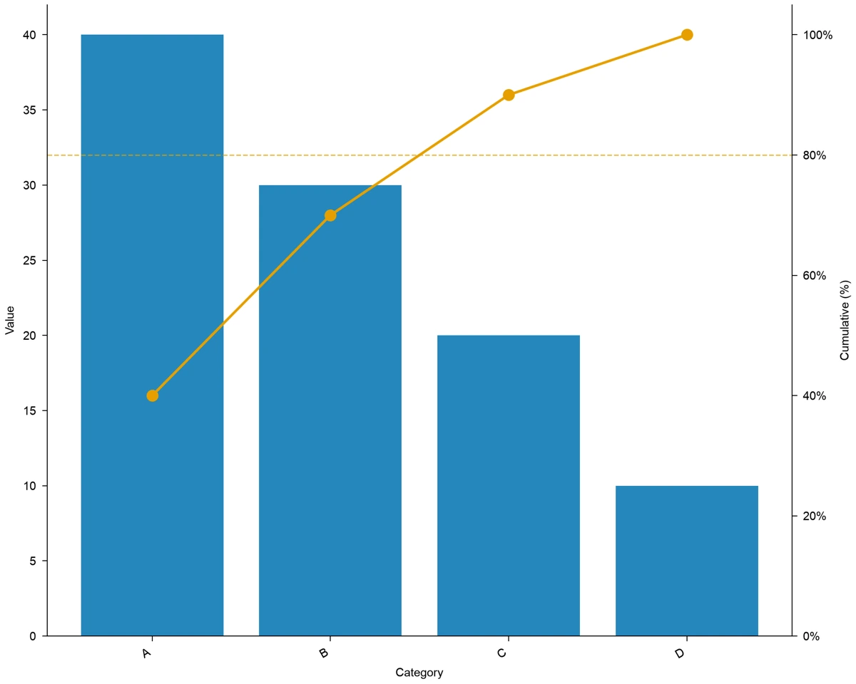
Combine the two A rows, 20 + 20 = 40, before sorting the category totals.
Explore this example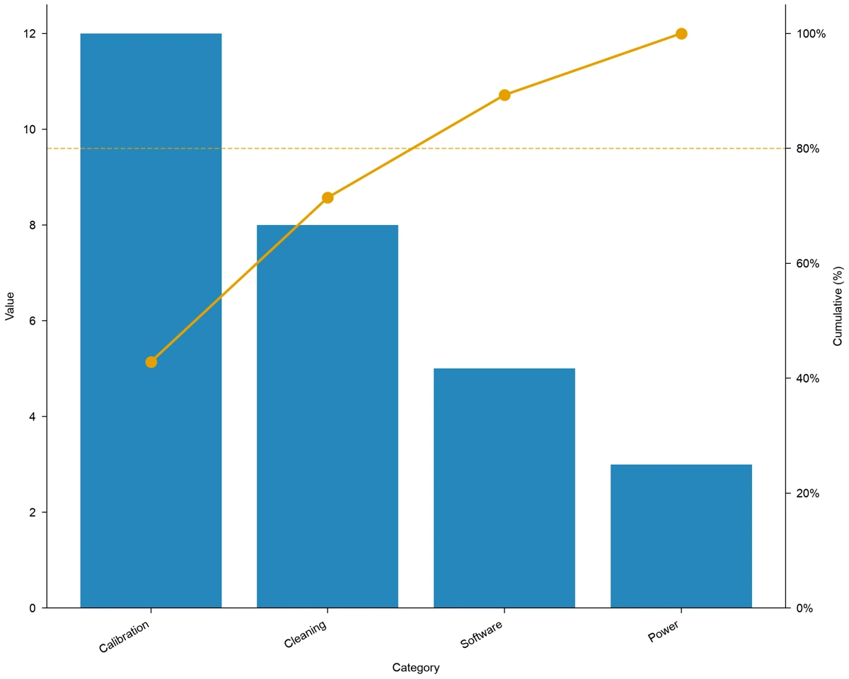
Compare downtime values for calibration 12, cleaning 8, software 5 and power 3.
Explore this example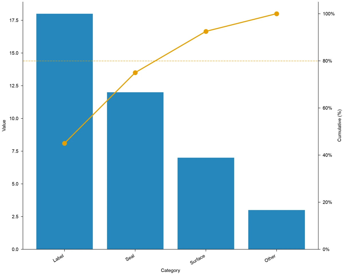
Compare defect counts for label 18, seal 12, surface 7 and other 3.
Explore this example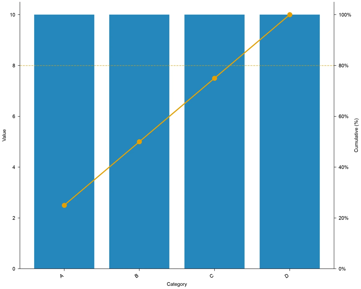
Compare four categories of 10; cumulative shares rise evenly through 25%, 50%, 75% and 100%.
Explore this exampleExport the chart alongside the input table so readers can see how categories were grouped and ordered.
Explore this exampleOur failed-run log contained repeated labels that made the largest causes hard to see. I used the Pareto chart maker with the recorded counts and reviewed how matching categories were combined. The ordered bars and cumulative line gave our quality meeting a clear starting point for choosing which problems to investigate first.
Marta Silva
Laboratory quality coordinator, University of Porto
Free tools
A tool for every scientific figure
97 focused generators for the scientific figure you need — each opens in the right workspace with a matching example.
Illustrations, structures and concept diagrams
44 tools Chemistry Structure Generator
 Graphical Abstract Maker
 Free Body Diagram Generator
 Circuit Diagram Maker
 AI Scientific Image Generator
 Editable 96-Well Plate
 Lewis Dot Structure Generator
 Scientific Poster Generator
 Cladogram Maker
 Food Web Maker
 Medical Illustration Generator
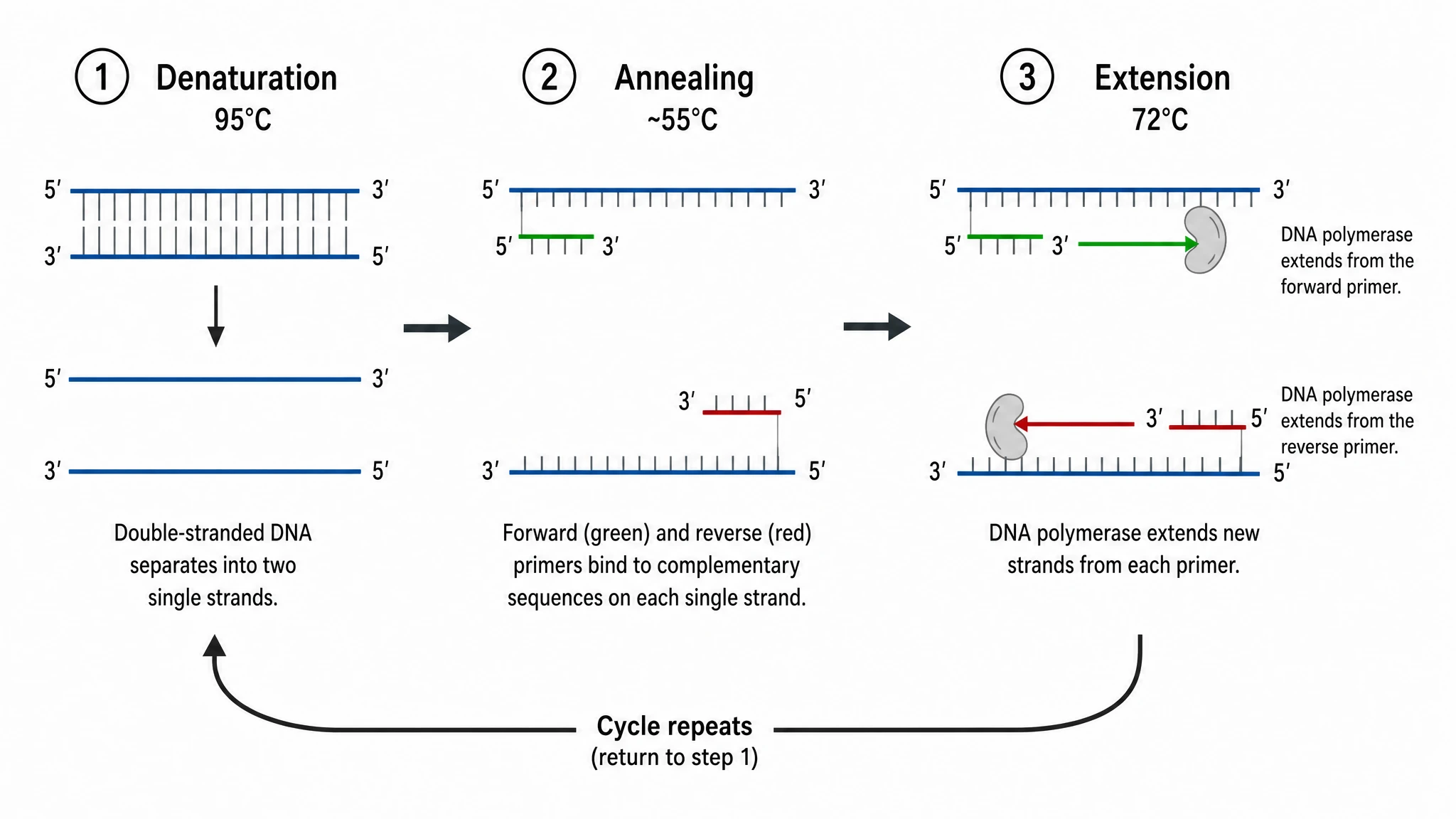 PCR Diagram Generator
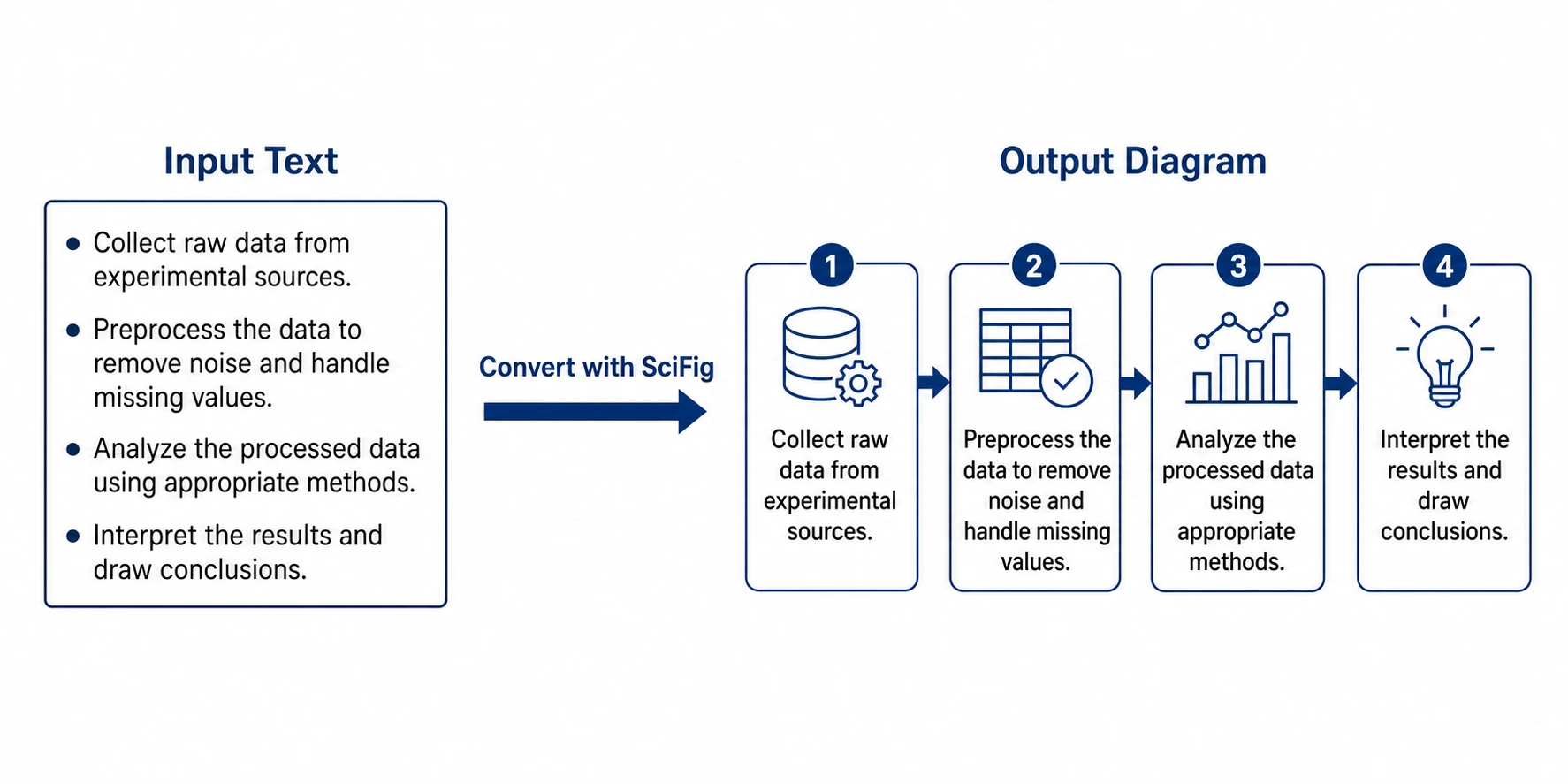 PPT Text to Visual Converter
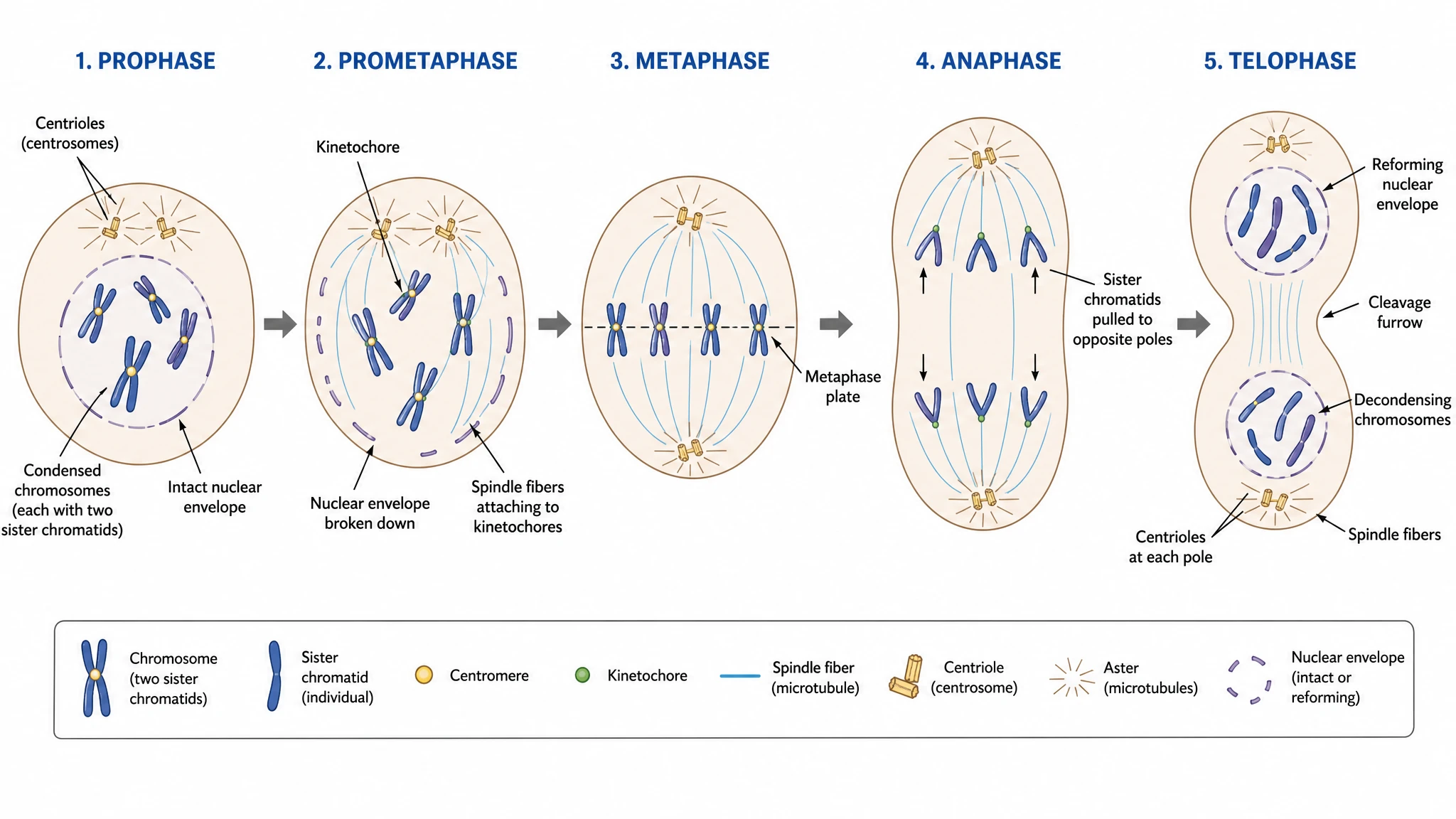 Mitosis Diagram Generator
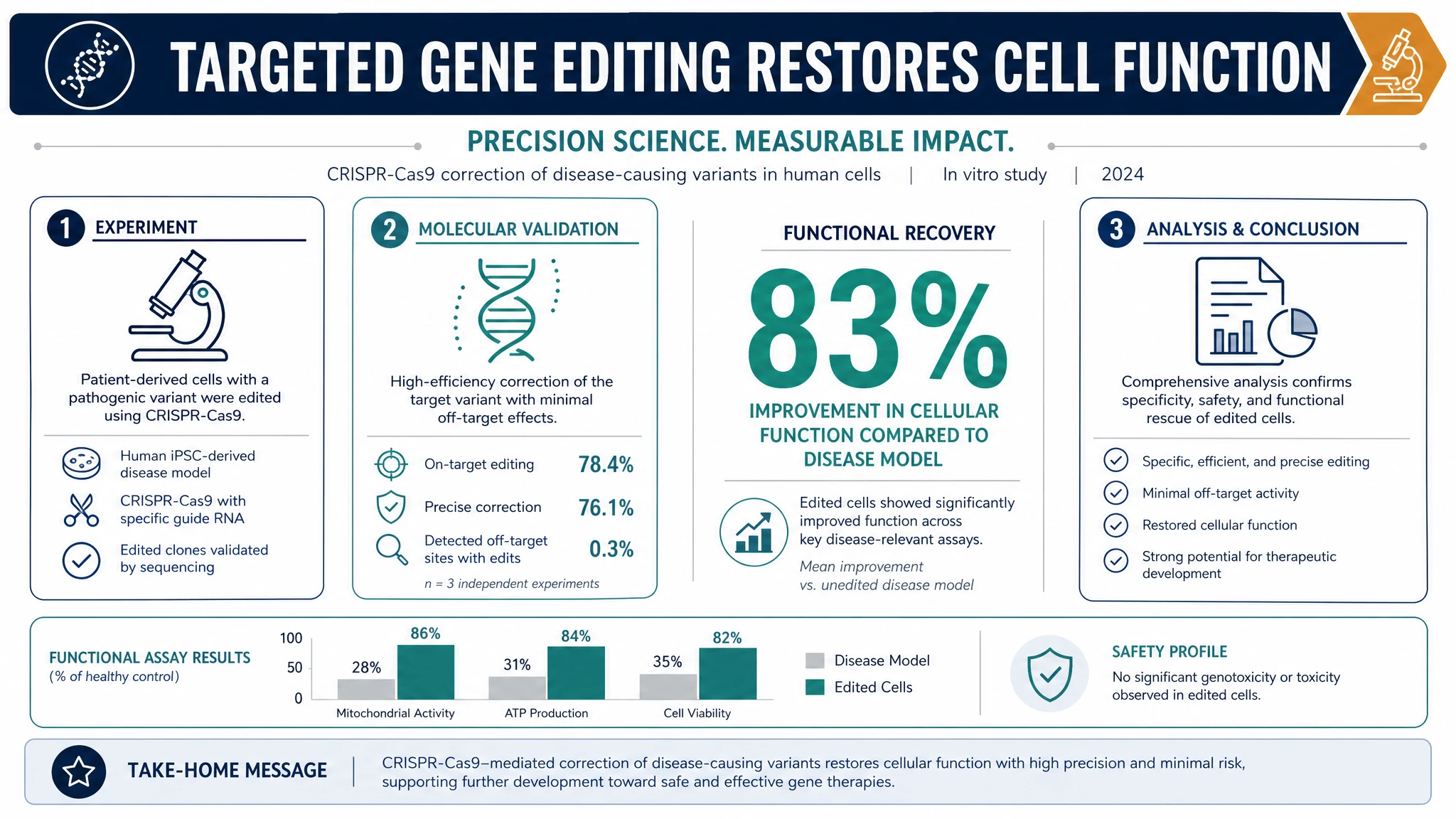 AI Infographic Generator
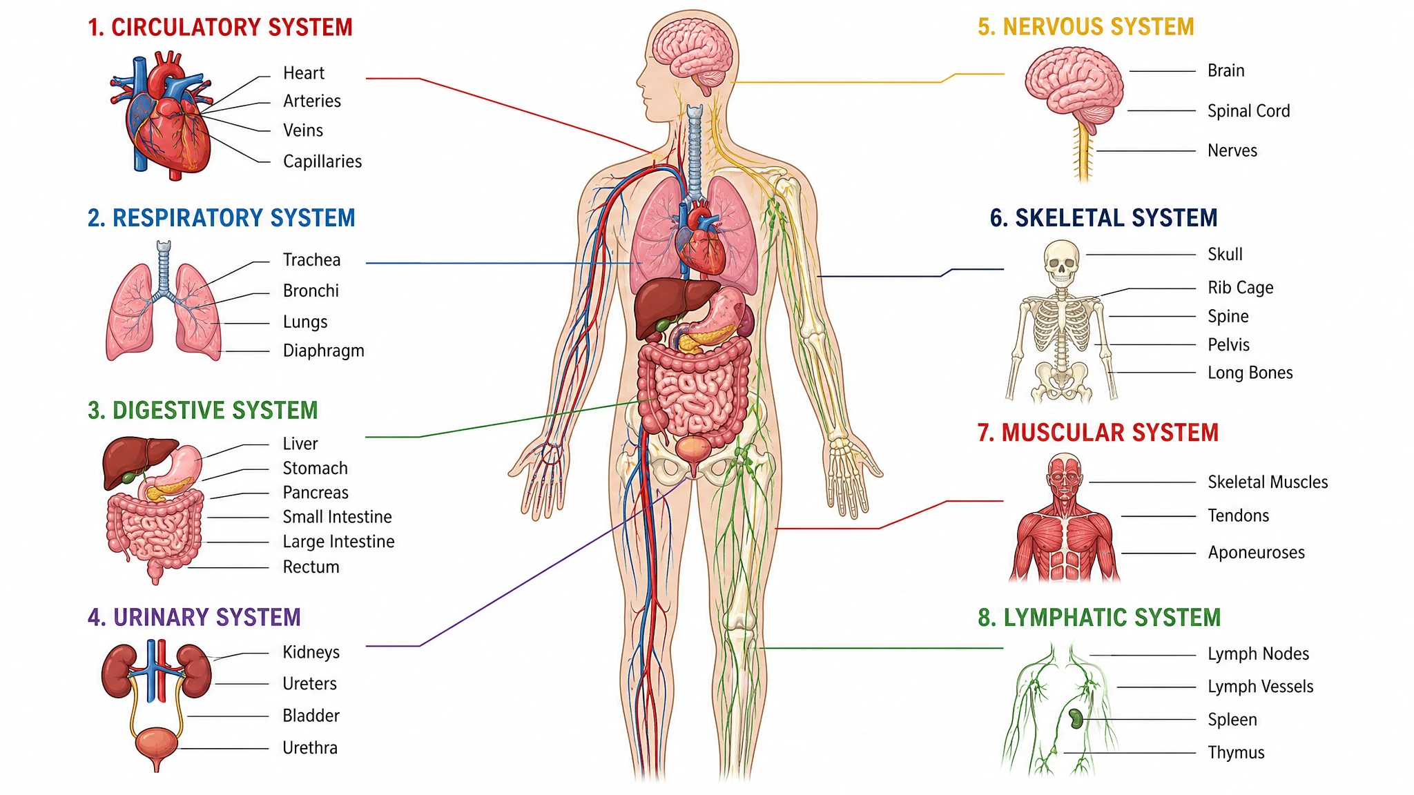 Anatomical Drawing Generator
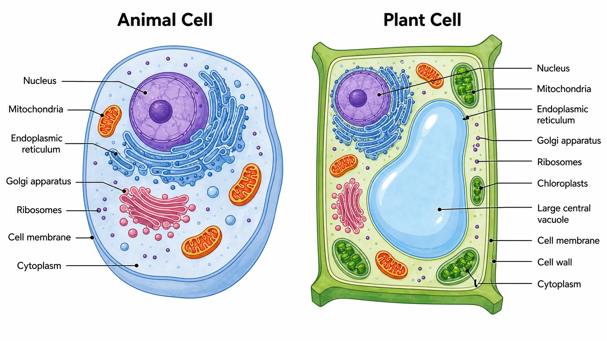 Animal and Plant Cell Comparison
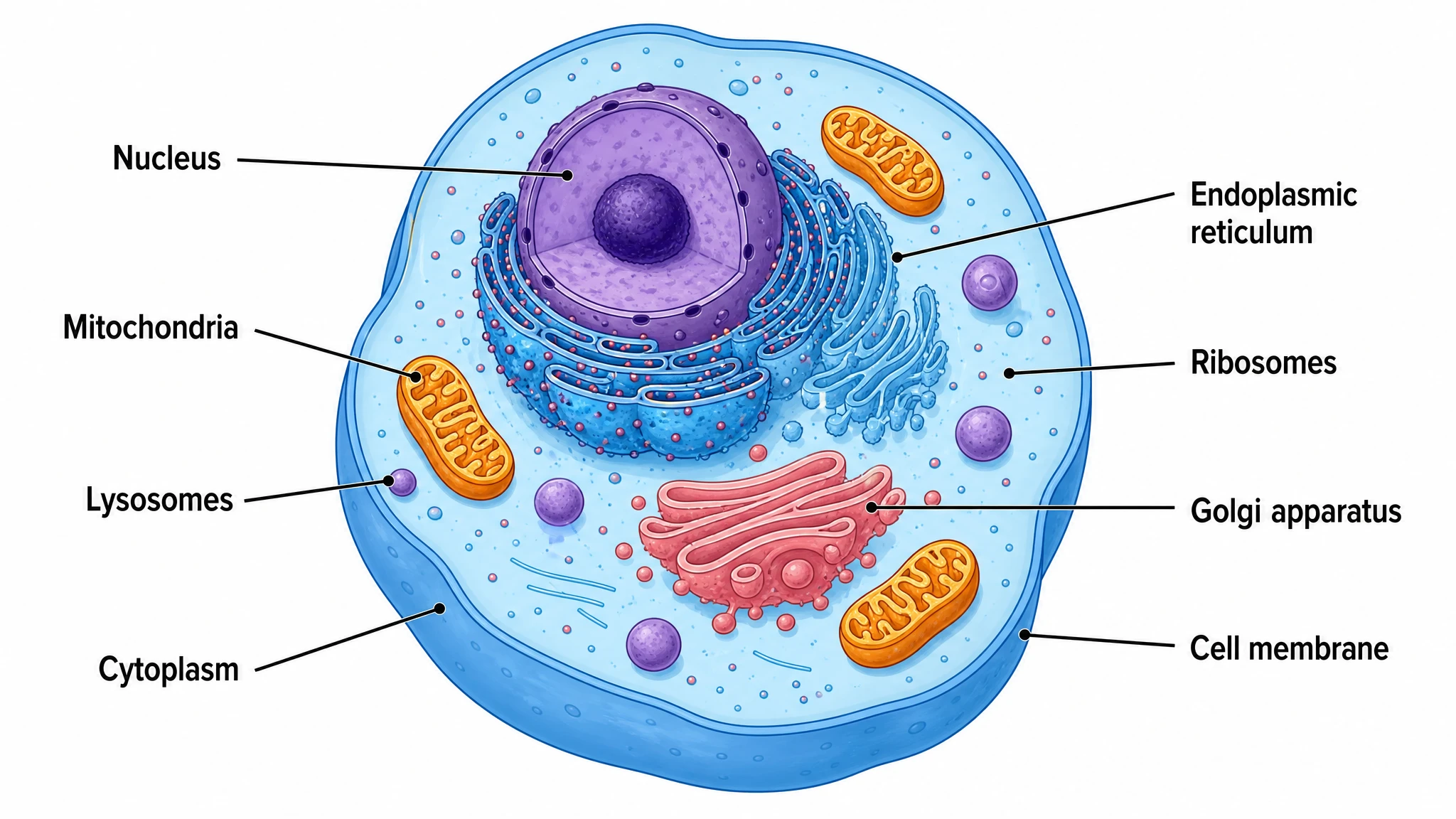 Animal Cell Diagram Generator
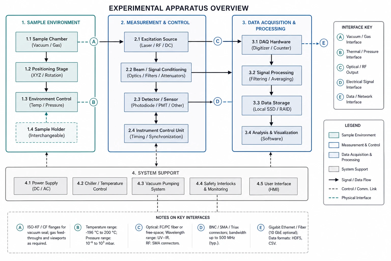 Blueprint Maker
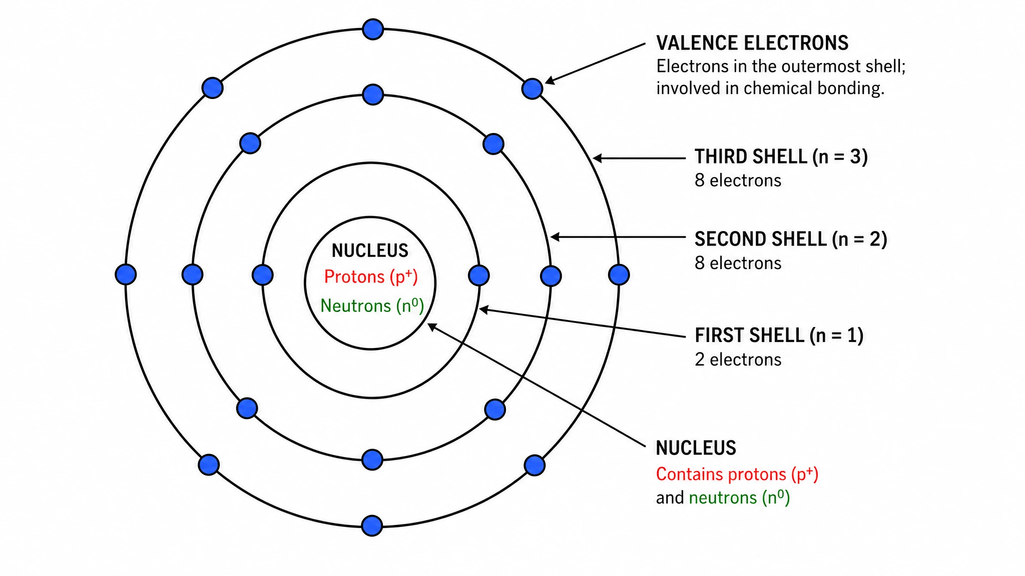 Bohr Model Maker
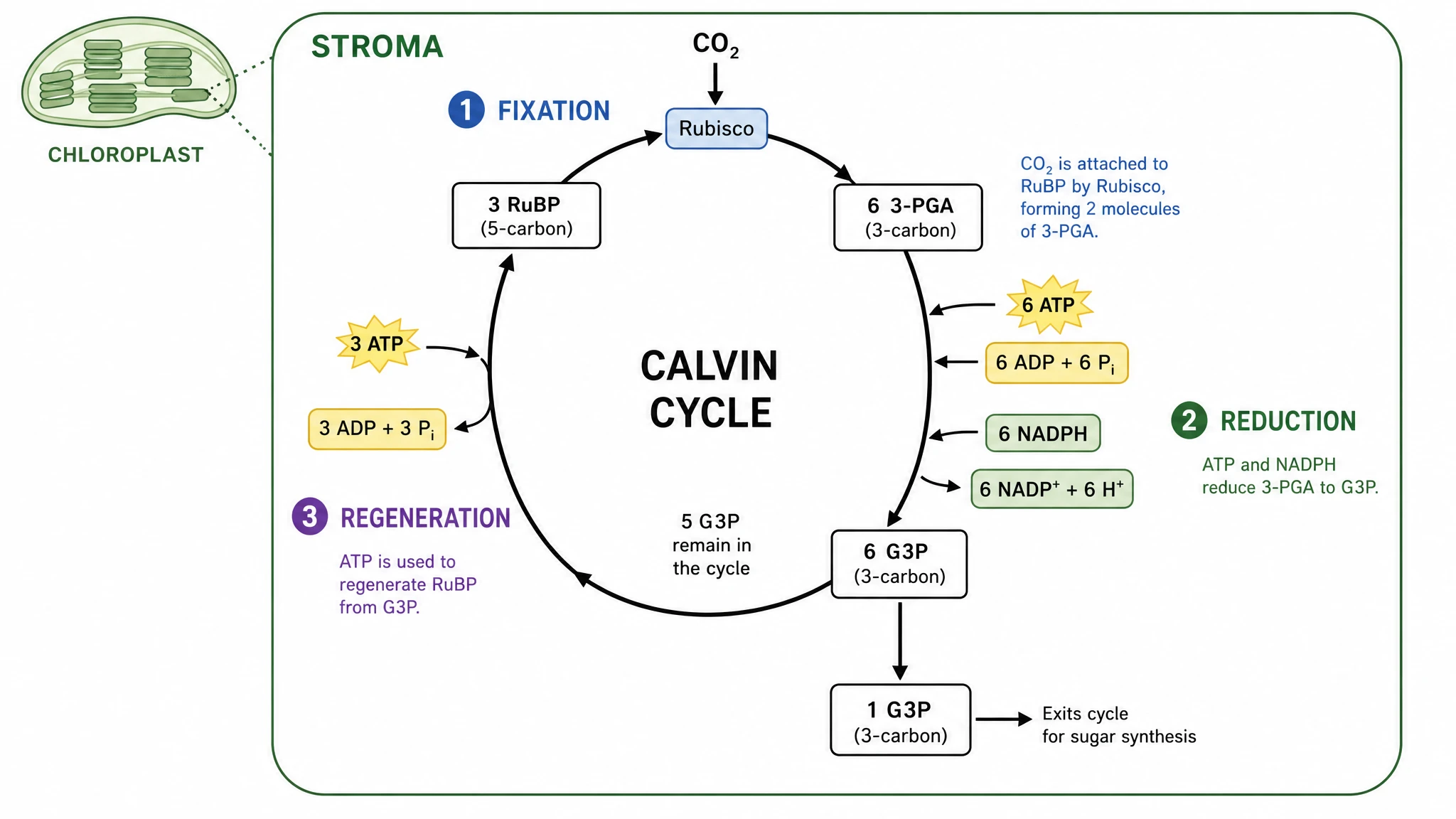 Calvin Cycle Diagram Generator
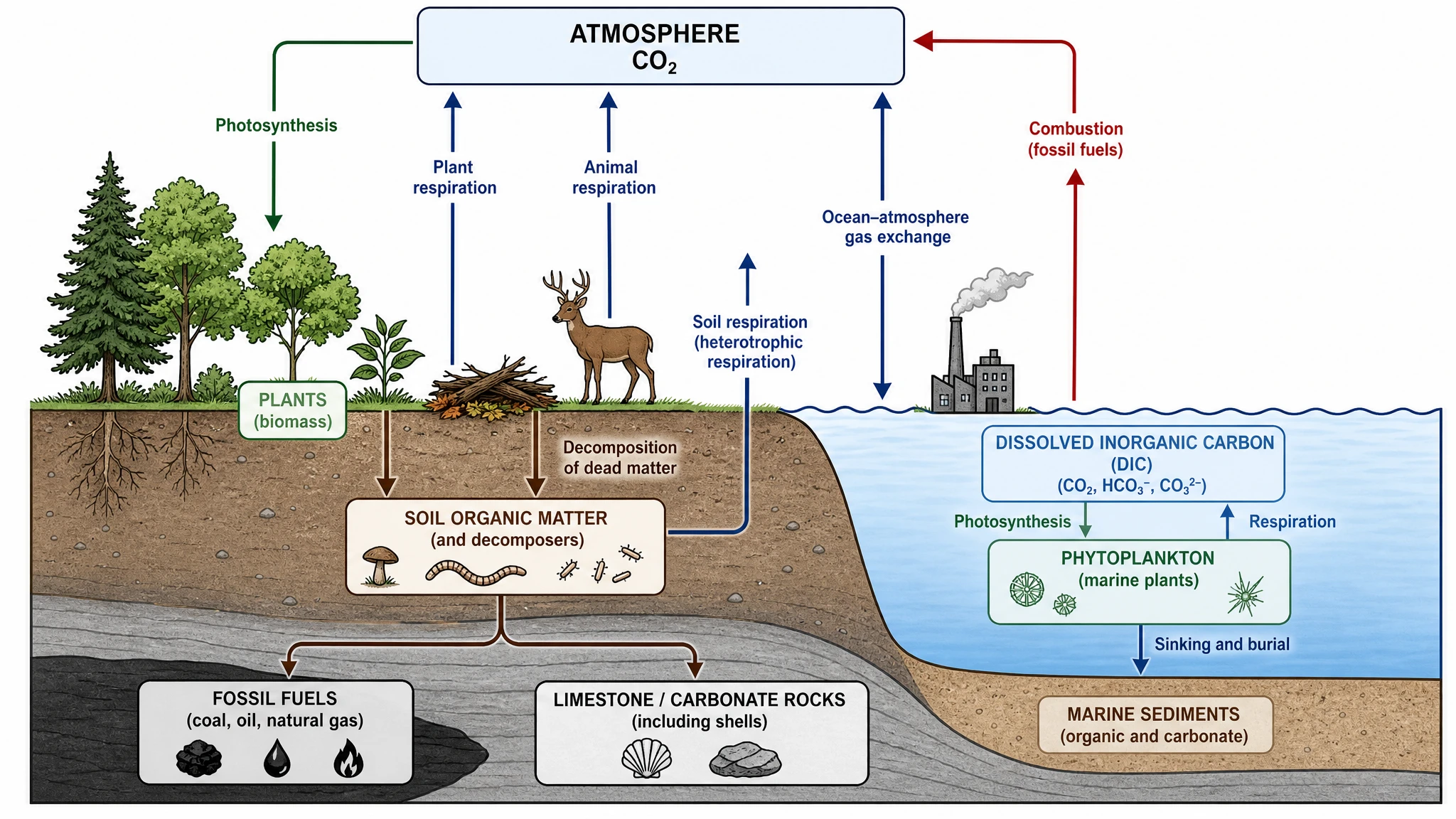 Carbon Cycle Diagram Generator
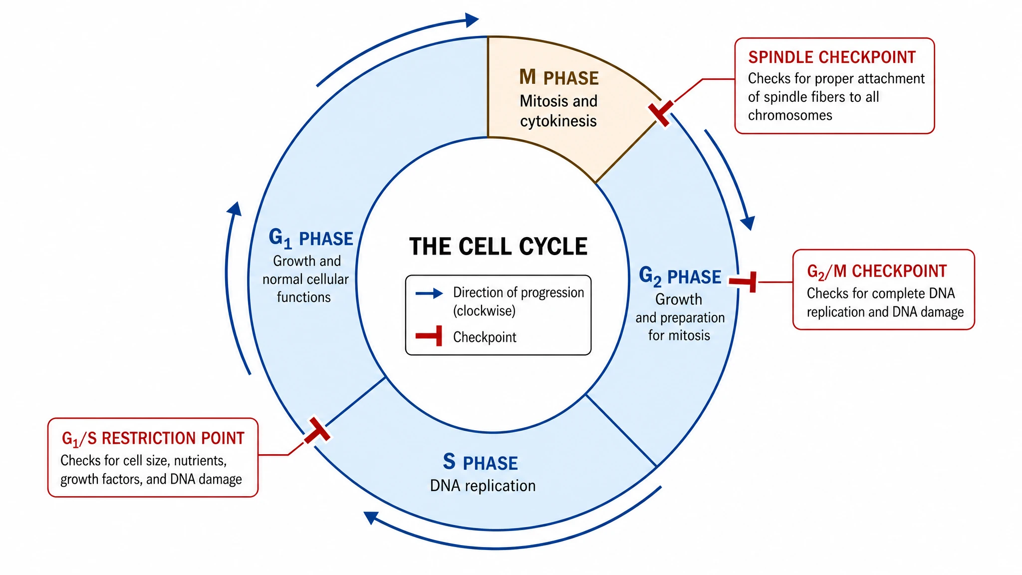 Cell Cycle Diagram Generator
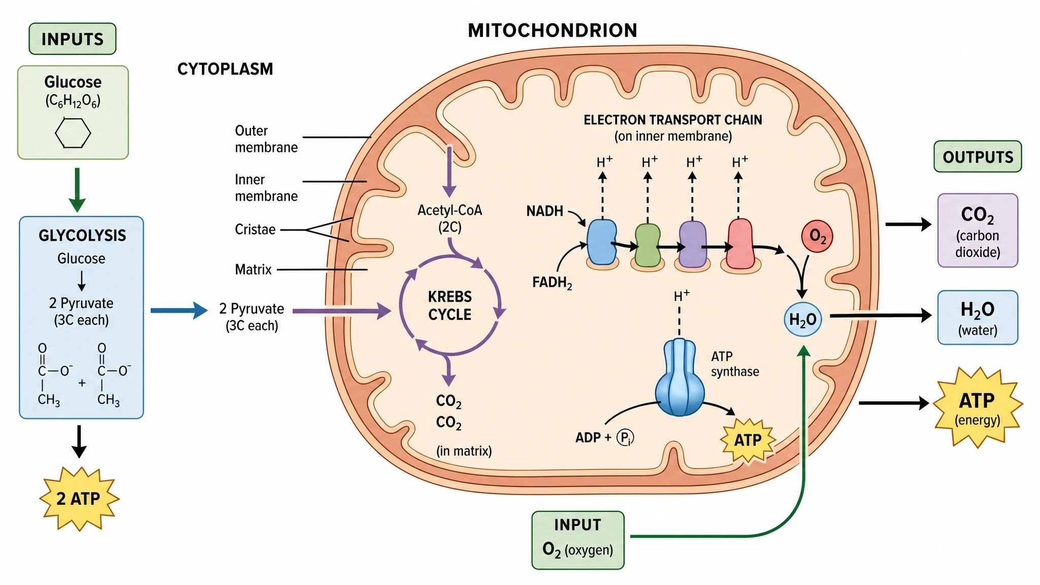 Cellular Respiration Diagram Generator
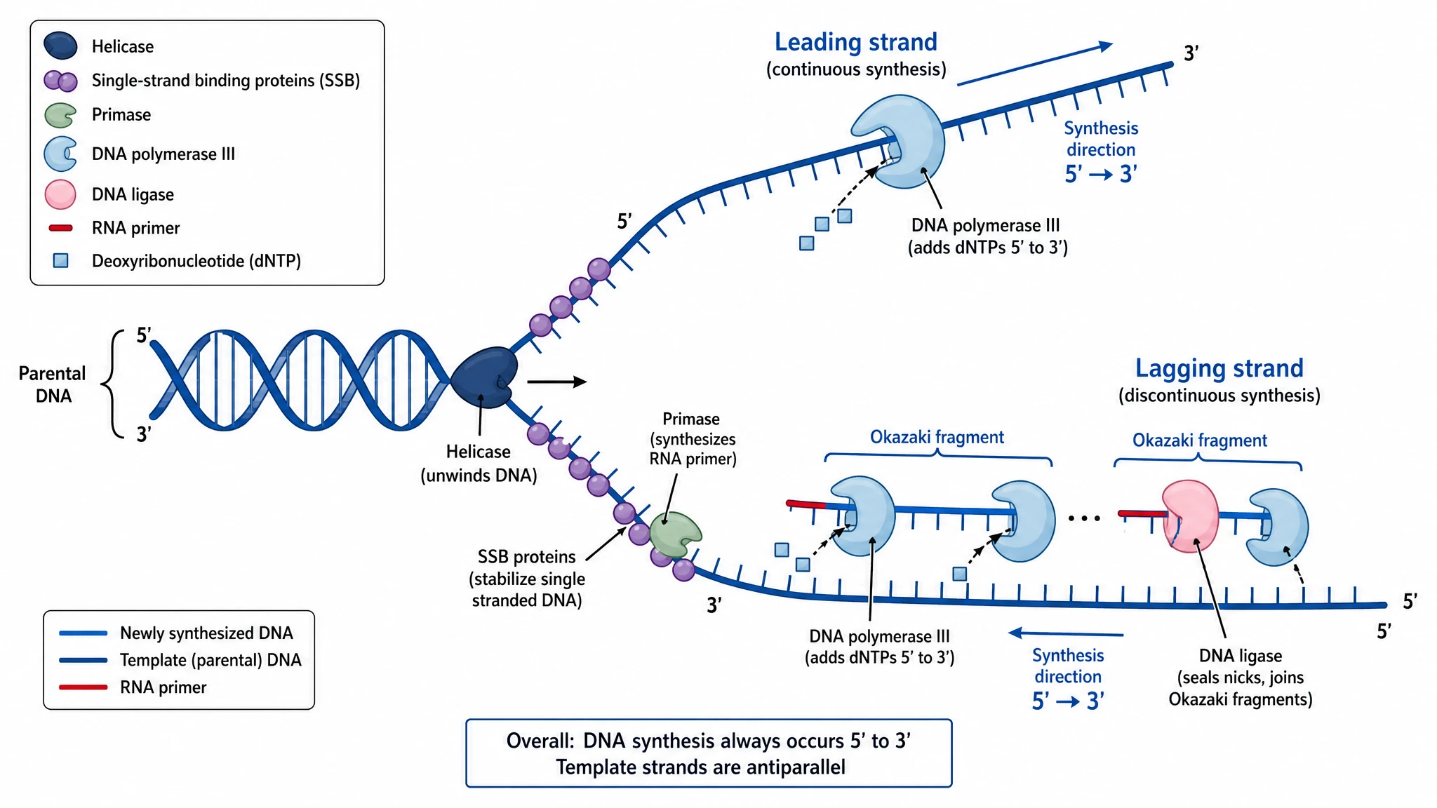 DNA Replication Diagram Generator
 Electron Transport Chain Diagram Generator
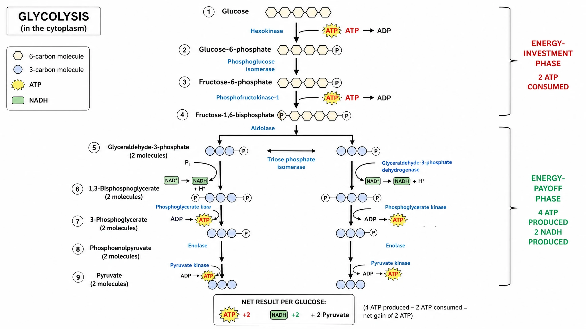 Glycolysis Diagram Generator
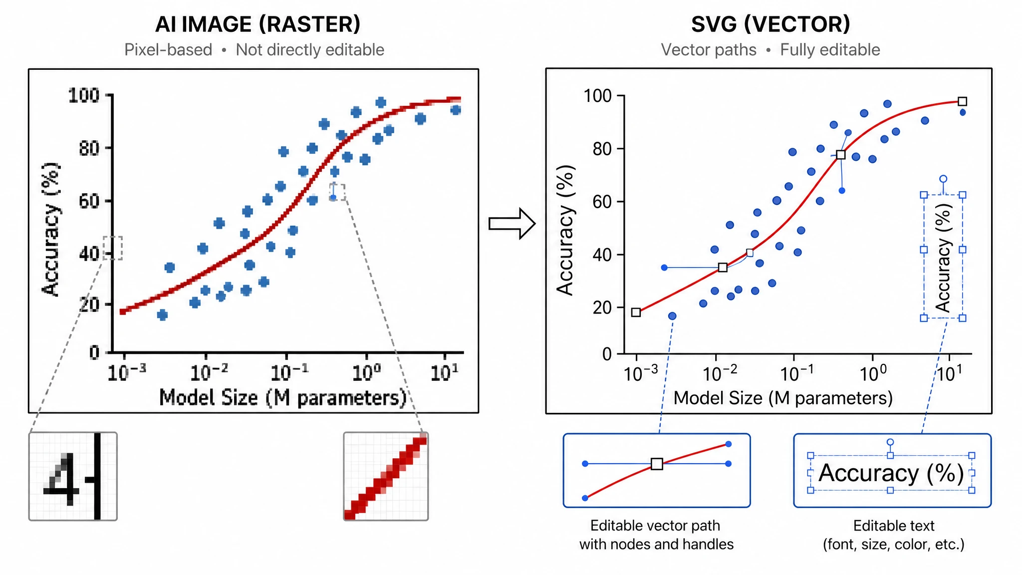 Image to Editable SVG Converter
 Krebs Cycle Diagram Generator
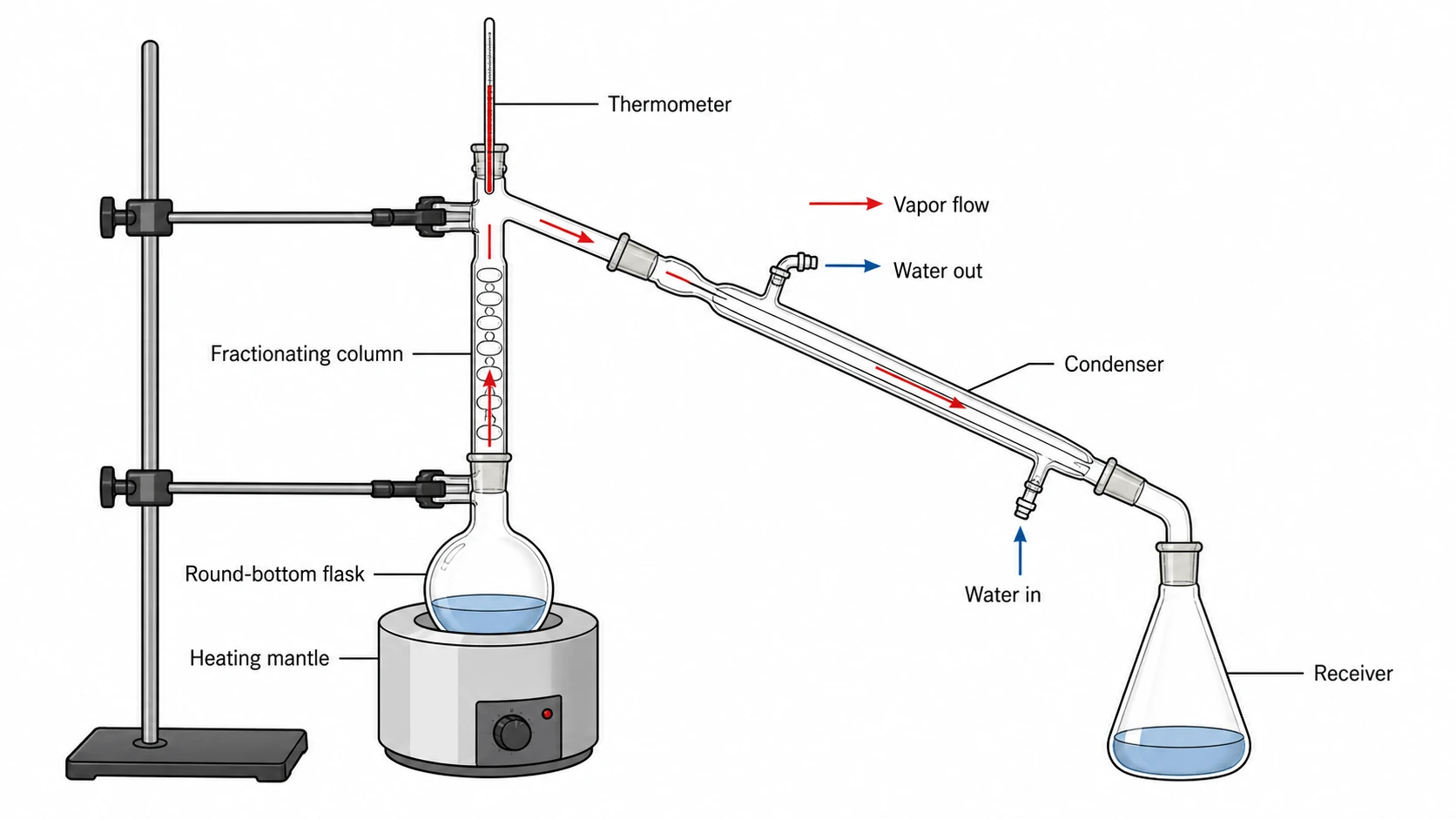 Lab Diagram Maker
 Meiosis Diagram Generator
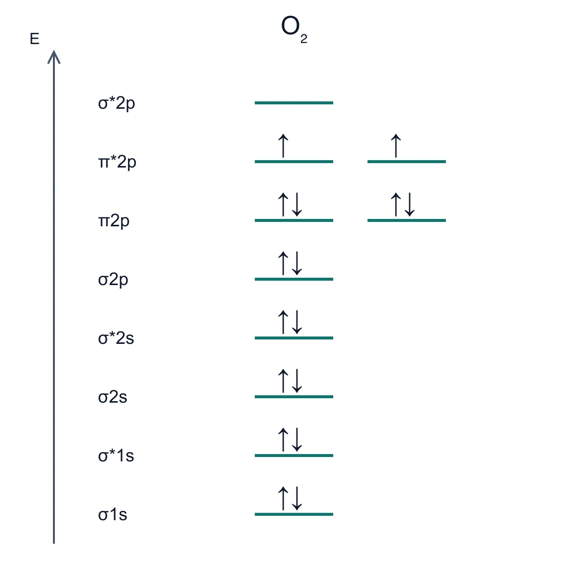 Molecular Orbital Diagram Generator
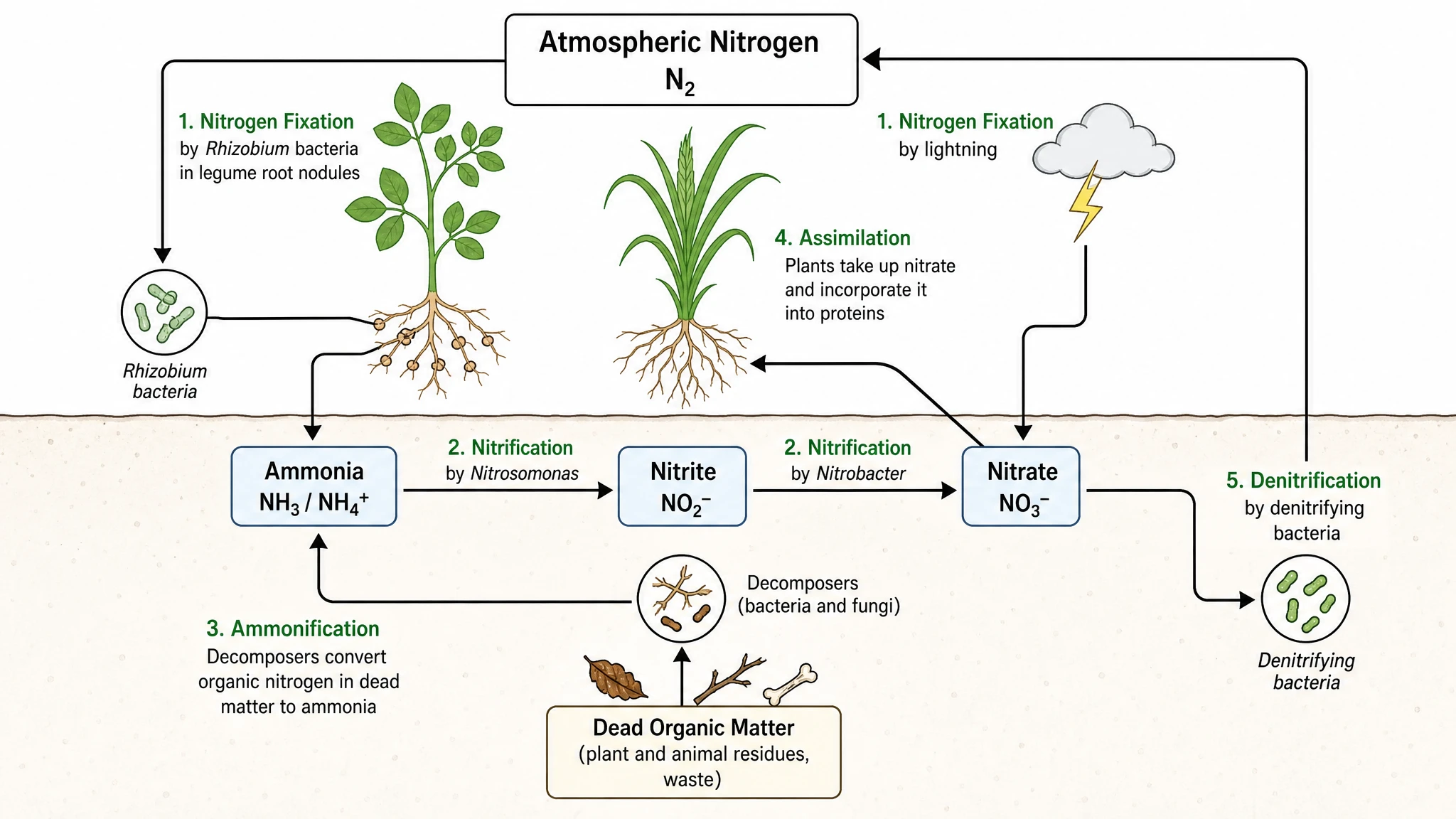 Nitrogen Cycle Diagram Generator
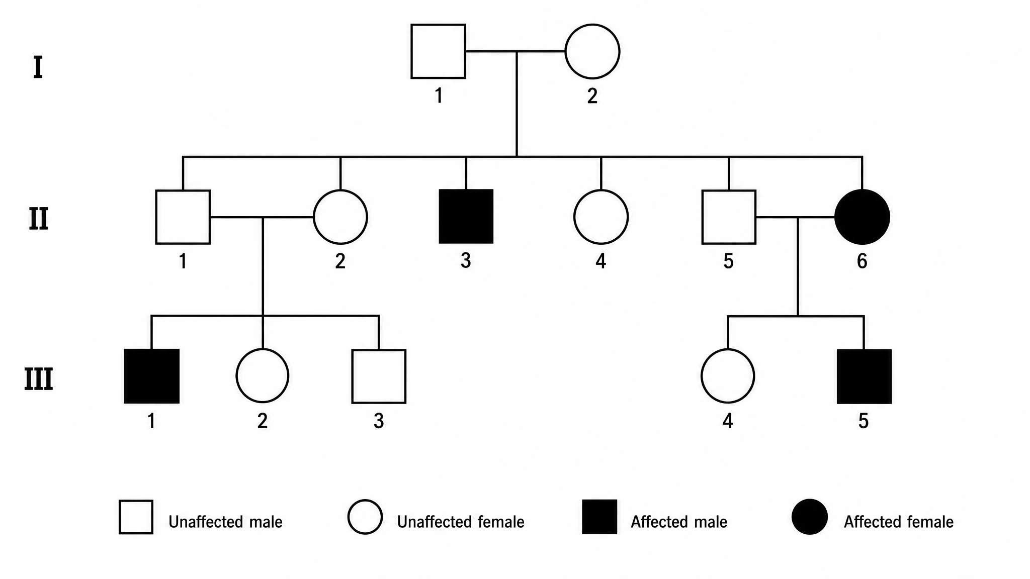 Pedigree Chart Maker
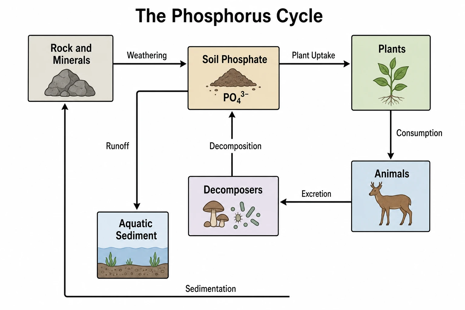 Phosphorus Cycle Diagram Generator
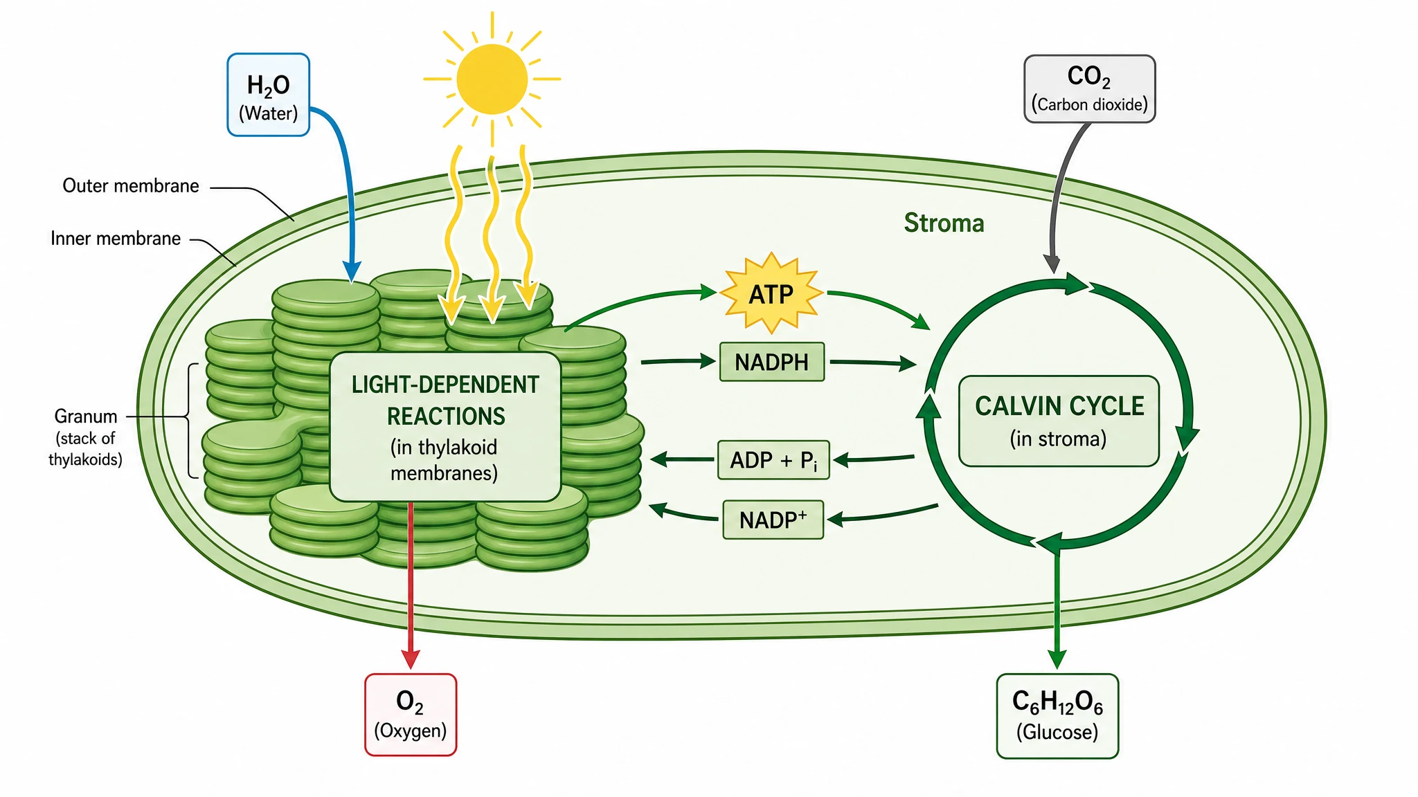 Photosynthesis Diagram Generator
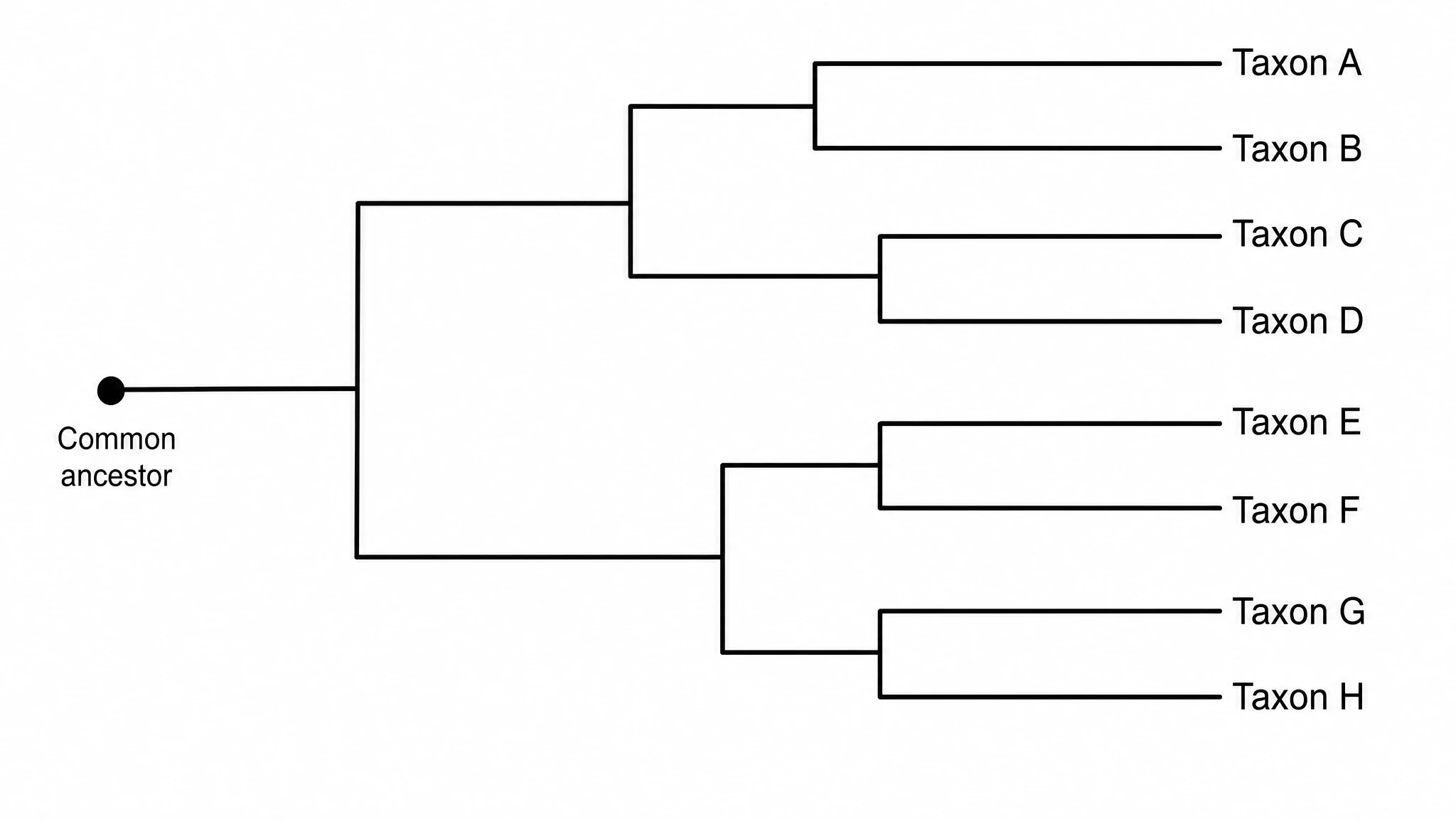 Phylogenetic Tree Maker
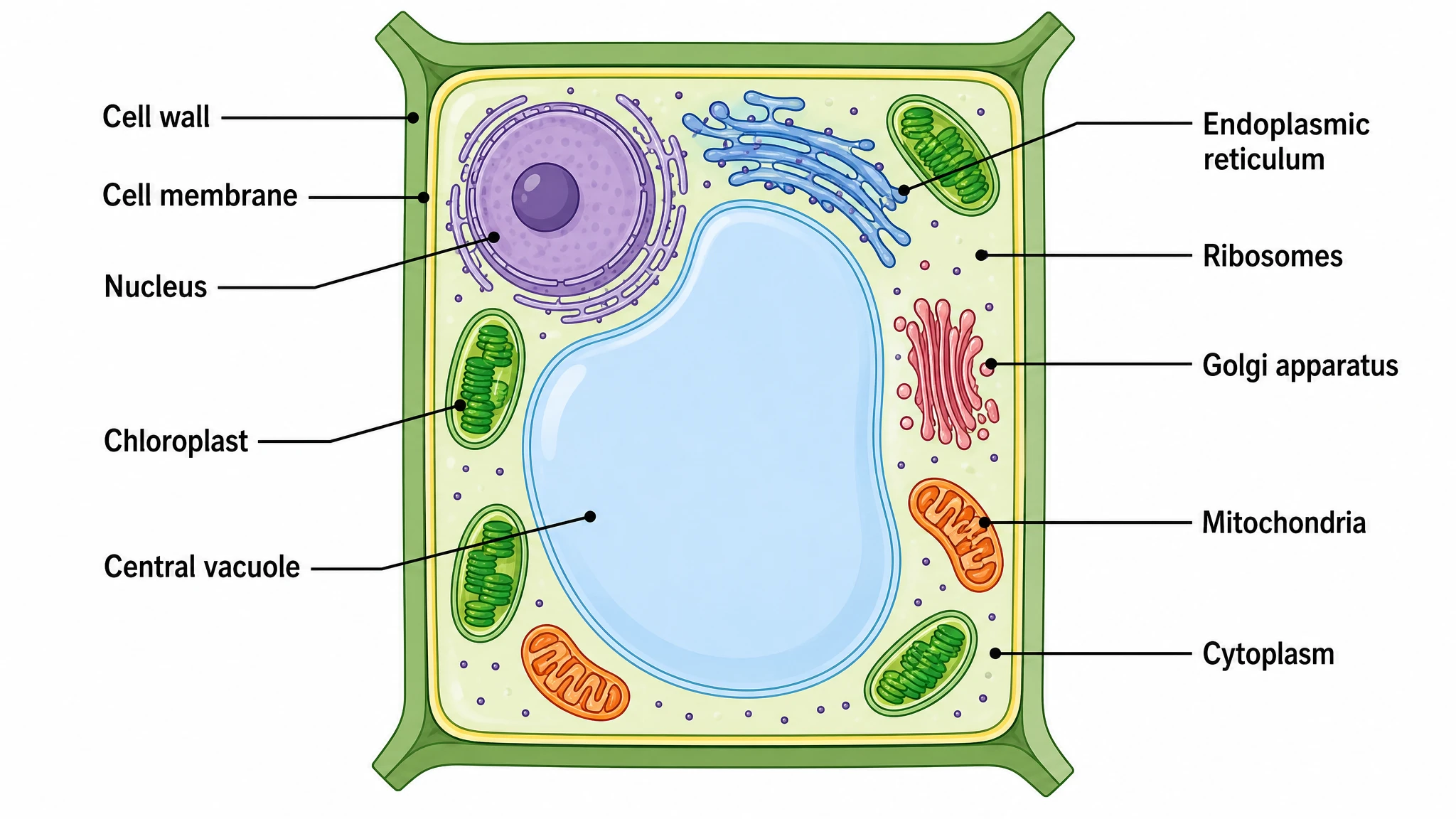 Plant Cell Diagram Generator
 Protein Synthesis Diagram Generator
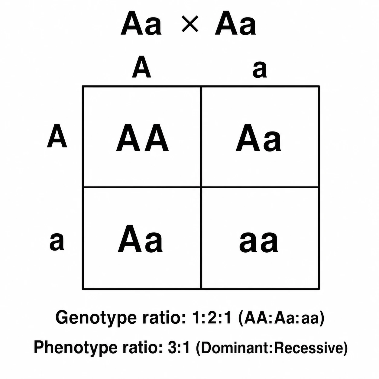 Punnett Square Maker
 Ray Diagram Maker
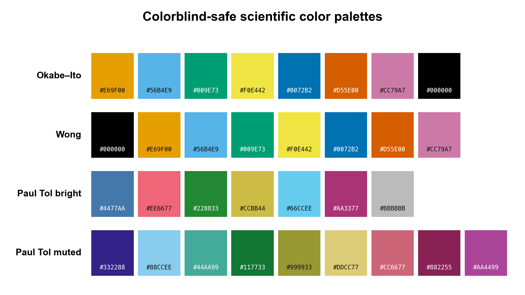 Scientific Color Palette Generator
 Water Cycle Diagram Generator
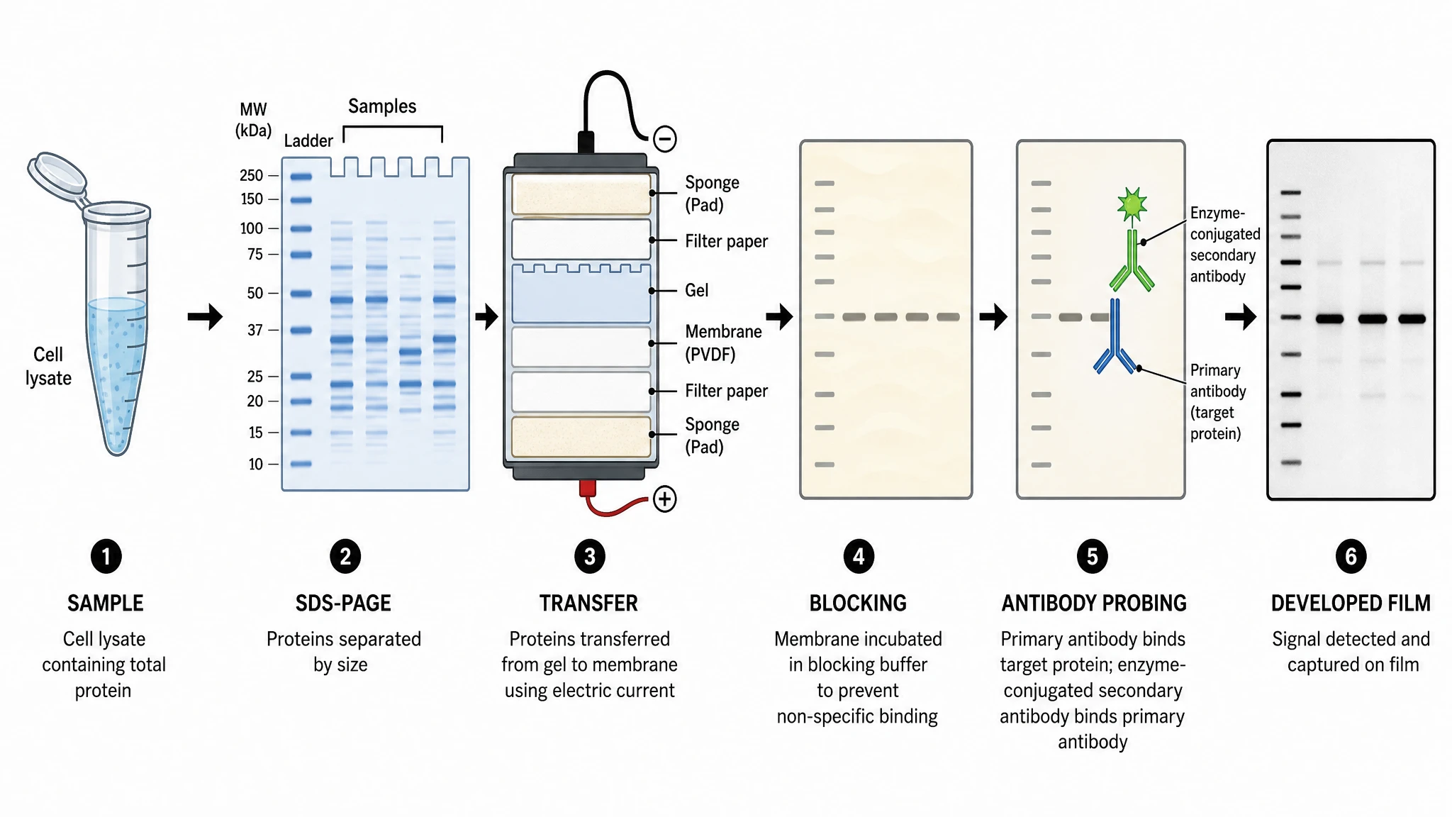 Western Blot Diagram Generator
Statistical charts and graphs
25 tools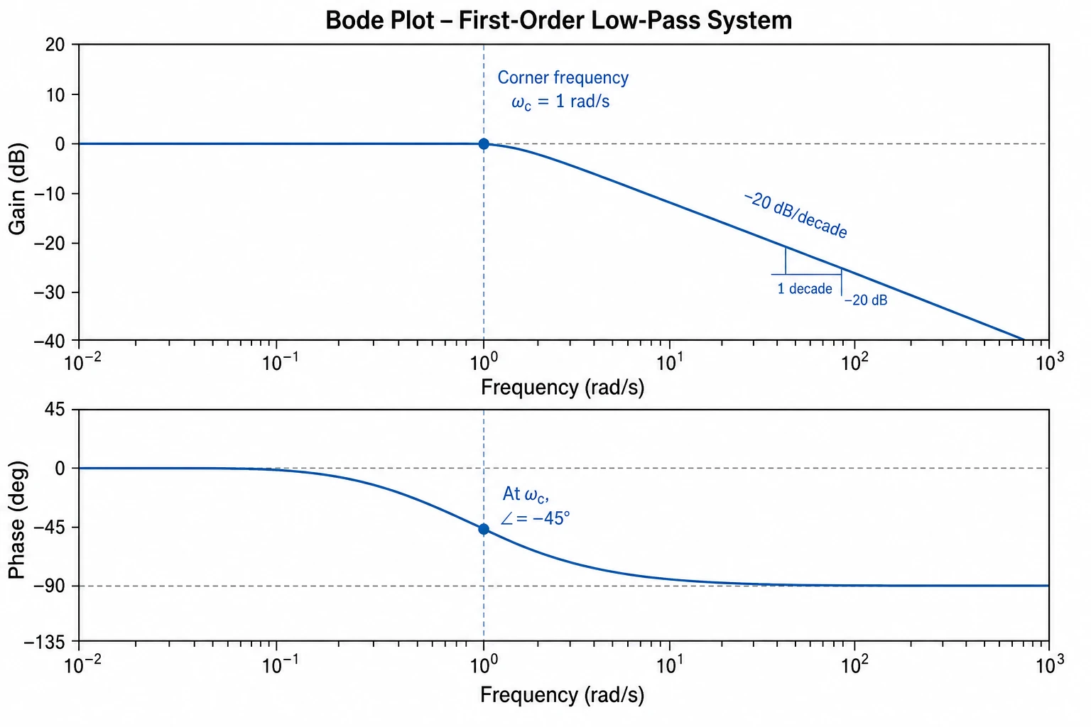 Bode Plot Generator
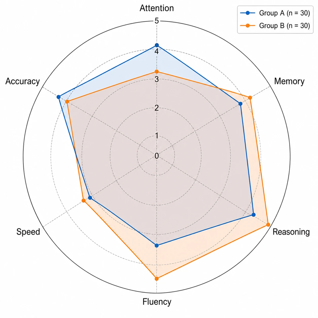 Spider Chart Maker
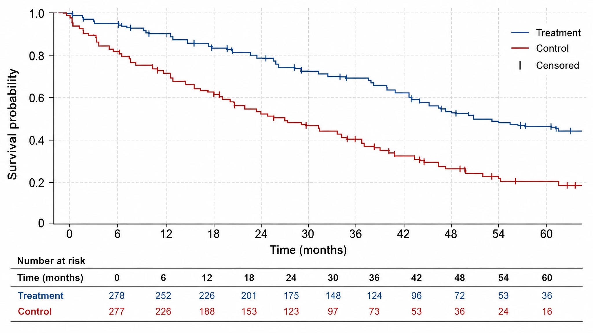 Kaplan-Meier Survival Curve
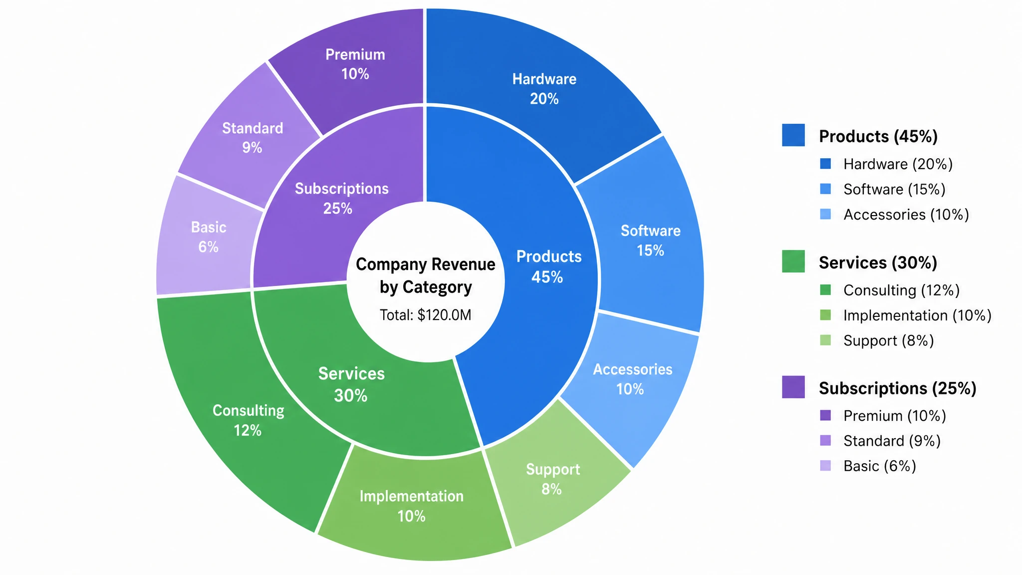 Multi-Layer Pie Chart Maker
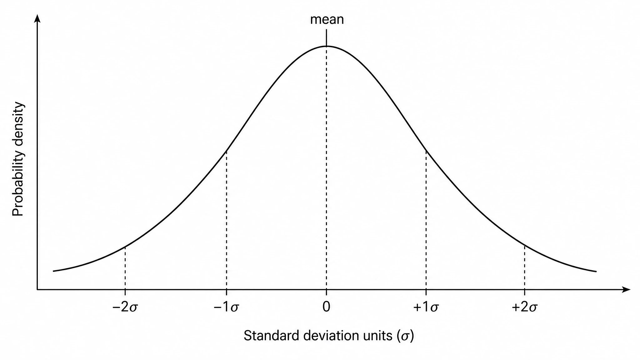 Bell Curve Generator
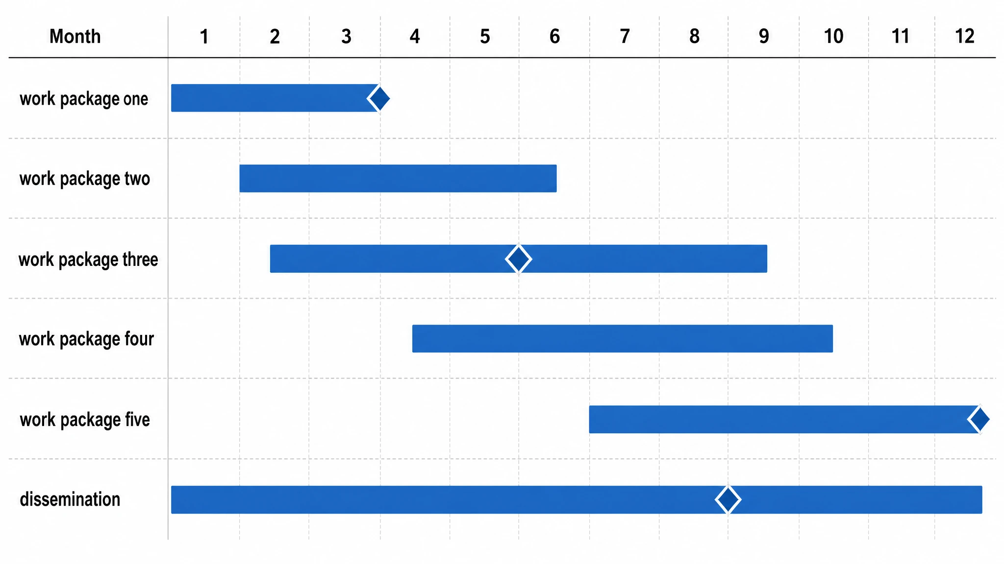 Gantt Chart Generator
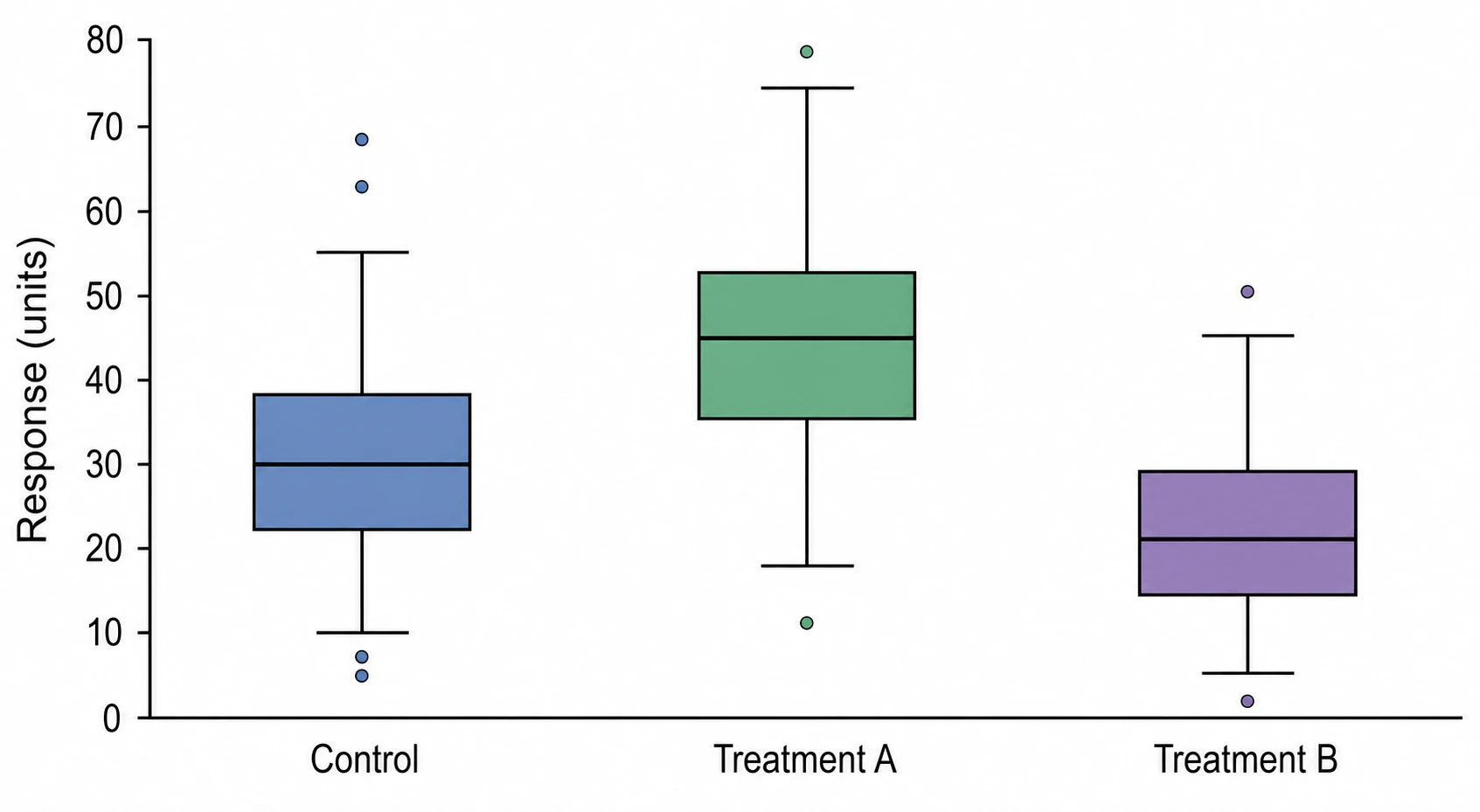 Box Plot Generator
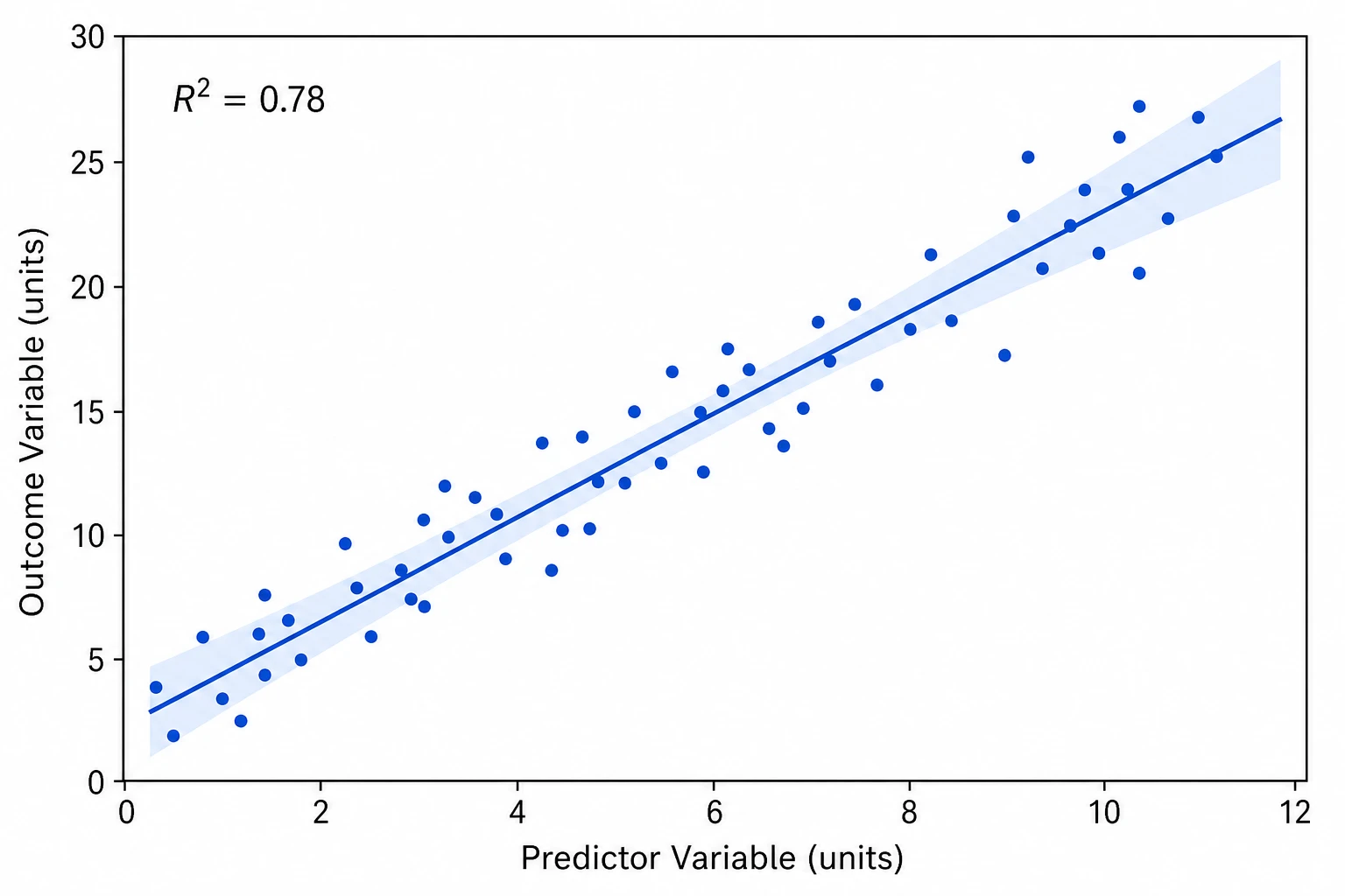 Scatter Plot Maker
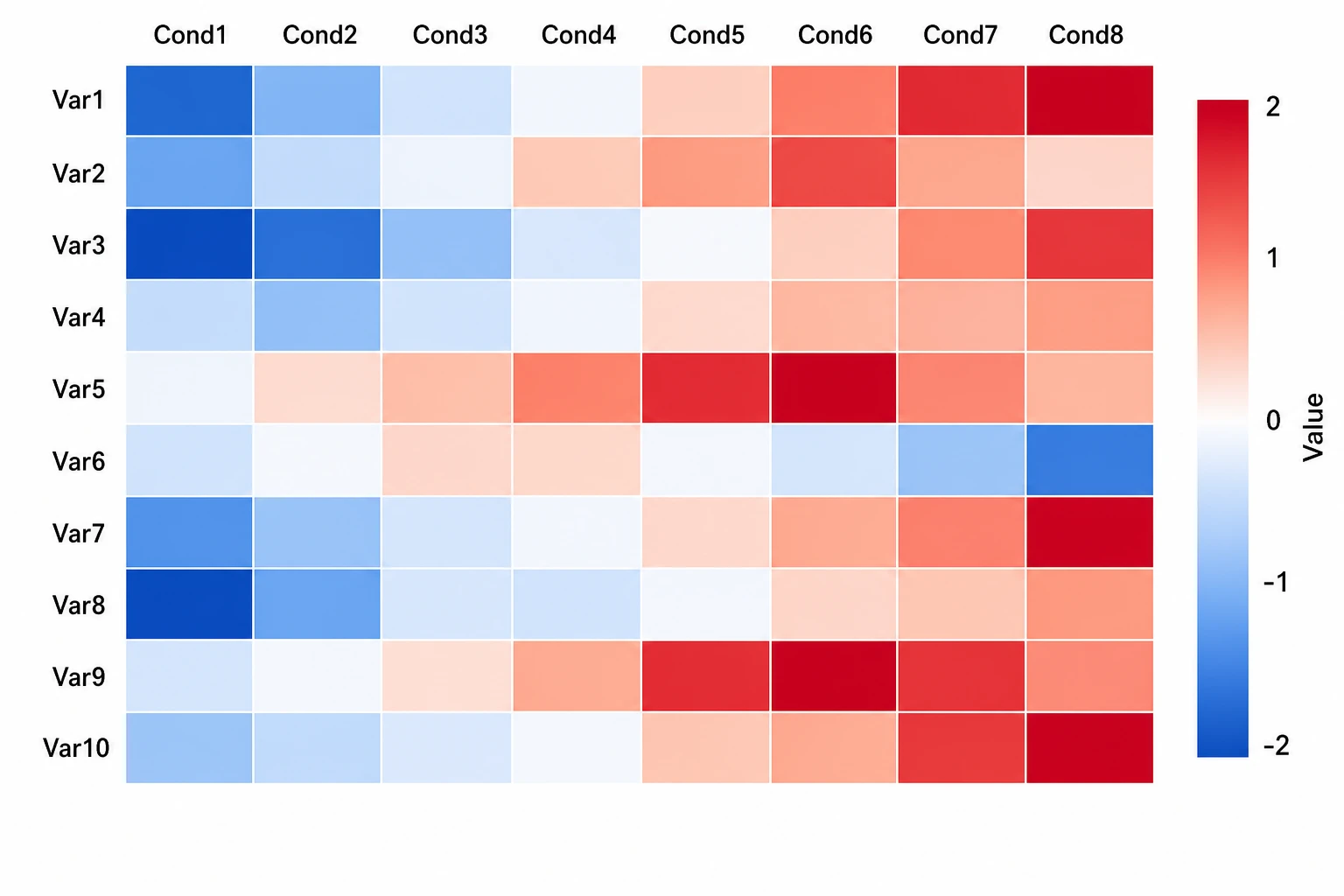 Heatmap Generator
 AI Chart Generator
 Comparison Chart Maker
 Sankey Diagram Generator
 Radar Chart Generator
 Histogram Maker
 Bar Chart Generator
 Coordinate Plane Generator
 Dot Plot Creator
 Forest Plot Generator
 Image DPI Calculator
 Line Chart Generator
 Number Line GeneratorPareto Chart Maker
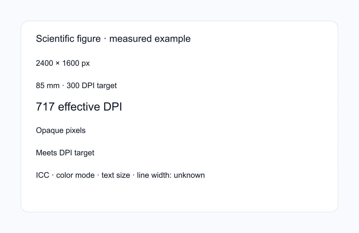 Figure Checker
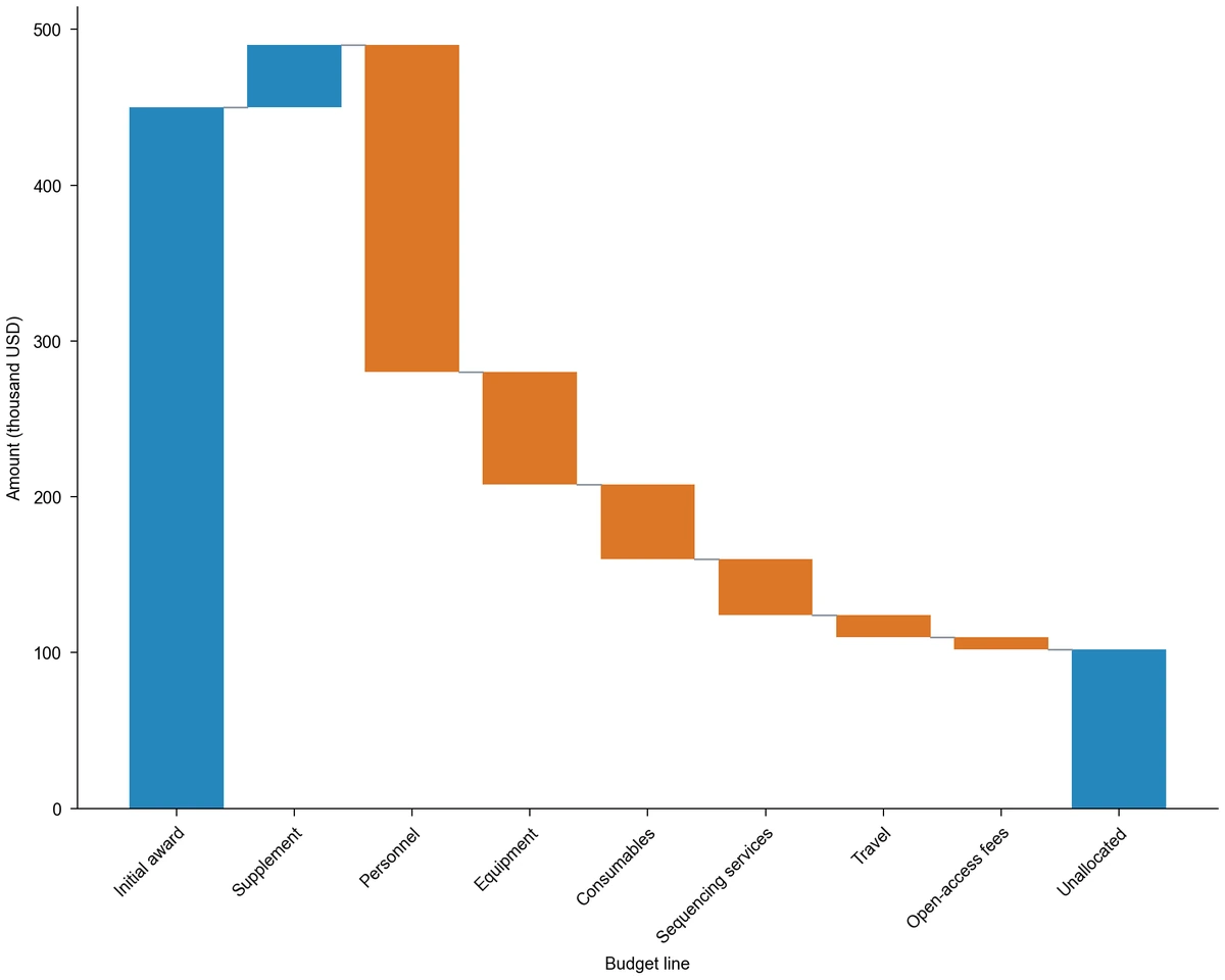 Waterfall Chart Maker
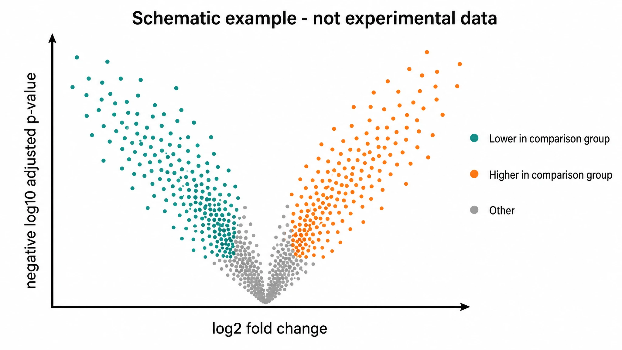 Volcano Plot Generator
Flowcharts, frameworks and structure diagrams
28 tools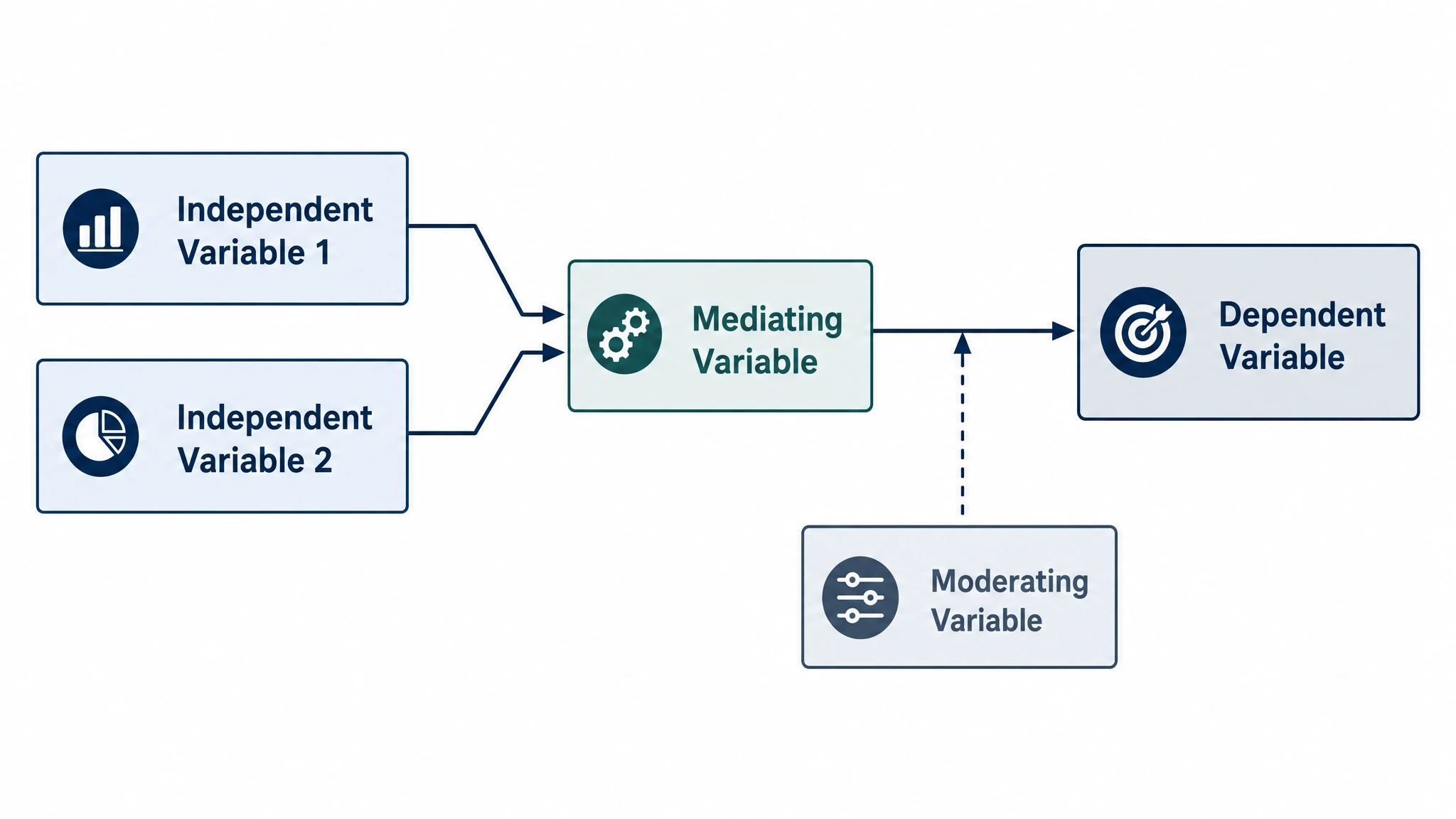 Conceptual Framework Generator
 Theoretical Framework Generator
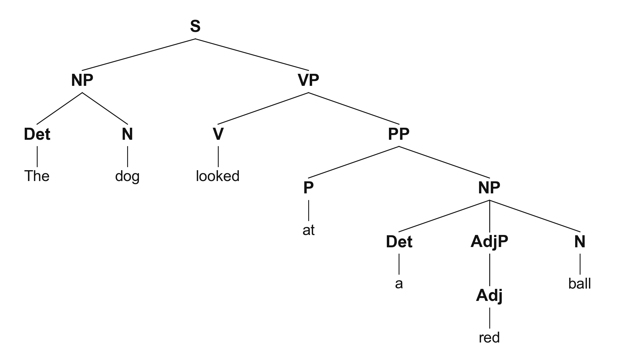 Syntactic Tree Generator
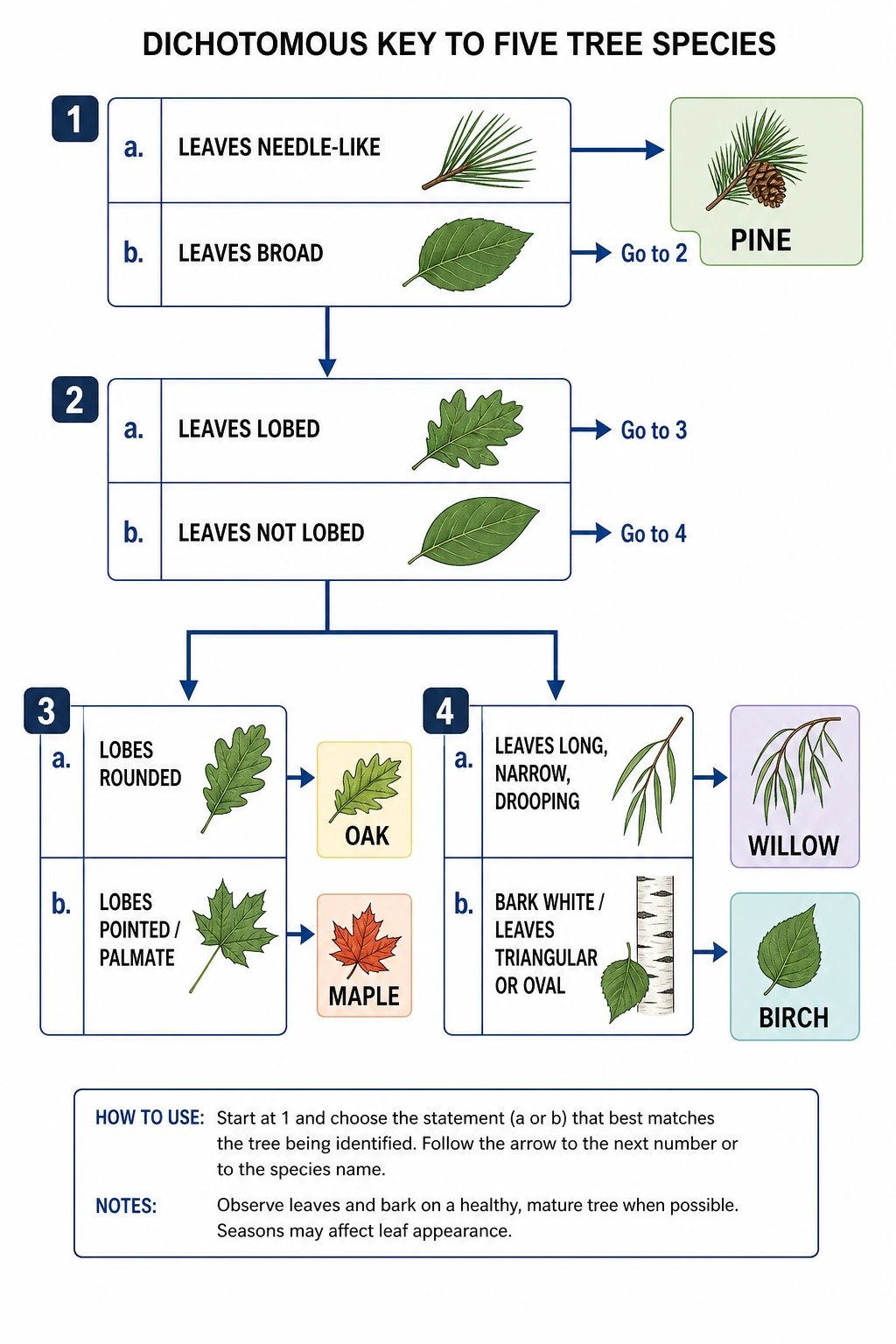 Dichotomous Key Maker
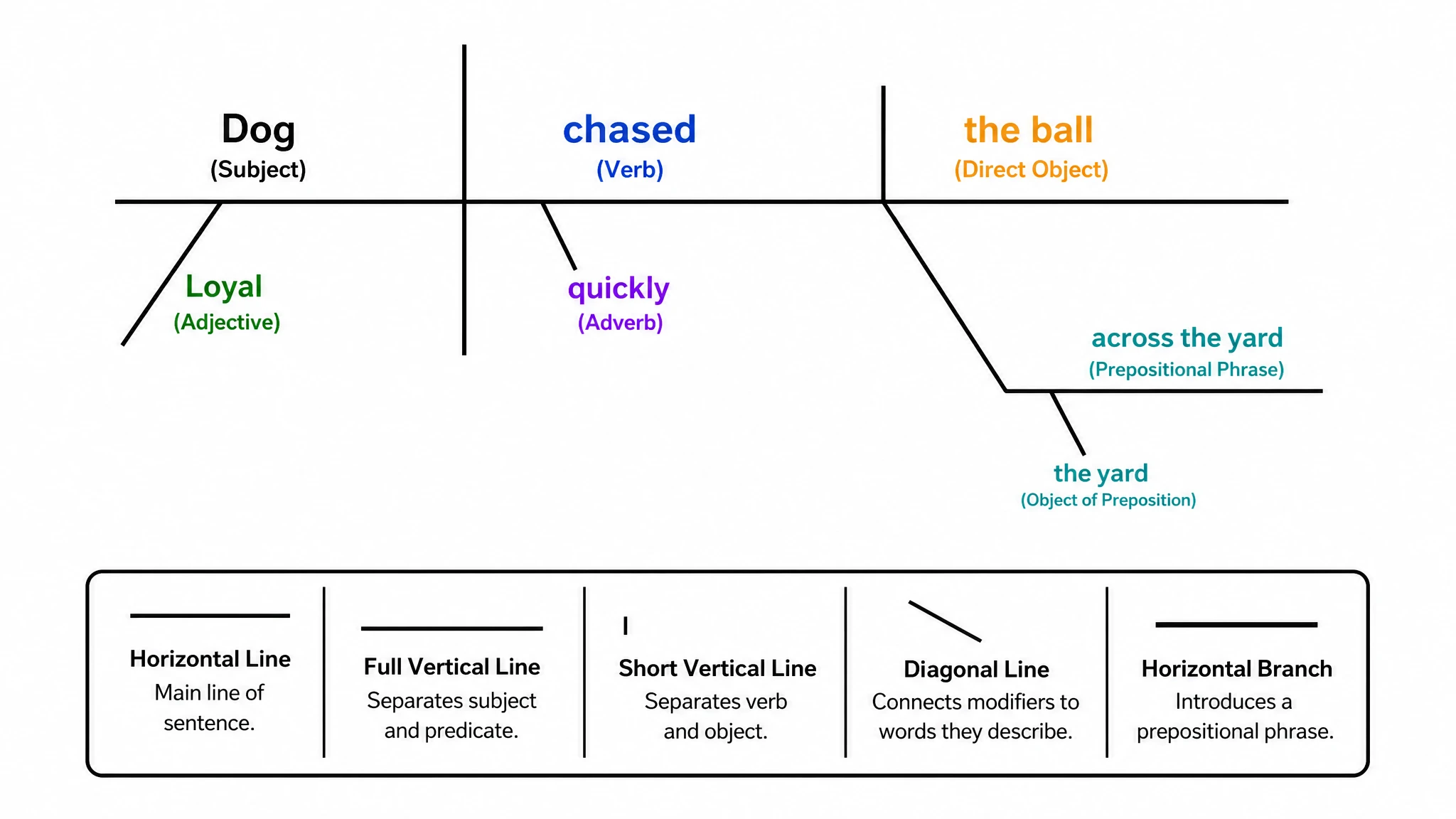 Sentence Diagram Generator
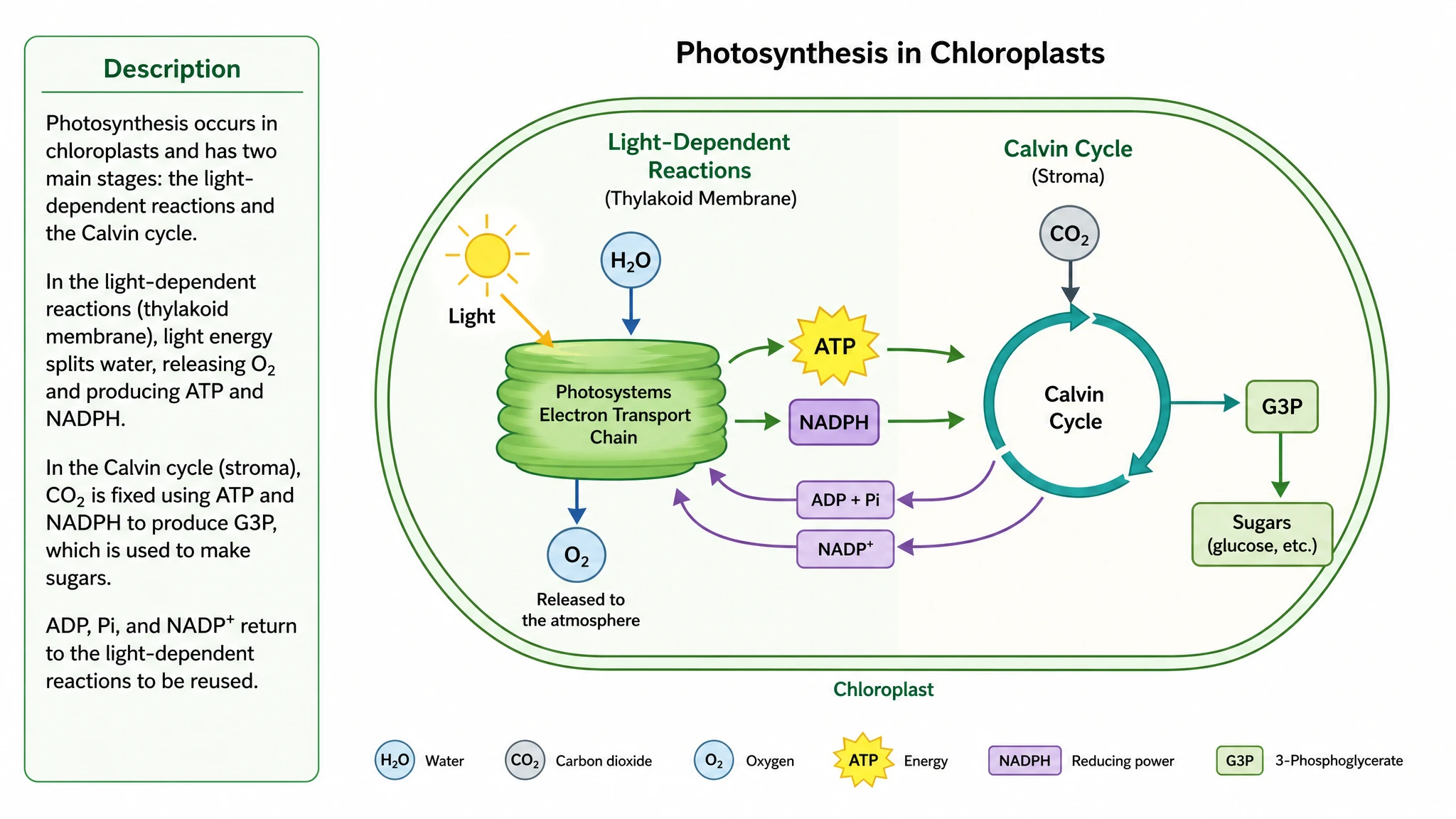 Text to Diagram Generator
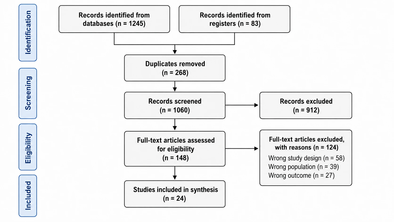 PRISMA Flow Diagram Generator
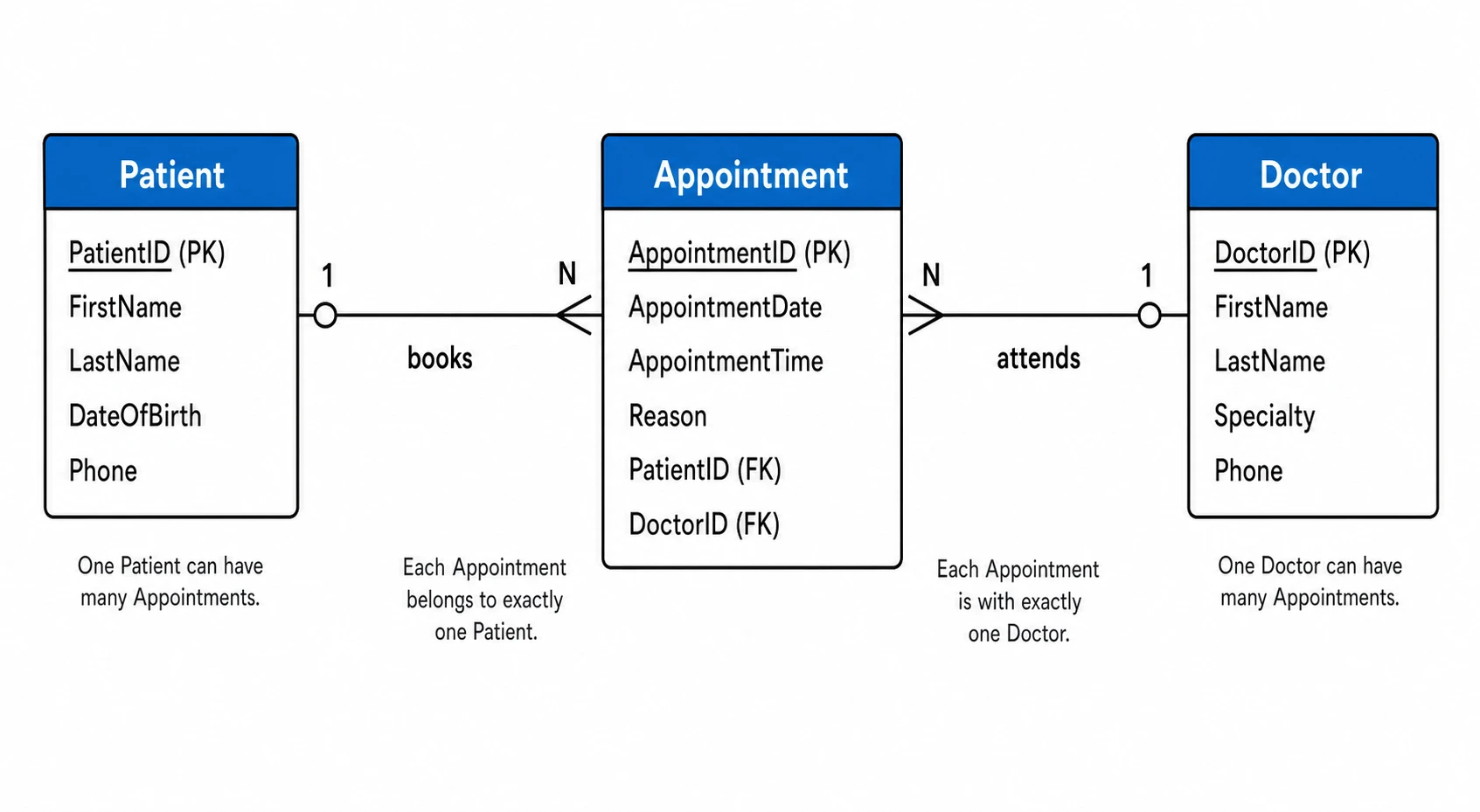 ER Diagram Generator
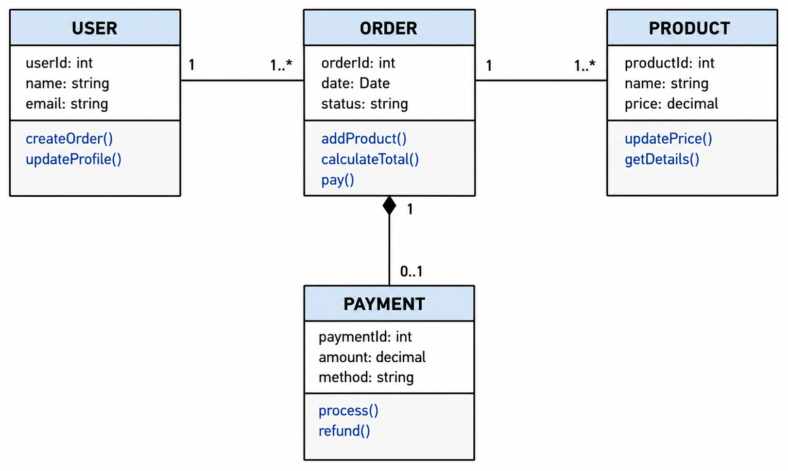 UML Diagram Generator
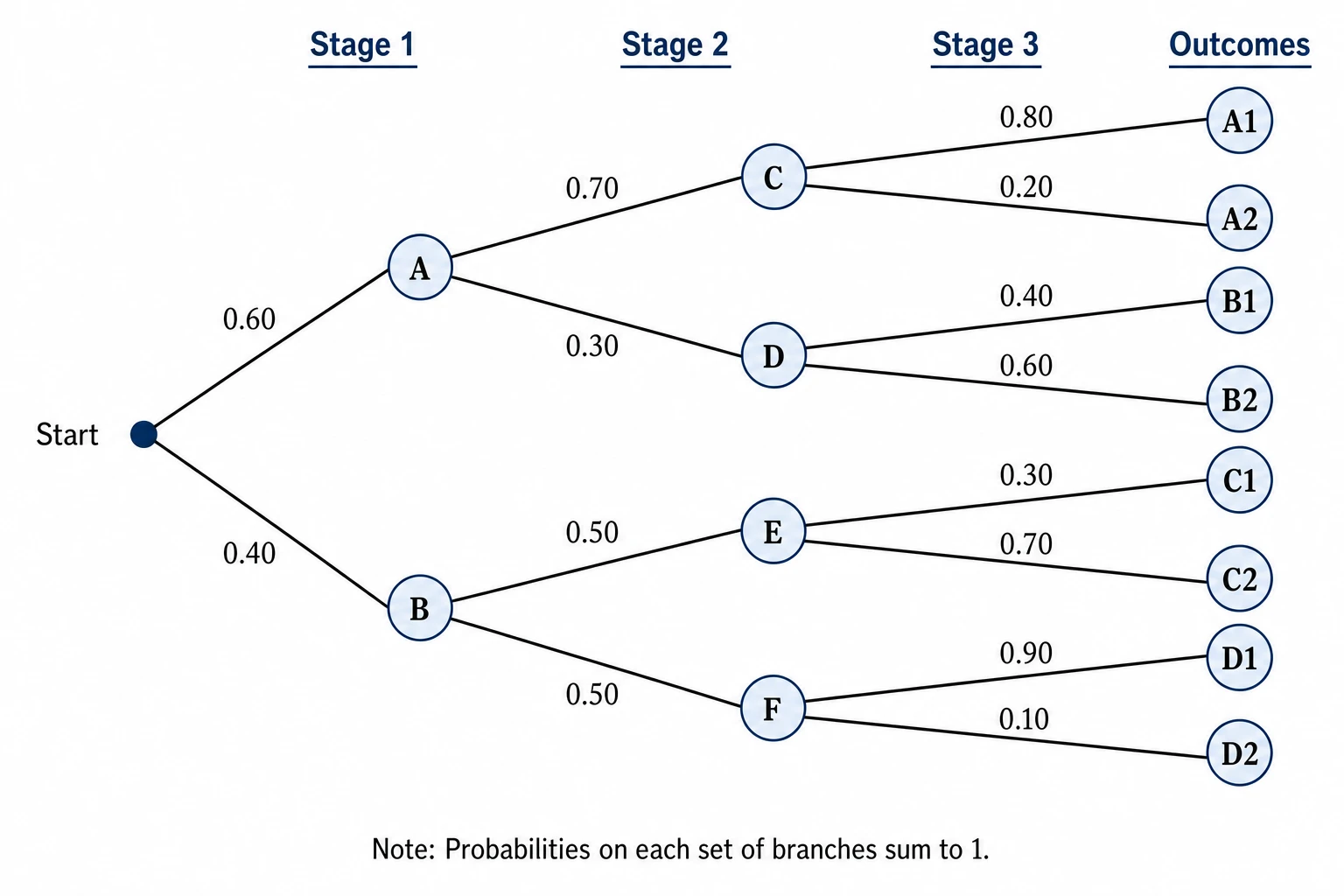 Tree Diagram Generator
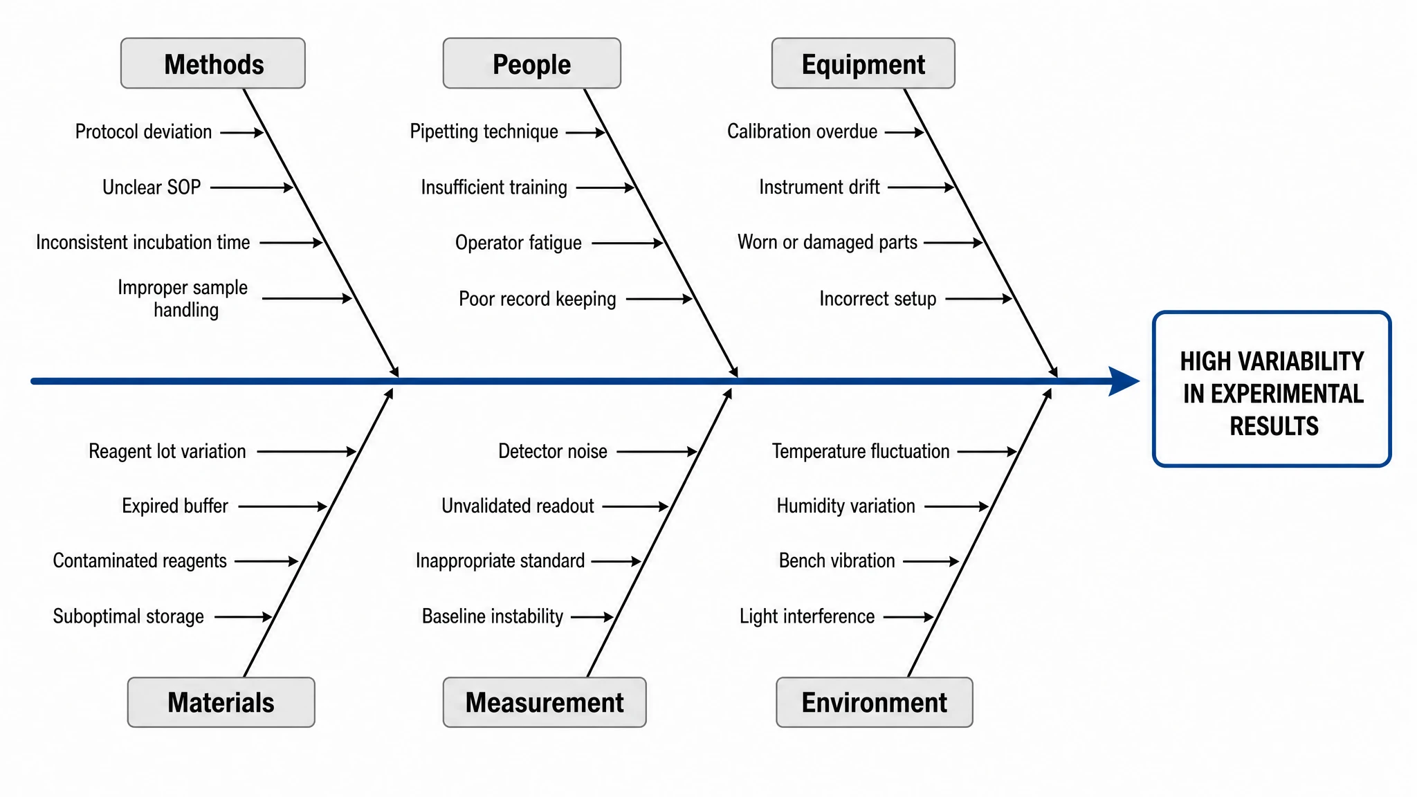 Fishbone Diagram Generator
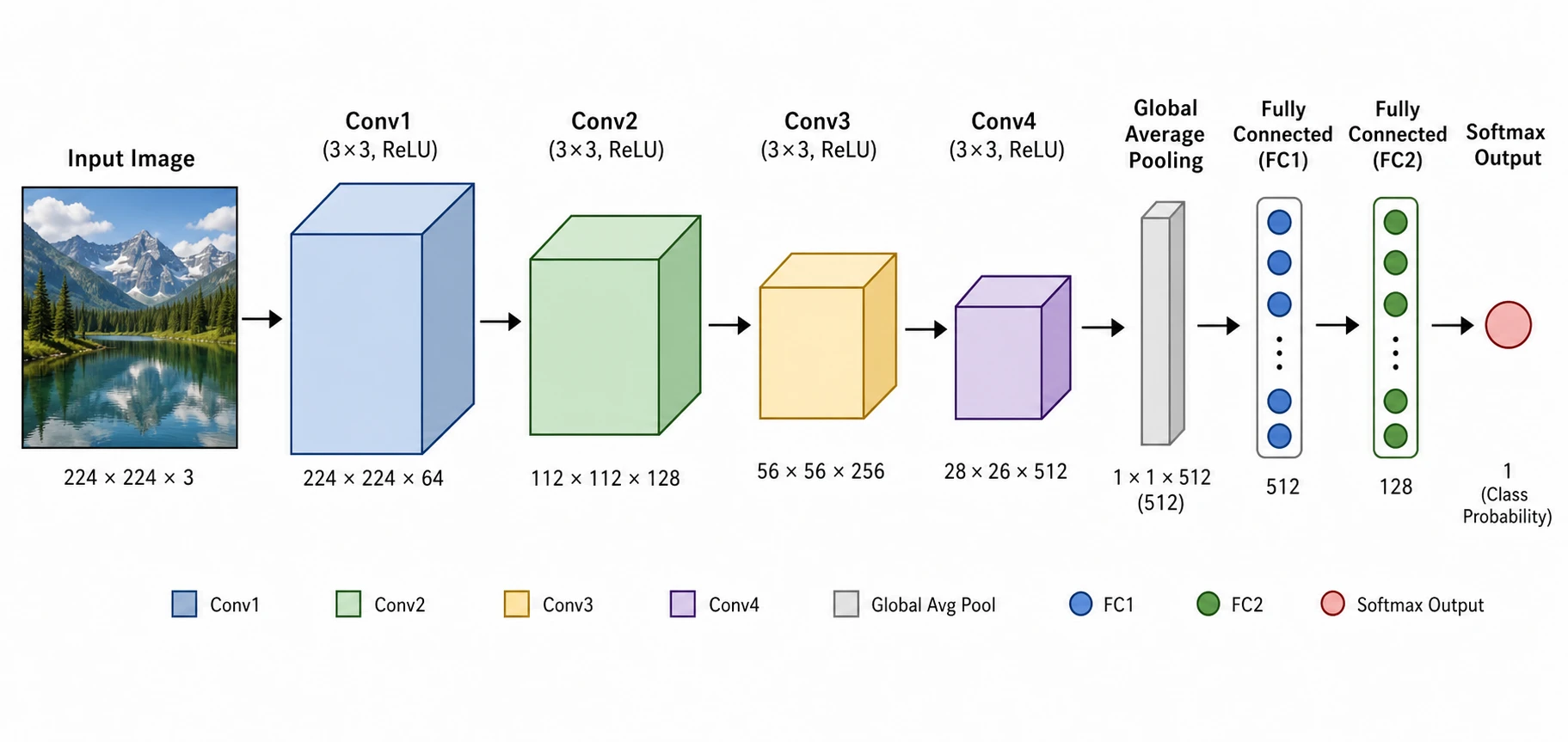 Neural Network Diagram Generator
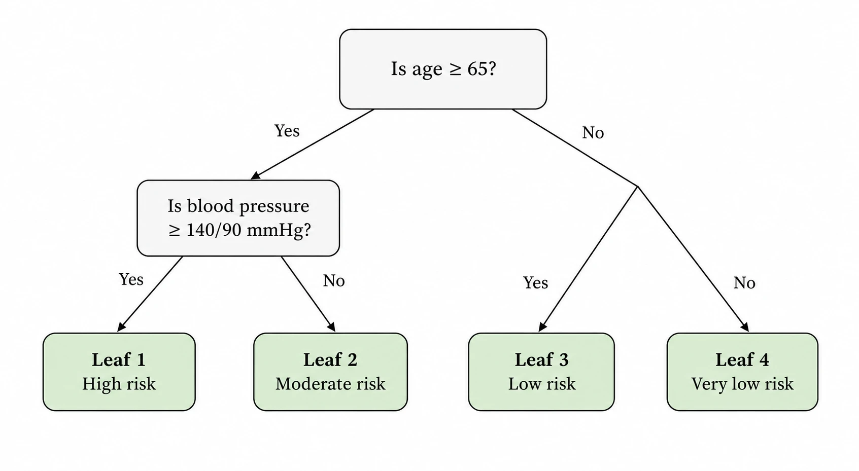 Decision Tree Generator
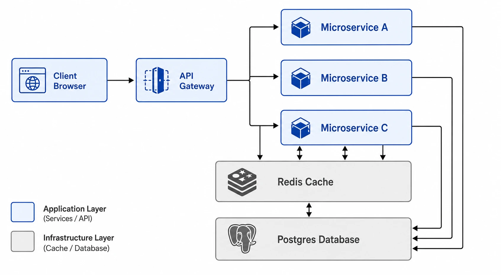 Software Architecture Diagram Generator
 CONSORT Flow Diagram Generator
 Context Diagram Creator
 Data Flow Diagram Generator
 Experimental Workflow Diagram
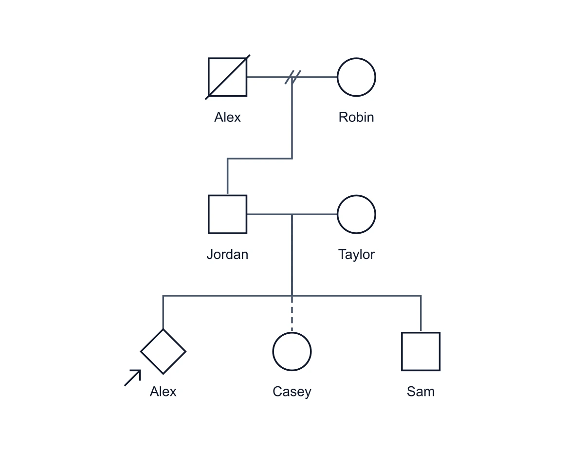 Genogram Maker
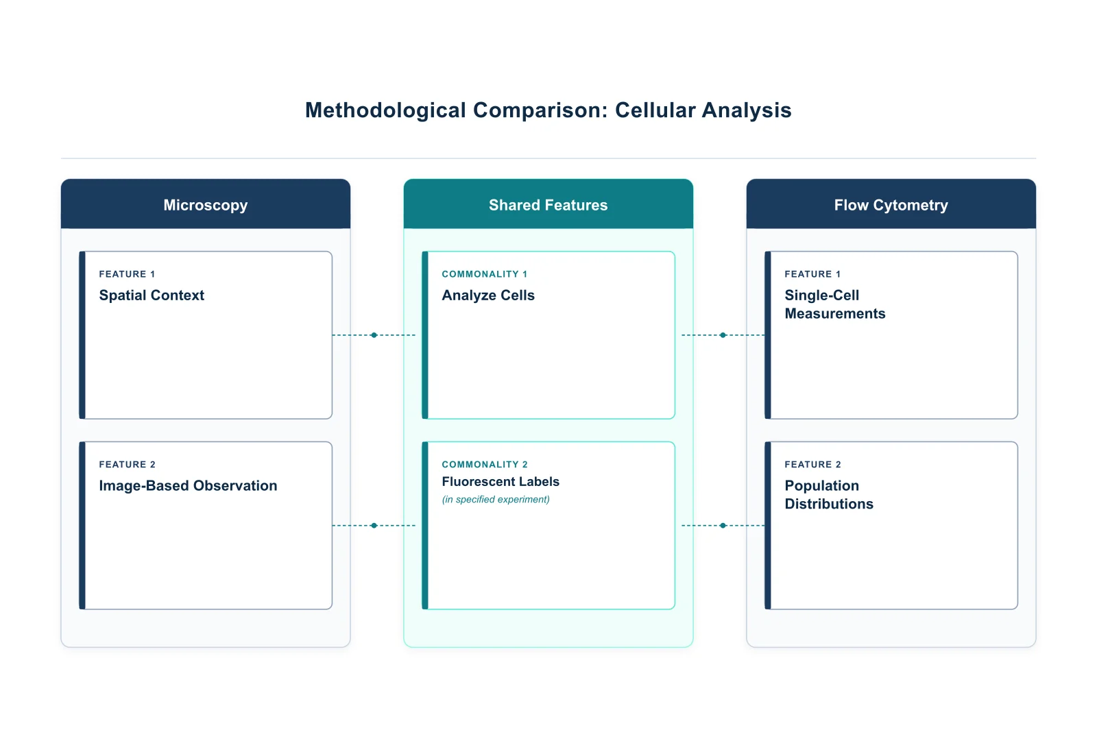 Graphic Organizer Generator
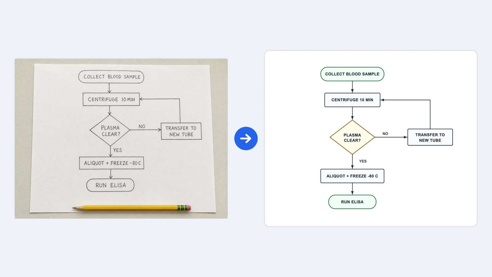 Image to Flowchart Converter
 Network Diagram Generator
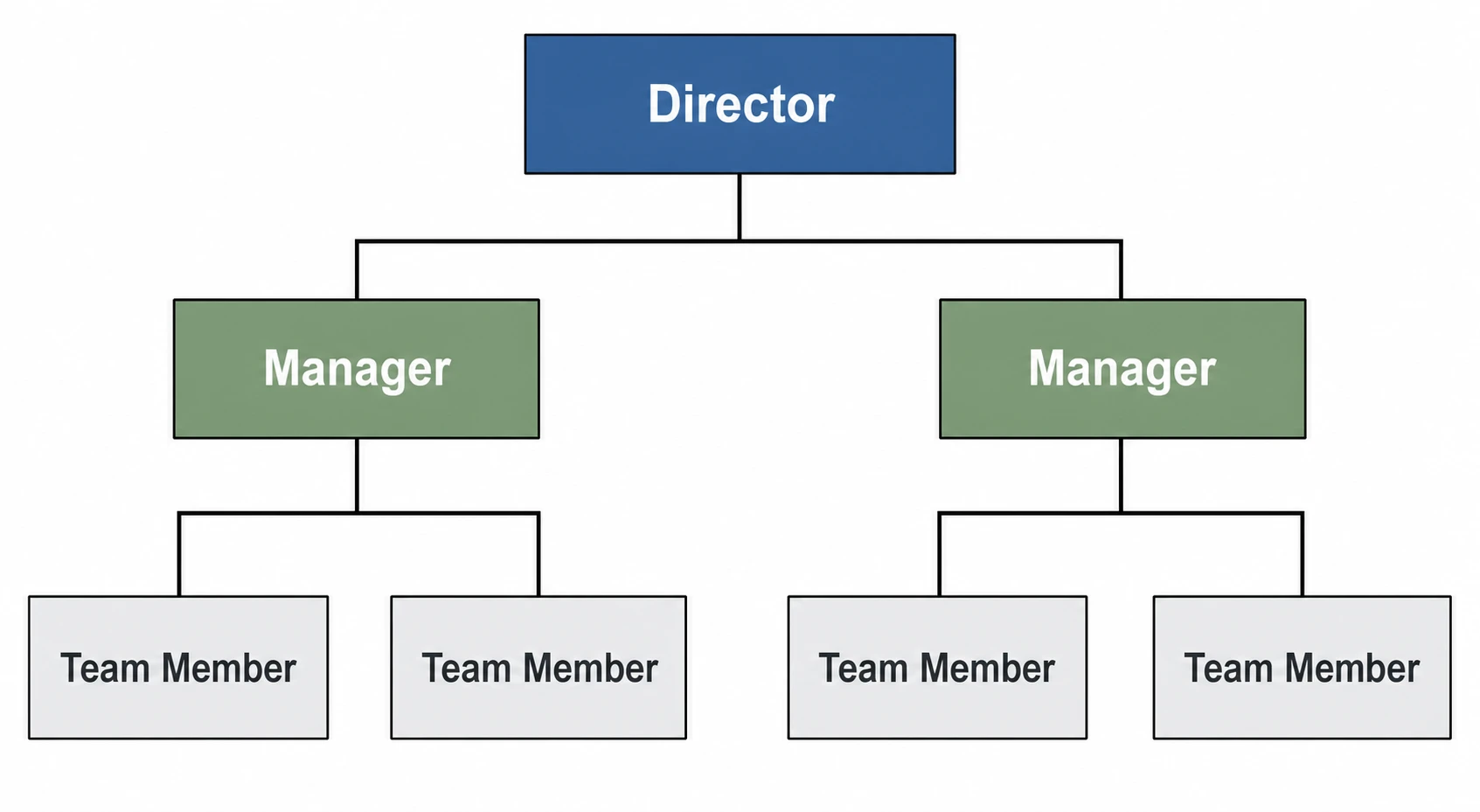 Org Chart Maker
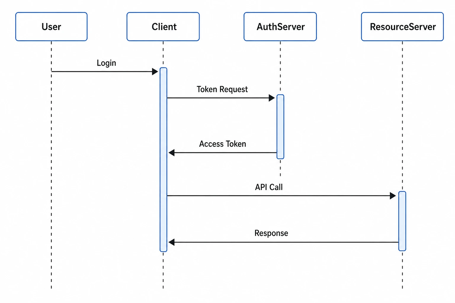 Sequence Diagram Generator
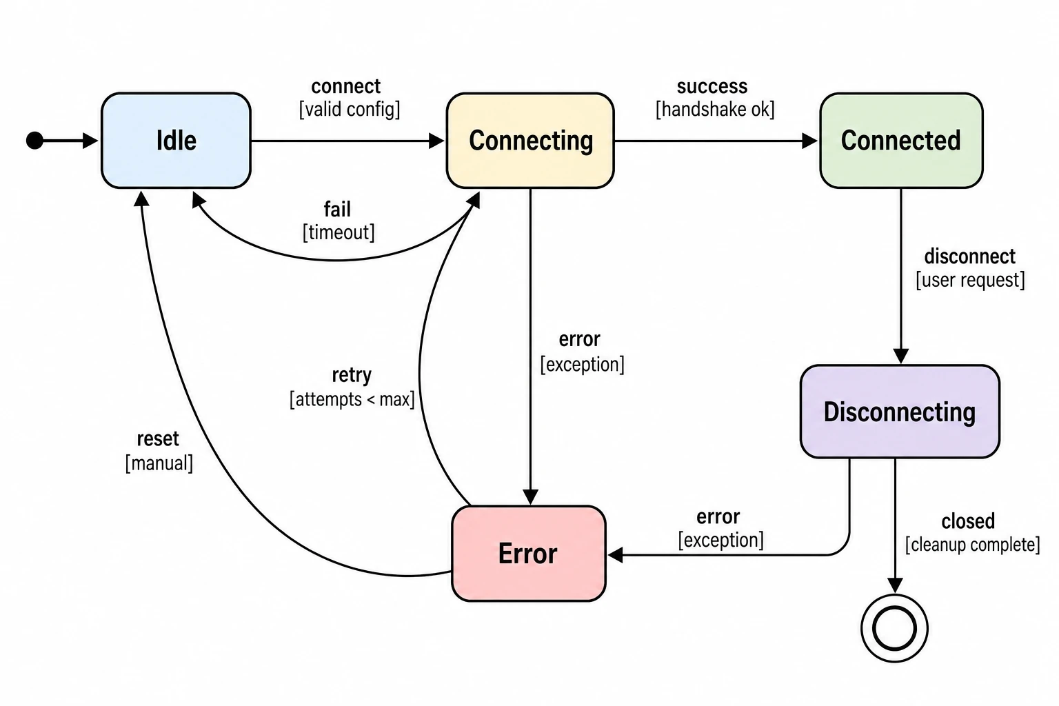 State Diagram Generator
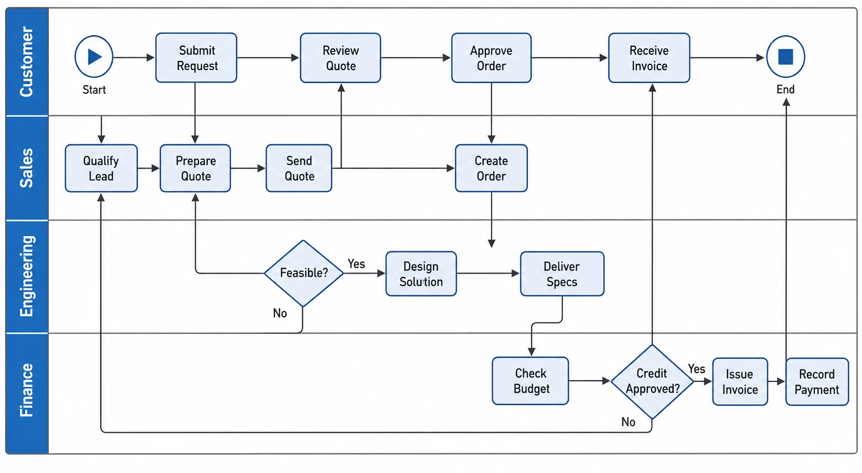 Swimlane Diagram Generator
 Use Case Diagram Generator
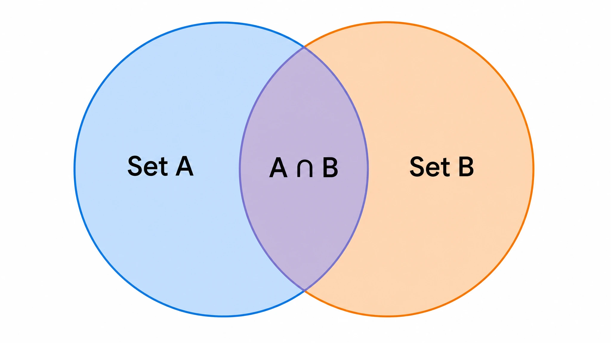 Venn Diagram Generator
pareto chart maker
Free to start · No credit card required · Built for researchers