Describe your scatter plot
Tell SciFig what to draw in plain language — no design tools required.
Generate accurate scatter plots with trend lines and correlation indicators — describe your X and Y variables and SciFig's scatter plot maker produces the figure for your paper.
Core Subject (e.g., Cas9 protein cutting DNA)
Action / Details (e.g., Double strand break, detailed molecular view)
Start with 200 free credits|No credit card required
Get up to 400 free credits on day one when you join through an invite.
A reliable scatter plot maker must position data points correctly on scaled axes and label both axes with variable names and units. Describe your X and Y variables, the approximate value range, and the general point cloud pattern, and SciFig generates a clean, accurate scatter plot with properly scaled axes — the foundation every linear regression scatter plot maker figure needs before the trend line is added.
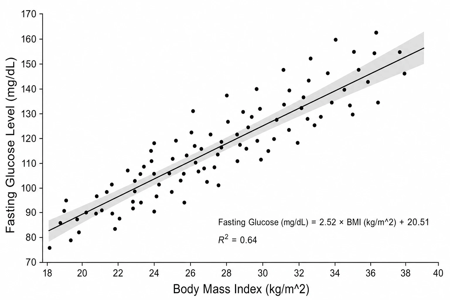
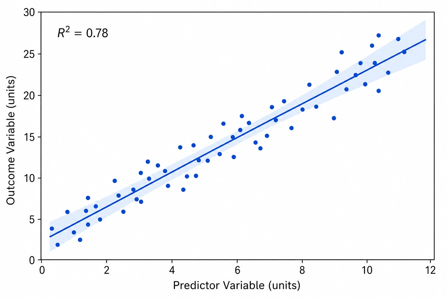
Most research scatter plots require a linear regression trend line with an R² value to demonstrate the strength of the relationship. SciFig's linear regression scatter plot maker overlays the best-fit line, adds a shaded 95% confidence band, and annotates the figure with the equation and R² — everything reviewers expect from a scatter plot with trend line in a published manuscript.
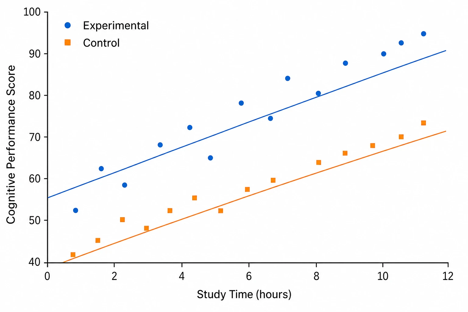
Scatter plots comparing subpopulations or experimental conditions require distinct marker styles and optionally separate regression lines per group. SciFig's scatter plot maker color-codes each group, assigns unique point shapes for accessibility, and draws separate trend lines when requested — producing a multi-group scatter plot that is clear at journal print size.
A scatter plot is a two-axis figure that plots paired data points to reveal the relationship between two continuous variables, with each point positioned by its X and Y values and the point cloud showing direction, strength, and linearity. Scatter plots are standard in biology, psychology, and social science for reporting correlations. With SciFig's scatter plot maker you describe your variables and receive a labeled figure with an optional linear regression line and R² annotation.
Tell SciFig what to draw in plain language — no design tools required.
Get a clean, publication-ready figure that matches your description in seconds.
Vectorize it into editable SVG, relabel everything, and export for your paper, poster, or slides.
Common questions about Scatter Plot Maker.
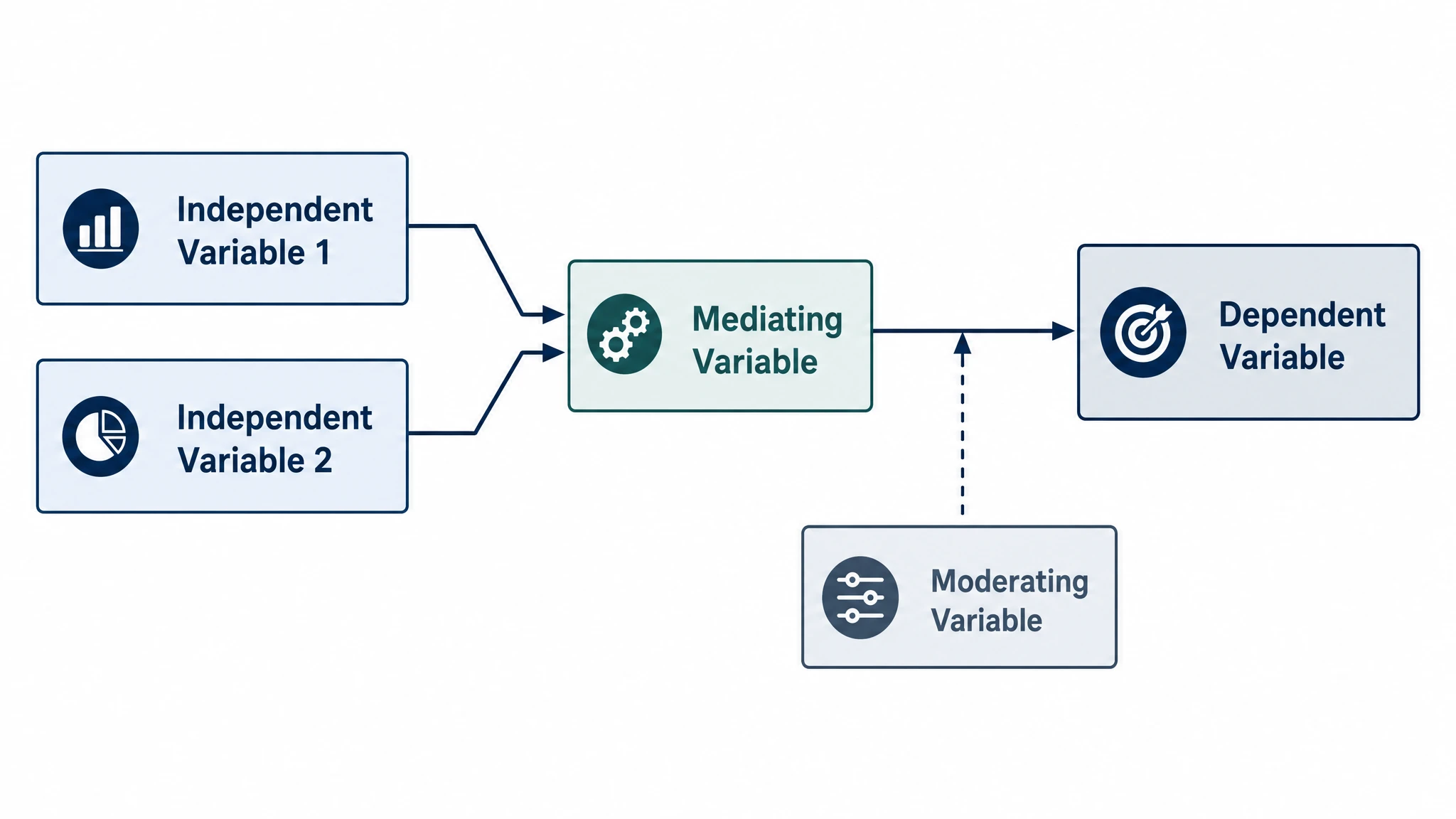
Create professional conceptual framework diagrams showing variable relationships, hypotheses, and theoretical models for your research.
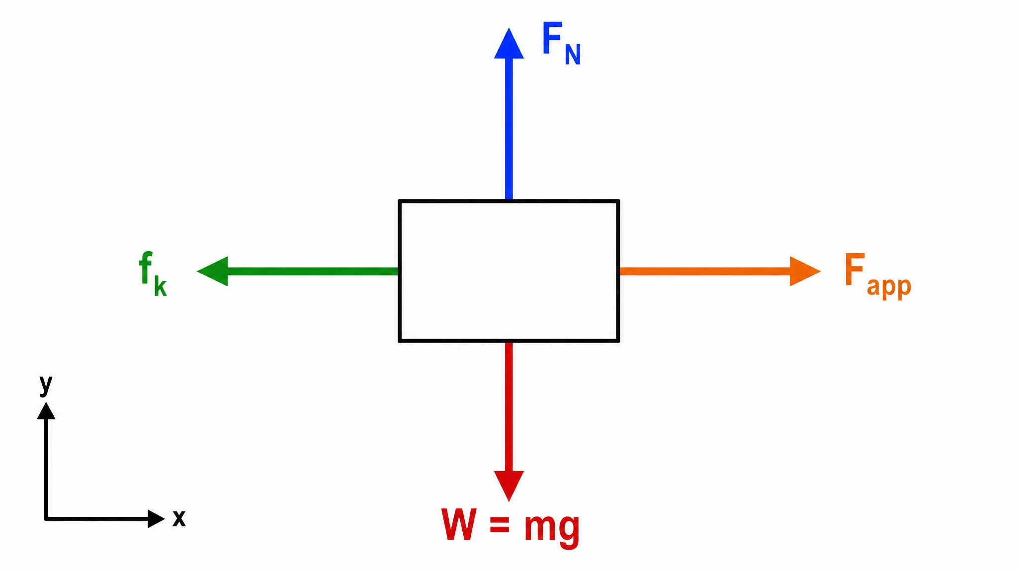
Create accurate, publication-ready free body diagrams with labeled force vectors for weight, normal force, friction, and tension in seconds.
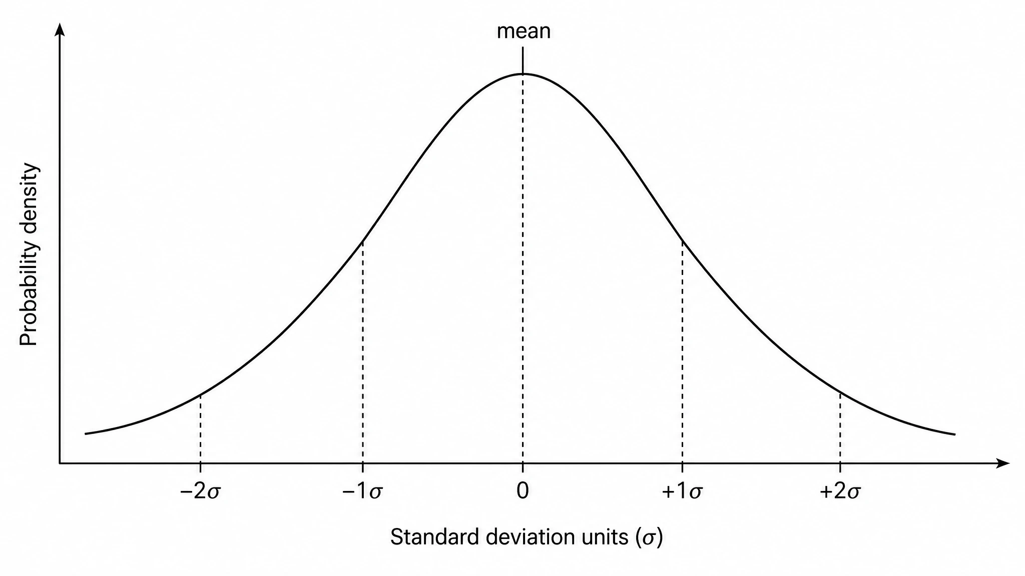
Generate a precise, fully labeled bell curve showing mean, standard deviations, and percentile regions — ready to export for your paper, thesis, or classroom.
Ready to publish?
Free to start · No credit card required · Built for researchers
