
Free Excel Chart Maker from Spreadsheet Data
Import your workbook into the Excel chart maker, pick the worksheet, and SciFig DataChart (data-driven charts) plots an accurate chart for your paper, report or slides.
Start with up to 150 free credits|No credit card required
Get up to 250 free credits on day one when you join through an invite.
Updated
Free Excel Chart Maker from Spreadsheet Data— templates & examples
Excel Workbook Data, Plotted Exactly as Imported
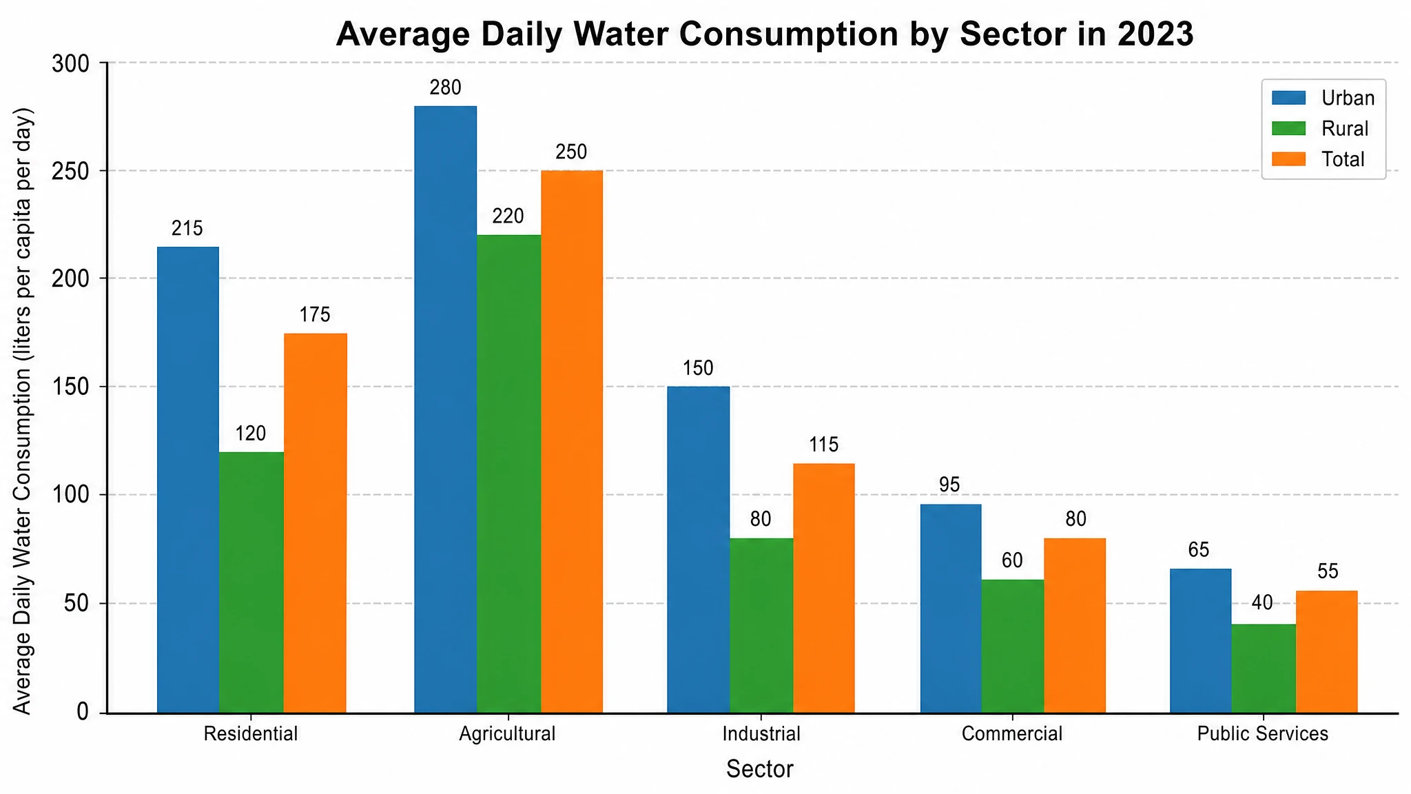
Choose the Relevant Worksheet
An Excel workbook is a container, not a single table. A lab file may include instrument readings, derived values, a summary sheet and notes, and those sheets can answer different questions. The workbook import flow lets you choose the intended worksheet and preview its table before generation. Once you pick the sheet, SciFig DataChart uses exactly that input for the Excel chart, so the sheet that answers your research question is the one that gets plotted. If the table is unclear, prepare it in your spreadsheet first.
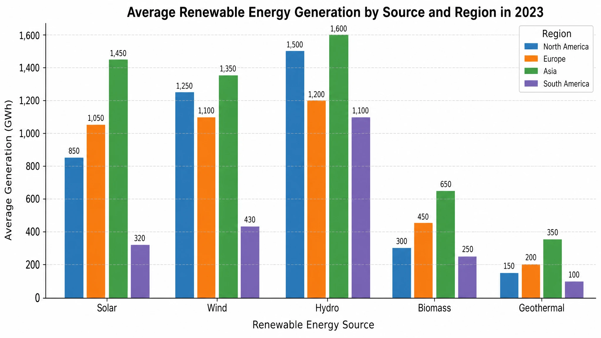
Keep Values, Categories and Units Aligned
An Excel chart request needs both the observations and their meaning. Explain which column is the measurement, which column identifies groups or categories, and whether a variable is ordered in time. For a category comparison, keep each label paired with its numeric value, as in the sample worksheet below. Avoid mixing units in one series or using a text description as a substitute for missing measurements. The imported preview is a useful checkpoint for column names, missing values and unexpected entries. SciFig DataChart keeps Excel chart values and scales tied to the selected table, even when an editing request changes the visual representation.
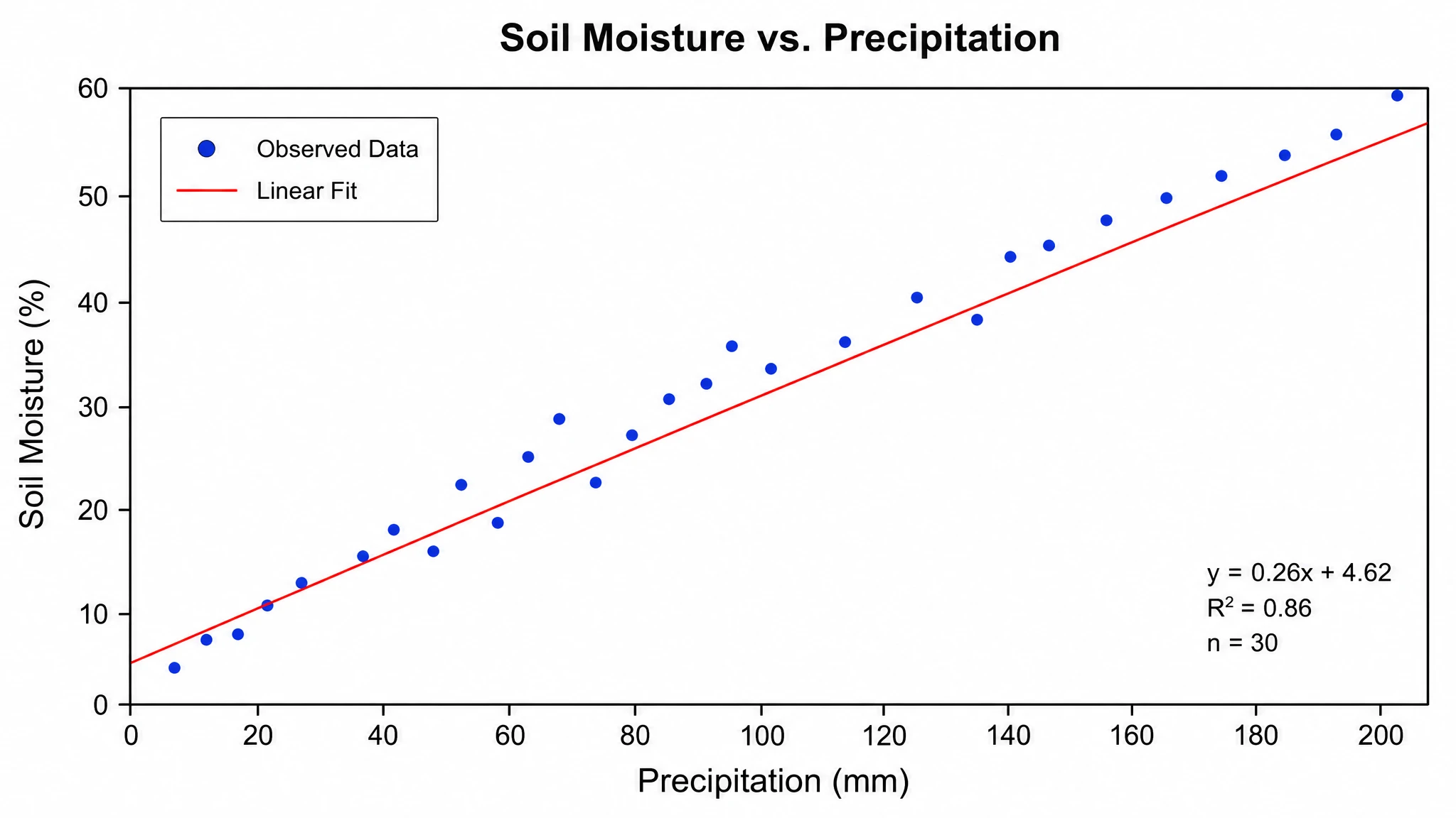
Fine-Tune the Chart for Its Final Use
A polished Excel chart also needs the right scale, a clear unit and a meaningful grouping for its audience. In SciFig DataChart, request specific changes to axes, legends, scales and styling, run the built-in statistical tests on supported chart types, and export at the size your paper, report or slides need. Keep the project for later revisions and choose PNG, PDF, EPS or TIFF for the final figure.
Excel Worksheet Example and Chart Preview
This small synthetic table demonstrates imported values and a category comparison. The preview below plots these example values directly.
| Group | Measured value (units) |
|---|---|
| Control | 12 |
| Treatment A | 18 |
| Treatment B | 15 |
What Is an Excel Chart Maker?
An Excel chart maker turns worksheet data into an accurate chart you can edit and export.
An Excel chart maker creates a chart from the values and column names in a spreadsheet. SciFig opens Excel data in SciFig DataChart (data-driven charts), where you select a worksheet, preview it and describe the comparison you need. You do not have to recreate the workbook as an illustration prompt: SciFig DataChart calculates and plots every value from the selected table, so the chart matches your data, and you can adjust axes, legends and styling by request.
Why Start with an Excel Workbook?
- Preserve the relationship between category labels and measurements rather than rewriting data as a vague image request.
- Choose the intended worksheet when raw observations and summary tables coexist in one workbook.
- Preview imported column names and values, then generate the chart.
- Explain the comparison in plain language while keeping the original observations as the chart input.
- Use the main SciFig DataChart workspace for additional chart types or supported data formats beyond Excel.
What to Check in an Excel Chart Dataset
- Excel chart column names identify measurements and categories; use informative headers instead of blank cells or ambiguous abbreviations.
- Units belong with measurements, and mixed units require an explicit decision before plotting one shared axis.
- Groups and category labels must align with the values they describe throughout imports and revisions.
- Choose how to handle missing values and any rows excluded from your analysis.
- Chart type follows the question: bars compare categories, lines show ordered change and scatter plots show numerical relationships.
Excel Charts for Papers, Reports and Slides
- Compare measured values across experimental groups straight from the worksheet that holds your observations.
- Present a time series from an ordered column while preserving the meaning of intervals and axis units.
- Visualize relationships between numerical columns with a scatter plot when the data supports that comparison.
- Prepare a report figure with clear labels and legends, exported at the exact size your report needs.
- Build teaching examples from synthetic tables while clearly distinguishing sample values from genuine research evidence.
How to Use the Excel Chart Maker
Import an Excel Workbook
Choose the SciFig DataChart input and import a supported Excel file. Follow the displayed file and data limits, then choose the worksheet that contains the observations you want to plot. A workbook may contain summaries, raw values and unrelated sheets; selecting the right one keeps the chart on the right table.
Map Columns and Describe the Chart
Use the table preview to identify measurement columns, category or group columns, and units, then explain the intended comparison in your chart request. If the sheet has merged headings or explanatory rows, prepare a clean table first. Pick a chart type suited to the data, and SciFig DataChart plots it from the observations you supplied.
Refine and Export
SciFig DataChart plots the chart from the selected worksheet. Adjust axis labels, scales, legends and supported statistical options through the workspace editing workflow, then export PNG, PDF, EPS or TIFF together with the Python code. Keep the project for later revisions.
Free Excel Chart Maker from Spreadsheet Data — Frequently Asked Questions
Common questions about Free Excel Chart Maker from Spreadsheet Data.
More tools

Circuit Diagram Maker
Draw electronic circuit schematics
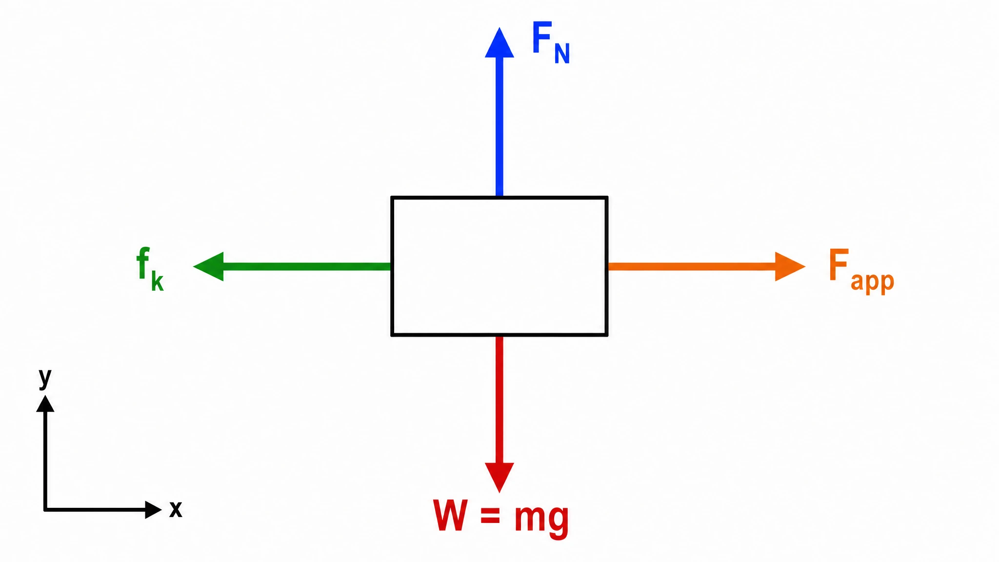
Free Body Diagram Generator
Show forces acting on an object

Graphical Abstract Maker
Summarize your study in one panel
SciFig
Free AI Scientific Figure Generator for Illustrations, Images, Charts and Flowcharts
Models
Default to GPT Image 2 for journal papers; switch to Nano Banana Pro for slides and posters; pick Nano Banana 2.1 for routine figure work
Tutorials
Seven short walkthroughs of the AI scientific figure generator
Blog
Tutorials, tool comparisons, and publication tips for researchers.
Inspiration
Explore publication-ready illustrations, charts and flowcharts. Copy a prompt or open any template as the starting point for your own figure.
Pricing
View pricing

Ready to publish?
Make your own Excel chart in minutes.
Start for freeFree to start · No credit card required · Built for researchers