
Sankey Diagram Generator
Create precise Sankey diagrams for energy systems, material flow analysis, and process efficiency — describe your flows and get a labeled, export-ready chart instantly.
Figure prompt
Describe the figure you want to create
Not sure where to start? Use Example.
Start with 100 free credits|No credit card required
Get up to 300 free credits on day one when you join through an invite.
Reviewed by SciFig TeamUpdated
Sankey Diagram Generator— templates & examples
Everything you need to build your Sankey diagram
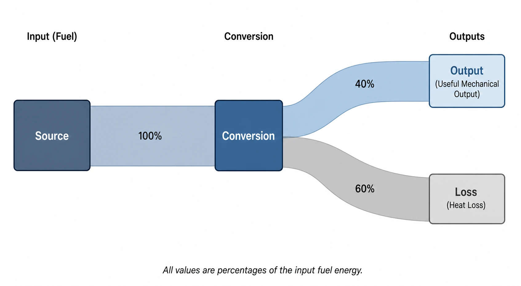
Generate a Sankey diagram from flow descriptions or values
List your sources, processes, sinks, and flow magnitudes — or describe the system in plain language — and SciFig's Sankey diagram generator produces a proportional flow chart instantly. Band widths scale automatically to your values, nodes are labeled, and the layout is optimized so the Sankey diagram is readable at a glance.
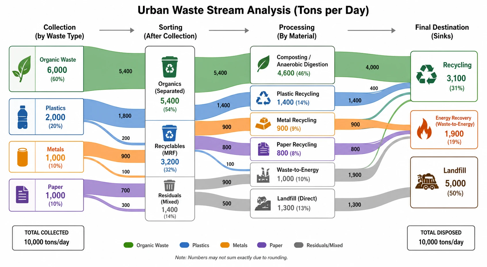
Built for material flow analysis and energy audits
SciFig's online Sankey MFA maker handles the structured flow data that material flow analysis and energy balance studies require. Assign units (tonnes, GJ, kg, kWh), color-code streams by material category or energy type, and export a Sankey diagram that meets publication standards for industrial ecology, environmental engineering, and energy research journals.
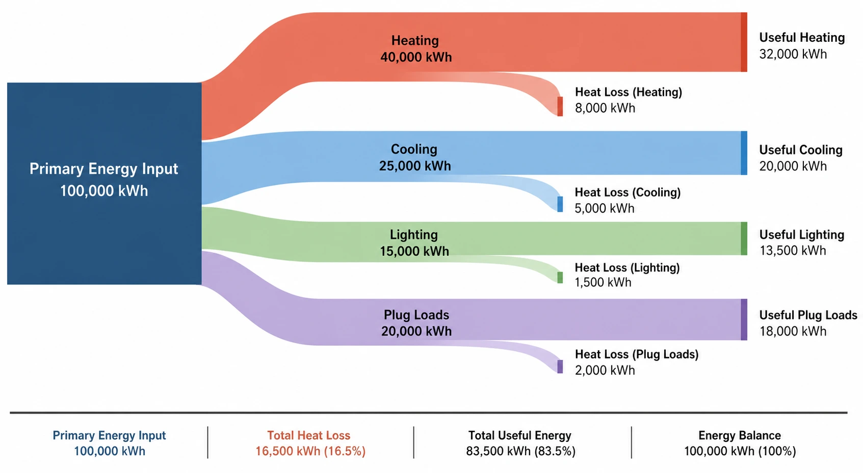
Edit flows, nodes, and colors after generation
Every Sankey diagram from SciFig is fully editable. Adjust individual flow widths, rename node labels, split or merge streams, and recolor bands to distinguish input types, losses, and recycled flows. When the Sankey chart matches your data, export it ready for your paper, thesis, or engineering report.
What is a Sankey diagram?
A Sankey diagram is a flow diagram in which band widths are proportional to the quantities they represent, making losses, conversions, and distributions immediately visible across energy systems and material streams. Sankey diagrams are the standard for material flow analysis, energy audits, and industrial ecology. With SciFig's Sankey diagram generator you describe your sources, processes, and sinks with flow magnitudes and receive a labeled, proportional chart for papers or reports.
Why Sankey diagrams are the standard for flow visualization
- Proportional band widths make losses and efficiencies immediately visible without a legend
- Standard figure format required in material flow analysis and energy audit publications
- Handles multi-input, multi-output systems that line charts and bar charts cannot represent
- Communicates complex process chains to non-specialist readers and decision-makers
- Supports traceability — every unit of material or energy is accounted for across the diagram
- Accepted by leading engineering and environmental science journals as a primary figure type
Key components of a Sankey diagram
- Source nodes — entry points where energy or material enters the system
- Process nodes — intermediate steps where conversion, transformation, or redistribution occurs
- Sink nodes — exit points representing useful output, waste, emissions, or storage
- Flow bands — arrows or ribbons whose width is proportional to flow magnitude
- Flow labels — numerical annotations showing quantities and units on each band
- Loss flows — typically downward-pointing bands indicating waste heat, emissions, or rejected material
Where Sankey diagrams are used in science and engineering
- Energy system analysis: national energy balance, building energy audits, power plant efficiency
- Material flow analysis: metal cycles, plastic waste streams, urban metabolism studies
- Industrial ecology: life cycle inventory visualization, supply chain material tracking
- Chemical engineering: process mass balance and heat integration diagrams
- Environmental engineering: greenhouse gas emission attribution across sectors
- Mechanical and aerospace engineering: thermodynamic cycle and propulsion efficiency diagrams
How to make a Sankey diagram
Describe your Sankey diagram
Tell SciFig what to draw in plain language — no design tools required.
Generate with SciFig
Get a clean, publication-ready figure that matches your description in seconds.
Edit & export
Vectorize it into editable SVG, relabel everything, and export for your paper, poster, or slides.
Sankey Diagram Generator — Frequently Asked Questions
Common questions about Sankey Diagram Generator.
More tools
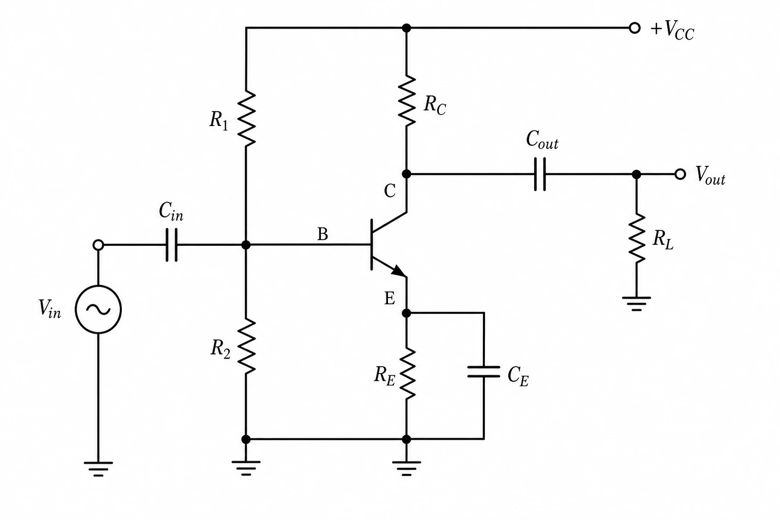
Circuit Diagram Maker
Generate accurate circuit diagrams with labeled schematic symbols for research papers, lab reports, and technical publications.
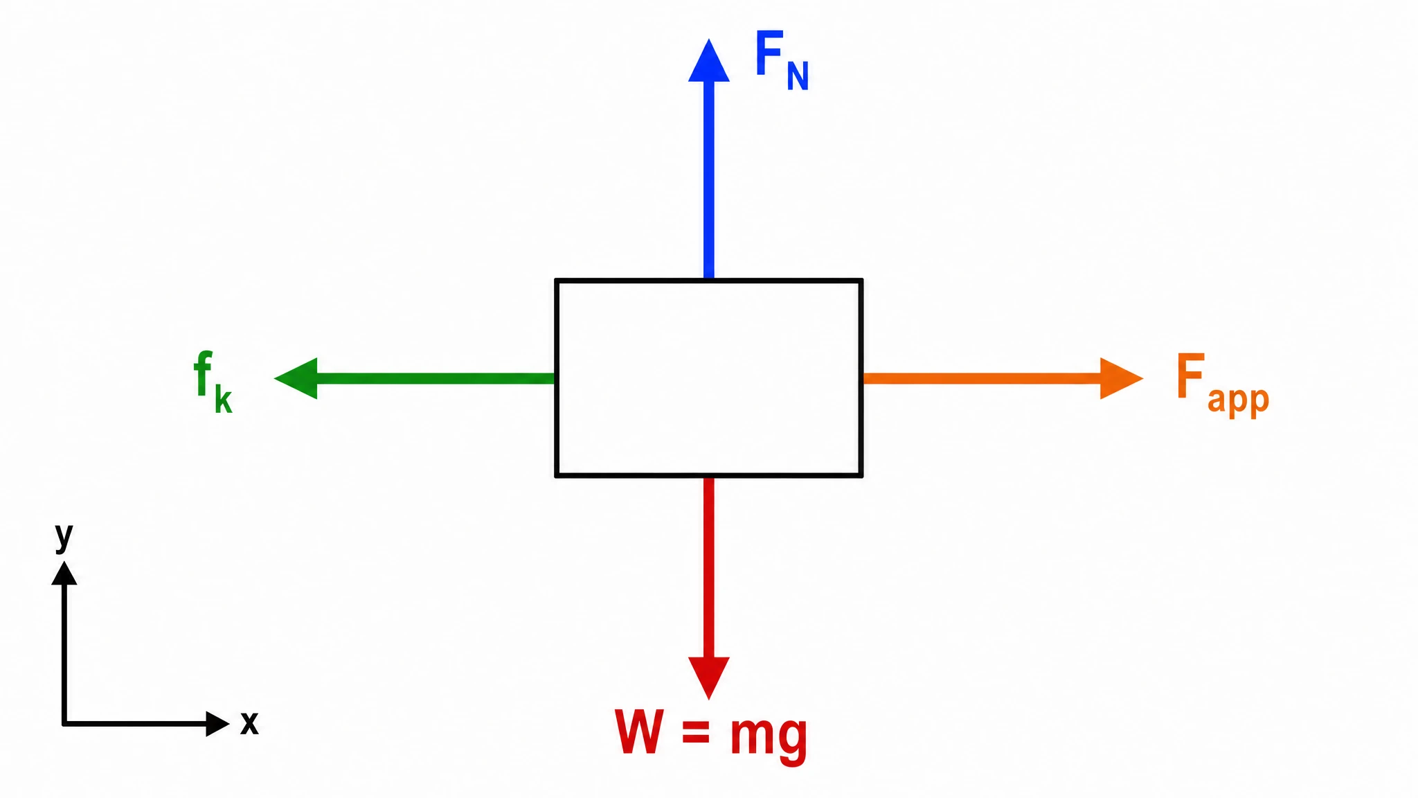
Free Body Diagram Generator
Create accurate, publication-ready free body diagrams with labeled force vectors for weight, normal force, friction, and tension in seconds.

Graphical Abstract Maker
Generate a publication-ready graphical abstract — a single-panel visual summary that captures your study's methods, key finding, and result with clear icons and flow arrows.
Home
Free AI Scientific Figure Generator and Figure Maker — Create Research Figures, Images, Illustrations and Diagrams
Text-to-Figure
Generate a figure from a plain-language description
Models
Default to GPT Image 2 for journal papers; switch to Nano Banana Pro for slides and posters; pick Nano Banana 2 for routine figure work
Tutorials
Seven short walkthroughs of the AI scientific figure generator
Blog
Tutorials, tool comparisons, and publication tips for researchers.
Inspiration
Explore publication-ready scientific figure examples, copy the prompts, and use them as starting points for your own work.

Ready to publish?
Make your own Sankey diagram in minutes.
Start for freeFree to start · No credit card required · Built for researchers