How AI image-to-figure bridges rough sketches and publication-ready scientific illustrations — step-by-step workflow with practical tips for research.
SciFig Team
Scientific Illustration Experts
Every great scientific figure starts the same way: a marker on a whiteboard, a ballpoint scrawl on a napkin, a hasty diagram in the margins of a lab notebook. In that rough sketch, the idea is perfectly clear to you. The relationship between the molecules is obvious. The direction of the cascade is unambiguous. The mechanism practically draws itself.
Then comes the reckoning. You sit down at your computer, open Illustrator or PowerPoint, and the scientific figure that lived so vividly in your imagination begins to feel impossibly distant. Hours pass. The proportions are wrong. The arrows look clumsy. The color scheme is an accident. By the time submission is three days away, you are still wrestling with a scientific figure that should have taken thirty minutes.
This is the most common friction point in scientific publishing — not a knowledge gap, not an experimental failure, but the chasm between conceptual clarity and execution quality. The idea is already there. What is missing is the bridge.
The dirty secret of scientific illustration is that the hardest part is not knowing what to draw — it is rendering it to publication standard. Most researchers are entirely capable of sketching the concept. The challenge is translating a sketch into a scientific figure that meets the aesthetic and technical requirements of a peer-reviewed journal.
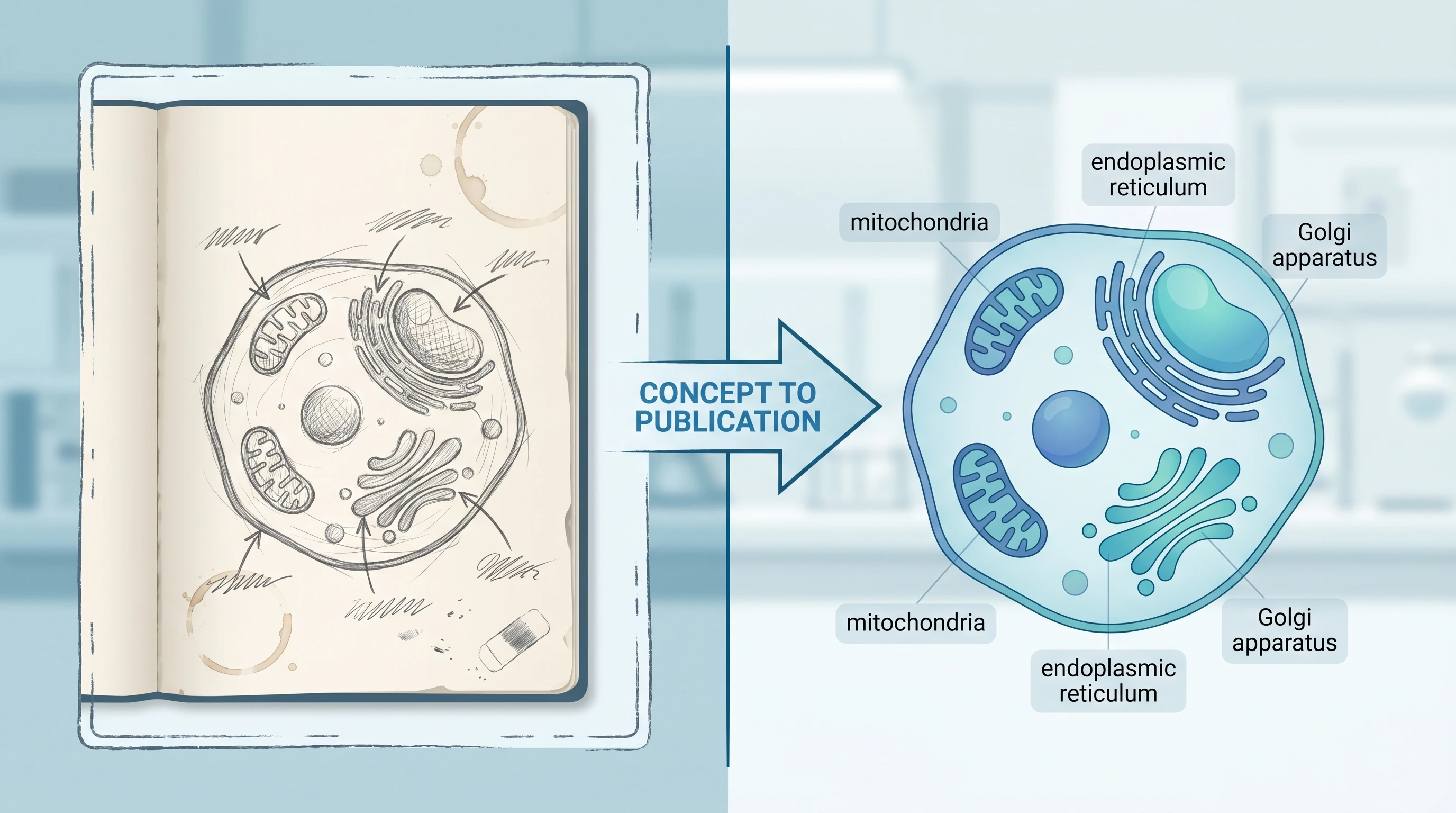
Split-frame illustration showing rough hand-drawn lab notebook sketch on left vs polished publication-ready vector scientific figure on right (Figure generated with SciFig)
Those requirements are demanding. Publication-quality figures need clean vector geometry, consistent line weights, professional typography, and color palettes that remain legible when converted to greyscale. They need to scale cleanly from a 3.5-inch single column to a 7-inch full-page spread without losing label legibility. They need to look like they were made by someone who has spent years in design software — because, historically, they were.
Most researchers have not spent years in design software. They have spent years doing science. The expectation that they should be proficient in both is unreasonable, and the resulting friction costs the research community an enormous amount of time.
A study of time allocation among academic researchers consistently finds that figure preparation ranks among the most time-intensive non-experimental tasks. Estimates vary, but a conservative figure is four to eight hours per panel for researchers working without design training. Multiply that across a typical manuscript — eight to twelve figures, each with two to four panels — and you are looking at an entire working week lost to illustration.
The concept was never the bottleneck. The rendering was.
The SciFig AI Bridge — Sketch to Vector in Minutes
SciFig's AI image-to-figure technology addresses the rendering bottleneck directly. Instead of requiring you to rebuild your sketch from scratch in vector software, SciFig takes the sketch you already have and transforms it into a publication-ready illustration.
The underlying process combines computer vision with scientific domain knowledge. The model analyzes your uploaded image to identify structural elements — boxes, arrows, circles, text labels, connective lines — and interprets their spatial relationships. It then reconstructs those relationships using clean vector geometry, applies professional visual conventions appropriate to the detected scientific domain, and returns a polished figure that preserves the conceptual structure of your original sketch.
Crucially, the AI does not invent content that was not in your sketch. It is not generating a scientific figure from a text prompt or drawing on generic training-data templates. It is reading your specific diagram and re-rendering it with professional quality. The intellectual work — the science — remains entirely yours. The AI handles the craft.
The practical result is that a hand-drawn diagram that would have taken a trained scientific illustrator three hours to reproduce digitally can now be converted in minutes. The output is editable, exportable in multiple formats, and ready for journal submission.
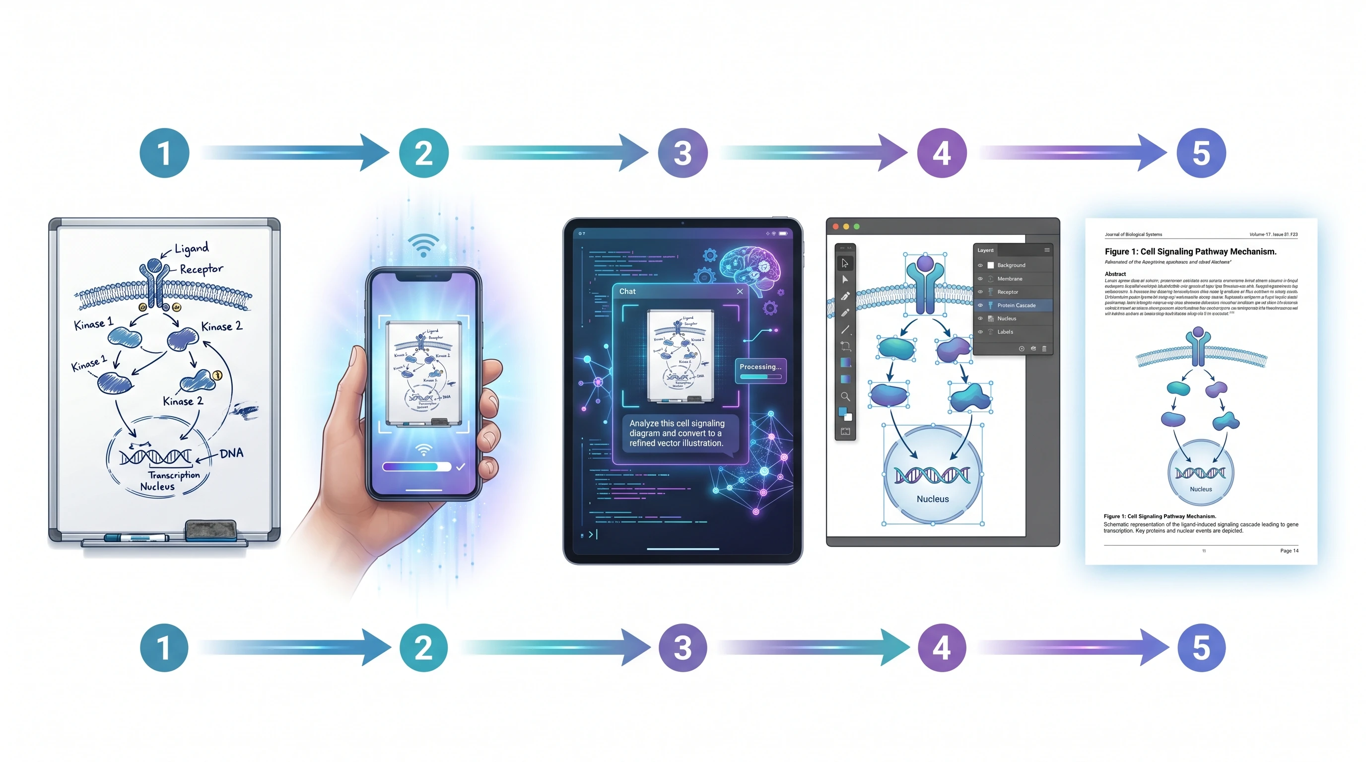
Step-by-Step — From Whiteboard to Publication
The workflow is straightforward enough to describe in five steps, but the speed with which those steps complete still surprises most researchers the first time.
Your sketch can live anywhere — a whiteboard, a lab notebook, a piece of printer paper, a tablet drawing app. What matters is that the capture is clear enough for the AI to read. A smartphone photo taken in good light is almost always sufficient. If you are working on a tablet, you can export your drawing directly. Scans produce the cleanest input but are rarely necessary. A focused, well-lit photo with the sketch filling most of the frame will perform well.
Step 2: Upload and describe what you want.
Upload your captured image and add a short description of the scientific figure's purpose. The description does not need to be a detailed prompt — a sentence or two is enough. "This is a diagram of the JAK-STAT signaling pathway showing activation by IFN-γ" gives the model the domain context it needs to apply appropriate visual conventions. (For a dedicated walkthrough of signaling pathway diagrams, see our tutorial.) If you have specific requirements — a particular color scheme, a target journal's style guidelines, a specific export format — include them here.
Step 3: AI generates a professional version.
The model processes your sketch and returns a clean, publication-quality illustration. This step typically takes under two minutes. The output preserves the spatial logic of your original diagram while upgrading every visual element: boxes become clean rectangles with consistent corner radii, hand-drawn arrows become precise vector arrowheads, scrawled labels become properly typeset text, and the overall composition gains the visual coherence of professionally produced scientific art.
Step 4: Refine and iterate.
Your first output is rarely your final figure. Treat it as a high-quality draft. Most refinements fall into two categories: structural corrections (a connection that was ambiguous in the sketch that you want to clarify) and stylistic adjustments (changing a color, adjusting label sizes, adding or removing a compartment boundary). Describe the changes you want in plain language — "move the nucleus label to the lower right and increase the font size" — and the model will apply them.
Step 5: Export in the format you need.
Once you are satisfied with the scientific figure, export it in the format required by your workflow. PNG at 300 DPI or higher for direct journal submission. SVG for a fully editable vector file you can open in Illustrator or Inkscape for final adjustments. PPTX if the scientific figure is destined for a conference talk or grant presentation. Having all three formats available from a single generation means you are never locked into a single use case.
See Sketch-to-Figure in Action
From napkin sketch to Nature-quality scientific figure — powered by SciFig AI.
Consider a realistic scenario: a graduate student studying T cell exhaustion has spent three months characterizing a novel interaction between PD-1 signaling and mitochondrial dynamics. The mechanism is genuinely new. The data is solid. The paper is going to a high-impact journal.
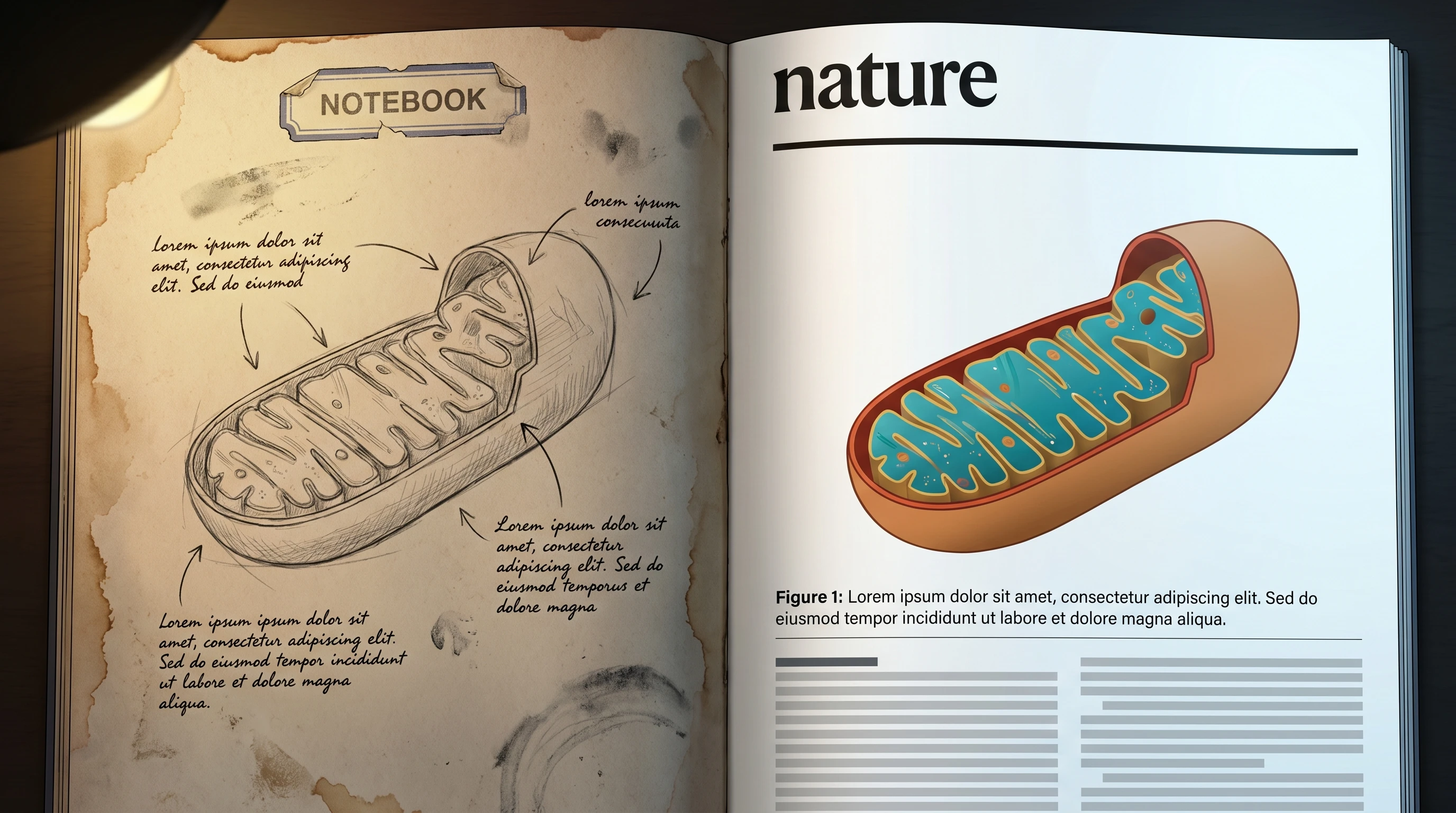
Before-and-after split: worn lab notebook hand sketch on left vs polished Nature journal page layout on right showing the same diagram (Figure generated with SciFig)
The problem is the model figure. The proposed mechanism involves four cellular compartments (plasma membrane, cytoplasm, mitochondria, nucleus), seven molecular actors, two feedback loops, and a set of inhibitory relationships that are counterintuitive enough to require careful visual scaffolding. The student has drawn this diagram probably forty times across different notebooks and whiteboards, refining it each time. The current version in her lab notebook is actually excellent — spatially organized, correctly labeled, conceptually clear.
Getting that diagram into the paper, however, has been a two-week saga. She started in PowerPoint, switched to Illustrator after the arrows refused to behave, hired a scientific illustrator through a university service (six-week turnaround, $400, one round of revisions included), received a scientific figure that was visually polished but contained a conceptual error in the feedback loop because the illustrator was not a cell biologist.
The corrected figure took another three weeks and a second payment.
With an AI image-to-figure workflow, the process looks different. She photographs the notebook diagram. She uploads it with the description: "T cell exhaustion mechanism — PD-1-mediated inhibition of mitochondrial biogenesis with TFAM nuclear feedback loop." The AI returns a clean vector illustration in two minutes. The spatial logic is preserved exactly as she drew it. The feedback loop is correct because it came from her sketch. She makes two refinements — adjusting the mitochondrial color and moving a label that was overlapping an arrow — and exports to SVG for a final check.
Total time from notebook to submission-ready figure: under thirty minutes.
The scientific figure that ran in the journal looked like professional scientific art. It started as a ballpoint sketch.
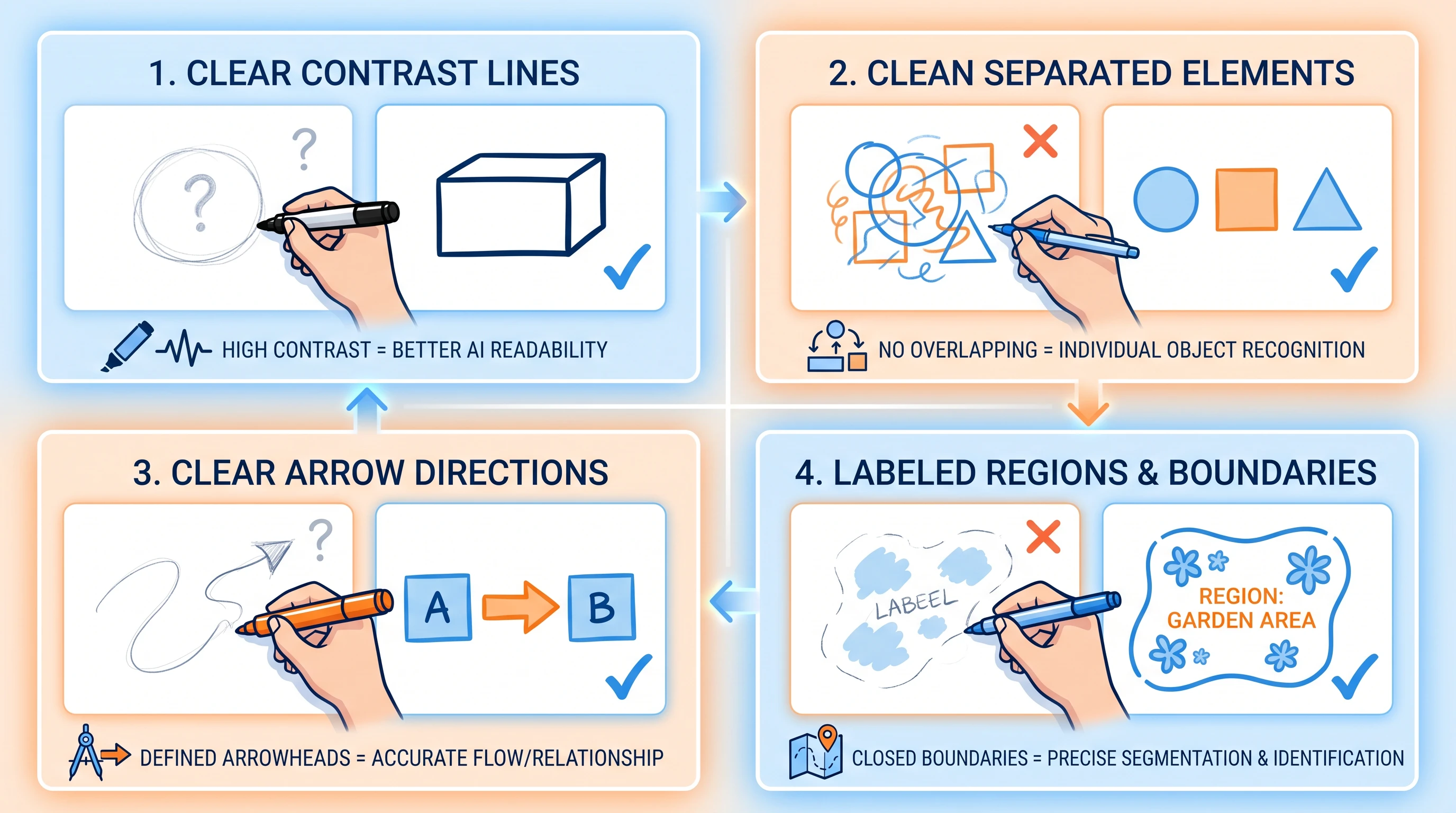
Tips for Better Sketch-to-Figure Results
The quality of the AI output depends partly on the quality of the input. The same prompting principles that work for text-to-figure apply to sketch upload too; five practices will improve your results consistently.
Educational 2x2 grid showing 4 sketch best practices: thick clear lines, separated elements, clear arrows with arrowheads, labeled regions (Figure generated with SciFig)
1. Draw large and leave space. Crowded sketches confuse the AI's spatial parser. When elements overlap or labels are written over arrows, the model has to guess at the intended relationships. Draw at a generous scale — if you are sketching on paper, use A4 or letter-size and leave at least half a centimeter between adjacent elements.
2. Use consistent arrow styles. If an arrow means activation, draw all activation arrows the same way throughout the diagram. If a T-bar means inhibition, use T-bars consistently. The AI infers semantic meaning from visual consistency. Mixing filled arrowheads and open arrowheads arbitrarily forces the model to treat them as identical, which may introduce errors in the rendered figure.
3. Label everything, even if it looks obvious. A circle in your sketch might be obviously a cell nucleus to you, but labeling it "nucleus" gives the AI unambiguous confirmation and ensures the rendered figure uses the correct anatomical terminology and visual conventions for that structure.
4. Capture in good light, perpendicular to the surface. Camera angle is the most common source of degraded input quality. A photo taken at a 45-degree angle introduces keystoning distortion that can make parallel elements look converging. Hold your phone directly above the sketch, parallel to the surface, and make sure the lighting is even with no shadows crossing the diagram.
5. Separate complex diagrams into panels. If your figure has distinct conceptual units — for example, an overview panel and a detail inset — sketch them separately and upload them as separate inputs. The AI performs better on focused, single-concept diagrams than on dense multi-panel composites. Combine the generated panels in your figure editor afterward.
Turn Sketches Into Pro Scientific Figures
Upload your hand-drawn sketch, get a polished scientific illustration instantly.
The single most impactful thing you can do to improve sketch-to-figure output quality is to write legible text labels directly on the sketch. When the AI can read your labels — molecule names, compartment boundaries, step numbers — it applies precise scientific conventions for those specific entities rather than inferring from shape alone. Clear labels outweigh almost every other input quality factor.
What AI Cannot Do (Yet)
Honest assessment of any tool requires acknowledging its limits. AI image-to-figure technology is genuinely powerful, but it has boundaries that are worth understanding before you commit to a workflow.
Complex three-dimensional structures remain challenging. If your sketch is trying to convey depth — a cross-section of a multi-layered tissue, a 3D rendering of a protein binding pocket, a volumetric diagram of an organ — the AI will produce a 2D interpretation that may not capture the spatial relationships you intend. For figures that are fundamentally three-dimensional, rendered molecular graphics software (PyMOL, ChimeraX) or purpose-built 3D illustration tools remain the better option.
Specialized chemical notation is a known limitation. Standard structural biology diagrams — receptor schematics, domain architectures, signaling networks — work well. But if your sketch contains proper chemical structures (ring systems, stereocenters, reaction mechanisms with electron-flow arrows), the AI may render these imprecisely. ChemDraw or equivalent chemistry-specific software remains the correct tool for any figure where chemical structure accuracy is scientifically critical.
Highly quantitative data figures are outside the tool's scope. If what you need is a bar chart, a scatter plot, a heat map, or a survival curve, AI image-to-figure is not the right approach. These figures should come directly from data visualization software (R, Python, Prism, MATLAB) to ensure numerical accuracy. AI image-to-figure is for conceptual and mechanistic diagrams — figures that convey logic and relationships, not quantities.
Understanding these limits helps you allocate the tool correctly: use it for mechanistic diagrams, pathway figures, experimental workflow schematics, anatomical illustrations, and conceptual models. Our text-to-figure across disciplines guide covers the full scope of AI-friendly figure types. For chemistry, 3D structures, and data plots, use the specialized tools those domains require.
The Democratization of Scientific Illustration
There is a larger story here that goes beyond workflow efficiency.
Diverse group of researchers (students, postdocs, PI) collaboratively transforming hand sketches into polished scientific figures on a shared AI canvas (Figure generated with SciFig)
For most of the history of scientific publishing, the quality of a paper's figures was tightly correlated with the institution's resources. Labs at well-funded research universities had access to professional scientific illustrators, graphic design staff, and high-end software licenses. Labs at smaller institutions, teaching universities, and research centers in lower-income countries made do with whatever their researchers could produce in PowerPoint.
The result was a systematic visual inequality in published science. The same experimental quality, the same conceptual insight, the same rigor in methodology — but the scientific figure from the well-resourced lab looked like Nature and the scientific figure from the underfunded lab looked like a homework assignment. Reviewers are not immune to this effect. Publication outcomes have historically been influenced by figure quality in ways that have nothing to do with scientific merit.
AI image-to-figure technology does not eliminate all barriers to publication, but it substantially lowers this particular one. A graduate student at a university with no illustration support, working on a modest stipend, can now produce figures that are visually indistinguishable from those produced by expensive professional services. The quality floor has risen dramatically.
This matters for individual researchers. It also matters for science as a whole. Ideas that might have been deprioritized by reviewers because their figures looked underprepared can now compete on their scientific merits. The sketch on the napkin can look like the scientific figure in the journal. That is a meaningful change in how scientific communication works.
Frequently Asked Questions
High-resolution JPEG or PNG photographs work well for whiteboard and paper sketches. If you are working on a tablet, export as PNG at the highest available resolution. PDF exports from drawing apps are also acceptable. The key factor is resolution — aim for at least 1500 pixels on the shorter dimension. Very small images (under 800 pixels) will produce degraded output because the AI has less visual information to work with.
The AI is designed to preserve the spatial logic of your sketch — the relative positions of elements, the directionality of connections, and the hierarchical relationships you have established. It will clean up proportions and regularize geometry (making hand-drawn rectangles into proper rectangles, for example), but it should not fundamentally rearrange your layout. If you find that a generated figure has departed significantly from your intended spatial organization, try adding a more explicit description of the layout in your text input: "maintain the top-to-bottom signal flow with membrane at the top and nucleus at the bottom."
The tool works with any image input — hand-drawn sketches, photographs of whiteboards, screenshots of existing digital figures, or exported images from other software. If you have an older figure that needs visual updating (outdated color scheme, inconsistent line weights, labels that no longer meet journal requirements), uploading the existing figure with instructions for the desired changes is a valid workflow. Think of it as AI-assisted figure revision, not just sketch conversion.
The most effective approach is to generate the conceptual elements with AI image-to-figure and then combine them with your data-generated elements in a figure editor. For example: generate a pathway diagram schematic with the AI, export as SVG, open in Illustrator or Inkscape, and place your quantitative inset panels (generated in R or Prism) within the layout. This hybrid approach gives you AI-quality conceptual art alongside numerically precise data visualization — which is exactly what most complex figures require.
Yes, for the most commonly used conventions in molecular and cell biology, neuroscience, and general biomedical science. Standard symbols for receptor activation, kinase phosphorylation, inhibitory signaling, and subcellular localization are well within the model's domain knowledge. Less common conventions — highly specialized notation systems used in niche fields, or laboratory-specific diagram styles — may require explicit description in your text input. When in doubt, label ambiguous symbols in your sketch and describe them in your prompt.
Recommended next
Related scientific figure resources
Go deeper with the most relevant SciFig pages for this article.