Three AI methods for publication-ready cell signaling pathway diagrams in minutes — text-to-figure, sketch-to-figure, and SVG vector export.
SciFig Team
Scientific Illustration Experts
If you have ever spent an entire afternoon arranging protein nodes in Adobe Illustrator — nudging arrows by two pixels, hunting for a receptor tyrosine kinase clipart that doesn't look like it was drawn in 2003 — you already understand the problem. Cell signaling pathway diagrams are essential to virtually every molecular biology paper, yet producing one that meets journal standards can consume four to eight hours of skilled labor. BioRender offers a shortcut, but its subscription costs can easily exceed $1,000 per year for a single researcher, and the symbol library still forces you to work within rigid templates. There is a better way, and it does not require a design degree or an institutional budget.
The Old Way vs. The AI Way
The traditional workflow for a pathway diagram runs something like this: open your vector editor of choice, search a licensed clipart library for each molecular component, manually position and label every element, draw arrows and establish visual hierarchy, then iterate through two or three rounds of revisions when your PI says the MAPK cascade is missing ERK2. From start to submission-ready figure, four to eight hours is realistic — and that clock resets whenever experimental results change the pathway.
The AI-powered workflow compresses this to minutes. Instead of assembling a scientific figure piece by piece, you describe what you need in plain scientific language and let a generative model handle layout, iconography, and styling. The result is a draft-quality figure in under sixty seconds. From there, you refine the prompt, upload a reference sketch, or polish individual elements in a vector editor — all within a single platform.
Step
Traditional
AI-Assisted
Initial draft
2–3 hours
< 2 minutes
Revision cycle
1–2 hours each
Seconds per iteration
Vector export
Manual cleanup
One-click SVG export
Skill required
Intermediate design
Plain-language prompting
The gap is not incremental. It is the difference between a scientific figure being a bottleneck and a scientific figure being a routine deliverable.
Method 1 — Text-to-Figure (The Fastest Approach)
Text-to-Figure is the most direct route: type a description, receive a figure. For pathway diagrams, the quality of your output scales directly with the specificity of your prompt.
Here is a worked example using the NF-κB signaling pathway. Open the SciFig text-to-figure interface and enter a prompt along these lines:
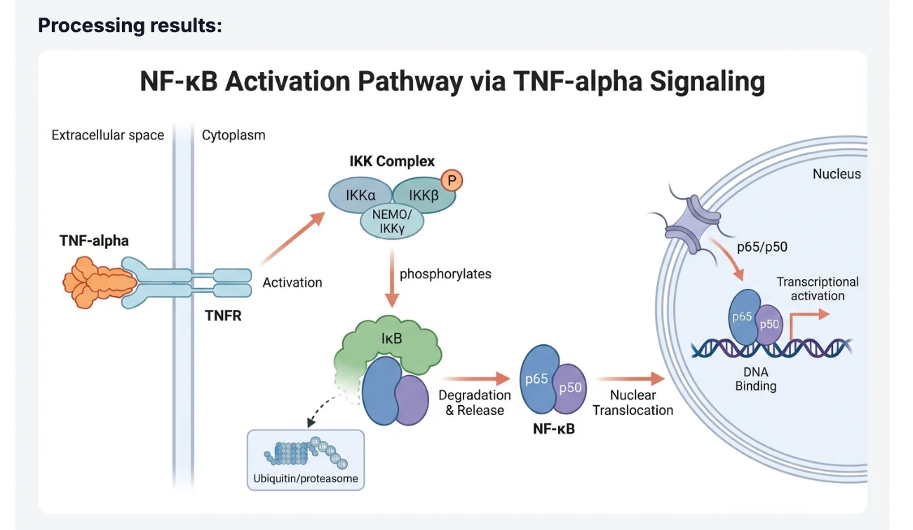
"Create a publication-ready cell signaling diagram of the canonical NF-κB pathway. Show TNF-α binding to TNFR1 at the plasma membrane, recruitment of TRADD and TRAF2, activation of the IKK complex (IKKα, IKKβ, IKKγ/NEMO), phosphorylation and proteasomal degradation of IκBα, and nuclear translocation of the p65/p50 heterodimer. Use a clean white background, labeled arrows indicating phosphorylation events, and a color scheme suitable for grayscale printing."
Notice what this prompt accomplishes: it names specific proteins rather than using generic terms, it specifies the subcellular compartments (plasma membrane, cytoplasm, nucleus), it requests labeled arrows for mechanistic clarity, and it anticipates a practical constraint (grayscale printing). Each of these details guides the model toward a scientifically accurate and journal-appropriate output.
SciFig text-to-figure interface
After submitting the prompt, the model generates a complete pathway diagram with consistent iconography, directional arrows, and protein labels. Most prompts produce a usable first draft; a single iteration — adding a detail like "include the p38 MAPK crosstalk pathway branching from TRAF2" — typically resolves any missing components.
AI-generated NF-κB pathway diagram
Tip
Prompt specificity is the single biggest lever for output quality. Name proteins by their standard HGNC symbols, specify subcellular localizations, and describe the directionality of each signaling event. A 60-word prompt almost always outperforms a 10-word one. See our S.S.V.D. prompt framework for the full pattern with 10 ready-to-use templates.
See AI Scientific Figure Generation in Action
Watch how researchers create publication-ready scientific figures from text descriptions.
Method 2 — Image-to-Figure (From Sketch to Science)
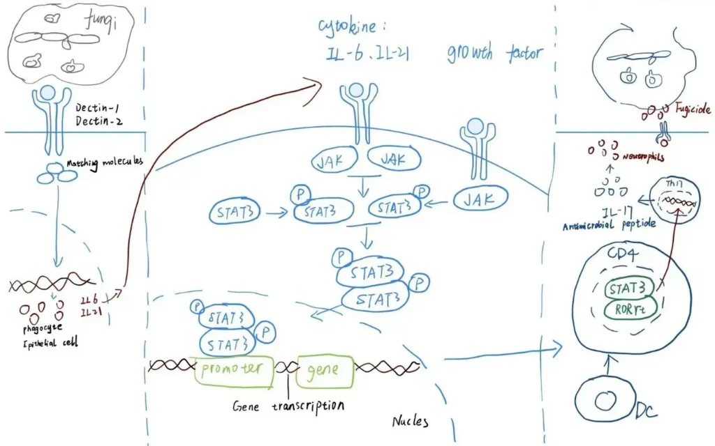
Not every pathway diagram starts from scratch. You may have a hand-drawn schematic from your lab notebook, a rough figure from a grant proposal, or a low-resolution diagram from an older publication that needs updating. Image-to-Figure — covered end-to-end in our hand-drawn sketch-to-figure walkthrough — converts these rough sources into polished illustrations by combining your visual layout with AI-powered rendering.
The workflow is straightforward. Draw or photograph your sketch — it does not need to be clean; even pencil on a whiteboard qualifies — and upload it to the Image-to-Figure interface. Then add a short text prompt describing the style and any elements you want added or modified:
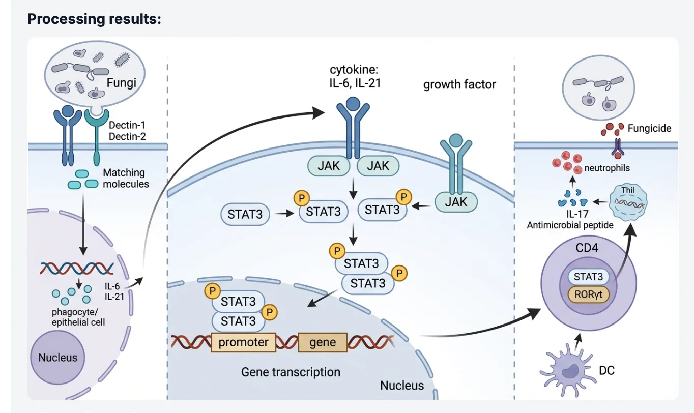
"Convert this hand-drawn MAPK cascade sketch into a publication-ready pathway diagram. Preserve the existing layout. Add labels for MEK1/2 and ERK1/2, use standard phosphorylation arrow notation, and apply a consistent blue-and-white color scheme."
Uploading a hand-drawn pathway sketch
The model reads the spatial relationships in your sketch — which components are upstream, how branches connect, where the nucleus sits relative to the membrane — and renders a professional figure that honors your intended architecture while replacing rough linework with clean vector-style graphics.
AI-rendered professional figure from sketch
This approach is particularly valuable when you need to reproduce a pathway from a published paper in higher quality. Rather than reconstructing the pathway from memory, you can photograph the original figure and instruct the AI to render it in your lab's style guide — saving time while maintaining scientific fidelity to the source.
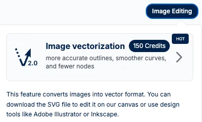
The Secret Weapon — SVG Vectorizer
AI-generated raster images look excellent on screen and in PDF, but journals frequently require figures at 300–600 DPI, and some submission systems demand editable vector files so that production editors can reflow text and resize elements without quality loss. SciFig's SVG Vectorizer bridges that gap.
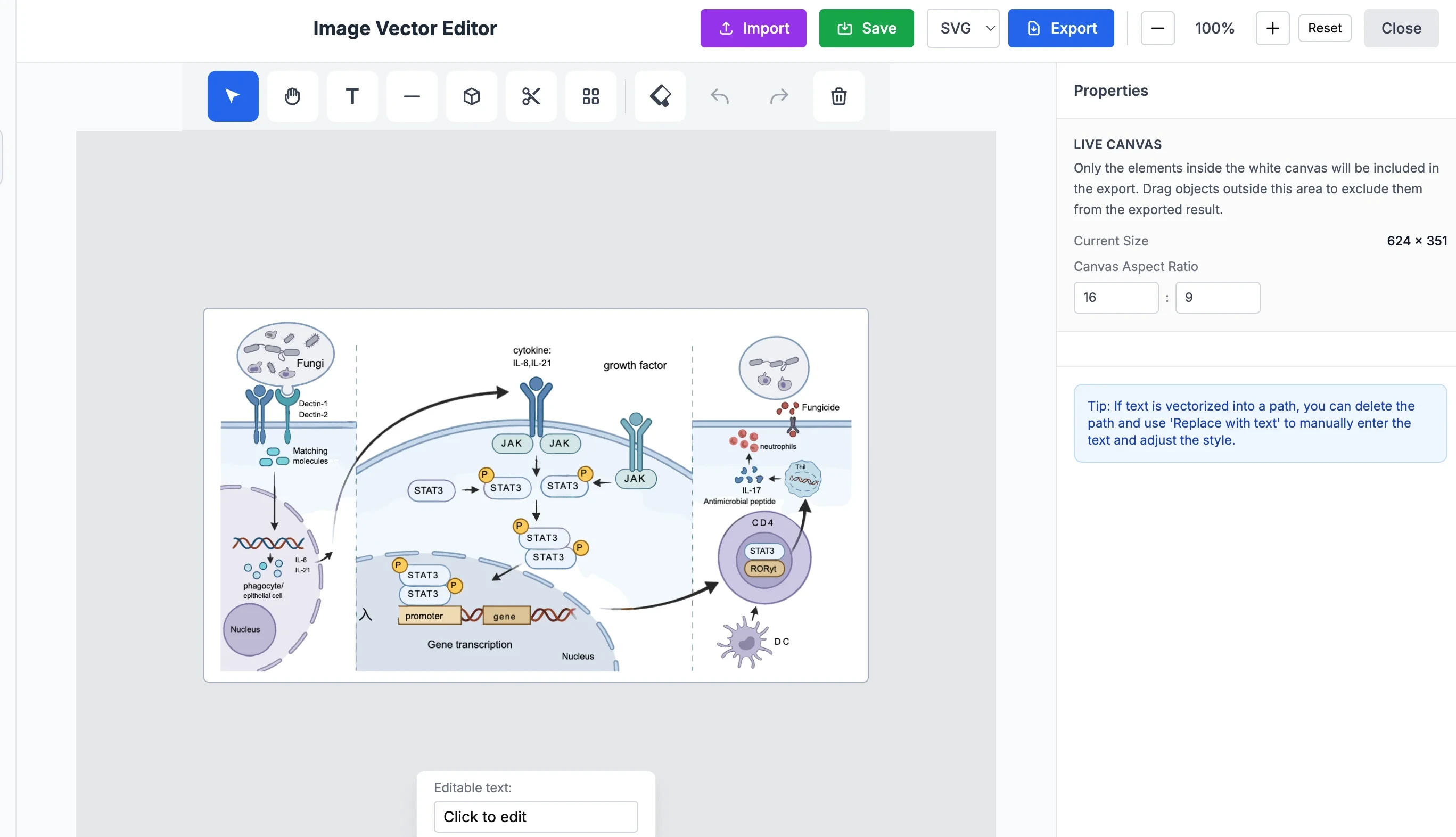
After generating a pathway diagram with either of the methods above, run it through the vectorization step. The tool traces every element — protein shapes, arrows, labels, background fills — and converts the raster output into a fully editable SVG file.
Figure vectorization interface
Once you have an SVG, you can open it in any vector editor (Inkscape, Adobe Illustrator, Affinity Designer) and manipulate individual components: change a protein label font, recolor a phosphorylation arrow, move a receptor without disturbing the rest of the scientific figure, or swap a single element for a revised version after peer review.
Editing vectorized figure in SVG editor
The practical implication: you can generate the bulk of your figure in seconds using AI, then make surgical edits in a vector editor for the final 5% of polish. This is far faster than building the entire figure manually, yet gives you the same degree of control that traditional workflows offer.
Create Scientific Figures Now
Describe your scientific figure in natural language — get publication-ready illustrations in minutes.
Generating a good pathway diagram is a skill that improves quickly with practice. Here are the most impactful adjustments researchers discover after their first few attempts:
1. Name every protein by its standard symbol. Generic terms like "a kinase" or "the receptor" yield generic outputs. Specific symbols like EGFR, PI3K, AKT1, and mTORC1 allow the model to apply accurate domain knowledge about molecular structure and signaling relationships.
2. Specify subcellular compartments explicitly. Stating "at the plasma membrane," "in the cytoplasm," and "following nuclear translocation" gives the model a spatial framework that organizes your pathway into a coherent diagram rather than a flat list of interactions.
3. Describe arrow semantics. Signaling diagrams use different arrow types to mean different things: activation, inhibition, phosphorylation, cleavage, translocation. Including instructions like "use blunt-ended arrows for inhibition and arrowheads for activation" ensures the scientific figure communicates mechanism accurately.
4. State your output constraints up front. If your target journal requires figures at 300 DPI, a two-column width of 84 mm, or a specific color palette, include these in the initial prompt rather than adding them later. Early constraint specification reduces revision cycles.
5. Iterate in small, specific steps. Rather than rewriting the entire prompt when something is missing, append a single targeted instruction: "Add the IκBα resynthesis feedback loop from the nucleus back to the cytoplasm." Focused iterations converge on the final figure faster than wholesale rewrites.
Frequently Asked Questions
Yes, with appropriately specific prompting. SciFig's models are trained on scientific literature and understand the structural and functional relationships between canonical pathway components — including branching cascades like MAPK, JAK-STAT, Wnt/β-catenin, and PI3K/AKT/mTOR. For highly specialized or recently characterized pathways, include a brief mechanistic description in your prompt to supplement the model's training data. The more precise your input, the more accurate the output.
Generated raster images are produced at high resolution suitable for standard journal submission — typically 300 DPI or higher at typical figure dimensions. For publications requiring vector files, use the SVG Vectorizer to export an infinitely scalable SVG. This satisfies the requirements of virtually all peer-reviewed journals, including those with strict production specifications.
Yes. The SVG Vectorizer converts any generated figure into a fully editable vector file. Once exported as SVG, you can open the file in Inkscape, Adobe Illustrator, or any other vector editor and modify individual elements — labels, arrows, shapes, colors — without affecting the rest of the scientific figure. This gives you the precision of manual design with the speed of AI generation.
The scientific figure itself is what matters to journals, not the tool used to produce it. As long as your figure meets the journal's technical specifications (resolution, color mode, file format) and accurately represents your data, the production method is irrelevant. Many researchers already use AI-assisted tools for figure production; what journals require is scientific accuracy and appropriate image integrity, both of which you maintain by reviewing and validating the AI output before submission.
BioRender is a drag-and-drop symbol library that gives you fine-grained control over every element but requires significant time investment and design skill to produce complex pathway figures. SciFig generates complete figures from text descriptions or sketches, dramatically reducing the time to a first draft. The two tools occupy different points on the speed-vs-control spectrum. For researchers who need rapid iteration, exploratory figure generation, or who lack design backgrounds, the AI-first approach is faster. For figures requiring very specific custom iconography with pixel-level control from the start, a hybrid approach — generate with SciFig, finish in a vector editor — often delivers the best of both worlds. Our 2026 scientific illustration tools comparison breaks down 10 options across pricing, scope, and output formats.
Recommended next
Related scientific figure resources
Go deeper with the most relevant SciFig pages for this article.