SciFig
Get Started Free

Turn your data into a publication-ready chart

Drop in a CSV, TSV, or Excel file — optional significance tests, export to PNG, PDF, EPS, or TIFF.

Import a data file to continue.

Start with up to 150 free credits|No credit card required

Get up to 350 free credits on day one when you join through an invite.

3 figure engines · 500+ templatesEvery label editable · 60+ color schemesEditable PPTX · Layered SVG · 8K PNG / JPG

Chart Templates

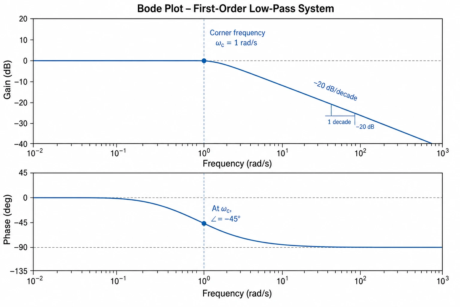
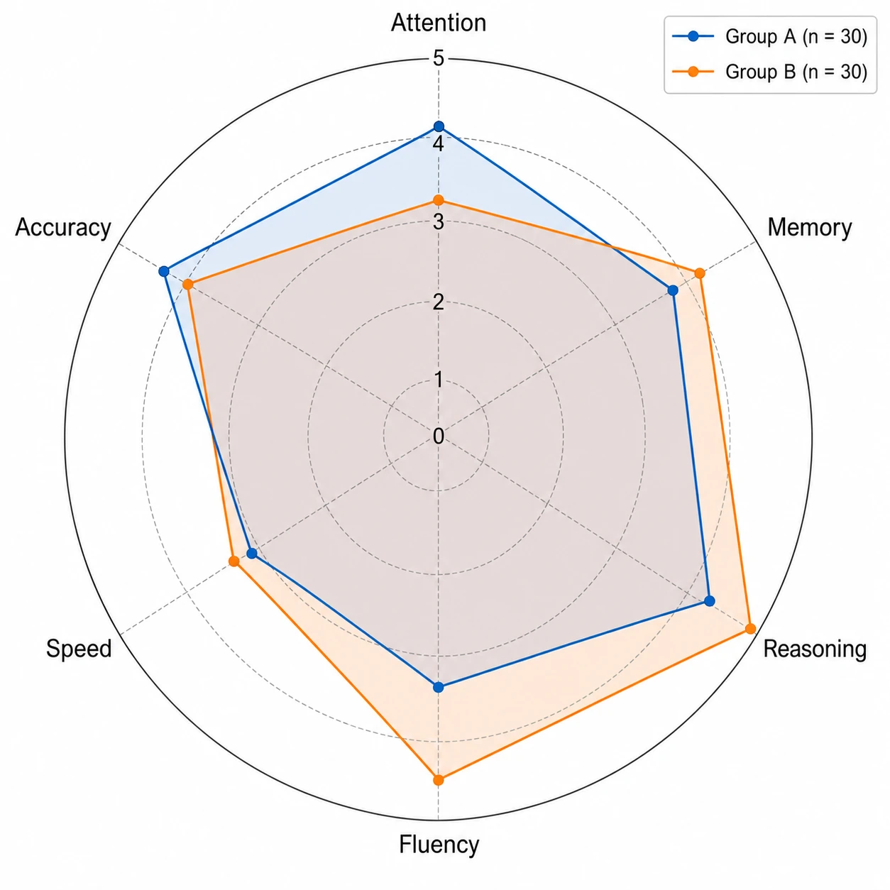
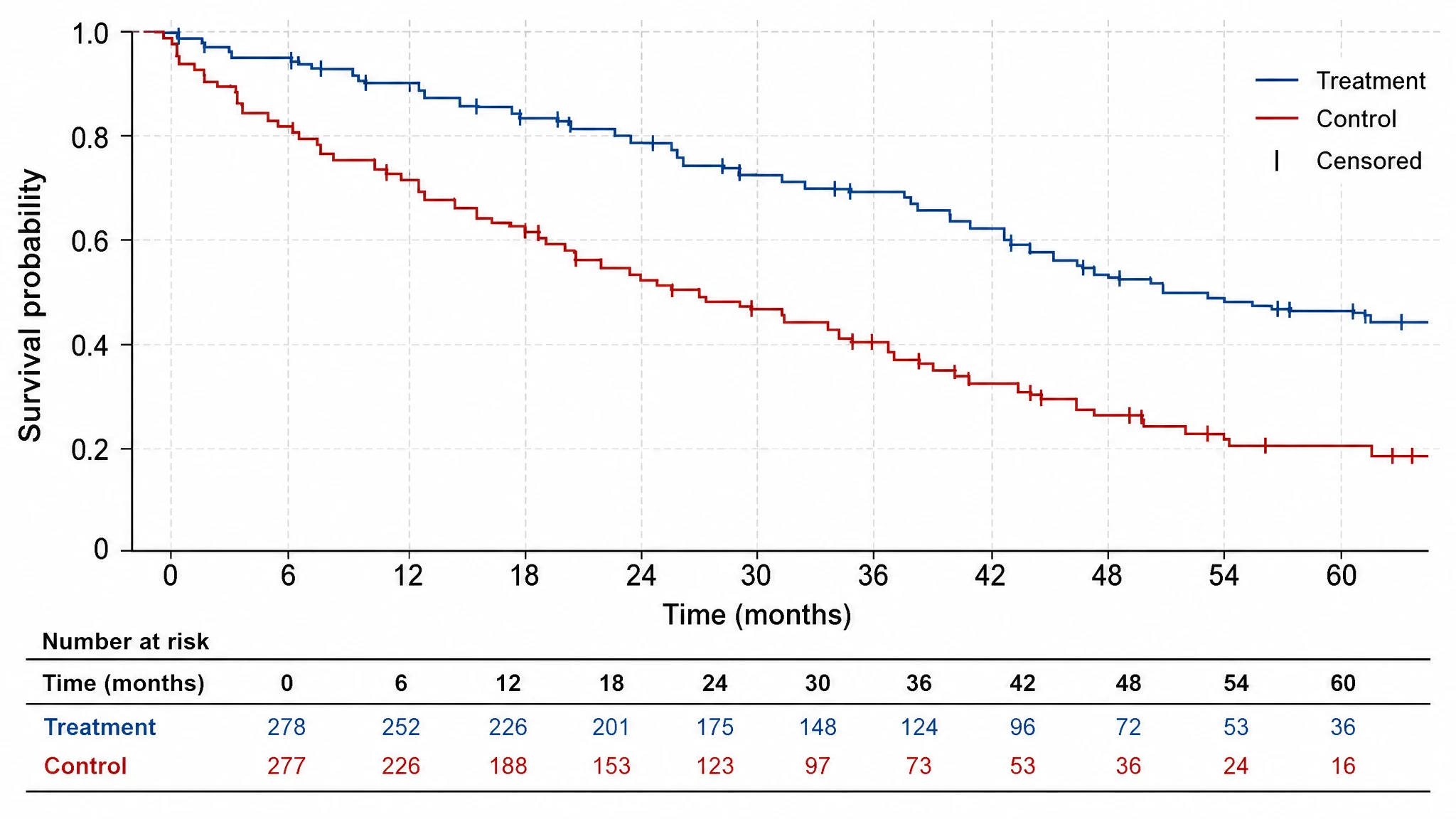
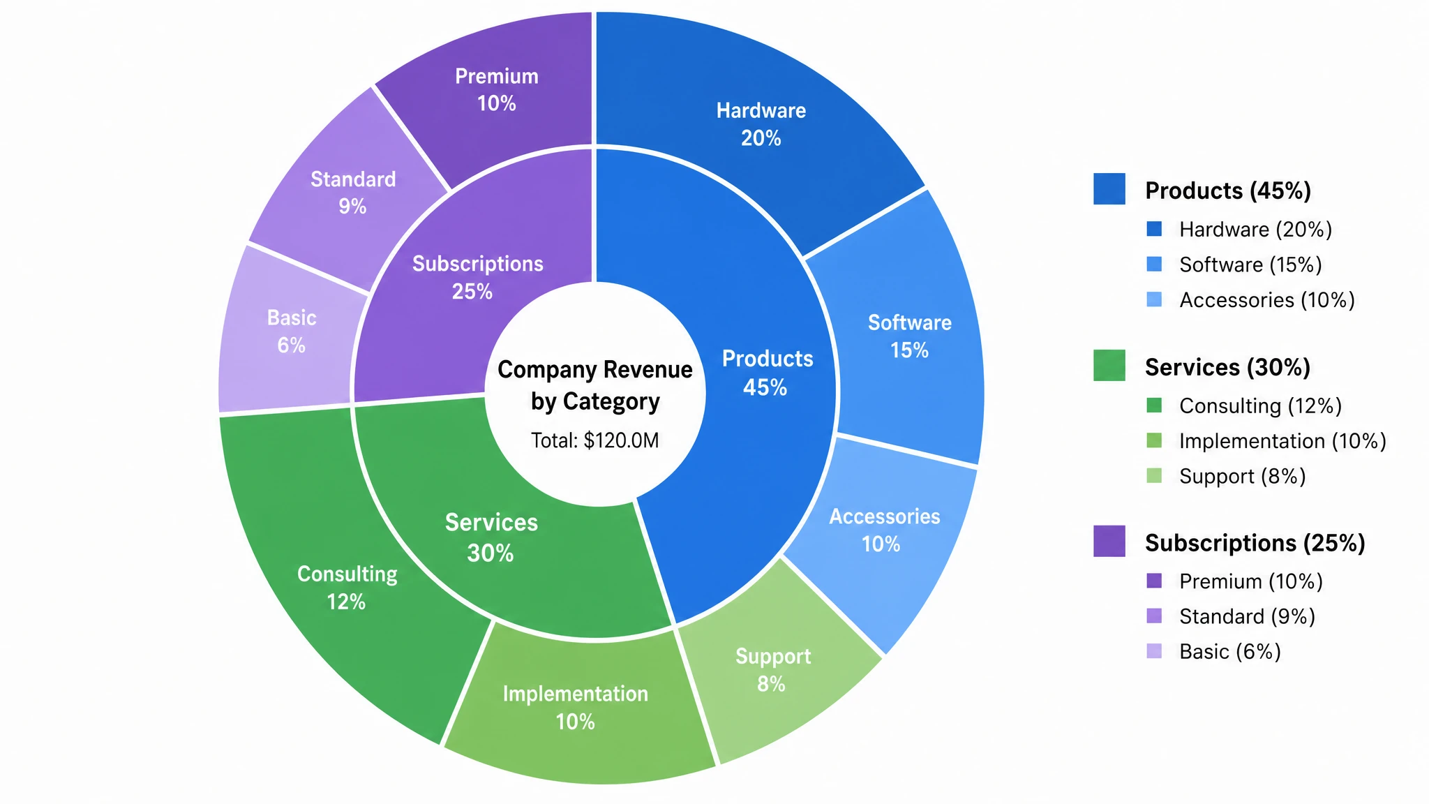
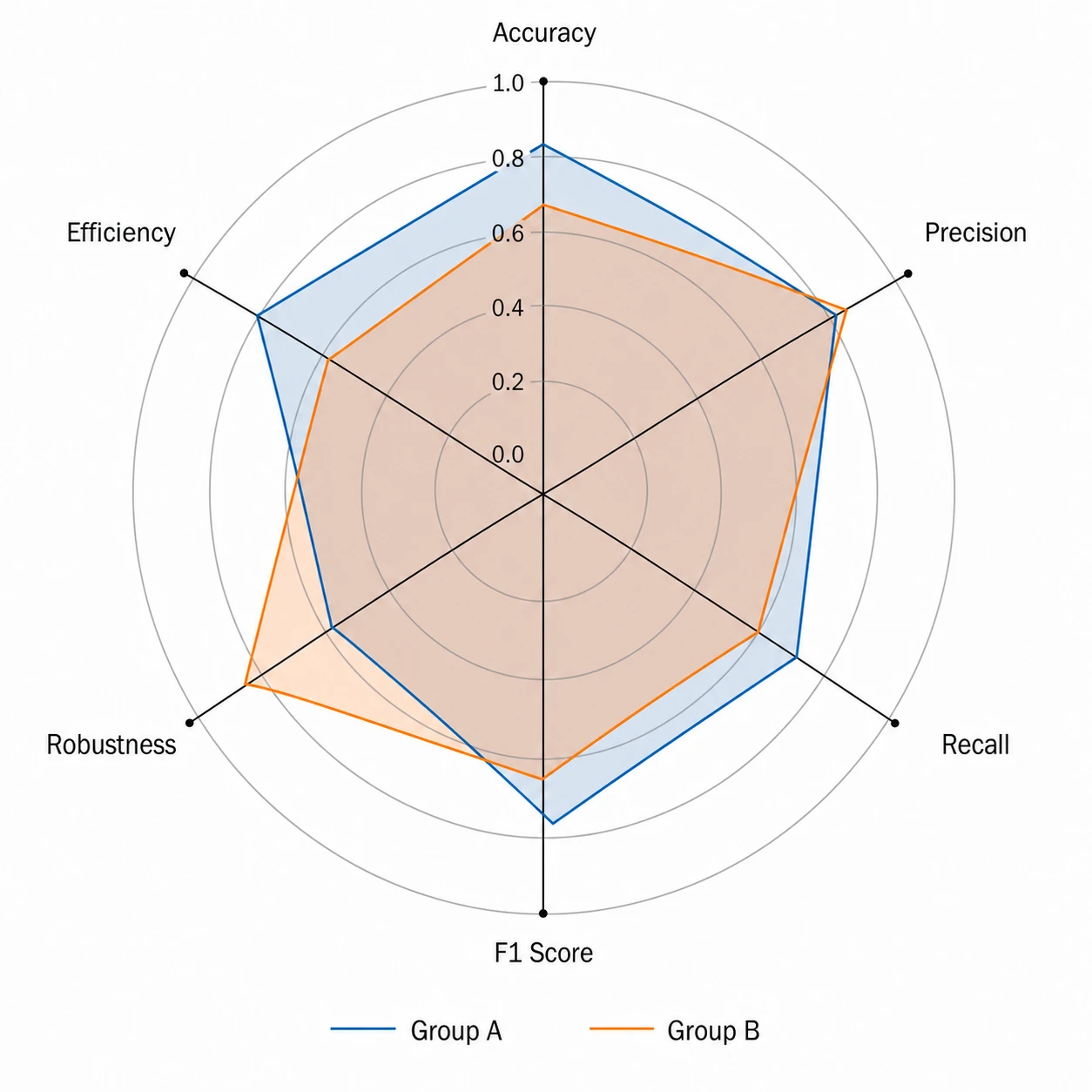
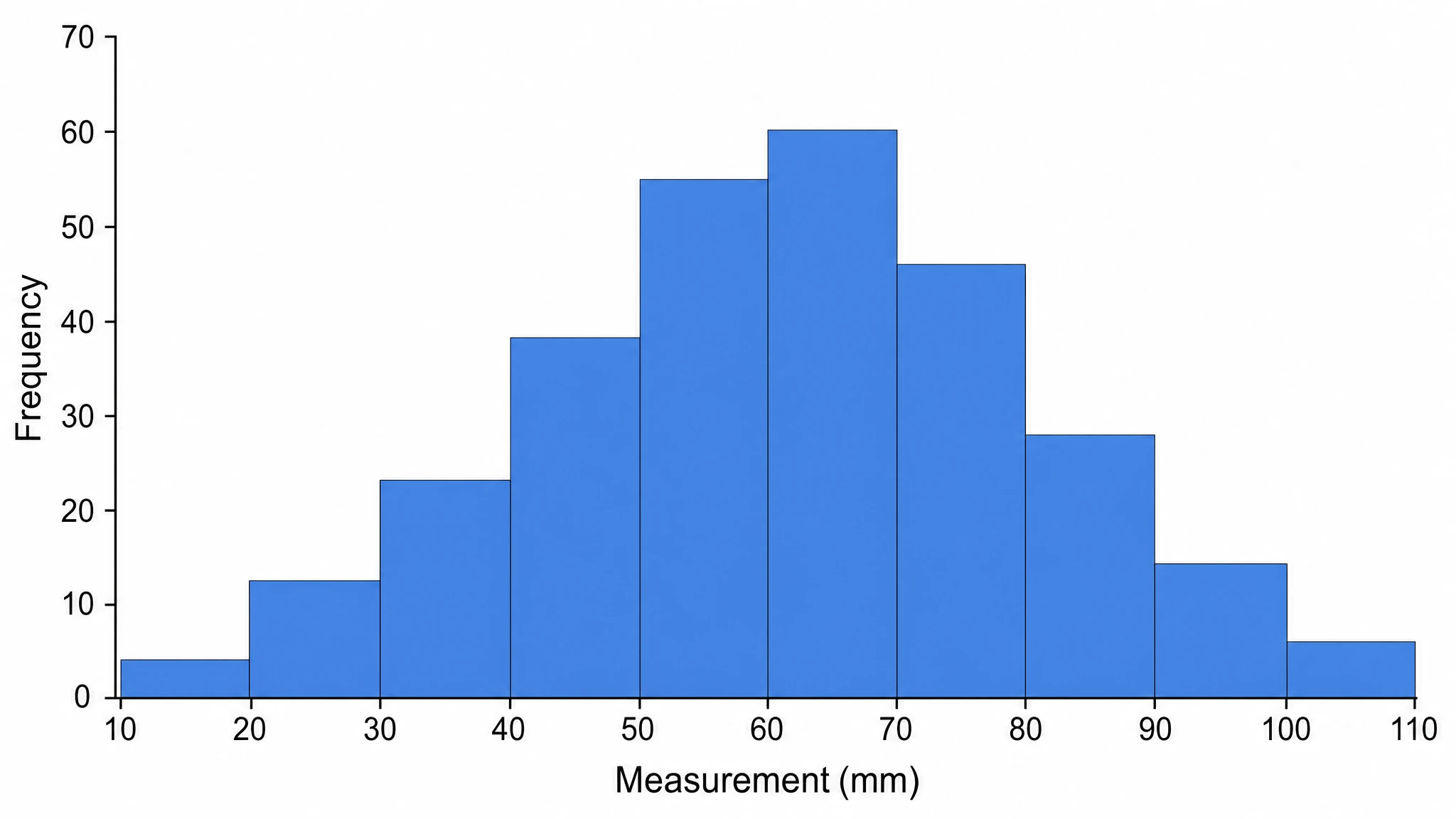
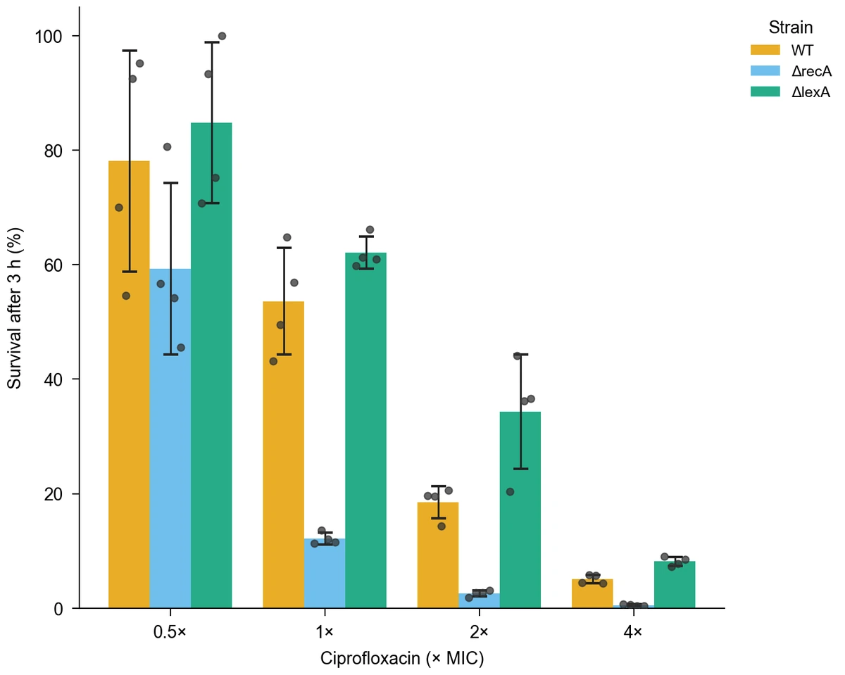
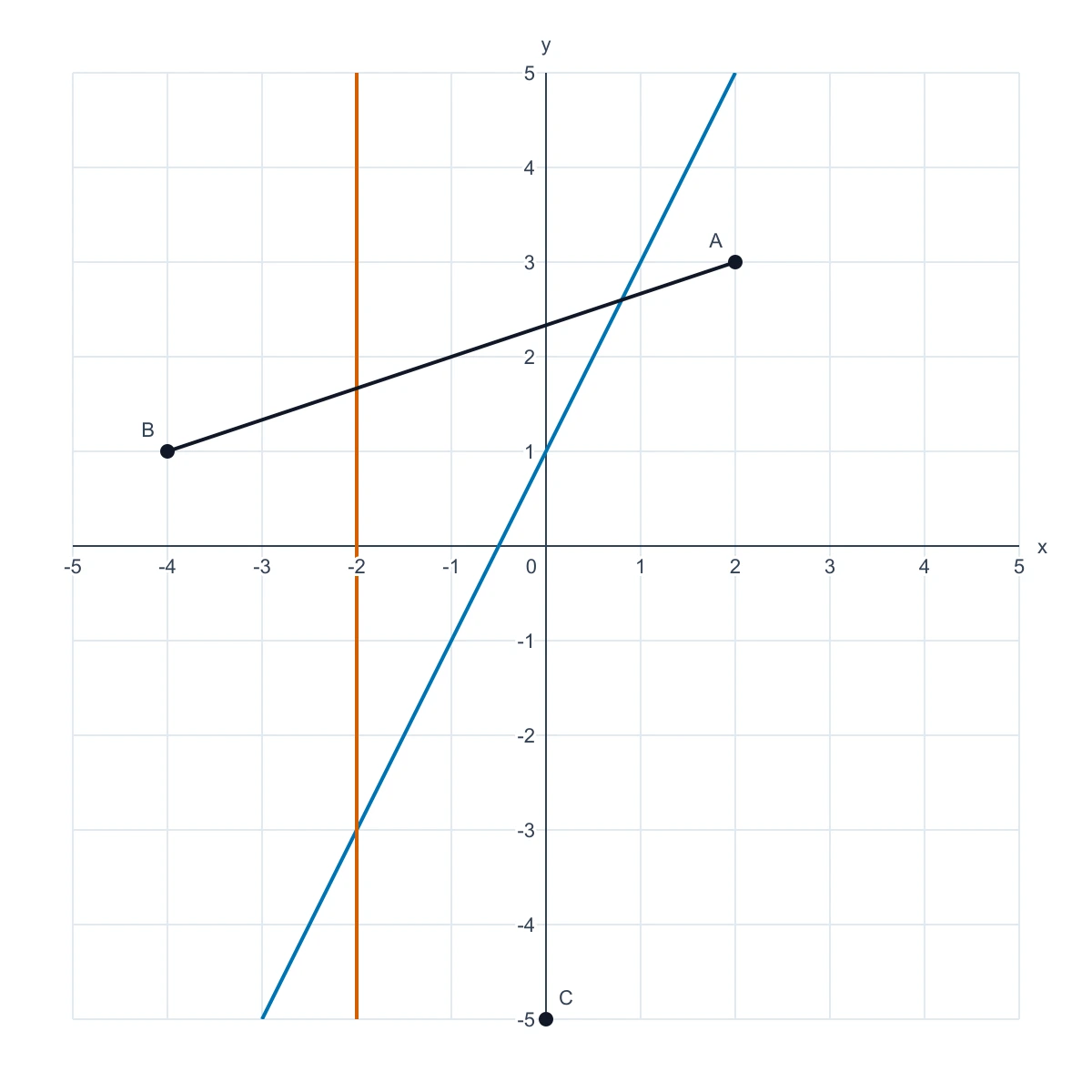
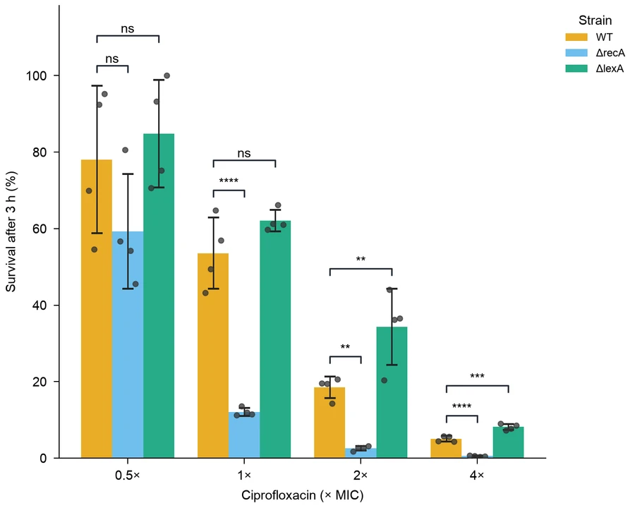
Bar chartCiprofloxacin survival
Box plotInsulin and obesity
Regression plotMammal metabolic scaling
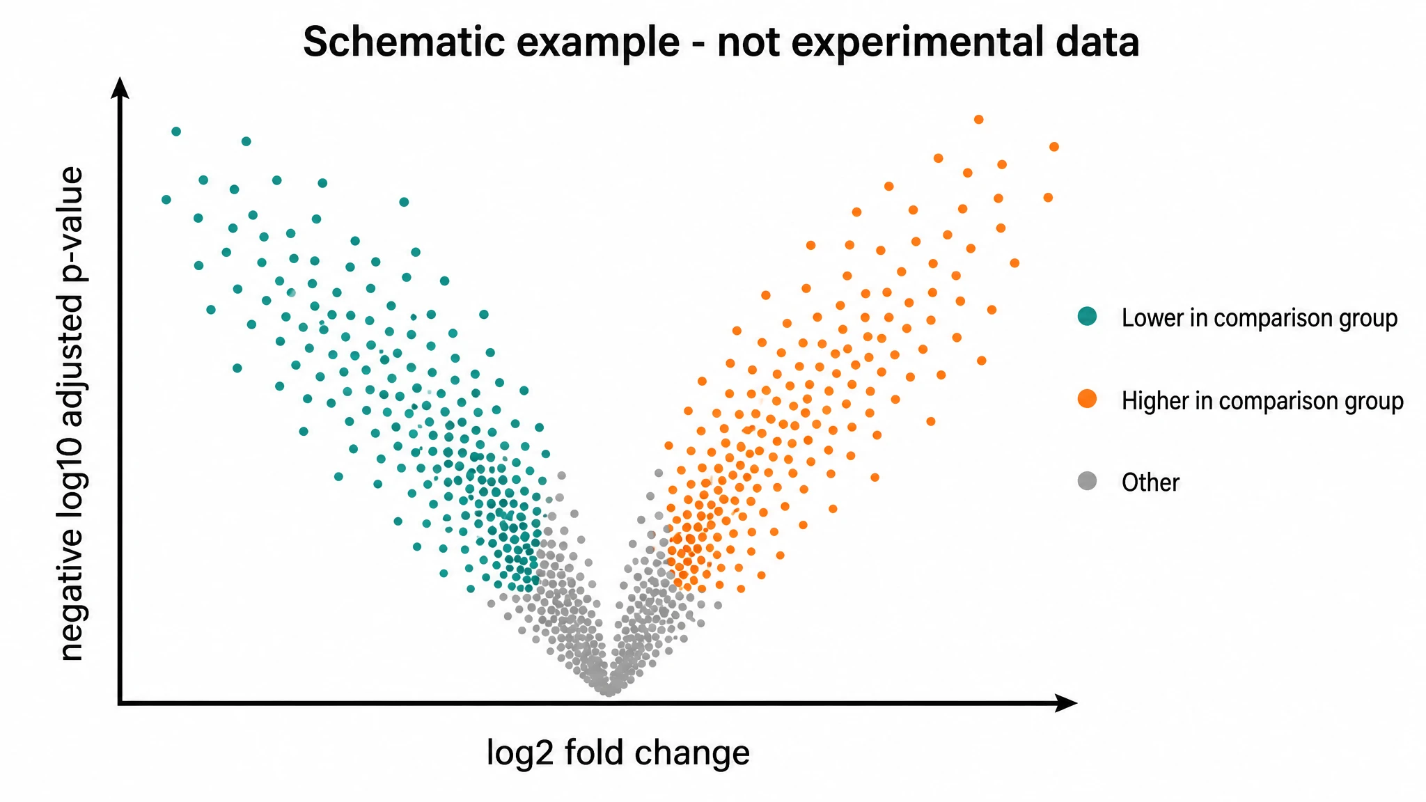
Volcano plotLiver cancer transcriptome

WHAT IS AN AI CHART MAKER?

Free AI Chart Maker for CSV, Excel and Pasted Data

Turn a Data Table into a Clear Visual Comparison

A chart maker turns a table of observations into a visual comparison. SciFig brings CSV, Excel and pasted data into a workspace where you can describe the research question, develop a chart draft and refine supported settings. Use the graph maker to explore categories, time trends, distributions or relationships with a suitable chart type. Check plotted values, units and labels against the source table before exporting the figure for a paper, report or presentation.

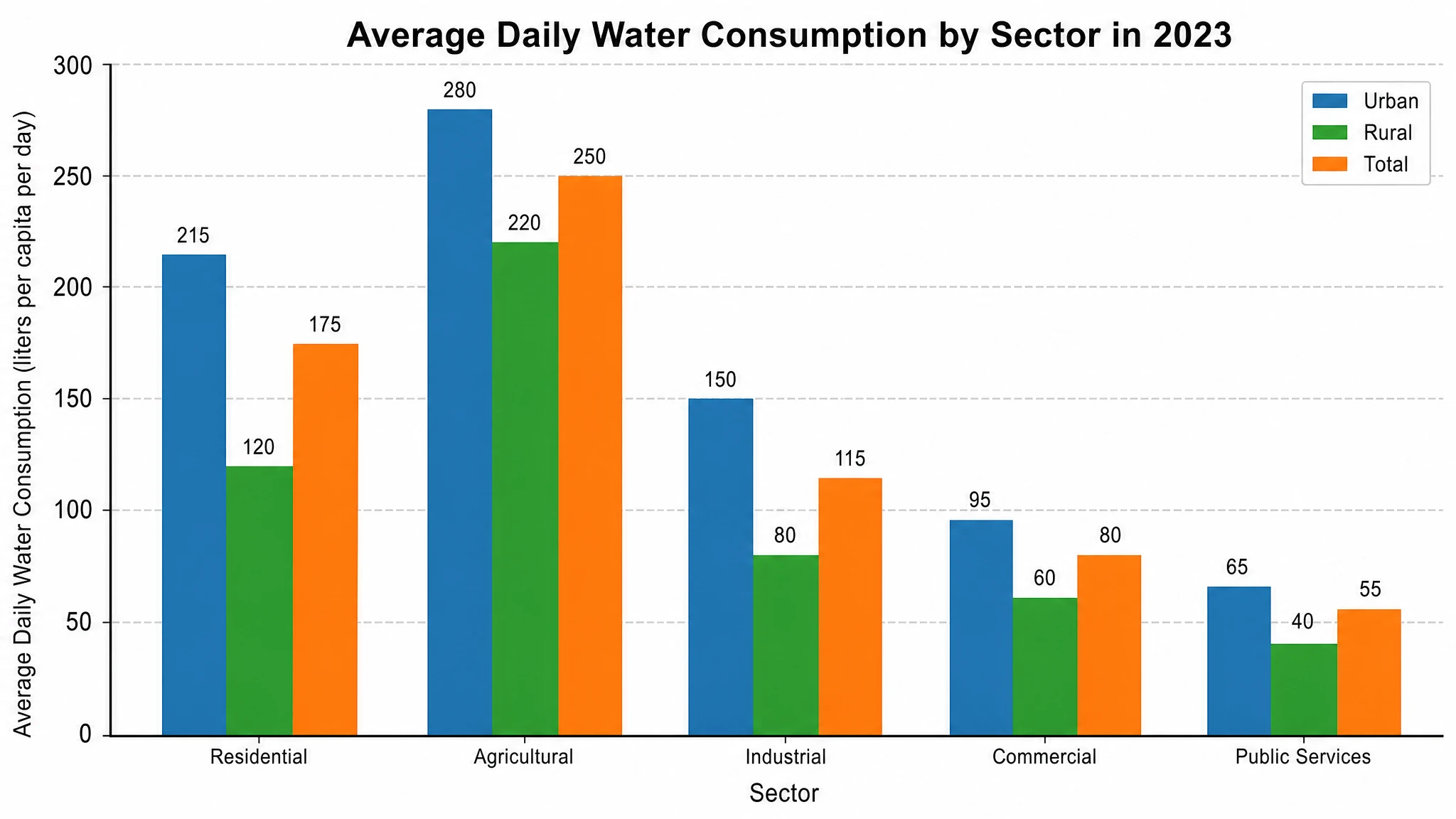
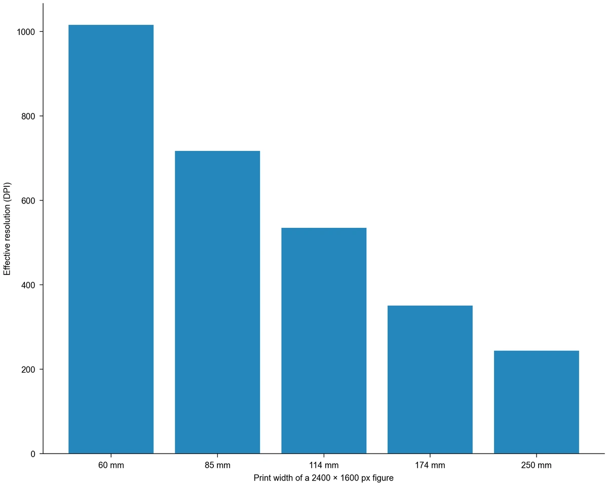
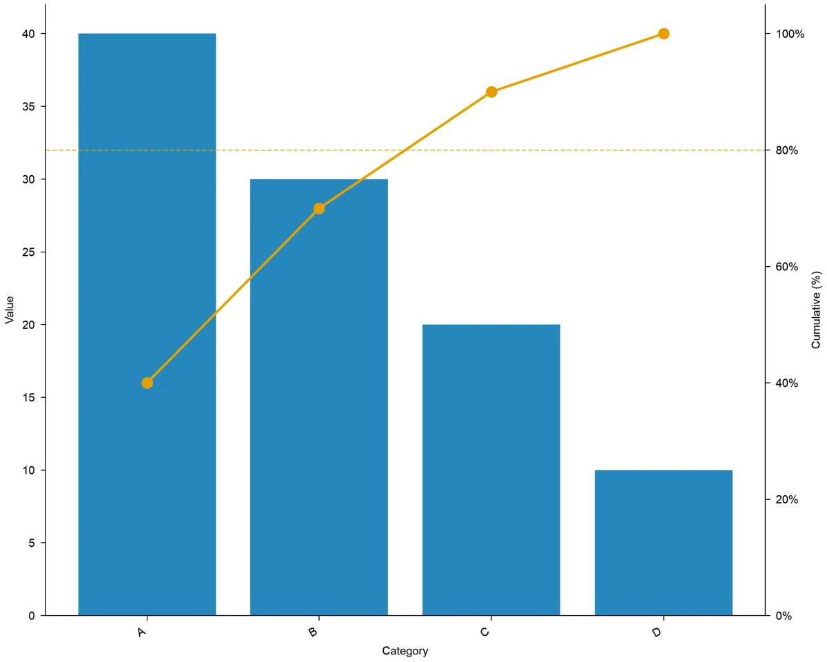
Bar chart comparing the template dataset categories
  • CSV, Excel and pasted tables
  • Chart types for different questions
  • Labels and supported styling controls
  • PNG, PDF, EPS and TIFF export

AI Chart Maker Features

Match your data to a chart, then refine the labels and styling for the comparison you want to show.

Bring Your Data into One Workspace

Start from CSV, Excel or a pasted table and turn observations into a chart brief. Inspect the data preview, choose the relevant worksheet and identify measurements, groups and units. This chart maker helps you move from a table to a visual comparison with the input clearly defined before generation.

  • Use supported CSV, Excel or pasted-table input.
  • Inspect the worksheet and column values in the preview.
  • Identify the measurements and comparison to visualize.
Prepare Your Data

Find the Chart That Answers Your Question

Choose a visual around what readers need to understand: differences between groups, change over time, distributions or relationships between variables. The AI chart generator supports chart drafts guided by your data and requested comparison. Use relevant templates to communicate the structure, then review the result against the observations.

  • Compare categories with a suitable bar chart.
  • Explore relationships, distributions or matrix patterns.
  • Use a relevant template to guide the chart structure.
Explore Chart Templates

Make Axes and Legends Easier to Read

Refine the labels, colors, scales and supported chart settings so readers can follow the comparison. This graph maker helps you develop the presentation while retaining the meaning of the data. Statistical options are available where supported by the chart type and settings; inspect values and units after a revision.

  • Clarify measurement units, axes and series labels.
  • Adjust supported colors, legends and chart settings.
  • Review the data meaning after visual or statistical changes.
Prepare Your Data

Export Charts for Papers and Slides

Prepare a chart for the size and format of your manuscript, report or presentation. Review labels and plotted values, then choose PNG, PDF, EPS or TIFF from the available export options. Keeping the project lets you return to chart revisions while the exported figure is used in the intended document.

  • Choose a supported PNG, PDF, EPS or TIFF export.
  • Check labels at the final display size.
  • Keep the project for later chart revisions.
Prepare Your Data

How to Use an AI Chart Maker

Import your data, choose a suitable chart, then check the result before export.

  1. Import and Inspect Your Table

    Choose a supported file or paste the table. For Excel, select the worksheet you need. Inspect the preview for column names, measurements, groups and units so the AI chart maker starts with the data you intend to present.

  2. Describe the Comparison

    Explain what the reader should compare or understand, then choose a suitable chart type or template. For example, compare treatment groups with a bar chart or explore two numerical variables with a scatter plot. Include the relevant labels and measurement units.

  3. Generate and Review the Chart

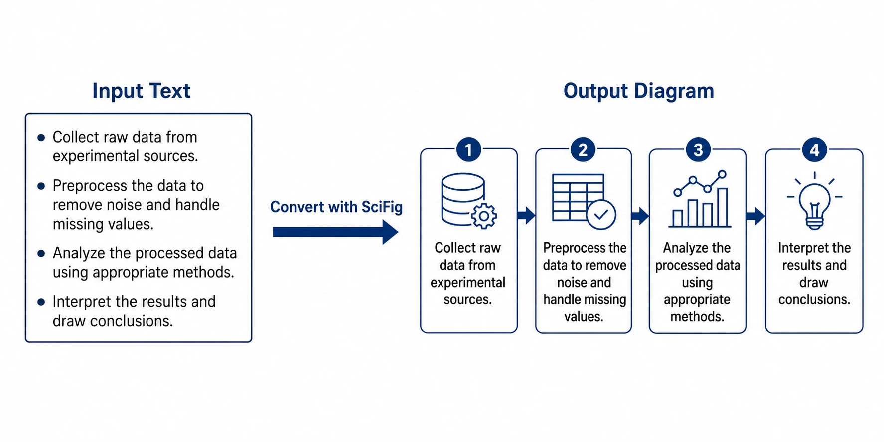
    Generate the chart with AI planning and Python plotting from your table. Explore the plotted values, axes and series, then adjust column mappings, labels, colors and other chart settings to communicate your comparison. Export the result as PNG, PDF, EPS or TIFF.

  4. Refine and Export the Figure

    Adjust labels, colors and supported chart settings, then inspect the revised result. Check the text at the intended report or slide size and choose an available PNG, PDF, EPS or TIFF export. Keep the project if the figure needs later revisions.

Chart and Graph Use Cases

Use charts to communicate comparisons, distributions, relationships and flows in real data.

Bar chart comparing the template dataset categories

Experimental Group Comparisons

Bring measurements and group labels into a chart that explains the comparison. A chart maker can help develop a bar chart for treatment groups, conditions or categories, with the measured quantity and units visible. Use the resulting figure in a lab meeting or report after checking the plotted values.

Explore this example
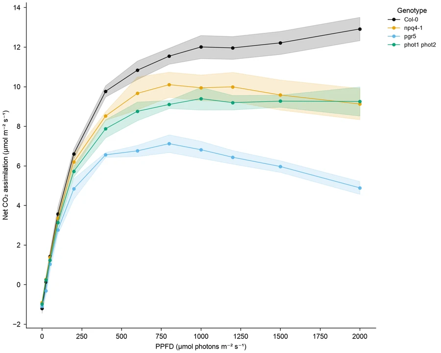
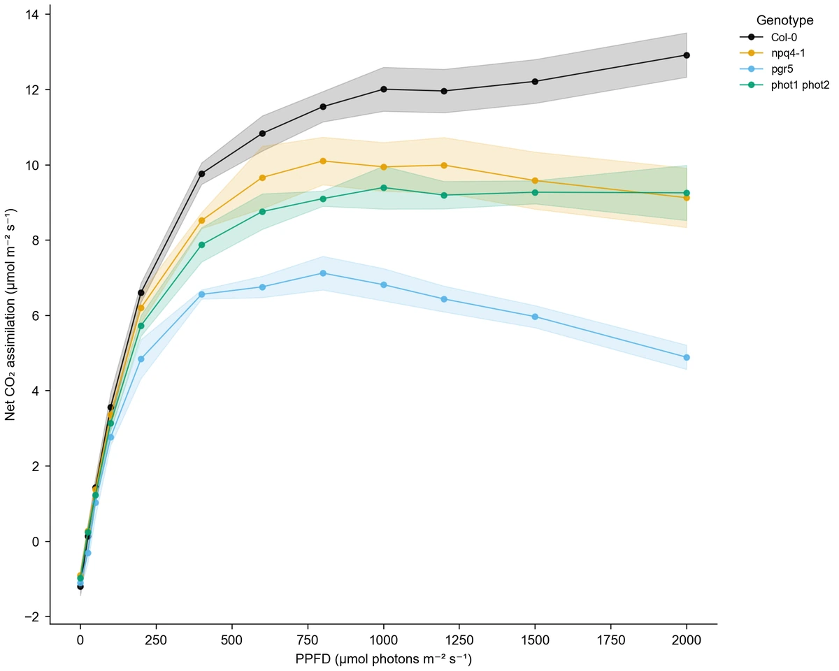
Line chart of Arabidopsis light-response observations

Measurements over Time

Show how observations change across measurement times or another ordered variable. Provide the time values, series and units, then develop a line chart for the pattern you want to explain. Review missing observations and intervals before placing the graph in a results summary or presentation.

Explore this example
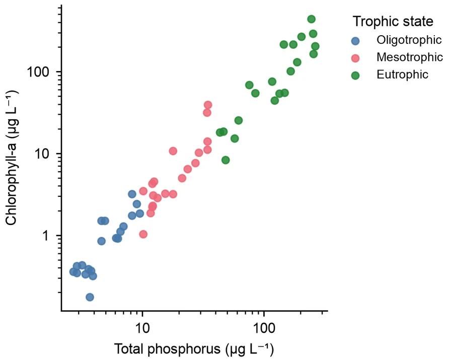
Scatter plot of lake phosphorus and chlorophyll-a observations

Relationships between Variables

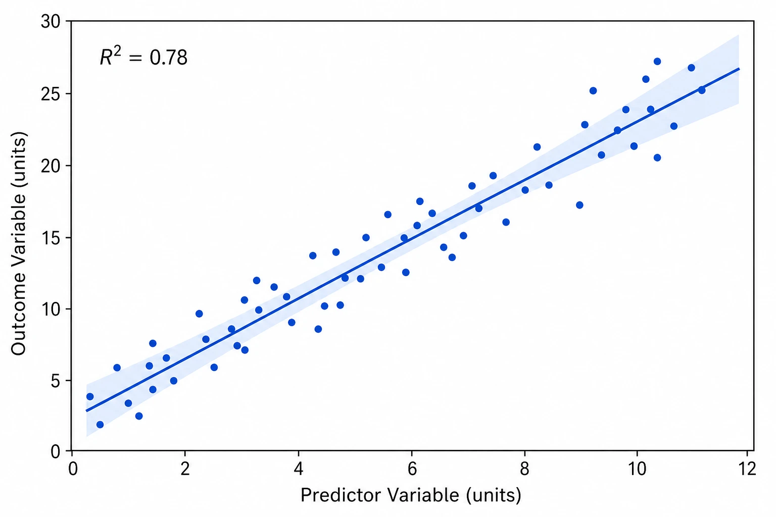
Use a scatter plot to show the relationship between two numerical measurements, such as lake phosphorus and chlorophyll-a. Provide the relevant table columns and axis units, then adjust labels and colors to make the observations easy to compare in a research figure or report.

Explore this example
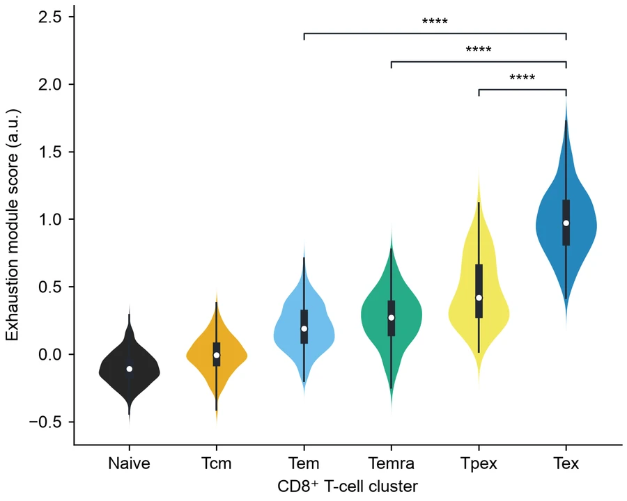
Violin plots of CD8 T-cell exhaustion scores across clusters

Distributions across Research Groups

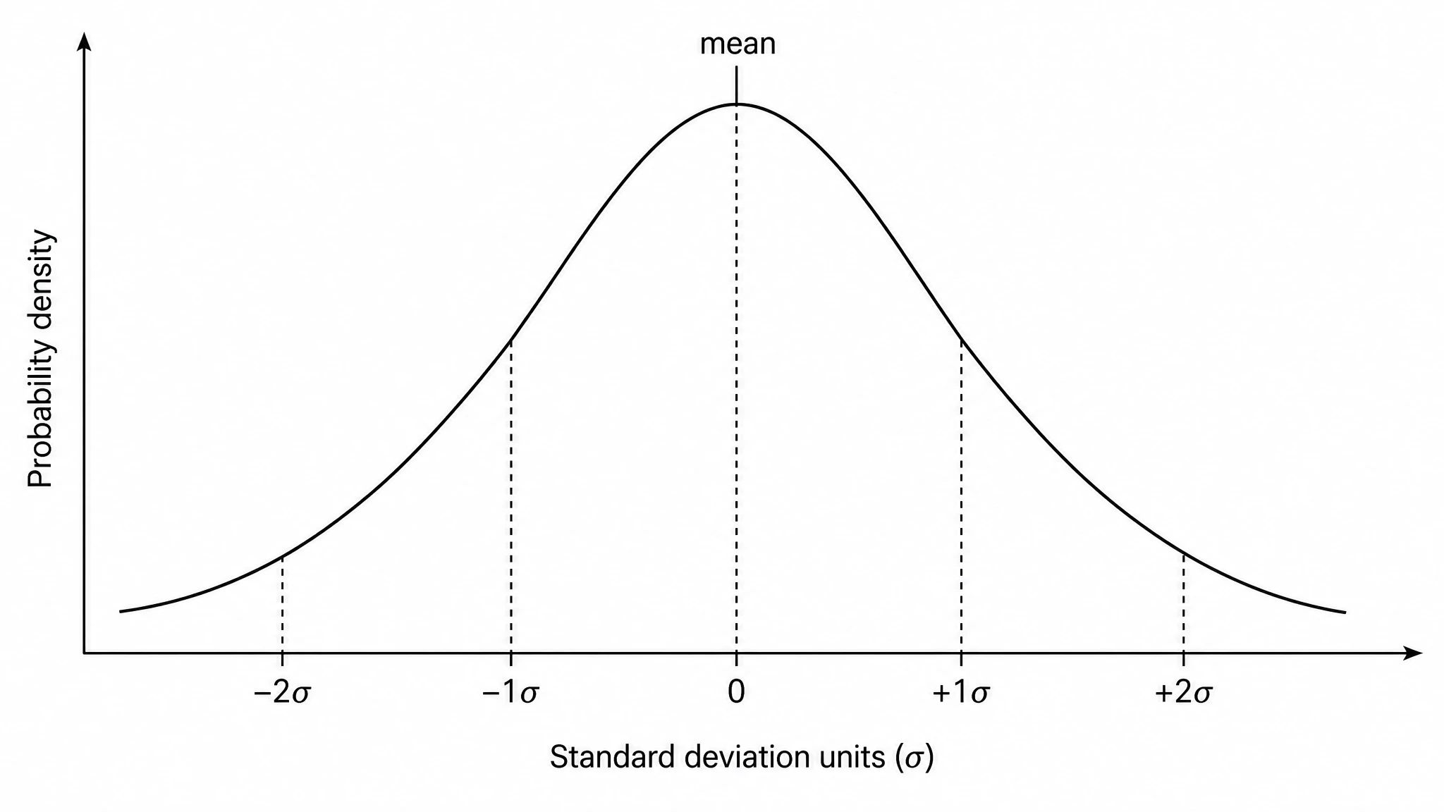
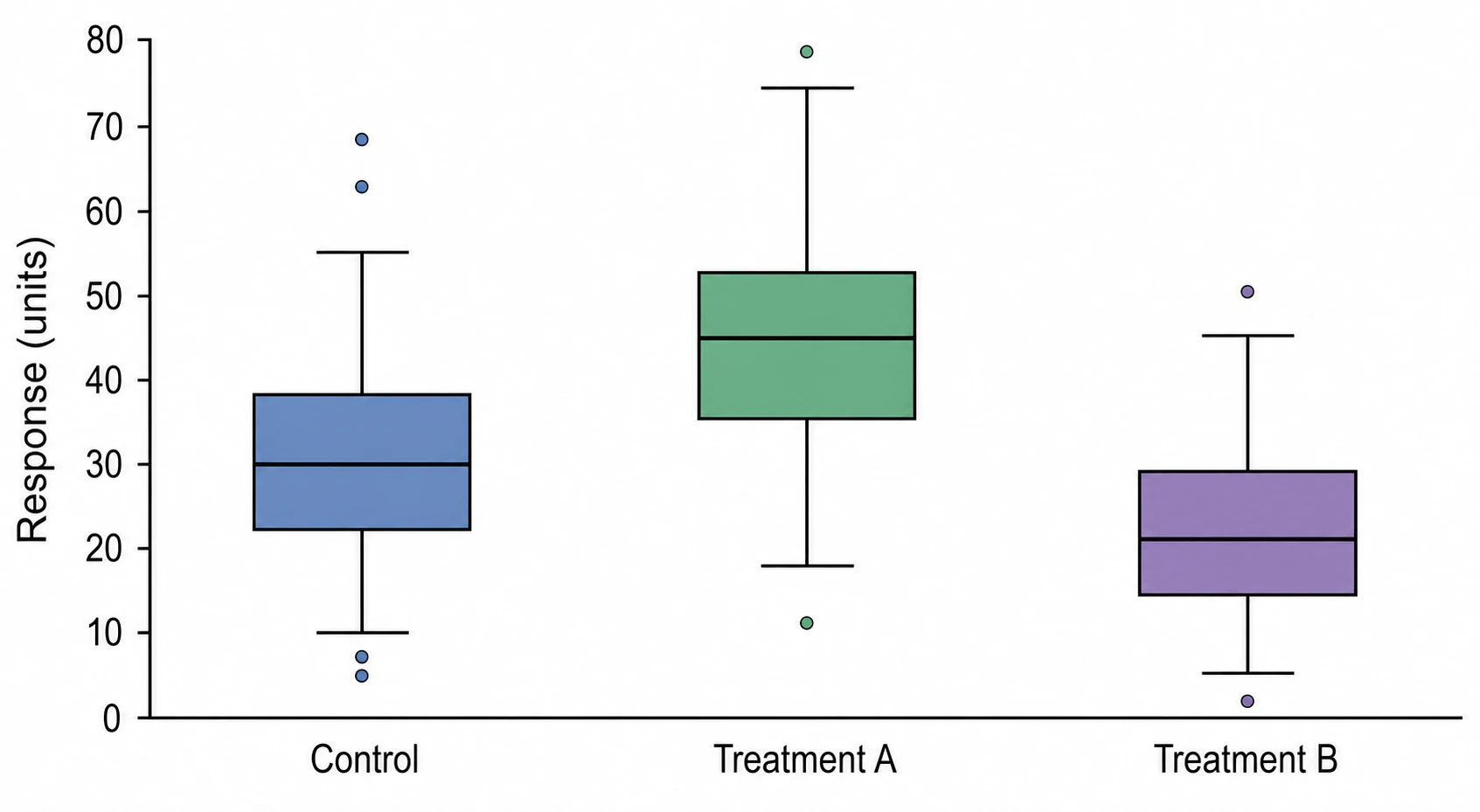
Show variation as well as central values when comparing groups. A box or violin plot can help explain the spread of observations in a research figure. Identify the grouping and measurement columns, check what the displayed summaries represent, and refine the labels for the report or meeting.

Explore this example
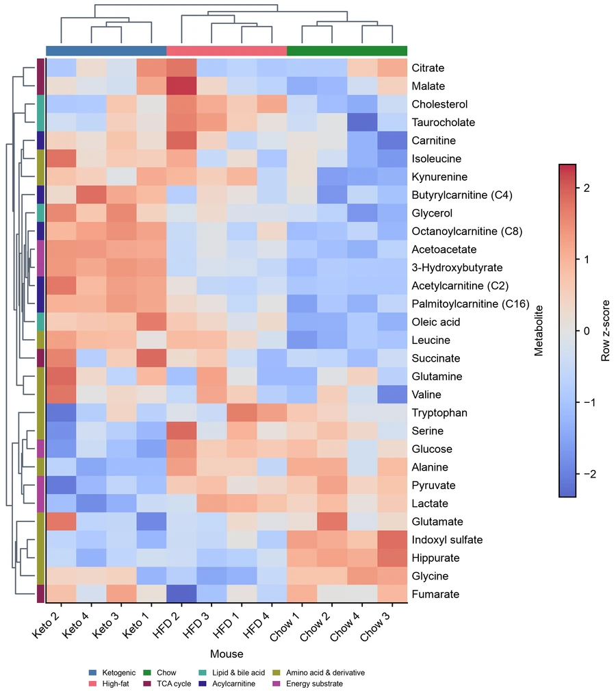
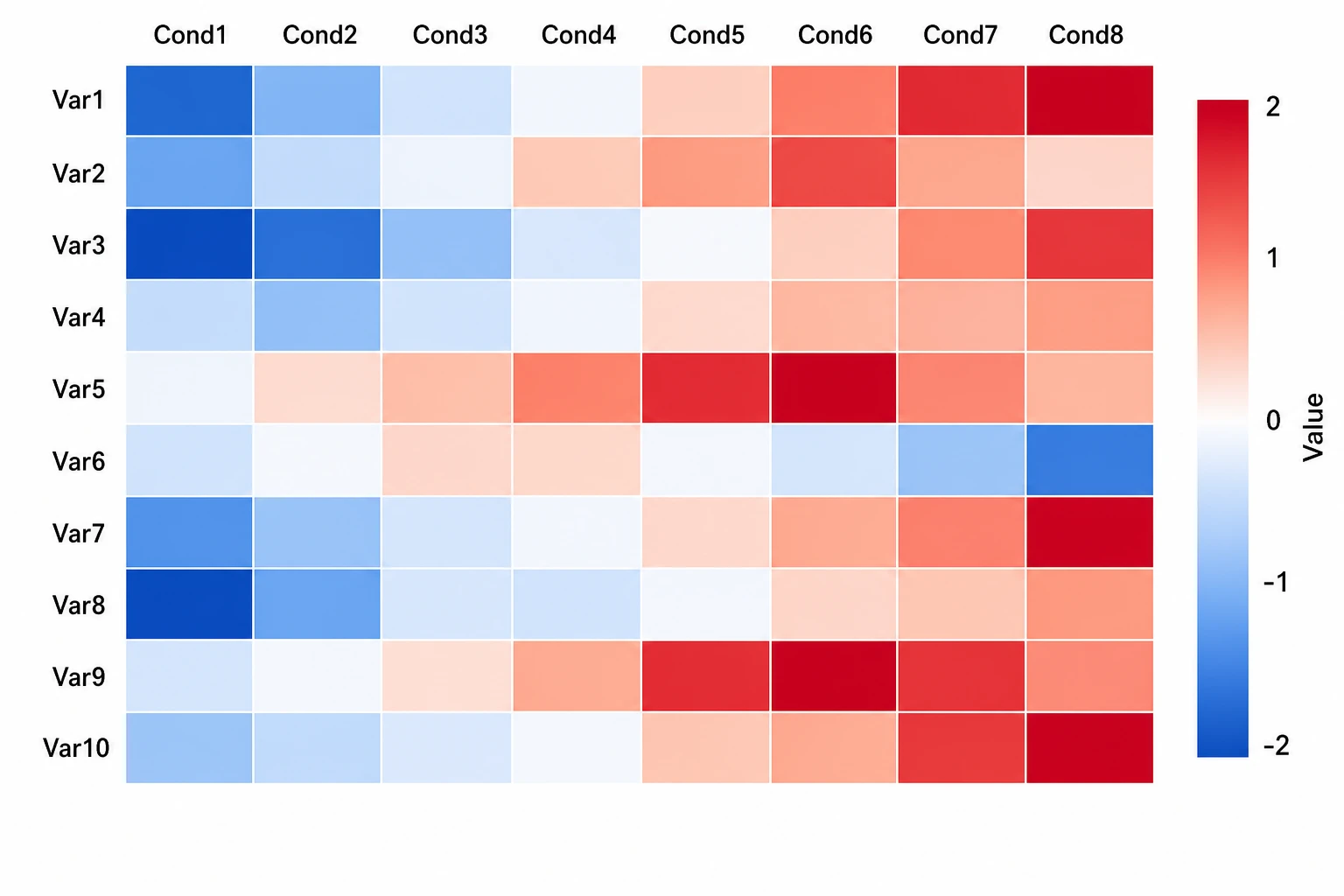
Heatmap of mouse plasma metabolites across diet groups

Heatmaps for Multivariable Data

Make a matrix of measurements easier to examine across rows and conditions. The AI chart generator can help prepare a heatmap from the supplied table. Define what the rows, columns and colors represent, then review the scale and labels before using the figure to discuss patterns.

Explore this example
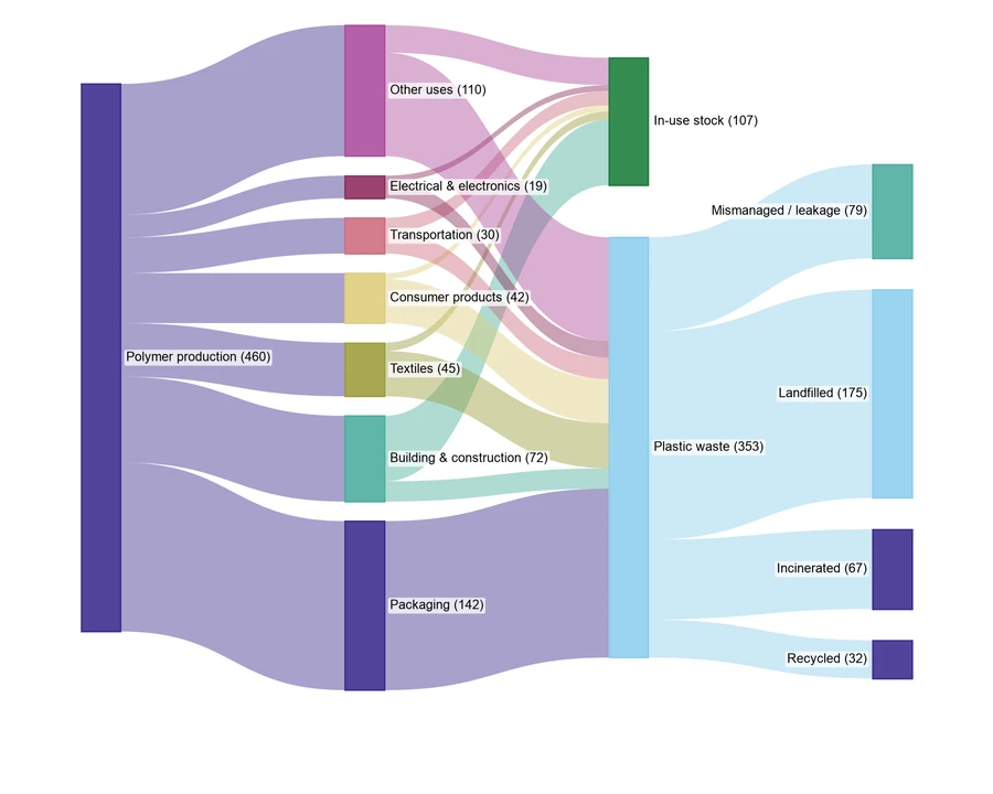
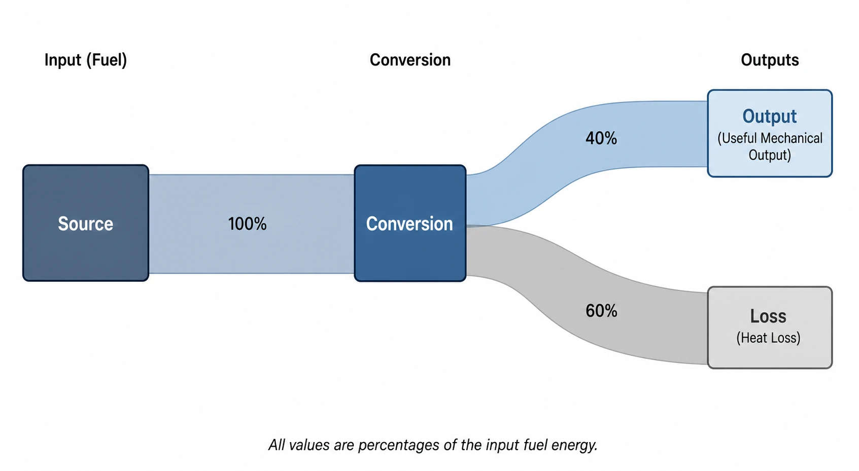
Sankey chart showing example global plastic material flows

Quantified Flows and Allocations

Explain how quantities move between categories with a Sankey chart. Supply the sources, destinations, values and units, and use a relevant example to describe the layout. The graph generator gives you a draft to review for a resource, material-flow or allocation report, with totals checked against the table.

Explore this example
AI Chart Maker User Reviews

Research, teaching and presentation perspectives on using SciFig.

Our treatment table needed a clearer comparison for the weekly lab meeting. I used the chart maker with the CSV data, then refined the grouping, labels and colors. The exported figure brought the categories and variation into one view, allowing the conversation to stay on the experiment instead of explaining how to read the spreadsheet.
Nora Edwards

Experimental biology researcher, Stanford University

Free tools

A tool for every scientific figure

97 focused generators for the scientific figure you need — each opens in the right workspace with a matching example.

AI Chart Maker FAQs

1.

2.

3.

4.

5.

6.

Call to action background

Your Data, Clearly Presented

Turn Your Data into a Chart

Prepare Your Data

Free to start · No credit card required · Built for researchers