Step-by-step guide to including figures in research papers: placement, captions, DPI, vector formats, and journal-specific rules. Avoid common rejection causes.
SciFig Team
Scientific Illustration Experts
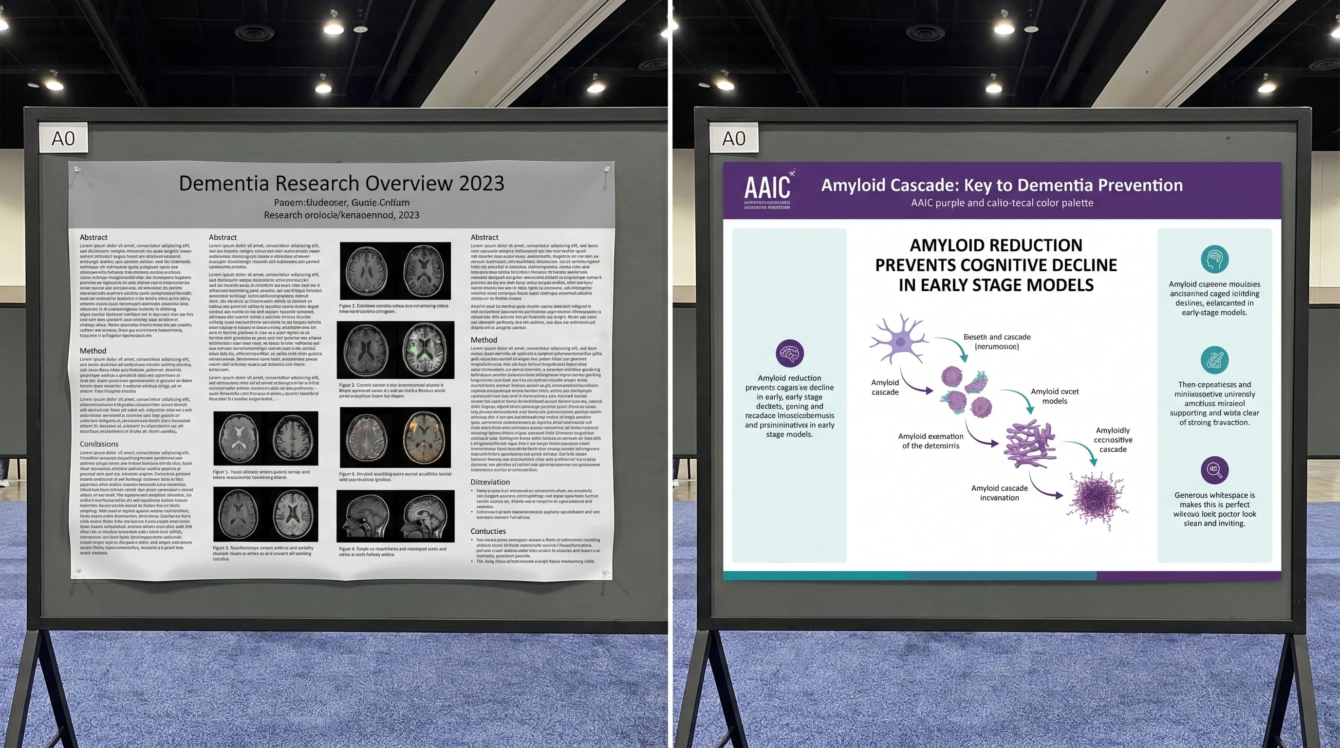
Journal editors will tell you, if you ask them directly, that figure problems are among the most common reasons manuscripts get desk-rejected before peer review even begins. Not the science — the figures. Wrong DPI, blurry exports, ambiguous captions, figures referenced out of order, the wrong format for the journal's typesetting pipeline. Each of these is a soft red flag that telegraphs "this paper isn't ready" before anyone reads your hypothesis.
This is a step-by-step guide to including figures in a research paper without triggering any of those flags. We cover figure selection, captions, DPI and vector requirements across the top journals, placement within the manuscript, and the common mistakes that send manuscripts back for revision. The advice is pragmatic — what to do and what to avoid — not a survey of typographic philosophy.
Open research paper with multi-panel scientific figure embedded inline (Figure generated with SciFig)
Why Figure Quality Matters More Than You Think
A 2023 survey by the Council of Science Editors found that ~22% of desk rejections cite figure problems as a primary reason, ahead of methodology concerns and behind only scope mismatch. This isn't because editors prioritize aesthetics; it's because poor figures correlate with rushed manuscripts, and rushed manuscripts correlate with weak peer review outcomes. A reviewer who can't read your figure stops trying to read your paper.
The cost compounds beyond rejection. Figure problems flagged in peer review extend the revision cycle by 3–6 weeks on average — time spent regenerating exports, re-cropping panels, adding scale bars, or finding higher-resolution source files because the original was deleted from a graduate student's laptop. Production-stage figure problems are worse: a typesetter who needs to back-and-forth on EPS layers can delay publication by an additional 2–4 weeks. The minutes saved by skipping figure best practices at submission cost weeks at the back end.
How Many Figures Should a Research Paper Have?
The right number depends on journal length limits and content density, but the typical range is well-defined. Most original research articles include 4 to 8 main figures, with additional supplementary figures placed in supporting information. Below that range and reviewers wonder whether the data is complete; above it, they wonder whether the figures could have been consolidated.
Journal
Typical main figures
Supplementary cap
Nature (Research Article)
6–8
No fixed cap
Cell (Article)
5–7
~12
Science (Research Article)
4–6
~10
eLife (Research Article)
4–8
No fixed cap
PLoS ONE
5–10
No fixed cap
BMJ
3–5
No fixed cap
If your data exceeds the main-figure budget, group related panels into multi-panel figures (Figure 1A–D) rather than listing them separately. Multi-panel figures are visually denser but tell the reader a single experimental story per figure number, which is easier to navigate than seven separate figures.
Step 1: Decide What Type of Figure You Need
Not every visualization in your paper is the same kind of figure. The four primary types — schematic, data plot, photograph, and mechanism illustration — each have different tools and requirements.
A schematic diagram illustrates structure or process at a conceptual level. Experimental designs, signaling pathways, and trial flow diagrams are schematics. Tools: SciFig text-to-figure for AI generation, BioRender for icon assembly, Adobe Illustrator for manual composition. A data plot shows quantitative results — bar charts, scatter plots, survival curves, heatmaps. Tools: GraphPad Prism, R/ggplot2, Python/matplotlib. AI image generators are not the right tool here. A photograph includes microscopy, gel electrophoresis, and clinical photos — captured with instruments, then cropped and color-corrected. Tools: ImageJ, Adobe Photoshop. For converting clinical photos into figures (for journals that won't print the photo directly), see AI Medical Illustration. A mechanism illustration shows how something works at the molecular or cellular level. Tools: SciFig sketch-to-figure, BioRender, manual Illustrator.
Decision tree: schematic vs data plot vs photo vs mechanism (Figure generated with SciFig)
See Figure Enhancement in Action
Upscale, inpaint, recolor, or relabel any existing scientific figure to 8K journal-ready quality.
Once you know what type of figure you need, there are three production paths.
Generate from scratch. This is the right choice for figures unique to your paper — your specific experimental design, your particular mechanism, your novel pathway. The fastest current path is AI generation: SciFig text-to-figure for textual prompts, sketch-to-figure for whiteboard-to-vector workflows, reference-to-figure when you want to match the style of a prior paper. A typical workflow produces a publication-ready figure in 10–15 minutes; the same figure in Adobe Illustrator from scratch takes 3–6 hours.
Source from a stock library. This is appropriate for generic context figures (a labeled cell, a standard pathway, a textbook anatomy diagram). BioRender, Bioicons, and Servier Medical Art all carry vetted illustrations with reasonable licensing. The trade-off is uniqueness — your figure will be visually similar to other papers using the same library. For a curated list of free options, see Free Scientific Icon Libraries 2026.
Enhance existing figures. When you have an old figure that's the right concept but low quality, the figure-enhancer tool upscales raster figures, adds vector edges, and refreshes color palettes without redrawing. This is the right path for paper revisions where the science is unchanged but the original figure was 72 DPI from a 2018 PowerPoint.
Step 3: Format Figure Captions That Pass Peer Review
A figure caption is not the figure title. It's a complete, self-contained explanation of what the reader is seeing, what was measured, and what conclusion the data supports. Reviewers and editors evaluate captions independently of the body text — if a figure can't be understood from caption alone, it gets flagged.
Data source citation — if data was reproduced from another paper, the citation in parentheses
A working example:
Figure 1. CAR-T cell expansion kinetics in r/r DLBCL patients.(A) Schematic of leukapheresis → manufacturing → infusion → follow-up (created with SciFig). (B) Peripheral blood CAR-T copy number from Day 0 to Day 28, n = 24 patients. Mean ± SEM. *Wilcoxon signed-rank vs Day 0, *p < 0.01. (C) Tumor reduction at Day 28 by best response. p < 0.001 by Kruskal-Wallis. Data normalized to baseline (Day -7).
The caption stands alone. A reviewer reading just the caption can tell what was done, what the panels show, and what statistical tests were used.
Caption anatomy: panel labels, description, scale bar, statistics, citation (Figure generated with SciFig)
Step 4: Meet Journal Requirements for DPI and Format
DPI (dots per inch) and file format are the two technical specifications that most often cause production-stage figure rejection. Every journal has a minimum standard, and most have slightly different ones.
Journal
Minimum DPI
Preferred formats
Color profile
Nature
300
TIFF, EPS, PDF
sRGB or CMYK
Cell
300
TIFF, EPS, PDF
RGB
Science
300
TIFF, EPS, PDF
sRGB
eLife
300
TIFF, EPS, PDF, SVG
RGB
PLoS ONE
300
TIFF, EPS
sRGB
BMJ
300
TIFF, EPS, PDF
sRGB
ACS journals
600
TIFF, EPS
RGB
Frontiers
300
TIFF, EPS, PDF
RGB
The 300 DPI minimum is universal for print figures. Some journals (ACS publications) require 600 DPI for figures with fine text or hairlines. Vector formats (EPS, SVG, PDF with embedded vectors) bypass the DPI question entirely because vectors scale without pixelating — when a journal accepts both vector and raster, default to vector.
Specific journal requirements update annually. The figure-enhancer tool can upscale raster figures to 300/600 DPI and add the vector layer required by EPS export, which handles 90%+ of the conversion work without requiring you to regenerate the source figure.
Journal DPI and format requirements grid for Nature, Cell, Science publication submissions (Figure generated with SciFig)
Enhance Any Existing Figure
Upload your figure — fix labels, upscale to 8K, and export publication-ready results.
Step 5: Place Figures Within Your Manuscript Correctly
Figure placement is governed by two rules: figures appear after their first reference in the text, and figure numbers are sequential. Both rules sound obvious but are violated more often than editors care to admit.
For initial submission, most journals accept three placement conventions: inline (figure embedded directly after the paragraph that first cites it), end-of-document (all figures on separate pages after References), or separate file uploads (one figure per uploaded file, referenced by number in the manuscript). Check the submission portal — Nature and Cell typically prefer separate files, eLife and PLoS accept inline. Whichever you choose, be internally consistent across all figures in the manuscript.
Three manuscript figure placement layouts compared: inline, end-of-document, separate file uploads (Figure generated with SciFig)
In-text figure references should be specific and contextual: "as shown in Figure 1B" or "the survival curve (Figure 3A)" — not "see Figure 1" without indicating which panel. Sequential numbering means Figure 1 appears before Figure 2 in both text references and physical placement; jumping back-and-forth between figures confuses readers and disrupts the manuscript narrative.
For supplementary figures, follow the journal's convention. Most journals use Supplementary Figure S1, S2, ... in a separate supporting information document. Supplementary figures should not duplicate main figure content — they expand on it.
Common Figure Mistakes That Trigger Rejection
Five recurring issues account for most figure-related rejections. We've documented them in detail in 5 Common Mistakes When Creating Scientific Figures, and the same patterns appear here in shortened form:
Wrong DPI — 72 DPI from a PowerPoint screenshot, when the journal requires 300+
Pixelated text — text rasterized at low resolution, especially in figure annotations
Missing scale bars — microscopy and anatomical figures without scale bars
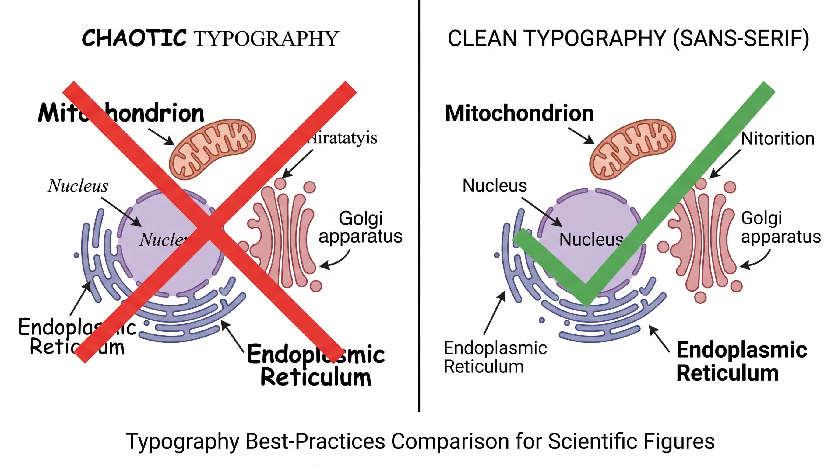
Inconsistent visual style across panels — different stroke widths, font sizes, color palettes
Raster PNG vs SVG vector at 400% zoom: pixelation comparison for journal figure submission (Figure generated with SciFig)
Frequently Asked Questions
Most original research articles include 4 to 8 main figures with additional supplementary figures in supporting information. Below that range, reviewers wonder if data is complete; above it, they wonder if figures could be consolidated. Group related panels into multi-panel figures (Figure 1A–D) rather than listing them separately.
300 DPI is the universal minimum across Nature, Cell, Science, eLife, PLoS, and BMJ. Some journals (ACS publications) require 600 DPI for figures with fine text or hairlines. Vector formats (EPS, SVG, PDF with embedded vectors) bypass the DPI question entirely because vectors scale without pixelation.
A good caption has five components: panel labels (A, B, C), brief description of each panel, methods reference, statistical annotation (sample size, test, significance), and data source citation. Reviewers should understand the figure from the caption alone, without referring to the body text.
Check the journal's submission portal — Nature and Cell typically prefer separate files, eLife and PLoS accept inline embedding. Whatever you choose, be internally consistent across all figures. For supplementary figures, use the journal's separate supporting information document.
Yes, with AI use disclosure in the Methods section. Major journals (Nature, Cell, Science, eLife) accept AI-generated figures provided the use is disclosed and the author has reviewed for accuracy. See Are AI-Generated Figures Allowed in Journals? for the full policy landscape across 12+ journals.
Main figures present the central results that support the paper's claims — typically 4–8 figures for original research. Supplementary figures expand on details (controls, additional time points, alternative analyses) that didn't fit in the main narrative. Supplementary should not duplicate main figure content.
The figure-enhancer tool upscales raster figures to 300/600 DPI and adds vector layers required by EPS export. For AI-generated figures from SciFig, the vector-canvas tool converts raster output to layered SVG in 1–2 minutes.
TIFF and EPS are accepted by every major journal as raster and vector formats respectively. PDF (with embedded vectors) is also universal. SVG is accepted by eLife and increasingly by other journals. PNG is rarely accepted as a primary format because it lacks the color profile control that print typesetting requires.
Recommended next
Related SciFig resources
Go deeper with the most relevant SciFig pages for this article.