Generate publication-quality medical illustrations with AI: anatomy, pathology, and clinical figures. Convert lab photos to line drawings without illustrators.
SciFig Team
Scientific Illustration Experts
You took a clinical photo of a wound. The patient signed the consent form. The data point is solid. But the journal you're targeting — The Lancet, NEJM, JAMA — requires a clean line drawing showing the lesion's anatomical context, not the photo itself. Hiring a medical illustrator costs $300–$1,500 per figure with a 2–3 week turnaround. Your submission deadline is Friday.
This is exactly the gap AI medical illustration was built to close. Modern domain-tuned image models produce publication-quality anatomical diagrams, pathology illustrations, and photo-to-figure conversions in roughly 10 minutes per illustration, at a small fraction of the cost. We walk through the workflows that work — anatomy generation, photo-to-figure, mechanism diagrams, and final refinement — and the ethics rules every medical author needs to follow when AI is in the production pipeline.
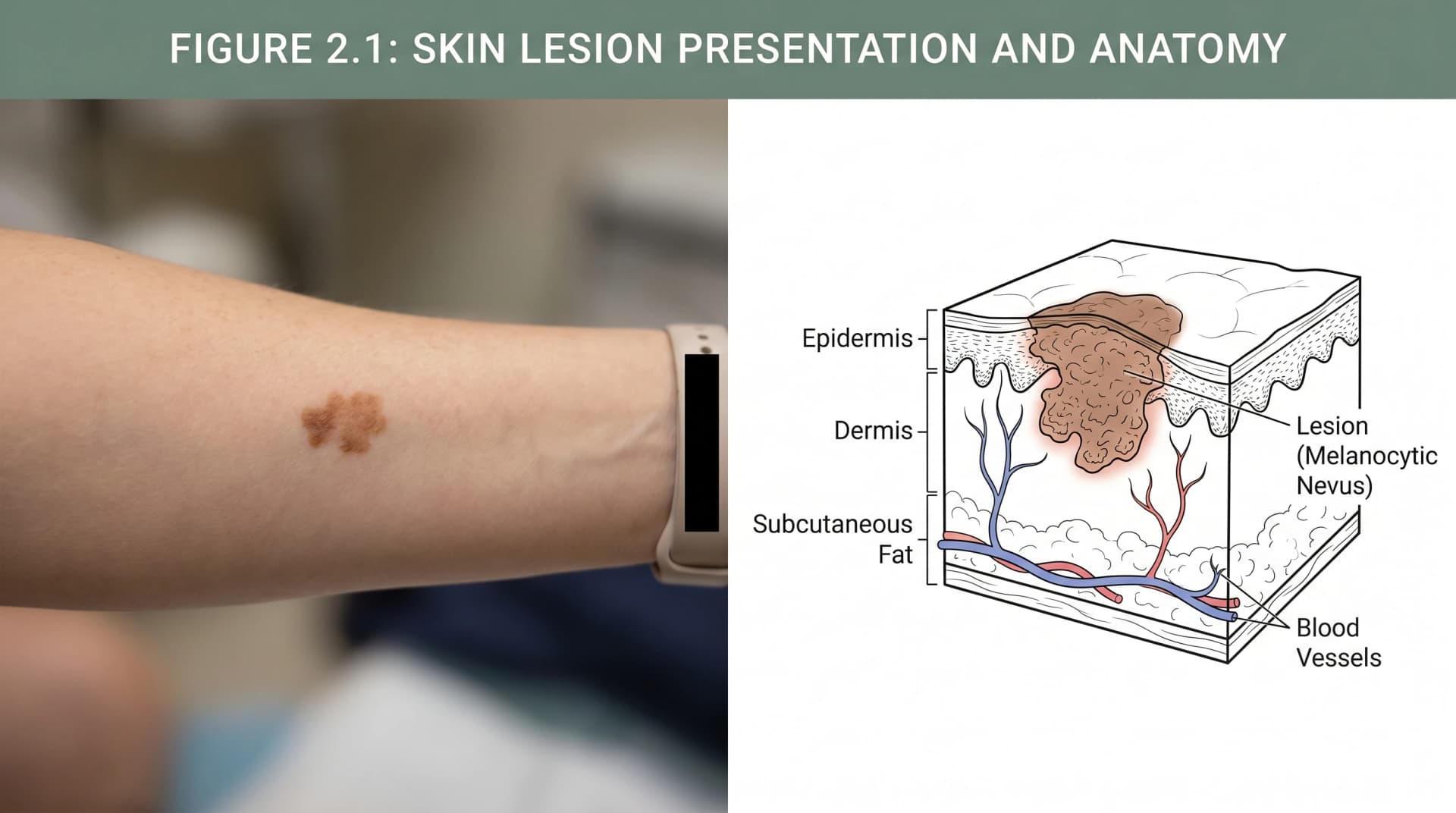
Clinical photo to medical line drawing: AI workflow (Figure generated with SciFig)
Transparency note: Illustrations in this article were generated with SciFig AI and reviewed by the author for scientific accuracy. Cited claims link to peer-reviewed sources.
What Medical Illustration Looks Like in Modern Research
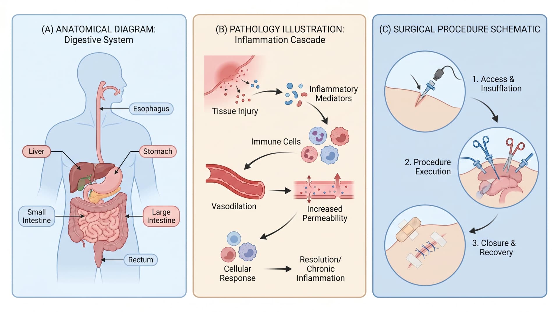
Medical illustration is the visual translation of clinical, anatomical, or pathological content into figures appropriate for journal publication, education, and patient communication. Three categories dominate research-paper use: anatomical diagrams (reproductive system, digestive tract, skeletal structures), pathology illustrations (disease mechanisms, inflammation cascades, immune responses), and surgical/procedural schematics (technique overviews, equipment positioning, intervention pathways).
The volume across journals is significant. A 2022 Council of Science Editors audit of clinical journals found that 64% of original research articles included at least one medical illustration beyond data plots and clinical photos. The figures are workhorses — they establish context that text cannot, particularly for readers outside the specific subspecialty. And until recently, producing them required a medical illustrator (Master's-level training, $80–$120 per hour) or careful manual work in Adobe Illustrator with a medical-illustration plugin library.
Three medical illustration types: anatomy, pathology, surgical (Figure generated with SciFig)
AI medical illustration changes the production economics. A domain-tuned model — SciFig's Nano Banana Pro 2K is the example we use here — generates the anatomical or pathological illustration from a natural-language description, with the option to upload reference photos for style and structural matching. The output is publication-ready vector after a brief refinement step in vector-canvas.
Why AI Medical Illustration Is Different (And When to Be Careful)
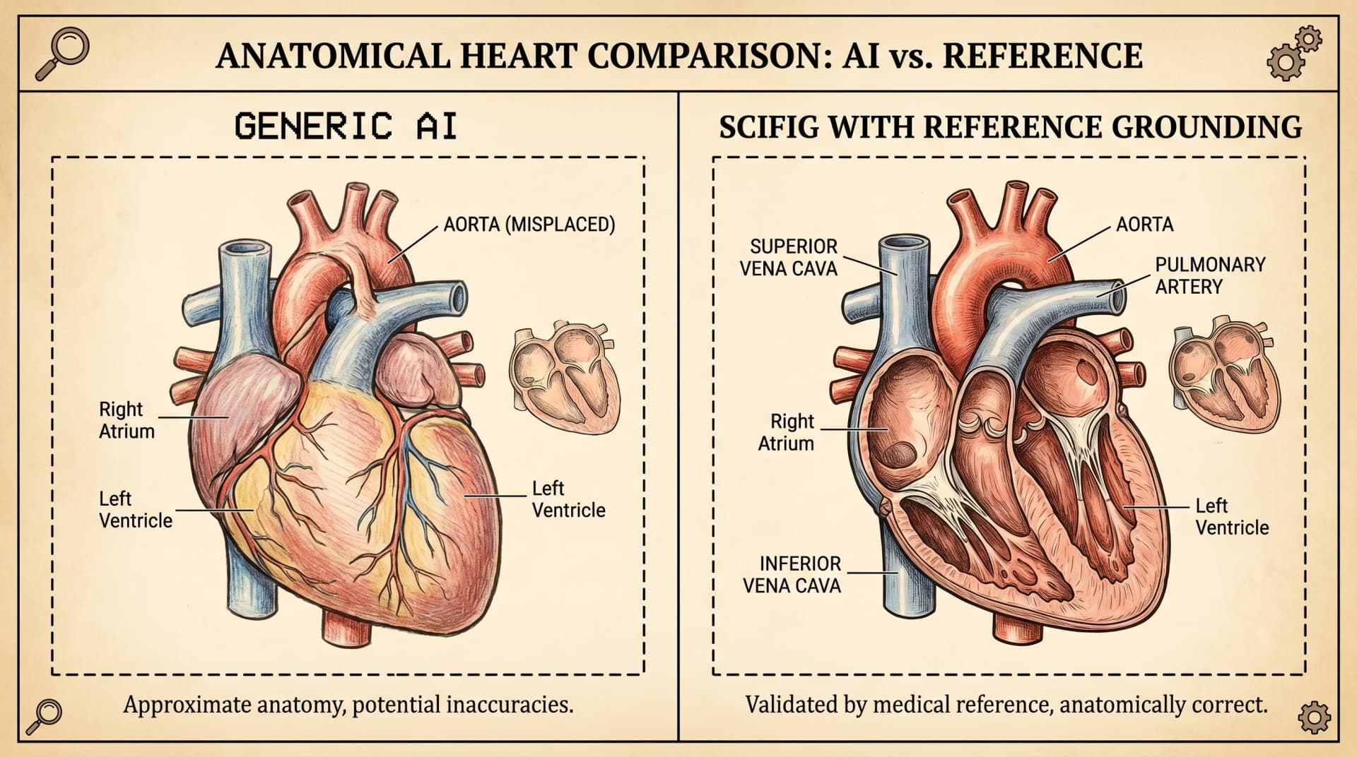
Generic image models (DALL·E, Midjourney, Stable Diffusion) produce plausible-looking medical illustrations with subtle anatomical errors: a heart with the aorta arching the wrong direction, a kidney with the nephron loop on the cortical instead of medullary side, a brain with the cerebellum disproportionately large. The errors are visually undetectable to non-experts and trivially obvious to a reviewer who teaches the relevant anatomy.
This is where domain-tuned models earn their reputation. SciFig's medical illustration generation is anchored on biology and clinical literature, which reduces three categories of error common to generic AI: anatomical inaccuracy (organ topology, vessel routing, neural pathway direction), scale violations (organelles drawn too large, anatomical structures out of proportion), and labeling errors (mislabeled structures, wrong terminology, anatomical-direction reversals).
Heart anatomy comparison: generic AI vs SciFig reference grounding (Figure generated with SciFig)
The remaining cautions are real and worth naming. Every AI-generated medical figure requires human review for anatomical correctness — the model reduces error rate, it does not eliminate it. Researchers should compare the output against an authoritative anatomy reference (Gray's Anatomy, Netter's Atlas, the relevant clinical journal's prior figures) before submitting. The review step takes 2–5 minutes per figure and catches the residual errors that fine-tuning didn't reach.
See Photo-to-Figure Conversion in Action
Snap a lab photo — SciFig turns it into a clean, labeled scientific schematic.
Step 1: From Clinical Photo to Line Drawing (Photo-to-Figure Workflow)
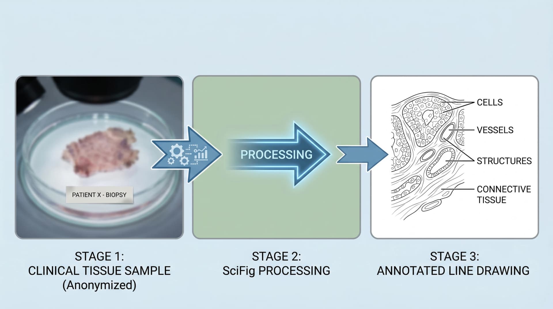
When you have a clinical photo and need a line drawing, the photo-to-figure tool is the right entry point. The workflow is three-step: upload the photo, describe what to emphasize and what to abstract, and generate.
For a dermatology lesion photo, an example prompt:
"Convert this clinical photo of a melanoma on forearm into a labeled medical line drawing. Show: lesion borders, asymmetry, color variation, surrounding healthy skin context. Label: lesion, periphery, dermal-epidermal junction. Style: medical textbook, soft cross-hatching shading, clean leader lines, anonymized (no skin folds or hair patterns that identify the patient)."
The output is a publication-ready line drawing that preserves clinical content (lesion borders, color, asymmetry) while abstracting away identifying features. Three points matter for ethics compliance: the photo's source patient must have consented, the line drawing should not be photographically reverse-engineerable to the source, and the resulting figure is captioned as AI-generated from a clinical photo with consent, not as direct photo reproduction.
Three-stage clinical photo to medical line drawing AI workflow: upload, describe, generate output (Figure generated with SciFig)
For pathology specimens, the workflow is the same with adjusted prompts emphasizing cellular structure (epithelial vs stromal, inflammatory infiltrate vs neoplastic). For endoscopy images, prompts emphasize anatomical landmarks and lumen orientation. The pattern transfers across imaging modalities — the variable is what to preserve and what to abstract.
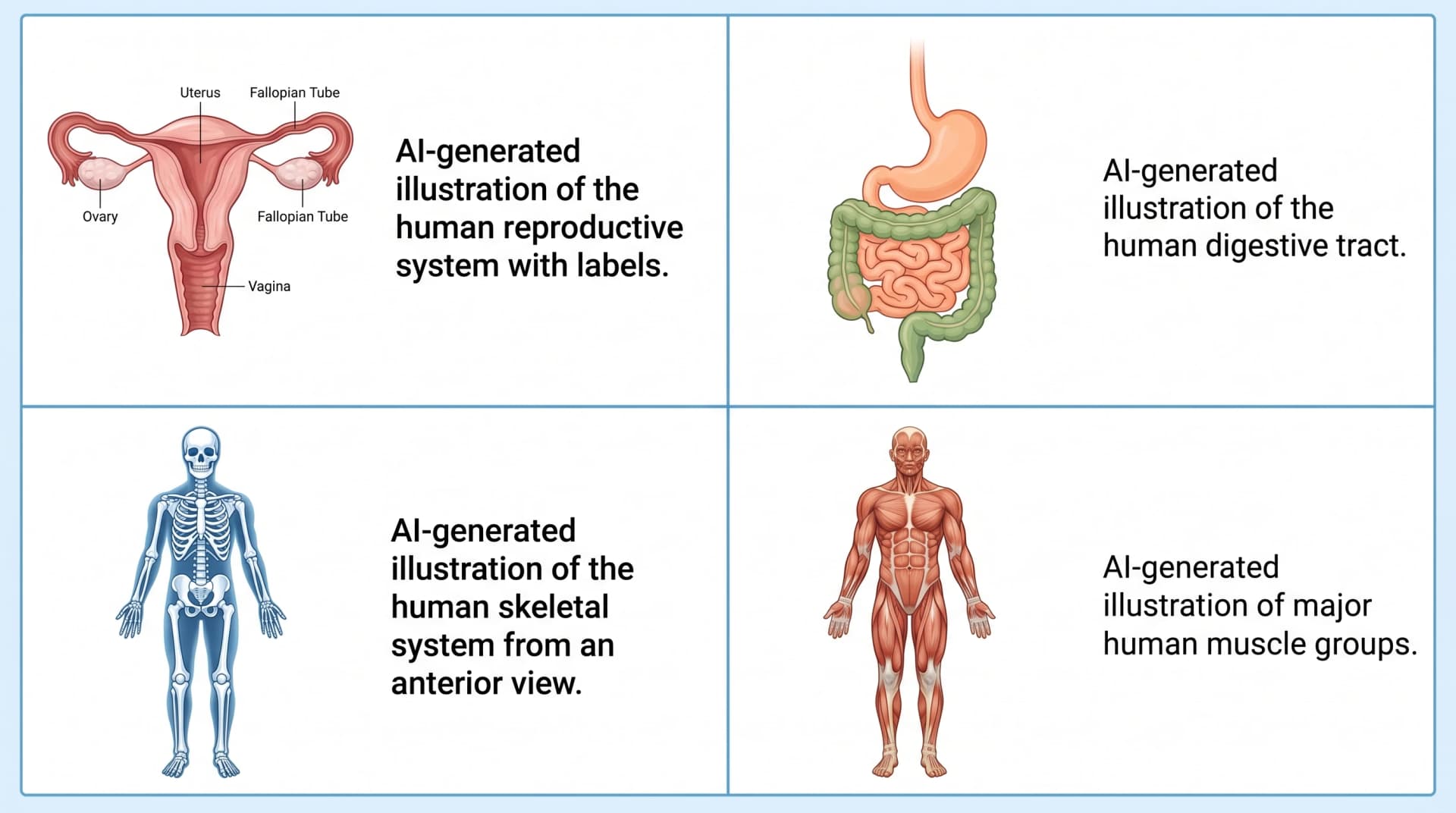
Step 2: Generate Anatomical Diagrams from Text Prompts
For anatomy figures without a source photo, the text-to-figure tool generates from descriptive prompts. The accuracy depends on prompt specificity — vague prompts produce textbook-generic illustrations, specific prompts produce paper-publishable ones.
Working prompts across four common anatomical needs:
Anatomical figure
Working prompt
Reproductive system (female)
"Female reproductive system anatomical illustration, anterior view, labeled: uterus, fallopian tubes, ovaries, cervix, vagina. Medical textbook style, soft pastel colors, leader-line labels, white background."
Digestive tract
"Human digestive tract anatomical diagram, anterior view, complete from oral cavity to rectum, labeled: esophagus, stomach, small intestine (duodenum, jejunum, ileum), large intestine (cecum, ascending/transverse/descending colon, sigmoid), rectum. Medical textbook style."
Four anatomical prompt examples with AI-generated output grid: reproductive, digestive, skeleton, muscles (Figure generated with SciFig)
For each, the prompt structure is consistent: entity, view, labels (enumerated), style anchor, background. The framework matches the one used for cellular diagrams (see the animal cell tutorial for E-S-S-V details).
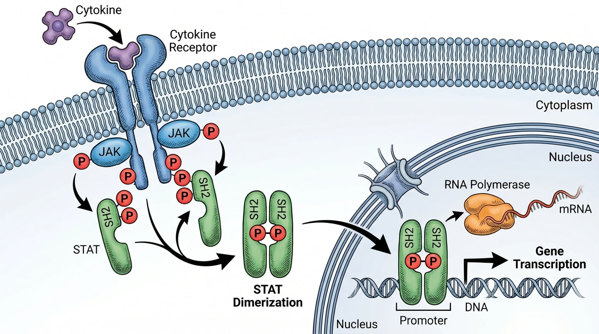
Step 3: Create Pathology Illustrations and Disease Mechanism Diagrams
Pathology illustrations show how disease processes work at the molecular or cellular level. They're harder to prompt than anatomical diagrams because the entities are abstract (pathways, signal cascades) and the spatial relationships matter (which protein activates which, in which compartment, in which order).
For a JAK/STAT signaling cascade — common in inflammation, oncology, and immune-mediated disease research — the working prompt is:
"JAK/STAT signaling pathway molecular illustration. Show: cytokine binding to cell surface receptor (extracellular), JAK phosphorylation (membrane-proximal), STAT recruitment and dimerization (cytoplasm), dimer translocation through nuclear pore, STAT binding to GAS element on DNA (nucleus). Arrows showing direction of signal flow. Label all key proteins. Molecular biology textbook style, layered cell compartments visible."
The output captures the canonical mechanism with correct directionality — STAT phosphorylation precedes dimerization, dimers translocate to nucleus, gene transcription follows. This is where generic image models fail most often: they routinely reverse the order (STAT first translocates, then dimerizes), or omit the GAS element, or label JAK as occupying the wrong subcellular compartment.
JAK/STAT signaling pathway molecular illustration with correct phosphorylation and dimerization order (Figure generated with SciFig)
For other common pathology figures — cancer cell metastasis cascades, immune synapse formation, complement activation, inflammasome assembly — the same prompt structure applies with adjusted entities and compartments.
Convert Lab Photos to Scientific Figures
Upload microscopy shots, sample images, or instrument photos — get clean schematics instantly.
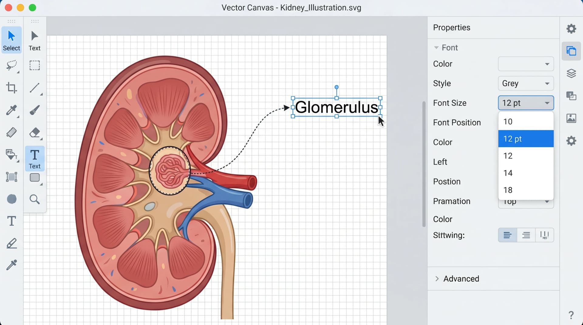
Step 4: Refine and Add Custom Labels in Vector Canvas
Generated figures often need label adjustments for your specific layout. The vector canvas tool opens the figure as a layered SVG: organelles and structures on one layer, labels on a separate layer, leader lines on a third. This lets you reposition labels without redrawing the underlying anatomy.
Common refinement tasks: font size to journal compliance (most journals require 7–8 pt minimum); label background contrast (semi-transparent backgrounds when labels overlay colored anatomy); arrow direction adjustments (signal flow that needs to read left-to-right for your specific layout); terminology localization (changing "renal corpuscle" to "glomerulus" for a clinical audience).
Vector canvas: editable kidney illustration with labels (Figure generated with SciFig)
The refinement step is 2–5 minutes per figure. For figures going into multi-panel compositions (see how to lay these out), the label refinement matters most — alignment across panels is the difference between a clean figure and a flagged one.
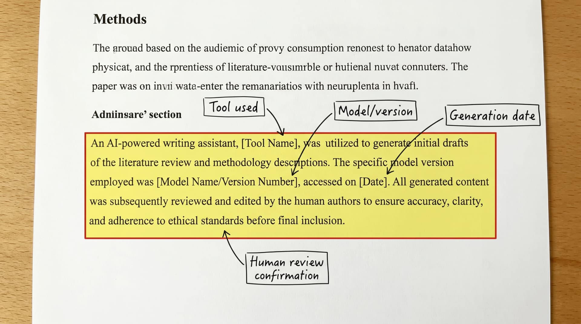
Medical Illustration Ethics: Disclosure, Consent, and AI in 2026
AI medical illustration is acceptable across major clinical journals — provided you disclose. The current best-practice disclosure has four components that appear in the Methods section:
Tool used — "Figures were generated with SciFig (https://scifig.ai)"
Model/version — "using the Nano Banana Pro 2K model"
Generation date — "between February 1 and February 10, 2026"
Human review confirmation — "All figures were reviewed by the corresponding author for anatomical and scientific accuracy"
Annotated Methods section AI use disclosure callout: tool, model version, date, human review (Figure generated with SciFig)
For figures derived from clinical photos, the consent disclosure is separate and explicit: "Clinical photographs were obtained with patient written informed consent (IRB protocol #X-XXXX). Photographs were transformed into anonymized line drawings using AI-based image generation." The combination of consent record + transformation disclosure satisfies the patient-protection requirements of every major clinical journal.
AI medical illustration generates anatomical, pathological, and clinical figures from natural-language prompts using domain-tuned image models. Unlike stock images (which are pre-drawn and limited to library scope), AI generation produces figures tailored to your specific paper — novel mechanisms, niche anatomy, custom labels. Modern domain-tuned models (SciFig Nano Banana Pro 2K) produce publication-ready output in 10–15 minutes per figure.
Yes, with proper disclosure in the Methods section. The disclosure should name the tool, model version, generation date, and confirm human review for accuracy. For figures derived from clinical photos, add a separate consent disclosure. Major clinical journals (NEJM, The Lancet, JAMA, BMJ) have accepted AI-generated figures since 2024 provided these disclosure requirements are met — see the NEJM editorial on AI in medicine for the journal's broader stance.
Use specific, structured prompts: entity (e.g., "female reproductive system"), view (anterior/lateral/cross-section), enumerated labels, style anchor ("medical textbook style"), background. Reference an authoritative anatomy atlas (Gray's, Netter's) to verify the generated output before submitting. Plan for 2–5 minutes of verification per figure regardless of AI assistance.
Yes, with documented patient consent and IRB approval if your institution requires it. The AI-converted figure should not be photographically reverse-engineerable to the source patient, and the Methods section must disclose both the consent process and the AI transformation. This is standard practice for dermatology, pathology, and clinical photography across major journals.
Domain-tuned models like SciFig's Nano Banana Pro 2K are fine-tuned on biology literature, which reduces common pathway errors (reversed signal flow, wrong subcellular compartments, missing intermediates). Generic image models (DALL·E, Midjourney) routinely make these errors. Every AI-generated mechanism figure still requires human review, but the baseline accuracy is high enough to make AI generation practical for routine illustrations.
For routine anatomical diagrams and standard pathway figures, AI generation is faster and cheaper (10–15 minutes vs 2–3 weeks; $0.16 per generation vs $300–$1,500 per figure). For highly specialized or novel medical illustration — complex surgical technique figures, custom artistic style for textbook covers — professional medical illustrators retain a clear advantage. The two paths are complementary: AI for routine, illustrator for special.
Four components in the Methods section: tool name, model/version, generation date, and human review confirmation. For clinical-photo-derived figures, add patient consent and transformation disclosure. See Are AI-Generated Figures Allowed in Journals? for journal-specific language requirements.
Medical Disclaimer
This article is educational content focused on scientific figure design for research publications. It is not medical advice and should not be used for clinical decisions. The disease mechanisms, anatomical references, and ethical guidance described here are summarized from cited peer-reviewed sources; for clinical practice, consult primary literature, official guidelines, and licensed clinicians. SciFig is a scientific illustration tool — it does not diagnose, treat, or advise on patient care.
Recommended next
Related SciFig resources
Go deeper with the most relevant SciFig pages for this article.