SciFig

Free Supply and Demand Graph Maker

Calculate linear market equilibrium, with editable inputs and reusable exports. Keep original and shifted curves.

Describe what you need in the box above.

Start with up to 150 free credits|No credit card required

Get up to 350 free credits on day one when you join through an invite.

3 figure engines · 500+ templatesEvery label editable · 60+ color schemesEditable PPTX · Layered SVG · 8K PNG / JPG

Linear supply and demand

Enter Qd = a − bP and Qs = c + dP. Shift either curve and compare price controls with equilibrium.

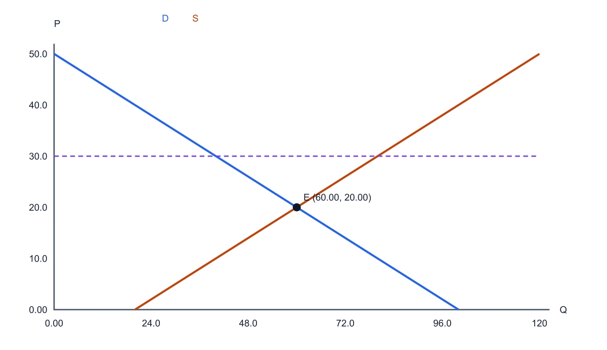
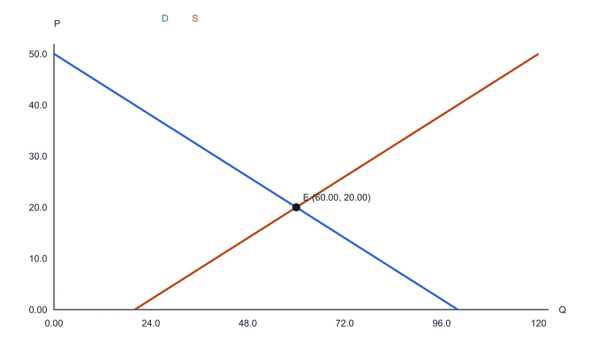
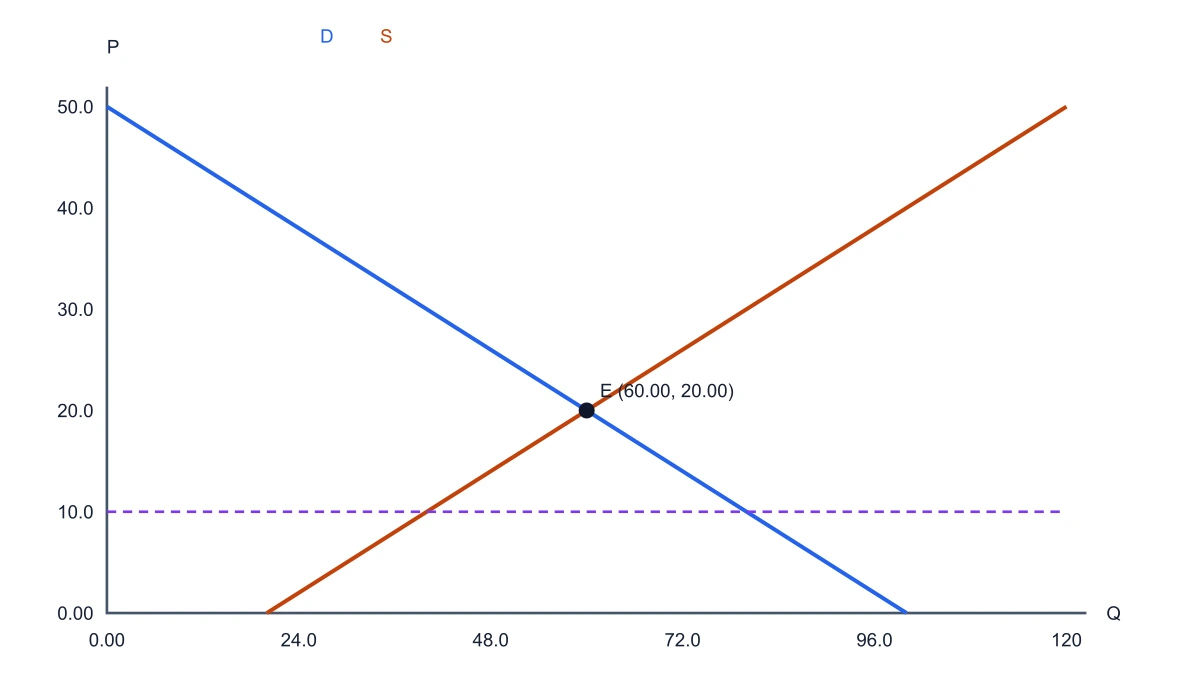
Equilibrium: P = 20.0000, Q = 60.0000

Original equilibrium: P = 20.0000, Q = 60.0000

Free Supply and Demand Graph Maker— templates & examples

Updated

Supply and demand graph

Free Supply and Demand Graph Maker

Calculate linear market equilibrium, with editable inputs and reusable exports.

SciFig’s supply and demand graph maker lets you plot quantity on the horizontal axis and price on the vertical axis from linear demand and supply equations. Change intercepts or slopes, shift either curve and compare the new equilibrium with the original. Add a price ceiling or price floor to display a binding control and its shortage or surplus. The calculated graph, numeric CSV and saved JSON settings use the same inputs. You can export a vector SVG or PNG for an economics report, lecture or research presentation.

Linear supply and demand curves intersecting at quantity 60 and price 20
  • Calculate linear market equilibrium
  • Keep original and shifted curves
  • Compare price ceilings and floors
  • Export the graph and numeric data

Supply And Demand Graph Features

Use SciFig to plot quantity on the horizontal axis and price on the vertical axis from linear demand and supply equations.

Plot equations instead of positioning lines by eye

With SciFig’s supply and demand graph maker, set the intercept and slope for Qd = a − bP and Qs = c + dP. SciFig computes the intersection and labels the equilibrium price and quantity on the graph. For the initial example, Qd = 100 − 2P and Qs = 20 + 2P meet at P = 20 and Q = 60, providing a simple reference for checking your own teaching example.

  • Enter demand and supply coefficients
  • Use price and quantity axes
  • Read the calculated intersection
Try this in SciFig

Compare a shift with the original market

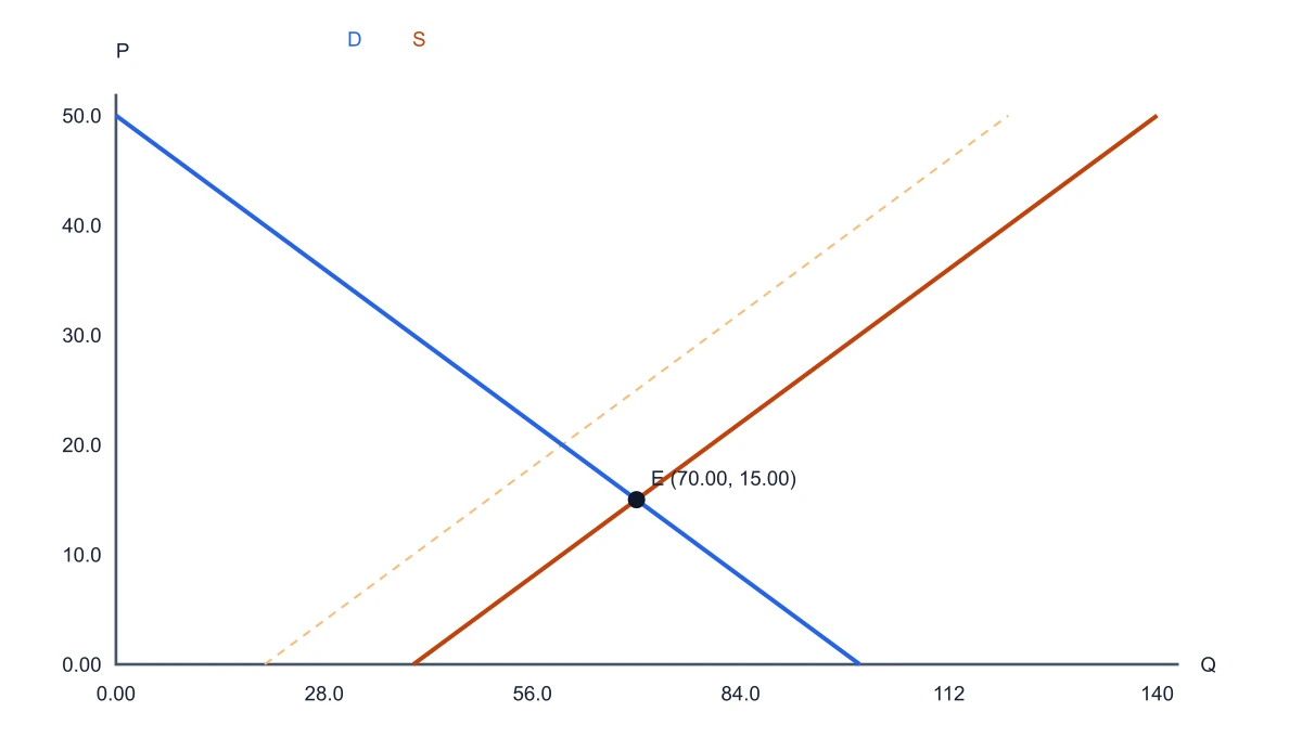
Change the demand or supply intercept without losing the original curves. The dotted baseline stays visible while the updated curves show how the market changes. A demand shift of +20 in the initial example moves equilibrium to P = 25 and Q = 70. Keeping both cases on one graph helps explain the difference between a curve shift and movement along an unchanged curve.

  • Keep the original equilibrium
  • Shift either or both curves
  • Compare the new intersection
Try this in SciFig

Explain binding ceilings and floors

With SciFig’s supply and demand graph maker, enter a controlled price and choose a ceiling or floor. SciFig compares it with equilibrium before reporting a shortage or surplus. A ceiling of 10 in the initial market gives demand of 80 and supply of 40, a shortage of 40. A nonbinding control is identified separately, so a price restriction does not automatically imply a market gap.

  • Compare the control with equilibrium
  • Calculate demand and supply at that price
  • Separate shortages from surpluses
Try this in SciFig

Reuse the graph in a report or class

Export SVG for vector editing or PNG for slides. Download a CSV of the plotted equations to inspect the numerical values behind the figure, and keep JSON settings for the next revision. These actions preserve the coefficients and selected price control, letting you return to the same scenario when a teaching example or report changes.

  • Download SVG or PNG
  • Keep a numerical CSV
  • Save and reopen the scenario
Try this in SciFig

How to Create a Supply And Demand Graph

Work from your own inputs and keep the exported figure with its saved source settings.

  1. Enter the market equations

    Set a, b, c and d for demand and supply. The slope inputs are nonnegative; the demand equation applies the minus sign. Use the initial example to see how each coefficient affects the curve.

  2. Inspect equilibrium and curve shifts

    Read the equilibrium price and quantity, then adjust the intercept shifts to compare a new market with the dotted baseline. Parallel or coincident curves receive their own states rather than an invented intersection.

  3. Add a price control

    Choose a ceiling or floor and enter its price. Inspect whether it binds and read the resulting shortage or surplus. The graph keeps the equilibrium visible for comparison.

  4. Save data and export the figure

    Download SVG or PNG for the document and CSV for the plotted numbers. Save settings as JSON if you want to reopen the same coefficients and price control later.

Supply And Demand Graph for Research and Teaching

Use the table or graph where its structure answers a specific question in your work.

Linear supply and demand curves intersecting at quantity 60 and price 20

Teach market equilibrium

Start with two linear equations and ask students to calculate the intersection. Compare their algebra with the graph and its P and Q values. The same scenario can be saved for an exercise sheet or exported for lecture slides.

Explore this example
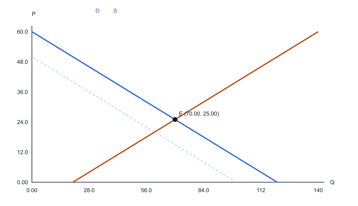
Demand increase shifting equilibrium from price 20 and quantity 60 to price 25 and quantity 70

Explain a demand increase

Keep supply unchanged and shift the demand intercept. Show the old and new equilibria on the same axes, making the price and quantity changes visible without confusing a shift of the curve with movement along it.

Explore this example
Price ceiling at 10 below equilibrium on linear demand and supply curves

Discuss a price ceiling

Place a ceiling below equilibrium and compare quantity demanded with quantity supplied. Use the shortage in a classroom policy example, then move the ceiling above equilibrium to show why the constraint no longer binds.

Explore this example

Price floor at 30 above equilibrium on linear demand and supply curves

Compare a price floor

Move a floor above equilibrium and identify excess supply. Pair the plotted gap with its numerical value in an economics worksheet or presentation, keeping the original market as the reference.

Explore this example

Increase in supply compared with the original market curves

Prepare report figures

Use chosen linear coefficients to communicate a model in a report. Download the vector graph and accompanying CSV so the visual and the numerical appendix describe the same scenario.

Explore this example

Linear supply and demand curves intersecting at quantity 60 and price 20

Build related research visuals

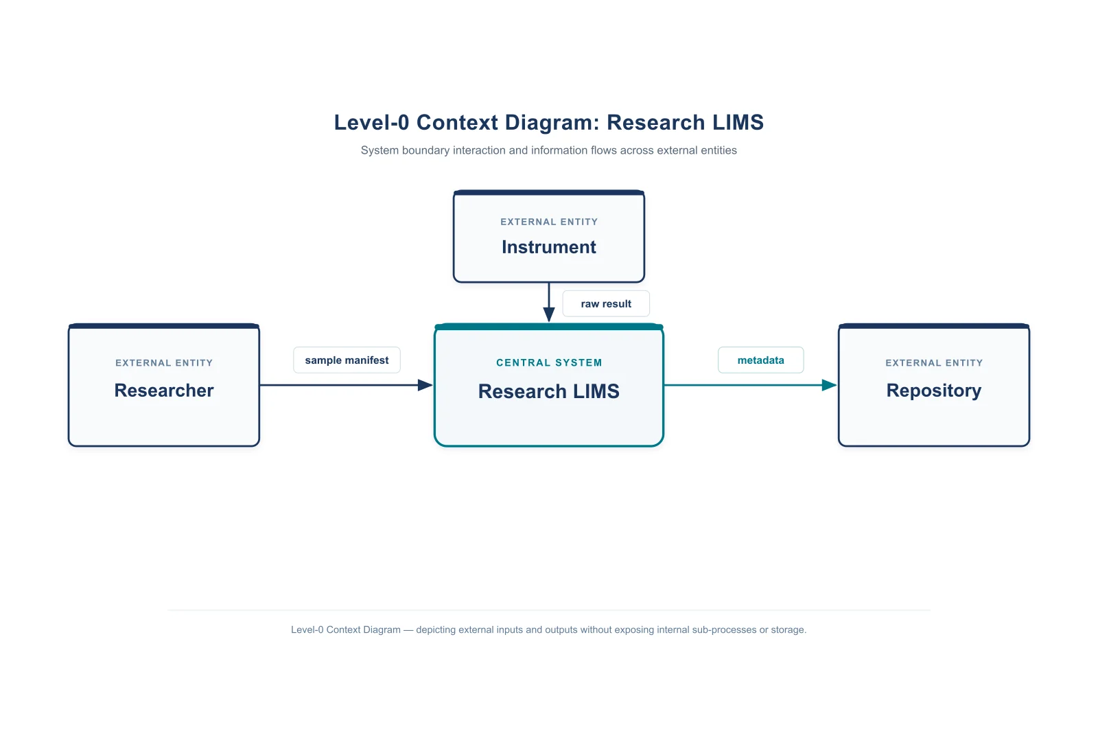
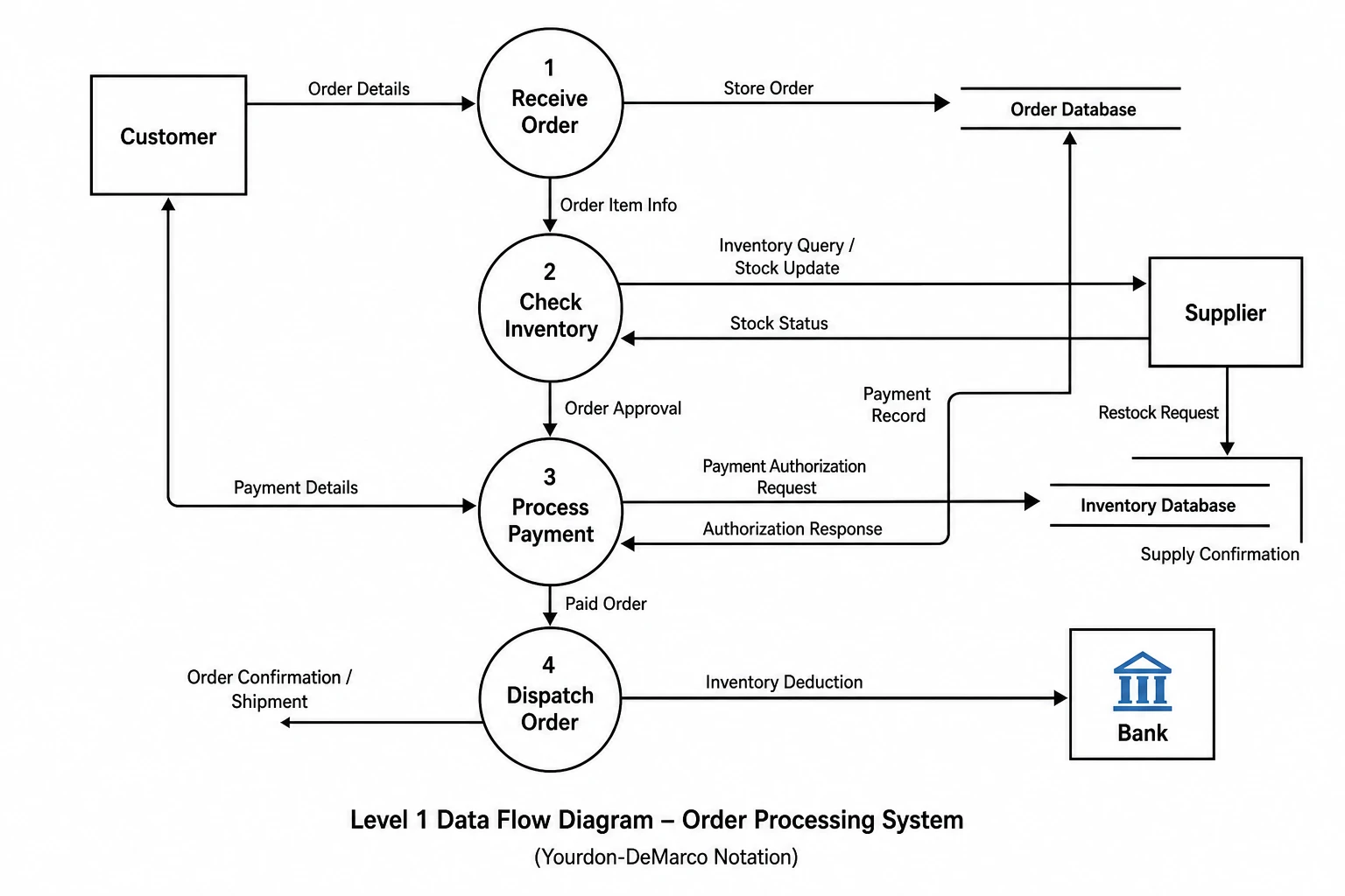
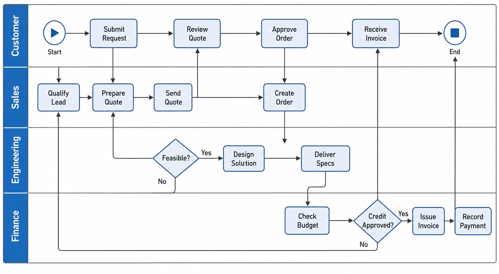
Keep the supply-demand figure beside related charts or an explanatory process. SciFig also provides AI scientific illustration, DataChart charts from data and editable FlowChart diagrams for the wider presentation.

Explore this example

How Researchers Use SciFig

My introductory class needed a clear comparison between equilibrium and a binding price ceiling. I entered the same equations used on the worksheet into the supply and demand graph maker, then moved the controlled price. Showing the calculated shortage beside the original intersection gave the discussion a consistent numerical reference.
Clara Jensen

Economics lecturer, Aarhus University

Free tools

A tool for every scientific figure

110 focused generators for the scientific figure you need — each opens in the right workspace with a matching example.

Supply And Demand Graph Questions

1.

2.

3.

4.

5.

6.

Call to action background

Create with SciFig

Make your supply and demand graph

Open the tool

Free to start · No credit card required · Built for researchers