
Scientific Poster Color Schemes
Six academic color schemes that stay readable in print, with hex values and a poster template in each one.
Reviewed by SciFig TeamUpdated
Each preview below is a separate PowerPoint file — click one to jump straight to its download.
What are scientific poster color schemes?
A scientific poster color scheme is the few colors on the title bar and section headings; body text stays near-black.
A scientific poster color scheme is the small set of colors applied to a poster's title bar, section headings and rules, while body text stays near-black on white. It is a legibility decision rather than a branding one: the board is read from one to two meters away under lighting you do not control. The six schemes here are the ones built into every SciFig poster template, each with its hex value.
Research poster color schemes: six ready-made palettes
These are the six schemes built into every SciFig poster template.
Each one is a single accent color applied to the title bar and section headings, with body text left near-black. Pick one, download that file, and the whole board is already consistent — there is nothing to recolor. Need a different size, orientation or column layout instead? Every board we make is on the scientific poster templates hub.
| Scheme | Accent | Reads well for |
|---|---|---|
| Navy | #1B365D | The default. Safe at any conference, high contrast on white |
| Forest | #14532D | Ecology, plant science, environmental work |
| Crimson | #8C1D2C | Boards that want one warm accent; use sparingly in figures |
| Teal | #0F4C5C | Holds up under warm exhibition lighting |
| Plum | #4A2545 | Boards that want a deeper accent than navy without giving up contrast |
| Graphite | #2F3437 | Figure-heavy posters where color should sit in the data |
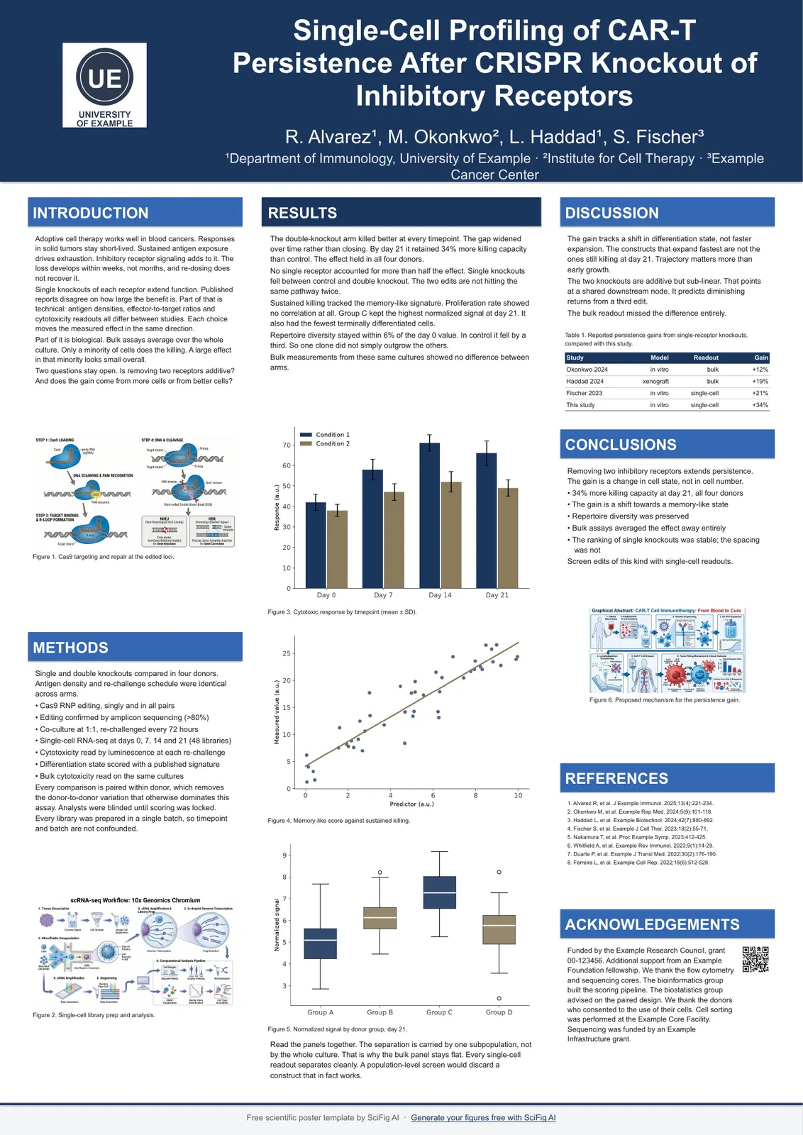
Navy — A0 portrait
A0 · 841 x 1189 mm · 33.11 x 46.81 in
#1B365D title bar and section headings
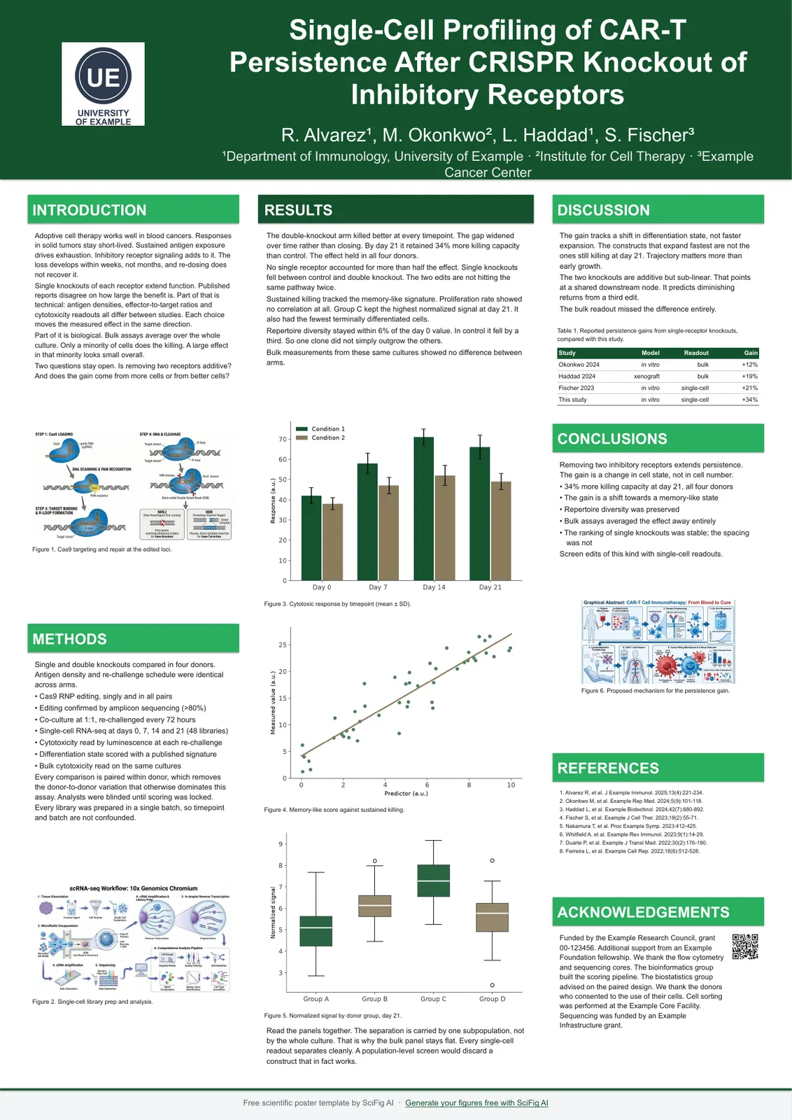
Forest — A0 portrait
A0 · 841 x 1189 mm · 33.11 x 46.81 in
#14532D title bar and section headings
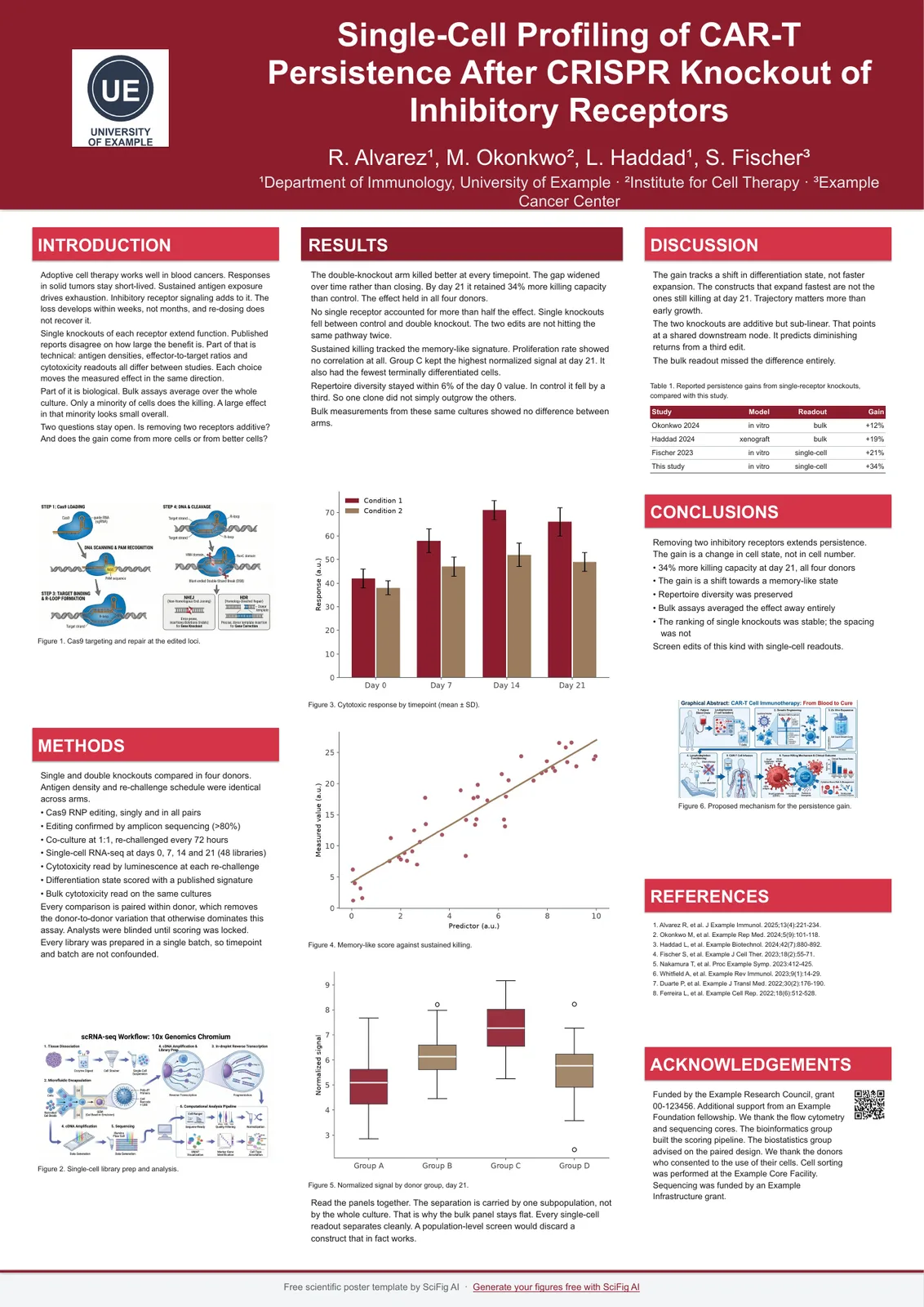
Crimson — A0 portrait
A0 · 841 x 1189 mm · 33.11 x 46.81 in
#8C1D2C title bar and section headings
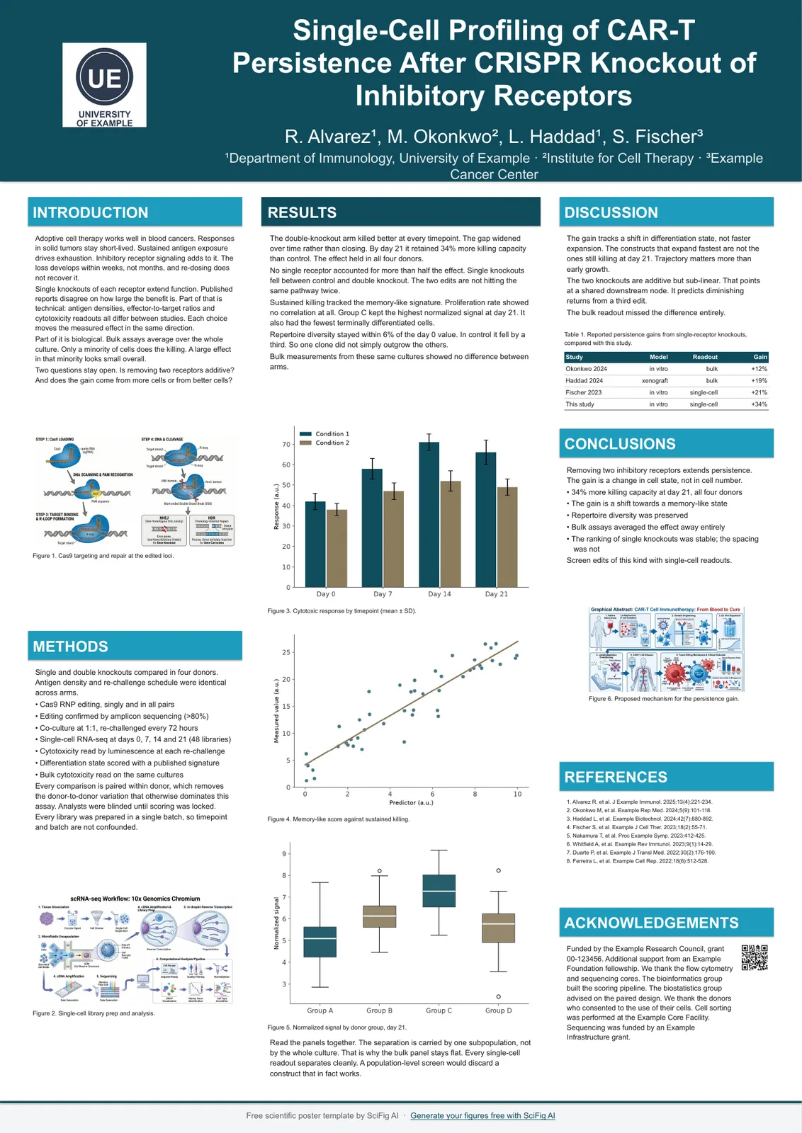
Teal — A0 portrait
A0 · 841 x 1189 mm · 33.11 x 46.81 in
#0F4C5C title bar and section headings
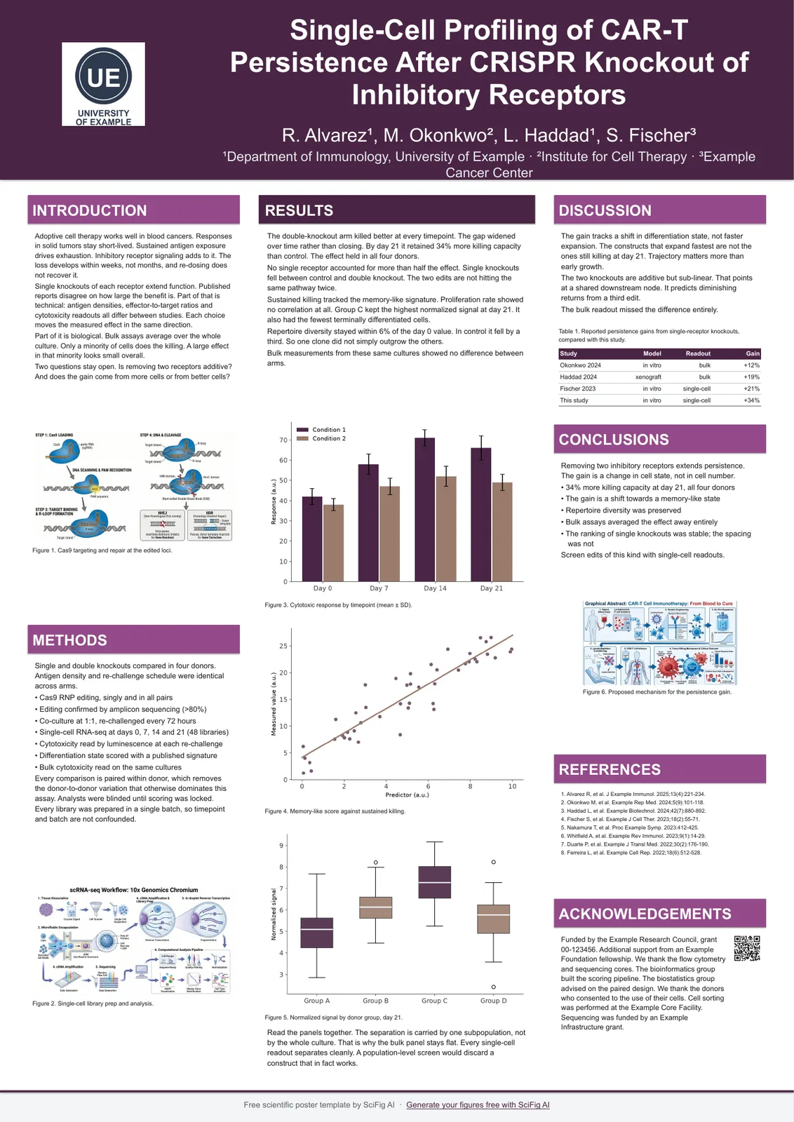
Plum — A0 portrait
A0 · 841 x 1189 mm · 33.11 x 46.81 in
#4A2545 title bar and section headings
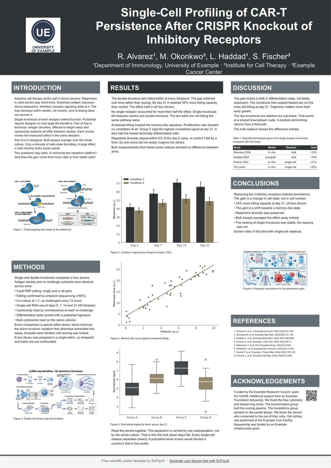
Graphite — A0 portrait
A0 · 841 x 1189 mm · 33.11 x 46.81 in
#2F3437 title bar and section headings
How to change the colors in a poster template
Every template is a normal .pptx, so its colors come from the file's theme rather than from hand-painted shapes.
The title bar and section headings are bound to that theme, so one change updates the whole board. If you only want a different one of our six schemes, downloading that file is faster than recoloring.
- Open the .pptx in PowerPoint and go to Design → Variants → Colors.
- Pick one of the built-in schemes to recolor the title bar and every section heading at once.
- For your institution's colors, choose Customize Colors and enter the hex values — start with the accent, which is what the title bar and section headings use.
- Leave body text near-black. Recoloring it is the one change that reliably costs you legibility in print.
How to change poster template colors in Google Slides
Every template also opens in Google Slides — use the Open in Google Slides link on any file above.
It opens read-only, so make your own copy first and edit the theme in that copy.
- Open the template in Google Slides, then choose File → Make a copy so you are editing your own version.
- In your copy, click Slide → Edit theme → Colors.
- Pick the theme color you want to change and enter your hex value in the color picker.
- Close the theme editor. The title bar and section headings across the whole board pick up the new color.
Scientific poster color schemes that survive printing
A scheme survives print when body text stays near-black on white and color is spent only on structure and data.
A scientific poster is read from one to two meters away, under lighting you do not control, and often printed on matte paper that lifts dark tones. That is the whole brief for a scientific poster color scheme: keep body text near-black on white, and spend color only where it carries meaning — the title bar, the section headings, and the data itself. Every scheme below keeps body text at #1A1A1A on white for exactly this reason.
Academic poster color scheme rules: contrast before decoration
An academic poster color scheme is a legibility decision, not a branding one.
Three rules cover most of it. Keep body text near-black on white rather than colored — colored body text loses contrast the moment it is printed. Use the accent for structure (title bar, section headings, rules) so a reader can find the sections from a distance. And keep your figures on their own palette: a colorblind-safe sequence inside a chart matters more than matching the chart to the poster.
Color palette for a research poster: how many colors you actually need
One accent plus near-black body text is enough for almost every research poster.
A second color is worth adding only when it means something — for example, one hue per experimental condition, used consistently across every figure. Beyond that, extra colors compete with your data — the academic poster colors that read best are the ones carrying meaning, and research poster colors past two accents rarely do. If your color palette for a research poster needs more than two, the extra ones almost always belong inside the figures rather than on the board.
Scientific poster colors to avoid
Avoid full-board dark backgrounds, red-green as your only cue, gradients behind text, and colors off a screenshot.
Four scientific poster colors to avoid: light text on a dark background across the whole board (it prints heavy and drinks ink); saturated red and green as your only distinction in a figure, which around 8% of male readers cannot separate; gradients behind body text; and any color pulled from a screenshot without checking its contrast. A scientific poster with no color at all is a legitimate choice — plenty of strong boards are black on white with color only inside the figures.
Scientific poster color palette in print vs on screen
Screens are additive and backlit; scientific posters are ink on paper.
The same hex value will look darker and slightly duller printed, and matte stock flattens it further than gloss. Two habits cover this: keep an eye on contrast rather than on how vivid a color looks on your monitor, and if the print matters, get a single A4 test page from the same printer before committing to the full board.
Conferences and departments write this size in different ways — you may also see it listed as: scientific poster color schemes · research poster color schemes · research poster color palette · academic poster color scheme · scientific poster colors · color palette for a research poster · poster color combinations · how to change poster template colors · scientific poster color palette · color palette for research poster
Related pages
All Poster Templates
Browse every poster template page in SciFig's library.
Text-to-Figure
Describe a figure in words and generate it with AI
PDF-to-Figure
Draft diagrams from the content of a paper PDF
Scientific 36x48 Poster Template
36 x 48 in poster templates, plus the 48 x 36 in landscape version — the size most North American conferences hang.
Scientific A0 Poster Template
A0 poster templates sized 841 x 1189 mm, in portrait and landscape, with the type scale already set for print.
Scientific A1 Poster Template
A1 poster templates sized 594 x 841 mm, portrait and landscape, with a type scale recomputed for the smaller board.
A2 Academic Poster Template
A2 poster templates at 420 x 594 mm, portrait and landscape, with a type scale recomputed for a close-read board.
Scientific Conference Poster Template
Conference poster templates in every board size conferences actually hang, with the print type scale already applied.
Scientific E-Poster Template
E-poster templates in three shapes: a 16:9 screen canvas, and A0 portrait and landscape single-page versions.
Frequently Asked Questions
Common questions about Scientific Poster Color Schemes.

Ready to publish?
Make your own Scientific Poster Color Schemes in minutes.
Start for freeFree to start · No credit card required · Built for researchers