Visme is built for marketing infographics, not for data-faithful science visuals.
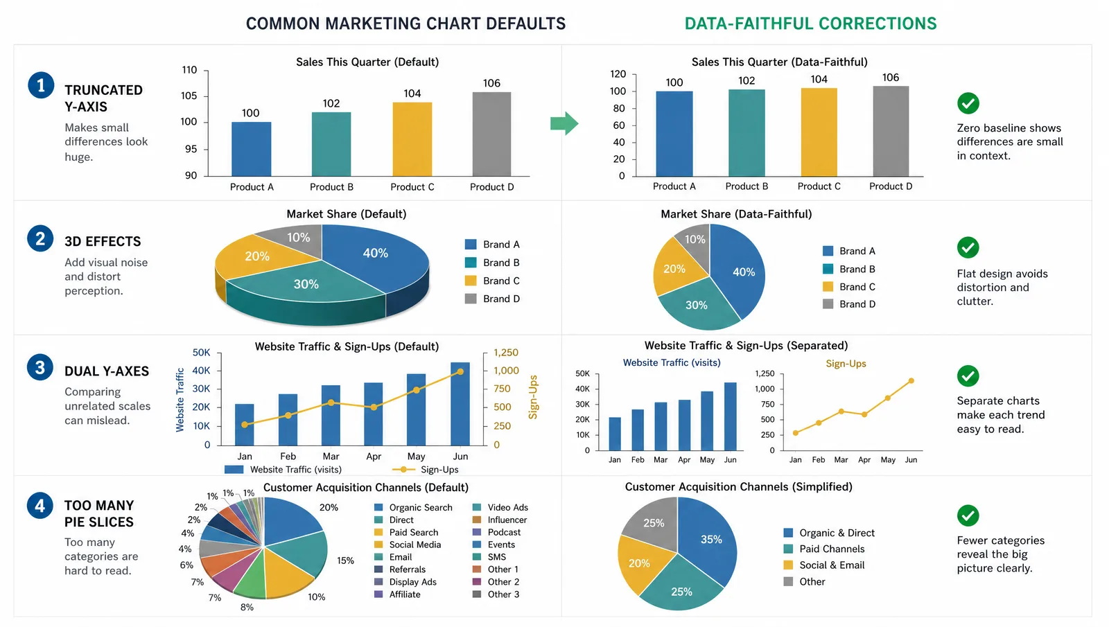
That is not a criticism of the product, but it explains the mismatch researchers hit. Marketing infographics optimize for attention; scientific graphics optimize for accuracy. A tool whose default chart styles include 3D pie charts and truncated axes is optimizing for the first, and every one of those defaults is a problem in a research context.
What Goes Wrong with Marketing-First Tools
Four defaults cause most of the damage:
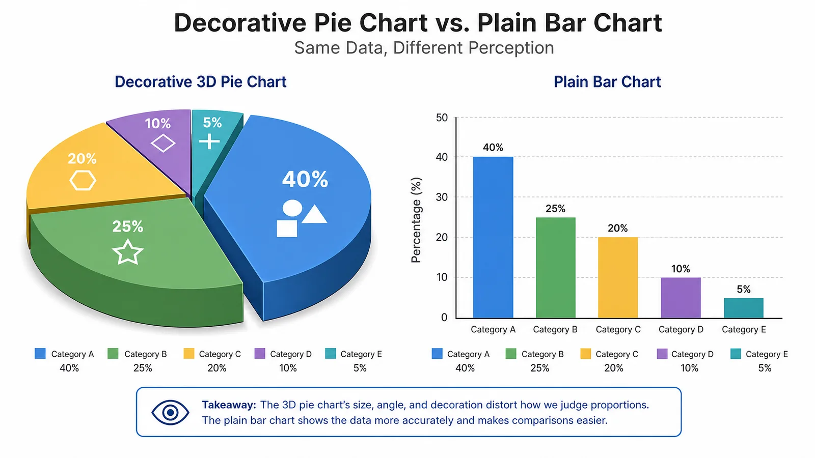
- 3D chart effects distort perceived proportion. A 3D pie chart makes foreground slices look larger.
- Truncated axes exaggerate differences. Common in marketing, misleading in research.
- Decorative icons standing in for data — a row of half-people to represent 4.5 million — introduce rounding the reader cannot see.
- Raster-only export fails journal requirements and degrades when scaled to poster size.
None of these makes a tool unusable. They make its defaults unsafe, which means every chart needs deliberate correction.
The Alternatives Compared
| Tool | Best for | Data-faithful defaults | Vector export | Offline |
|---|---|---|---|---|
| Canva | Outreach graphics, slides | No | Yes (paid tiers) | Limited |
| Inkscape | Final poster and figure artwork | Not applicable | Yes | Yes |
| Datawrapper | Charts for publication and press | Yes | Yes | No |
| RAWGraphs | Exploratory chart forms | Yes | SVG | Yes (local) |
| Flourish | Interactive and animated charts | Yes | Limited | No |
| Affinity Publisher | Posters and multi-panel layouts | Not applicable | Yes | Yes |
| matplotlib / ggplot2 | Figures bound to real data | Yes | Yes | Yes |
See AI Scientific Figure Generation in Action
Watch how researchers create publication-ready scientific figures from text descriptions.
Explore the ToolDatawrapper
The strongest recommendation for anyone making charts that must be both attractive and honest. Defaults are conservative — no 3D, no truncated axes without warning — and it exports vector. Widely used in journalism for exactly this reason.
RAWGraphs
Useful when your data does not fit a standard chart type. It covers alluvial diagrams, beeswarm plots, and treemaps, exports SVG for finishing in Inkscape, and runs locally so data need not leave your machine.
Inkscape and Affinity Publisher
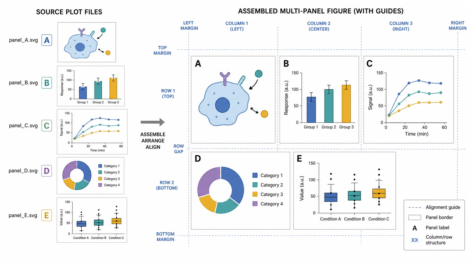
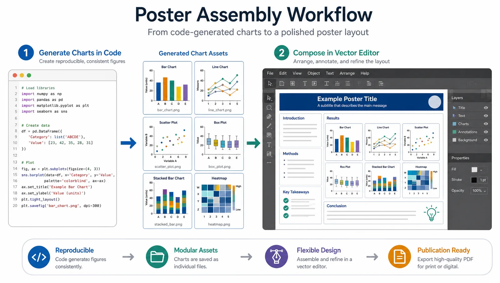
Where posters should be assembled. Neither generates charts; both give precise control over layout, typography, and export. For a conference poster, the usual pattern is charts from a plotting library, assembly in one of these.
matplotlib and ggplot2
If a scientific figure represents data, it should ideally be generated from that data by code. The figure then updates when the data does, and the transformation is auditable. This is the most reliable route to a defensible figure.
Outreach Is a Legitimate Use
None of this means decoration is always wrong. A public engagement infographic, a lab website graphic, or a conference social post has a different job from a figure in a manuscript, and simplification is appropriate there.
Tip
Keep outreach and publication versions as separate files from the start. Trying to make one graphic serve both audiences usually produces something too decorated for the journal and too dense for the public.
Create Scientific Figures Now
Describe your scientific figure in natural language — get publication-ready illustrations in minutes.
Try Free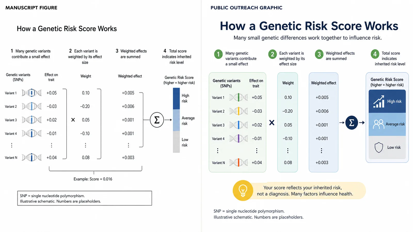
Related Reading
Related reading: 7 Best BioRender Alternatives in 2026 (Free & Paid), 18 Scientific Poster Examples to Learn From in 2026.