All eight Okabe-Ito hex codes with RGB values, colorblind-safe ordering rules, and copy-ready R, Python, and CSS snippets for scientific figures.
SciFig Team
Scientific Illustration Experts
The Okabe-Ito palette is eight colorblind-safe hex codes for scientific figures.
Roughly one in twelve men and one in two hundred women has some form of color vision deficiency. If your figure encodes meaning in red versus green, a meaningful share of your readers — and reviewers — sees something different from what you designed. This page is the reference: every hex code, the RGB values, and code you can paste straight into R, Python, or CSS.
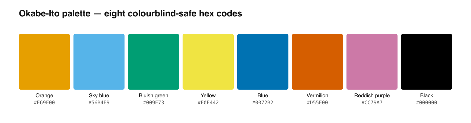
The eight Okabe-Ito palette colors displayed as labeled swatches with hex codes beneath each block (Okabe-Ito swatch chart rendered by SciFig)
The Okabe-Ito Palette: All Eight Hex Codes
The Okabe-Ito palette is eight colors chosen to remain distinguishable under protanopia, deuteranopia, and tritanopia. It was published by Masataka Okabe and Kei Ito as part of their Color Universal Design work, and popularized in the life sciences by Bang Wong's 2011 Nature Methods column — which is why you will sometimes see the identical set called the Wong palette.
Name
Hex
RGB
Orange
#E69F00
230, 159, 0
Sky blue
#56B4E9
86, 180, 233
Bluish green
#009E73
0, 158, 115
Yellow
#F0E442
240, 228, 66
Blue
#0072B2
0, 114, 178
Vermilion
#D55E00
213, 94, 0
Reddish purple
#CC79A7
204, 121, 167
Black
#000000
0, 0, 0
The yellow is #F0E442 — a soft, slightly desaturated yellow. This is worth stating explicitly because incorrect values circulate widely. Pure yellow (#FFFF00) is not the Okabe-Ito yellow, and at least one popular R package ships an "amber" variant (#F5C710) as an option that replaces the original. If you copy from a blog post rather than a reference implementation, you can easily end up with a palette that is no longer the published one.
See Figure Enhancement in Action
Upscale, recolor, or relabel any existing scientific figure to 8K journal-ready quality.
Color vision deficiency is not "seeing in grayscale." The common forms compress a specific axis of color space, so hues that differ mainly along the red-green axis collapse toward each other while differences in lightness and in the blue-yellow axis survive.
The Okabe-Ito set is built around that fact. Adjacent entries differ in lightness as well as hue, so even when two colors converge for a given viewer, they remain separable by how bright they are. That is also why the palette includes black: it anchors the lightness range and gives you a reliable reference category.
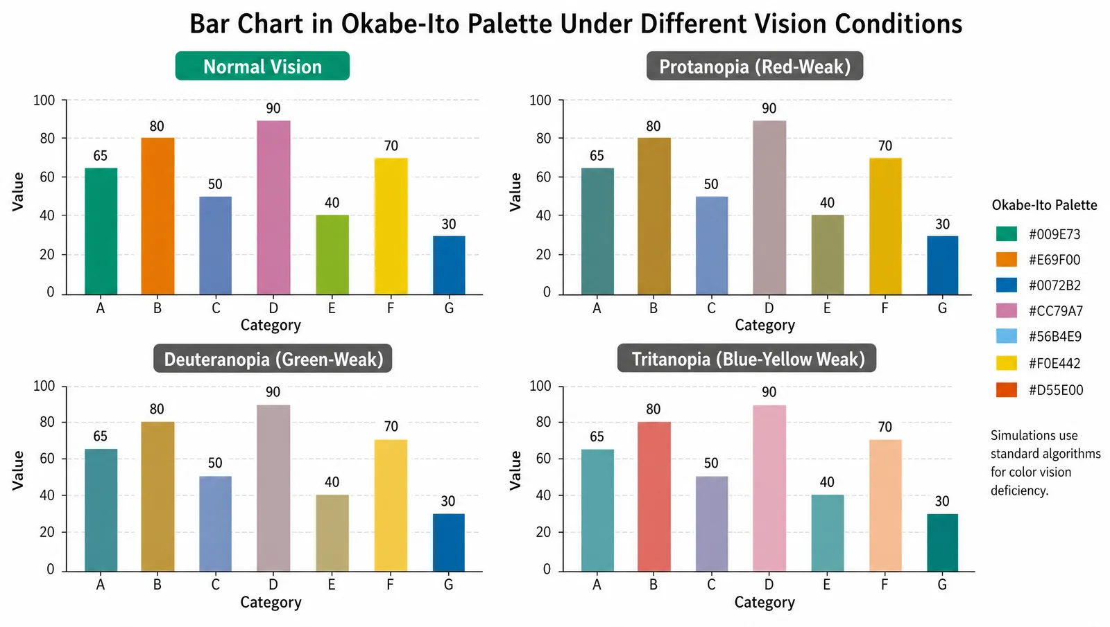
Side-by-side simulation of a bar chart in the Okabe-Ito palette under normal vision, protanopia, deuteranopia, and tritanopia (Color vision simulation rendered by SciFig)
Recommended ordering
If you need fewer than eight colors, do not simply take the first N. Use this order, which keeps maximum separation at small counts:
#0072B2 blue
#E69F00 orange
#009E73 bluish green
#CC79A7 reddish purple
#56B4E9 sky blue
#D55E00 vermilion
#F0E442 yellow
#000000 black
Blue and orange first is deliberate: that pair is the most robust two-color contrast in the set across all deficiency types.
Okabe-Ito is a qualitative palette. It is designed for unordered categories — treatment groups, species, conditions. It is the wrong tool for three common jobs:
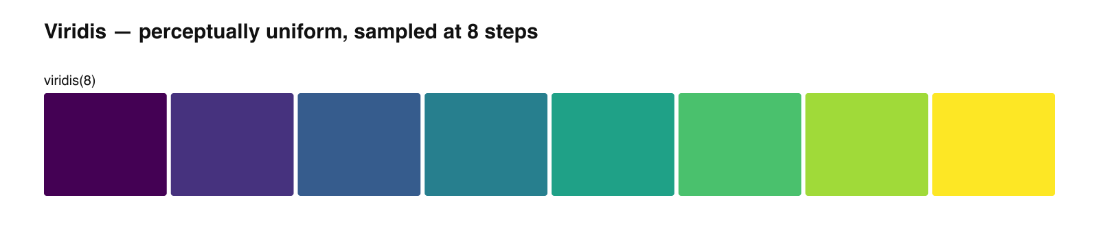
Ordered or continuous data. Use a perceptually uniform sequential map instead. Viridis is the usual choice.
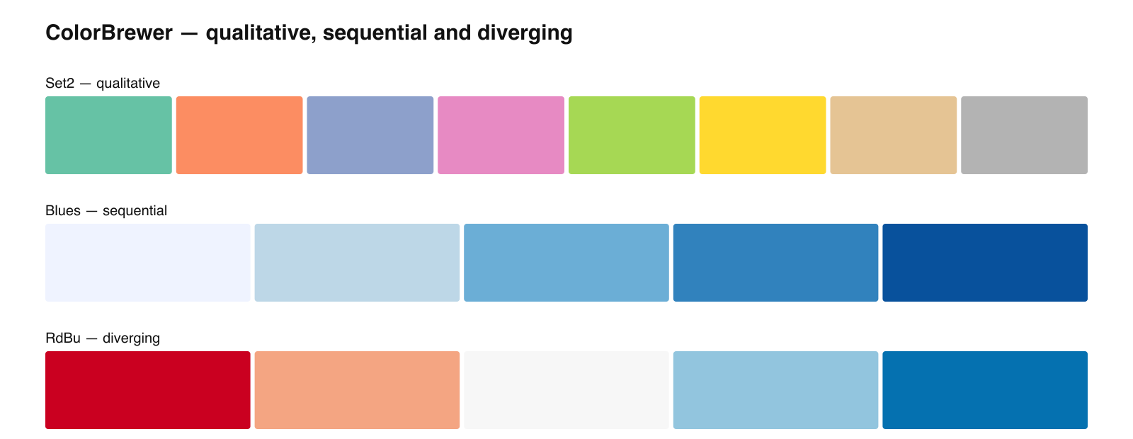
Diverging data around a midpoint. Use a diverging scheme with a neutral center, such as ColorBrewer's RdBu.
More than eight categories. If you need more, the honest answer is usually that the figure needs restructuring — faceting, grouping, or direct labeling — rather than a ninth color.
For the broader decision of which palette type fits which data, our guide to choosing color palettes for scientific figures walks through the sequential, diverging, and qualitative split with worked examples.
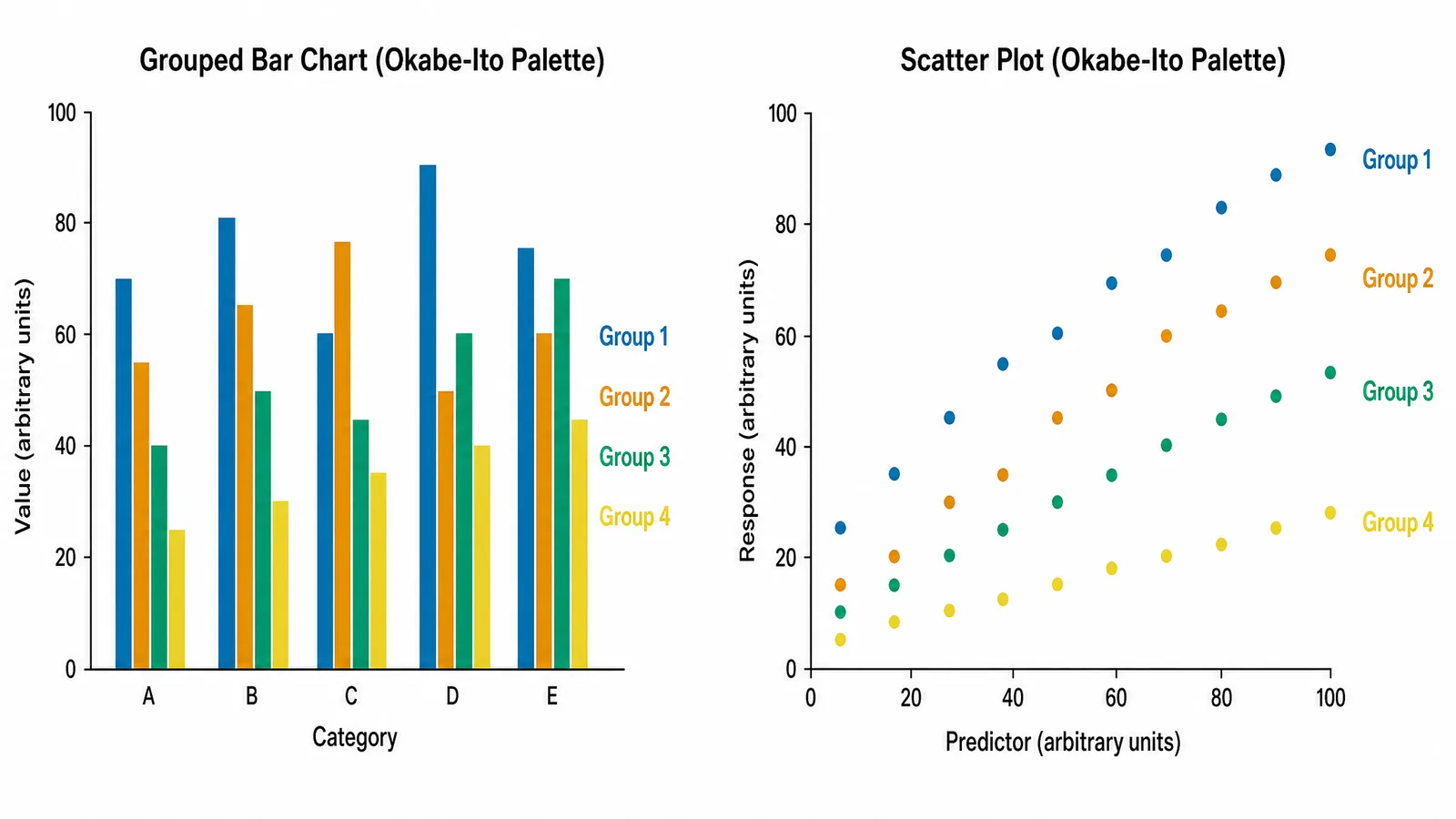
A grouped bar chart and a scatter plot using the Okabe-Ito palette with direct labels instead of a legend (Figure generated with SciFig)
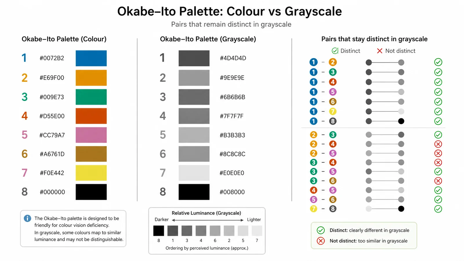
The same Okabe-Ito figure shown in colour and converted to grayscale, with the pairs that stay distinct highlighted (Figure generated with SciFig)
Common Mistakes
Relying on color alone. Even a perfect palette fails in grayscale printing and for readers with monochromacy. Pair color with a second channel: line style, marker shape, direct labels, or texture.
Using yellow on white.#F0E442 has low contrast against a white background. Reserve it for filled areas with an outline, not thin lines or small markers.
Assuming the palette fixes the figure. A crowded figure with eight overlapping series is hard to read no matter how well chosen the colors are. Color accessibility is a floor, not a substitute for structure.
Create Scientific Figures Now
Describe your scientific figure in natural language — get publication-ready illustrations in minutes.
If you are building the figure rather than recoloring an existing one, the scientific color palette generator applies these constraints while you work, and figure enhancer can recolor an existing figure to a colorblind-safe set without rebuilding it.
Tip
Verify, do not trust. Before submission, run your figure through a color vision simulator and check it once in grayscale. Both take under a minute and catch the majority of accessibility problems.
The eight Okabe-Ito hex codes are #E69F00 orange, #56B4E9 sky blue, #009E73 bluish green, #F0E442 yellow, #0072B2 blue, #D55E00 vermilion, #CC79A7 reddish purple, and #000000 black. All eight remain distinguishable under the common forms of color vision deficiency.
Yes — they are the same eight colors. The set was published by Okabe and Ito as part of Color Universal Design, and Bang Wong presented it to a life sciences audience in a 2011 Nature Methods column, so both names refer to the identical hex values.
The Okabe-Ito yellow is #F0E442, a soft desaturated yellow. Pure yellow #FFFF00 is not part of the palette, and the amber #F5C710 seen in some R packages is a package-specific substitution rather than the published value.
No. Okabe-Ito is a qualitative palette for unordered categories. For continuous data use a perceptually uniform sequential map such as viridis, and for data diverging around a midpoint use a diverging scheme with a neutral center.
Use as few as the figure allows, and take them in the recommended order starting with blue and orange. Beyond five or six categories most readers stop tracking colors reliably, so consider faceting or direct labeling instead of adding more.
Partly. The colors differ in lightness, so many pairs survive grayscale conversion, but not all eight stay distinct. If grayscale printing matters, encode the same information with a second channel such as marker shape or line style.
Keep going
Recommended resources
Templates, tools, and further reading for your research