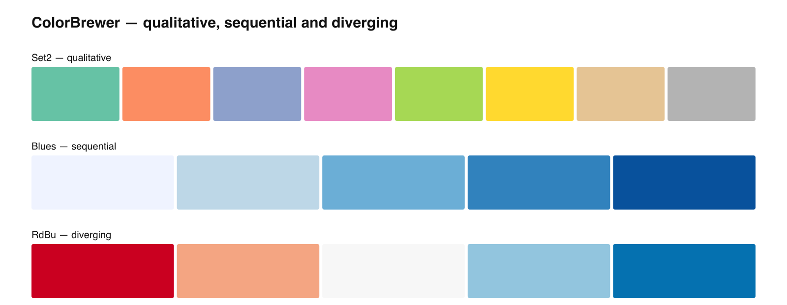
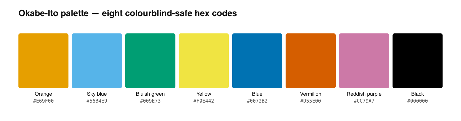
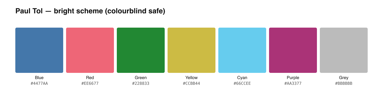
Viridis is a perceptually uniform colormap for continuous scientific data.
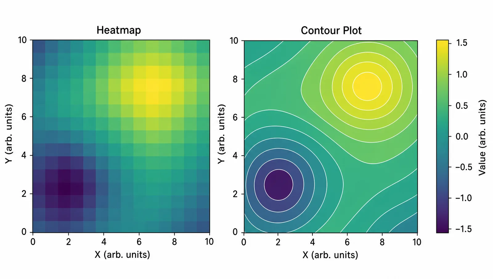
It runs from dark purple to bright yellow, and unlike the rainbow maps it replaced, equal steps in your data produce equal-looking steps in color. That property is what makes it safe for heatmaps, density plots, and any scientific figure where readers estimate values from color. This page gives the hex codes at the sampling densities you actually need.
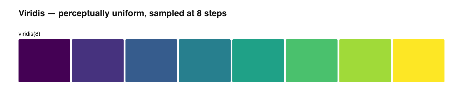
Viridis Hex Codes at 5, 8, and 10 Steps
| Steps | Hex codes |
|---|---|
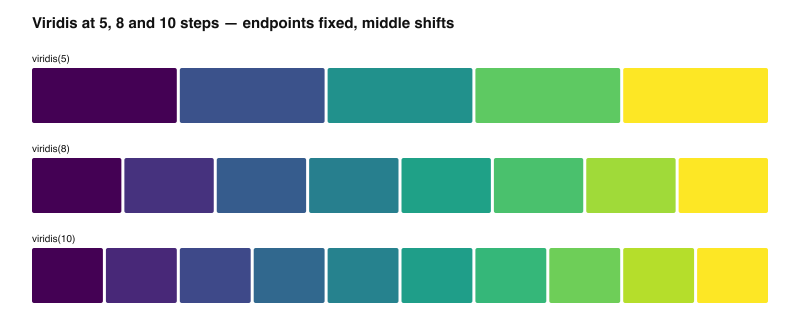
| 5 | #440154 #3B528B #21918C #5EC962 #FDE725 |
| 8 | #440154 #46327E #365C8D #277F8E #1FA187 #4AC16D #A0DA39 #FDE725 |
| 10 | #440154 #482878 #3E4989 #31688E #26828E #1F9E89 #35B779 #6ECE58 #B5DE2B #FDE725 |
#440154 (dark purple) and #FDE725 (bright yellow). The intermediate values change with the number of steps — the 8-step and 10-step lists are not subsets of each other. If you quote viridis hex codes anywhere, state how many steps you sampled, or the numbers will not reproduce.See Figure Enhancement in Action
Upscale, recolor, or relabel any existing scientific figure to 8K journal-ready quality.
Explore the ToolWhy Perceptual Uniformity Matters
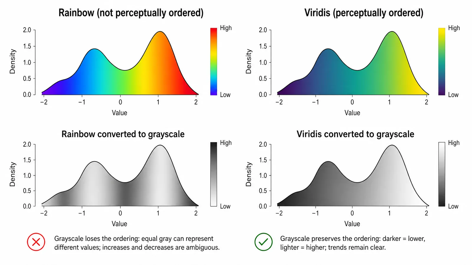
The classic rainbow colormap has bands where color changes fast and bands where it barely changes at all. Readers perceive the fast-changing bands as sharp boundaries in the data even when the data is smooth, and they miss real structure inside the slow-changing bands. The colormap invents features and hides others.
Viridis was designed to avoid this. Lightness increases monotonically from one end to the other, and the rate of perceived change stays roughly constant across the range. Two consequences follow directly:
- It survives grayscale. Because lightness is monotonic, converting to grayscale preserves the ordering. A rainbow map does not — its middle is often lighter than both ends.
- It survives color vision deficiency. The ordering is carried mostly by lightness rather than by a red-green contrast, so the reading stays intact.
Copy-Ready Code
Python
import matplotlib.pyplot as plt
plt.imshow(data, cmap="viridis")

# discrete sampling
from matplotlib import cm
from matplotlib.colors import to_hex
import numpy as np
hexes = [to_hex(cm.get_cmap("viridis")(x)).upper()
         for x in np.linspace(0, 1, 8)]
R
library(viridis)
scale_fill_viridis_c()          # continuous
scale_fill_viridis_d()          # discrete
viridis(8)                      # hex vector
CSS
.viridis-gradient {
  background: linear-gradient(
    to right,
    #440154, #46327E, #365C8D, #277F8E,
    #1FA187, #4AC16D, #A0DA39, #FDE725
  );
}
When Not to Use Viridis
- Unordered categories. Treatment groups and species have no natural order. Sampling viridis for them implies a ranking that does not exist. Use a qualitative palette such as Okabe-Ito instead.
- Data diverging around a meaningful midpoint. Log fold change, temperature anomaly, and correlation all have a neutral center. A sequential map hides it. Use a diverging scheme with a neutral middle.
#440154 on a white background can read as plain black. For line plots with few series, a qualitative palette usually communicates better.Tip
Viridis has siblings built on the same principle — magma, inferno, plasma, and cividis. Cividis is specifically optimized so that people with and without color vision deficiency perceive nearly the same image, which makes it a strong default for figures aimed at broad audiences.
Create Scientific Figures Now
Describe your scientific figure in natural language — get publication-ready illustrations in minutes.
Try FreeRelated Reading
Related reading: The Best Color Palettes for Scientific Figures (2026), Nature-Level Scientific Figures on a Budget.