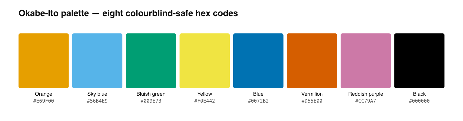
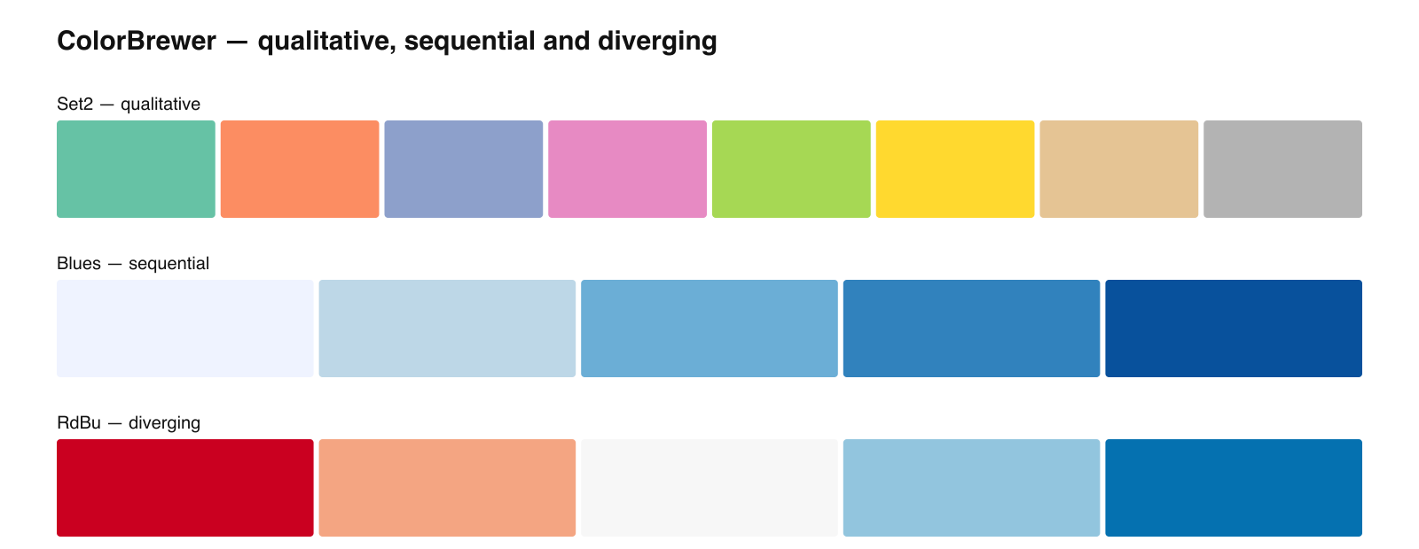
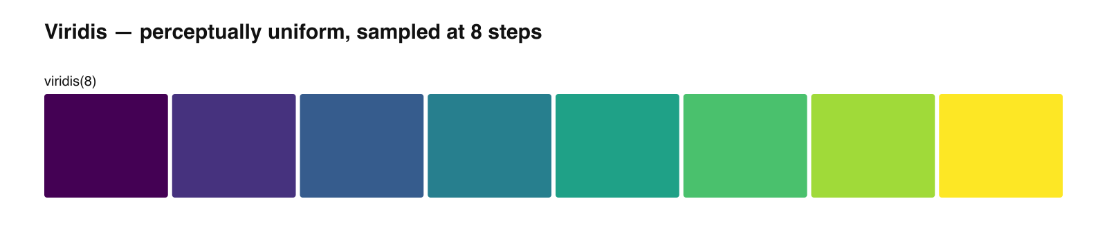
Paul Tol's schemes are colorblind-safe palettes built for scientific plots.
They come from a technical note published at SRON, the Netherlands Institute for Space Research, and they are unusual in that each scheme is designed for a specific job: maximum separation, maximum contrast, high saturation, or many categories at once. Picking the right one is mostly a matter of knowing which job you have.
The Four Colorblind-Safe Schemes
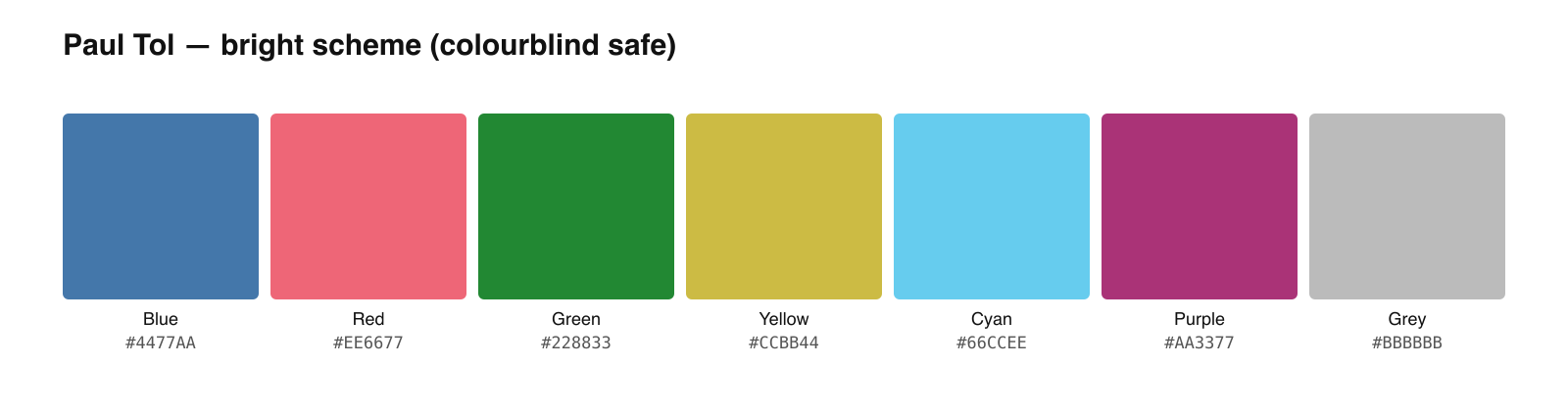
Bright (7 colors)
The general-purpose default. Good separation without the harshness of fully saturated colors.
| Name | Hex |
|---|---|
| Blue | #4477AA |
| Red | #EE6677 |
| Green | #228833 |
| Yellow | #CCBB44 |
| Cyan | #66CCEE |
| Purple | #AA3377 |
| Grey | #BBBBBB |
High contrast (5 colors)
For figures that must survive black-and-white printing, and for readers with severe deficiency. Includes black and white as endpoints.
| Name | Hex |
|---|---|
| Black | #000000 |
| Blue | #004488 |
| Red | #BB5566 |
| Yellow | #DDAA33 |
| White | #FFFFFF |
Vibrant (7 colors)
Higher saturation than bright. Better for thin lines, small markers, and presentation slides viewed at a distance.
| Name | Hex |
|---|---|
| Orange | #EE7733 |
| Blue | #0077BB |
| Cyan | #33BBEE |
| Magenta | #EE3377 |
| Red | #CC3311 |
| Teal | #009988 |
| Grey | #BBBBBB |
Muted (10 colors)
The largest colorblind-safe set here. Lower saturation, which keeps a busy figure calm. The pale grey is reserved for missing or excluded data.
| Name | Hex |
|---|---|
| Rose | #CC6677 |
| Indigo | #332288 |
| Sand | #DDCC77 |
| Green | #117733 |
| Cyan | #88CCEE |
| Wine | #882255 |
| Teal | #44AA99 |
| Olive | #999933 |
| Purple | #AA4499 |
| Pale grey | #DDDDDD |
See Figure Enhancement in Action
Upscale, recolor, or relabel any existing scientific figure to 8K journal-ready quality.
Explore the ToolChoosing Between Them
| If your figure is… | Use | Why |
|---|---|---|
| A standard plot with 3-7 series | Bright | Balanced separation, not harsh |
| Printed in black and white | High contrast | Designed around lightness, includes black and white |
| Thin lines or a projected slide | Vibrant | Saturation survives distance and low-quality projection |
| Dense with 8-10 categories | Muted | Largest safe set, low saturation keeps it calm |
#DDDDDD is reserved for missing, excluded, or not-applicable data — using it as an ordinary category color removes a useful signal. And the grey #BBBBBB in bright and vibrant plays the same role for a residual "other" category.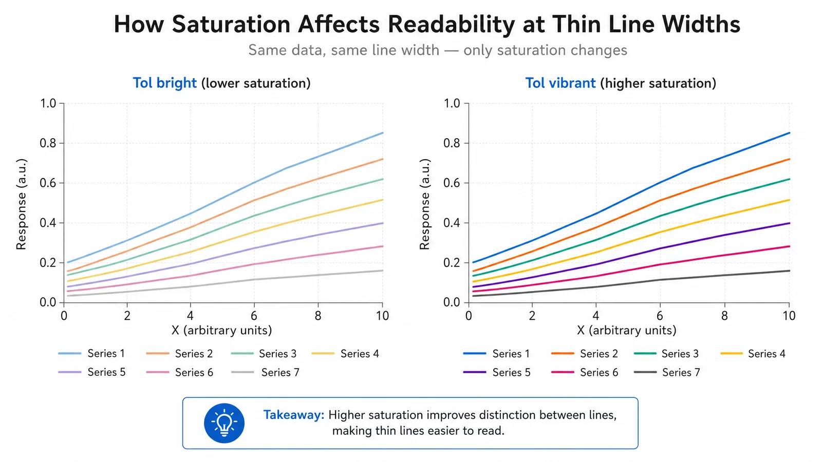
Copy-Ready Code
Python
TOL_BRIGHT = ["#4477AA", "#EE6677", "#228833", "#CCBB44",
              "#66CCEE", "#AA3377", "#BBBBBB"]
import matplotlib as mpl
mpl.rcParams["axes.prop_cycle"] = mpl.cycler(color=TOL_BRIGHT)tol-colors package exposes all schemes directly if you prefer not to hard-code them.R
tol_bright <- c("#4477AA", "#EE6677", "#228833", "#CCBB44",
                "#66CCEE", "#AA3377", "#BBBBBB")
scale_colour_manual(values = tol_bright)khroma package provides scale_colour_tol() and related helpers.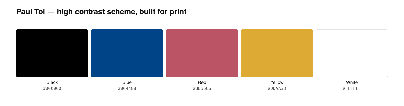
Tol or Okabe-Ito?
Both are colorblind-safe qualitative sets, and for most figures either works. The practical differences:
- Okabe-Ito is the more widely recognized standard in the life sciences, largely because of its Nature Methods exposure. If a reviewer asks which accessible palette you used, naming it needs no explanation.
- Tol gives you a choice of schemes for different jobs, and the muted scheme reaches ten categories where Okabe-Ito stops at eight.
Tip
Whichever scheme you pick, use it consistently across every figure in a manuscript. Readers learn a color mapping over the course of a paper, and re-assigning the same color to a different group between figures costs more comprehension than any palette choice gains.
Create Scientific Figures Now
Describe your scientific figure in natural language — get publication-ready illustrations in minutes.
Try FreeRelated Reading
Related reading: The Best Color Palettes for Scientific Figures (2026), Best Fonts for Scientific Posters and Figures: Font Sizes.