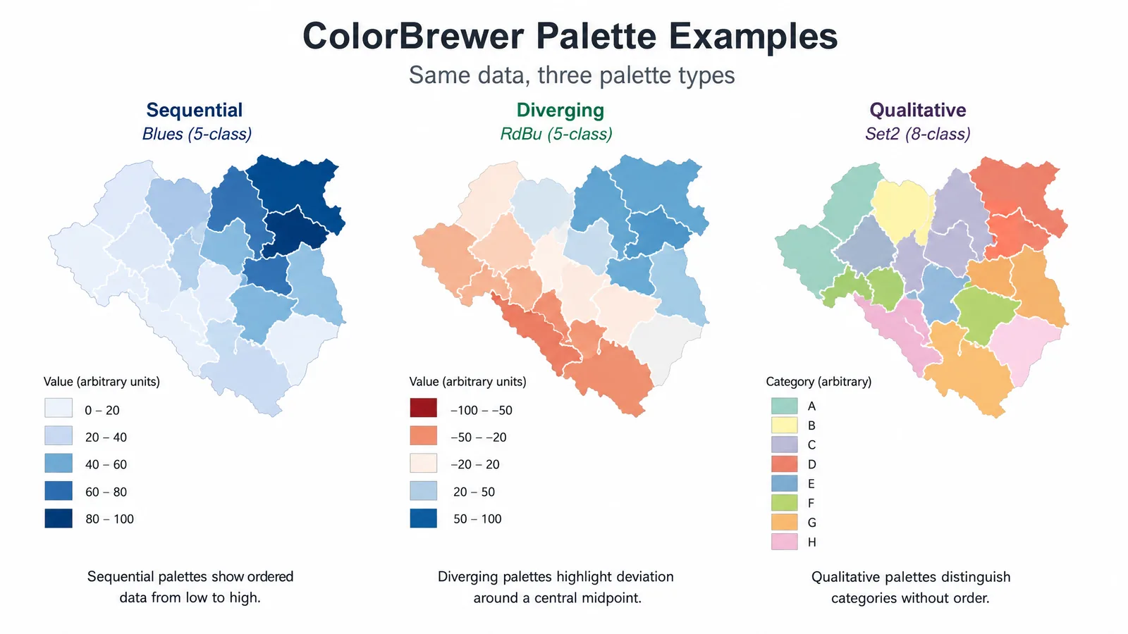
ColorBrewer provides tested sequential, diverging, and qualitative palettes.
It began as a cartography tool from Cynthia Brewer and Mark Harrower at Penn State, and it remains the most widely used palette library in scientific plotting because it does one thing well: it separates palettes by the kind of data they encode, then tells you which ones survive colorblindness and grayscale printing.
Pick the Palette Type First
Almost every bad color choice in a scientific figure is a type error rather than a taste error. Match the palette family to the data before comparing individual colors.
| Data type | Palette family | Example | Use for |
|---|---|---|---|
| Unordered categories | Qualitative | Set2, Dark2, Paired | Species, treatment groups, conditions |
| Ordered / continuous | Sequential | Blues, Greens, YlOrRd | Concentration, count, density |
| Diverging from a midpoint | Diverging | RdBu, RdYlBu, BrBG | Log fold change, anomaly, correlation |
Using a diverging palette for sequential data invents a midpoint that is not there. Using a sequential palette for categories implies a ranking that does not exist. Both mislead readers before they read a single axis label.
See Figure Enhancement in Action
Upscale, recolor, or relabel any existing scientific figure to 8K journal-ready quality.
Explore the ToolQualitative Palettes
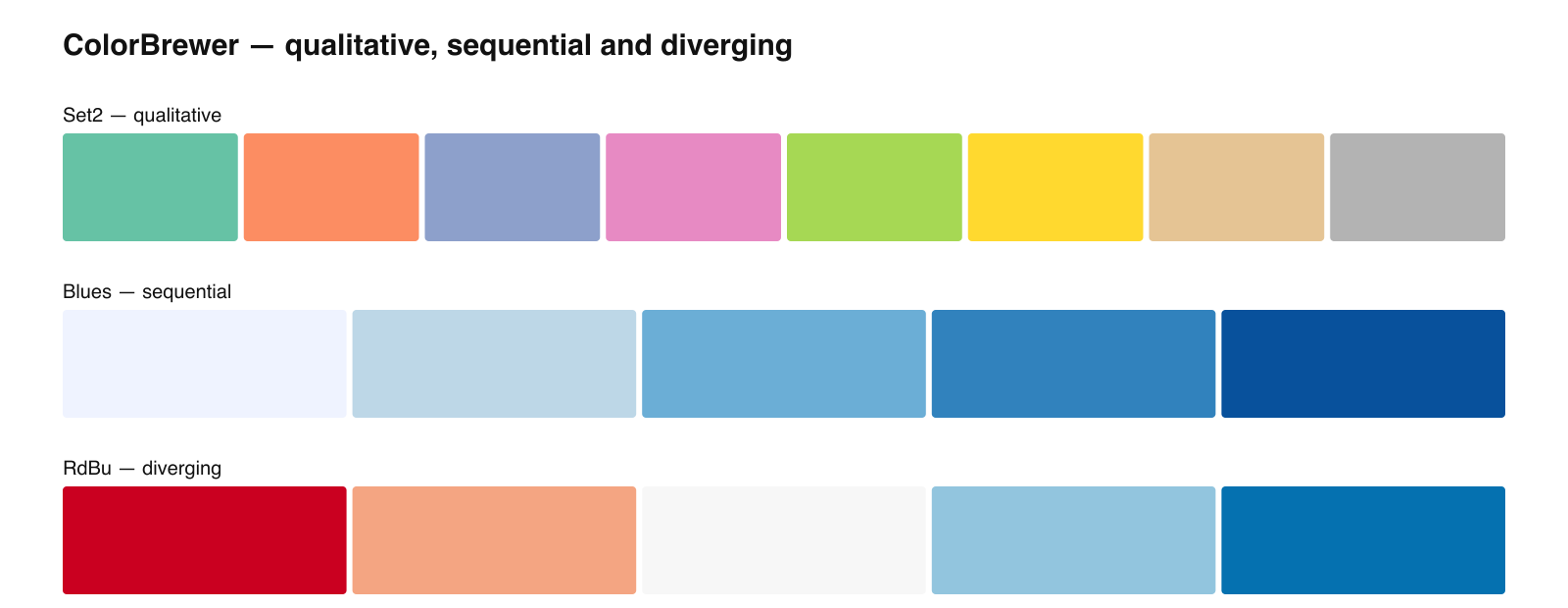
#66C2A5 #FC8D62 #8DA0CB #E78AC3 #A6D854 #FFD92F #E5C494 #B3B3B3#1B9E77 #D95F02 #7570B3 #E7298A #66A61E #E6AB02 #A6761D #666666#A6CEE3 #1F78B4 #B2DF8A #33A02C #FB9A99 #E31A1C #FDBF6F #FF7F00 #CAB2D6 #6A3D9A #FFFF99 #B15928A caution on Paired: only the pairing is meaningful. Do not use it for twelve unrelated categories, because readers will infer relationships from the pairing that your data does not support.
Sequential and Diverging Palettes
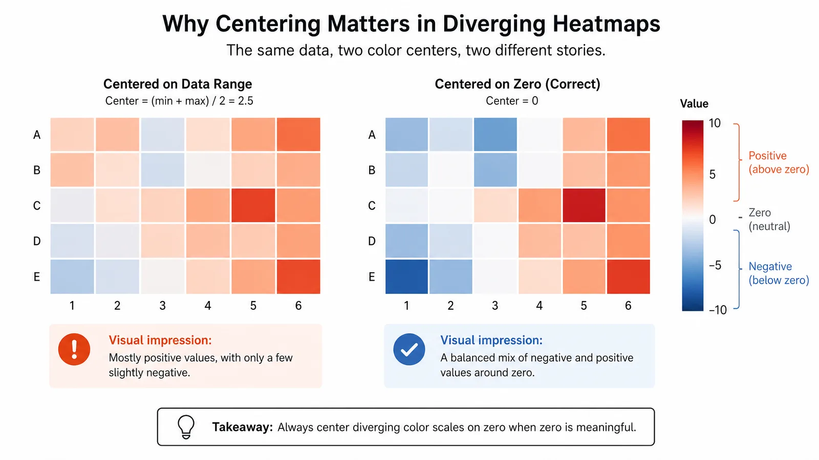
#EFF3FF #BDD7E7 #6BAED6 #3182BD #08519C#CA0020 #F4A582 #F7F7F7 #92C5DE #0571B0#D7191C #FDAE61 #FFFFBF #ABD9E9 #2C7BB6For diverging maps, anchor the neutral color to the meaningful midpoint. If your log fold change runs from -1 to +4 and you let the software center the scale on the data range, the neutral color lands at +1.5 and the figure will read as though most genes are downregulated.
Colorblind-Safe Subset
Not every ColorBrewer palette is colorblind safe, and the qualitative family is the weakest. As a practical rule:
- Sequential single-hue palettes (Blues, Greens, Purples) are safe by construction, since they vary mainly in lightness.
- Set2 and Dark2 hold up well at three to four classes and degrade beyond that.
- Paired is not reliable, because the light/dark pairing that carries meaning compresses under deficiency.
Tip
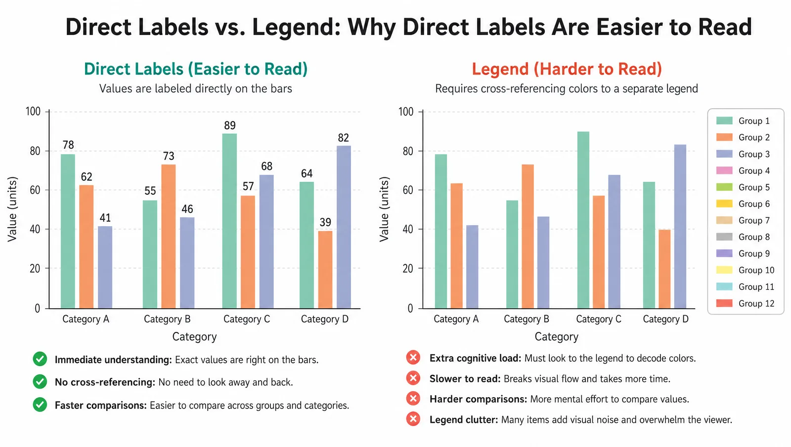
ColorBrewer palettes are capped deliberately. If a scheme offers at most 8 or 9 classes, that is a finding, not a limitation — beyond that count readers stop matching colors to a legend reliably. Treat the cap as a signal to restructure the figure.
Create Scientific Figures Now
Describe your scientific figure in natural language — get publication-ready illustrations in minutes.
Try FreeRelated Reading
Related reading: The Best Color Palettes for Scientific Figures (2026), How to Add Figures to a Research Paper.