A Three Minute Thesis slide must carry one idea with no animation.
That constraint is the whole design brief. Most 3MT competitions allow a single static slide, no transitions, no sound, and no props. Within those rules the slide is not a summary of your research — it is a backdrop that makes one idea land while you talk.
Check Your Competition's Rules First
- Whether the slide must be static, and whether builds or transitions are permitted
- Required aspect ratio and file format
- Submission deadline, which is often well before the event
- Whether any text limit applies
The constants across most competitions are one slide, no animation, and no additional media. Everything else is worth verifying rather than assuming.
See AI Scientific Figure Generation in Action
Watch how researchers create publication-ready scientific figures from text descriptions.
Explore the ToolThe One-Idea Rule
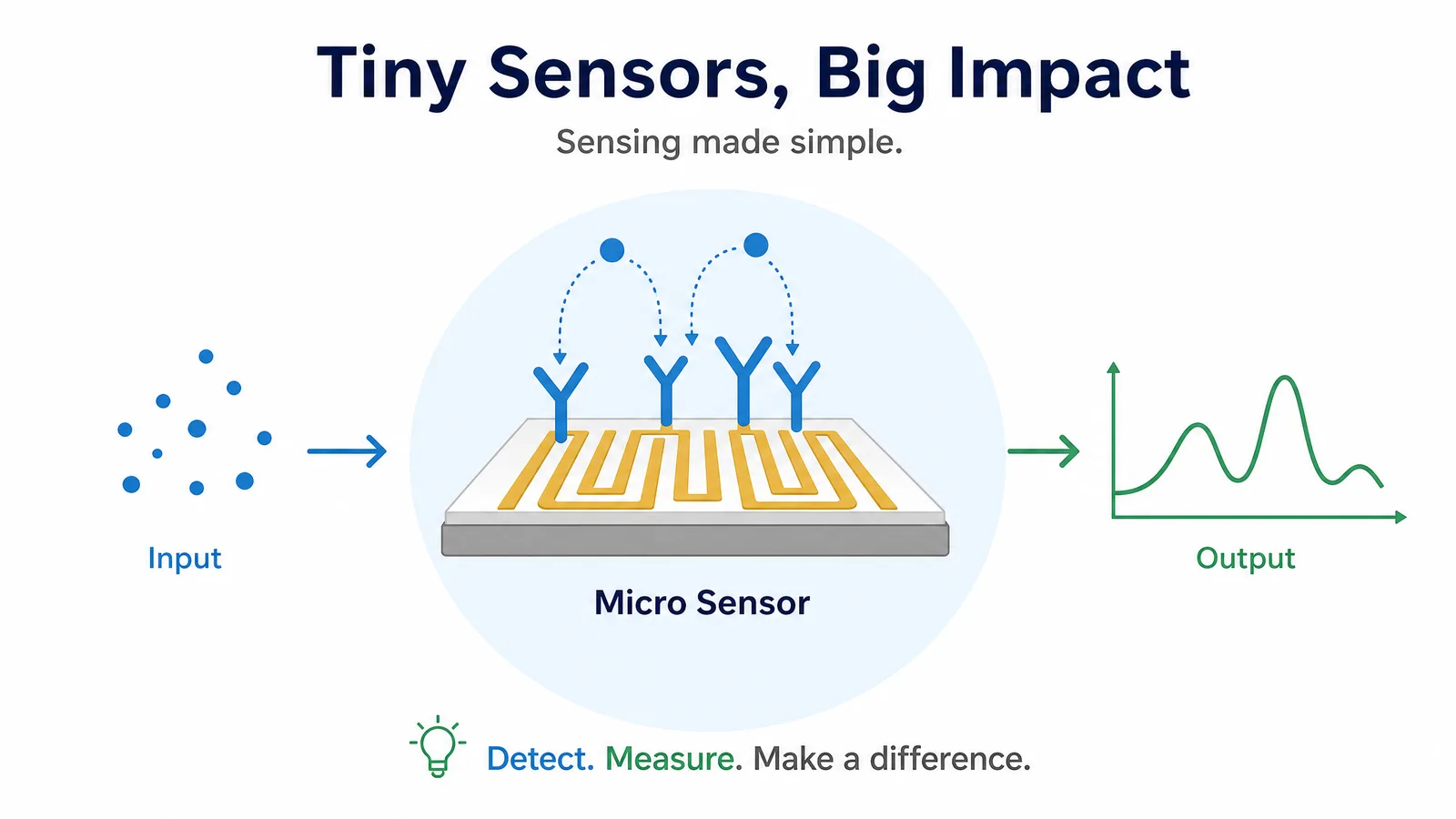
Your talk has one central message. The slide should reinforce that message and nothing else. A useful test: cover the slide and deliver your talk. If nothing is lost, the slide is decorative. Then show the slide without speaking. If a stranger cannot guess the topic, it is too abstract.
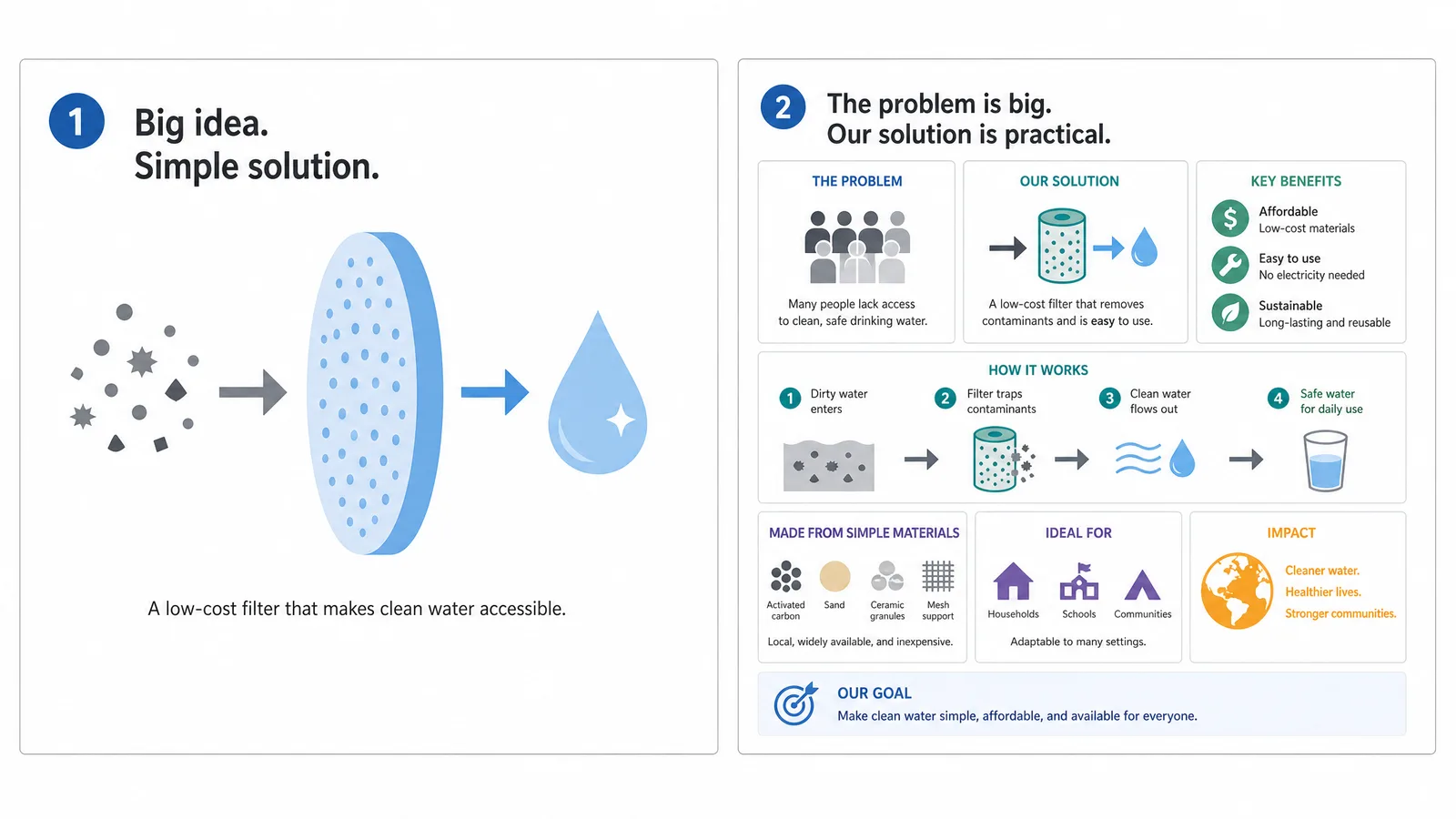
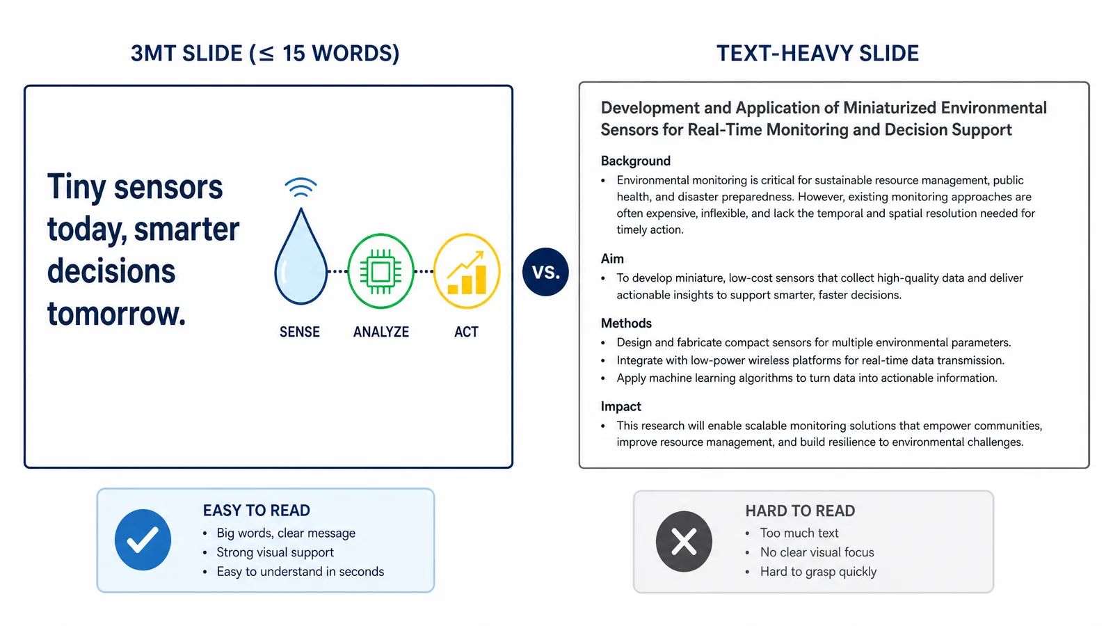
The failure mode is treating the slide as a poster. Three panels, a methods schematic, and a results chart is a poster, and in a three-minute talk the audience will read it instead of listening to you.
| Works | Does not work |
|---|---|
| One striking image | Multi-panel figure |
| A single number with context | A results table |
| A simple before-and-after | A methods flowchart |
| A metaphor made visual | Dense body text |
Design Specifics
- Text: under about 15 words. Enough for a title or a single label. The audience cannot read and listen simultaneously.
- Type size: readable from the back. Assume a large room and a projector that washes out contrast.
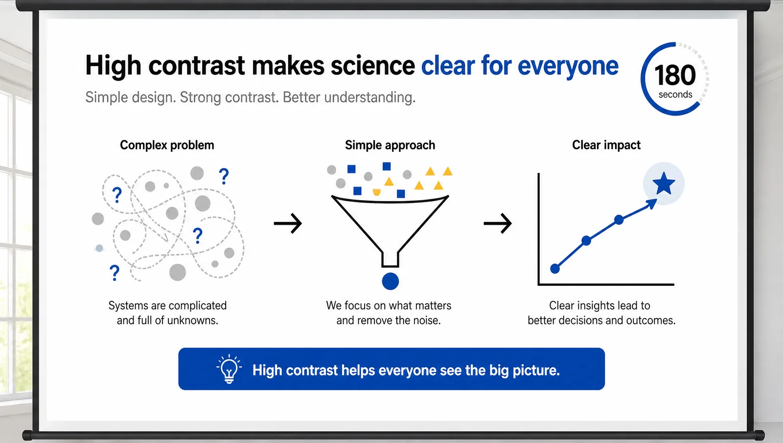
- Contrast: high. Competition venues are often brighter than you expect. Dark text on light background survives better than the reverse.
- Colour: restrained. Two or three colours. Check it works for colourblind viewers, since judges and audience are a general population.
- No logos or clutter unless required. Every element that is not the idea competes with it.
What Judges Typically Reward
Criteria differ by competition, but published rubrics commonly cover comprehension, engagement, and communication rather than the slide itself. The slide is judged indirectly, through whether it helped or hindered.
That reframes the design goal. The slide is not scored on beauty. It is scored on whether a non-specialist understood your research afterwards. A plain slide that makes one idea vivid beats a polished slide that adds nothing.
Tip
Rehearse with the slide projected, not on your laptop. Colours wash out, thin lines vanish, and text that looked generous on a monitor can be unreadable from row fifteen. This single check catches most slide problems.
Create Scientific Figures Now
Describe your scientific figure in natural language — get publication-ready illustrations in minutes.
Try FreeRelated Reading
Related reading: 18 Scientific Poster Examples to Learn From in 2026, Best Research Poster Templates & Makers (2026).