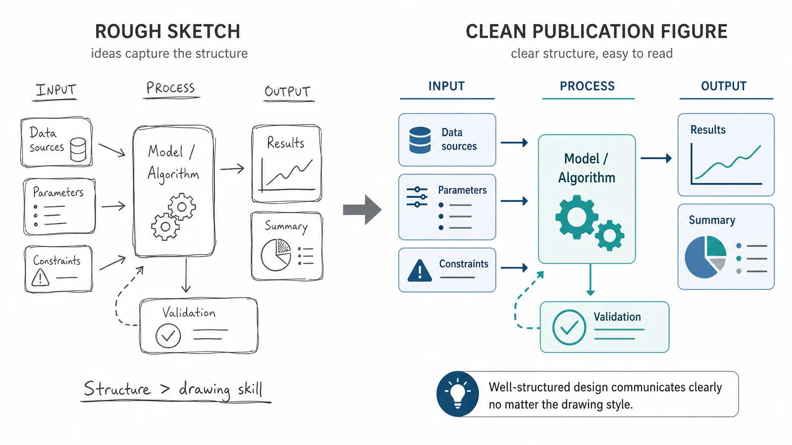
Illustration style is a communication decision, not a matter of taste.
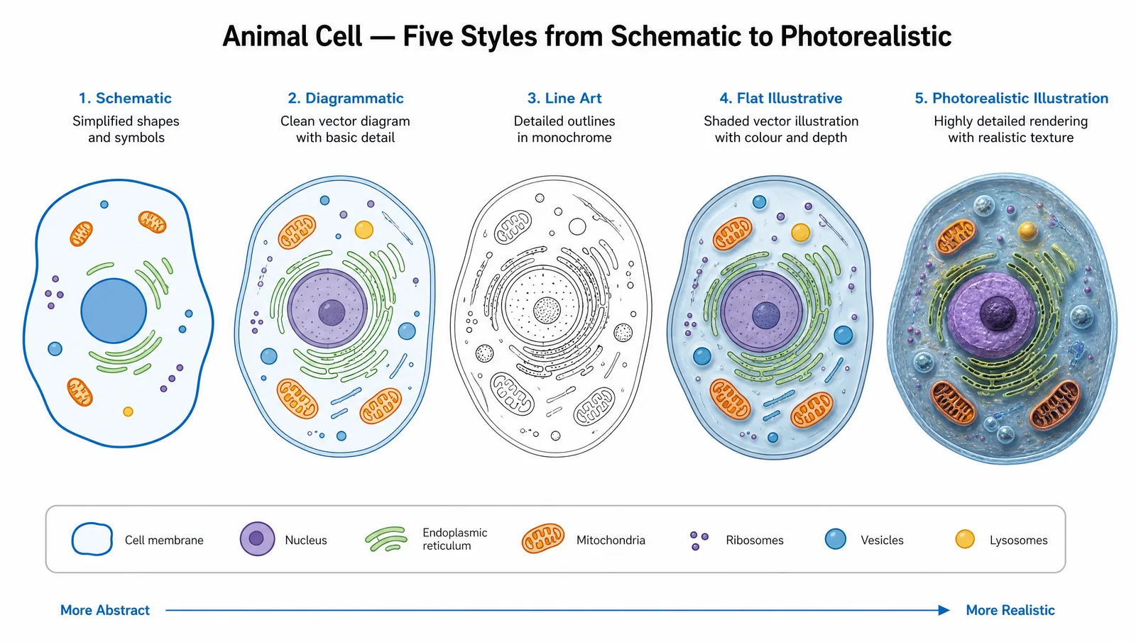
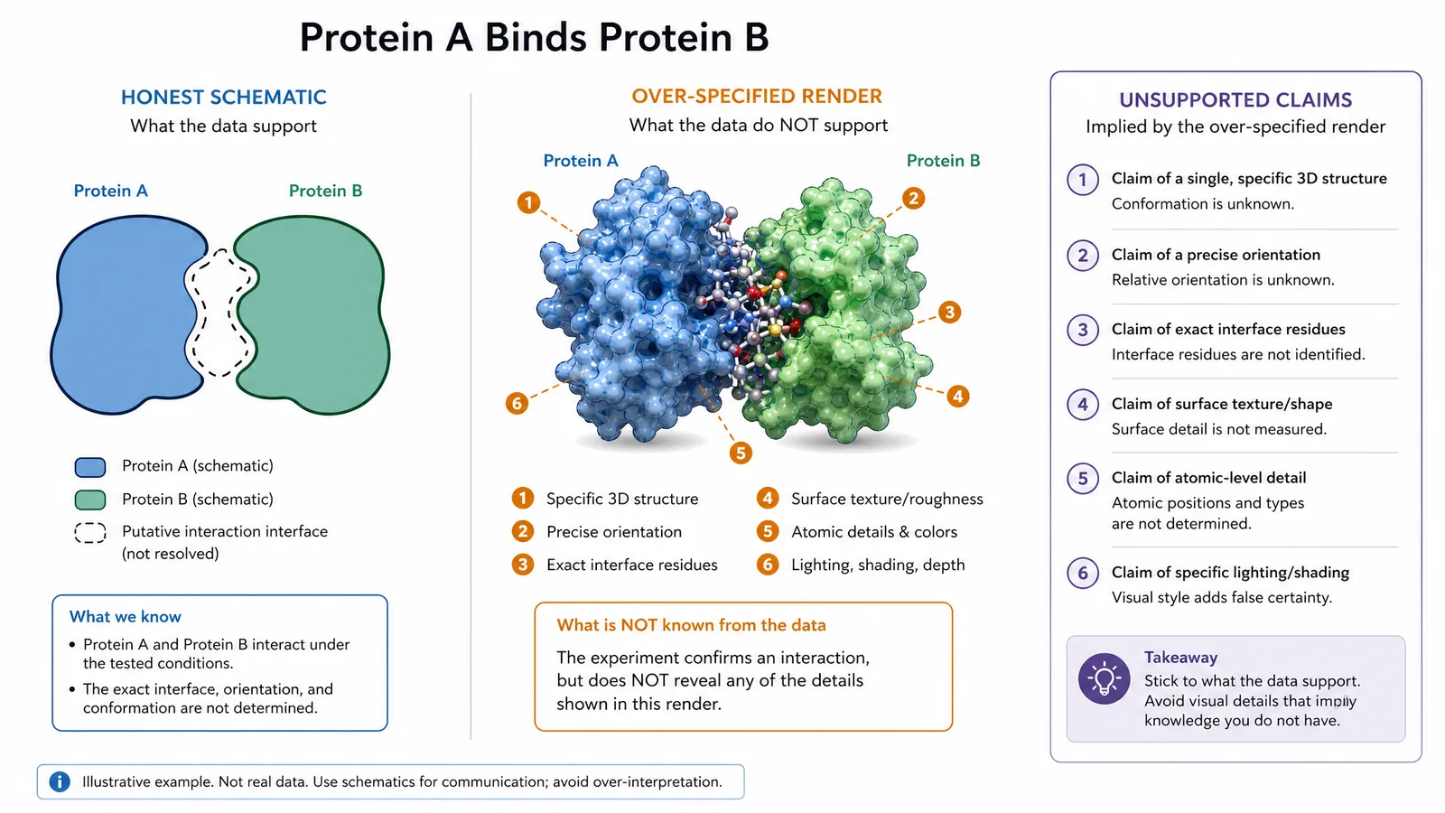
Each style carries information about certainty, scale, and abstraction. A photorealistic render implies you know exactly what something looks like; a schematic implies you are showing relationships rather than appearance. Choosing a style that overstates your knowledge is a subtle but real form of misrepresentation.
The Main Styles
| Style | Signals | Typical use | Risk |
|---|---|---|---|
| Schematic / diagrammatic | Relationships, not appearance | Pathways, mechanisms, workflows | Oversimplification |
| Line art | Structure and boundaries | Anatomy, morphology, apparatus | Looks dated if inconsistent |
| Flat vector | Modern, approachable | Graphical abstracts, slides | Can read as marketing |
| Semi-realistic | Appearance with interpretation | Medical and biological illustration | Implies more certainty than held |
| Photorealistic 3D | Exact appearance | Structural biology, surface detail | Strongly overstates certainty |
| Data-driven render | Actual measured structure | Molecular models, imaging | Needs provenance stated |
See AI Scientific Figure Generation in Action
Watch how researchers create publication-ready scientific figures from text descriptions.
Explore the ToolMatching Style to Claim
If you are showing that protein A activates protein B, a schematic with two labelled shapes is honest. A photorealistic render of both proteins in a membrane implies you know their conformations, orientation, and stoichiometry. If you do, cite the structure. If you do not, the render is decoration presented as knowledge.
This is why schematic and flat vector styles dominate mechanism figures, and why photorealistic rendering is concentrated in structural fields where the underlying data actually exists.
Discipline Conventions
Readers in every field carry expectations, and violating them costs comprehension:
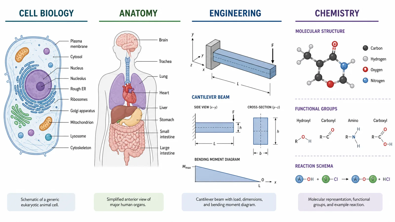
- Molecular and cell biology. Flat vector schematics with standard shapes. Membranes as double lines, proteins as rounded forms.
- Anatomy and medicine. Semi-realistic illustration with a long tradition of specific conventions in shading and labelling.
- Ecology and earth science. Landscape-style composite illustration showing multiple processes in situ.
- Physics and engineering. Line art and technical schematic, minimal shading, precise geometry.
- Chemistry. Structure editor output, not illustration, for anything molecular.
Following convention is not conservatism. Readers scan a scientific figure using learned patterns, and an unconventional style makes them work harder for the same information.
Keeping Style Consistent
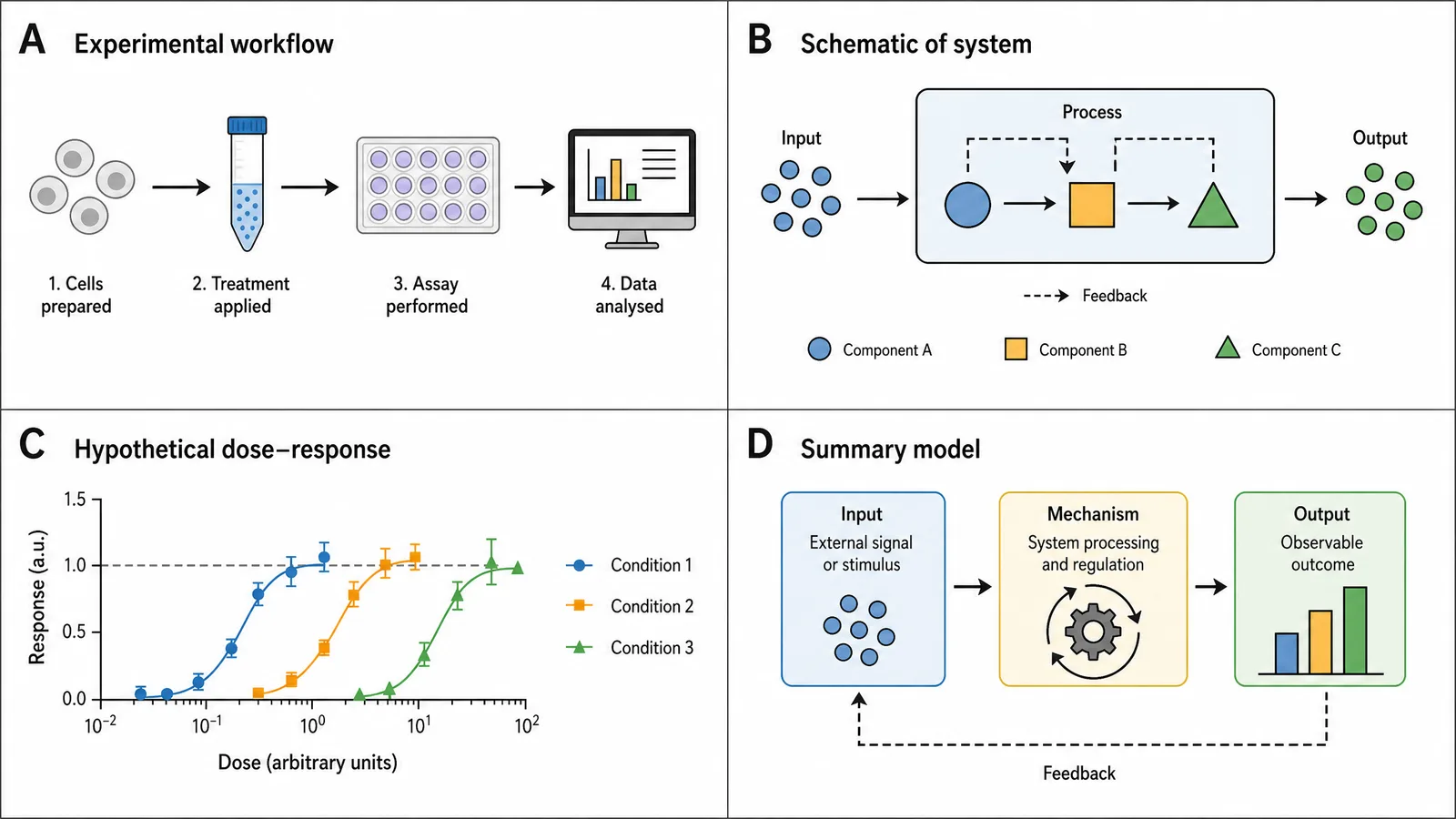
Within a manuscript, inconsistency is more damaging than any individual style choice. Fix these before you start:
- Line weight at final print size
- Colour palette, ideally one colourblind-safe set across all figures
- Label typography, one font and a small set of sizes
- Level of abstraction, so figure 1 and figure 4 do not disagree about how much detail a cell has
Tip
Decide the style before drawing the first figure, and record the decisions — palette hex values, line weights, fonts — in a short style note. Retrofitting consistency across a finished figure set is far more work than following a note you wrote in an hour.
Create Scientific Figures Now
Describe your scientific figure in natural language — get publication-ready illustrations in minutes.
Try FreeRelated Reading
Related reading: The Best Color Palettes for Scientific Figures (2026), AI Medical Illustration for Researchers.