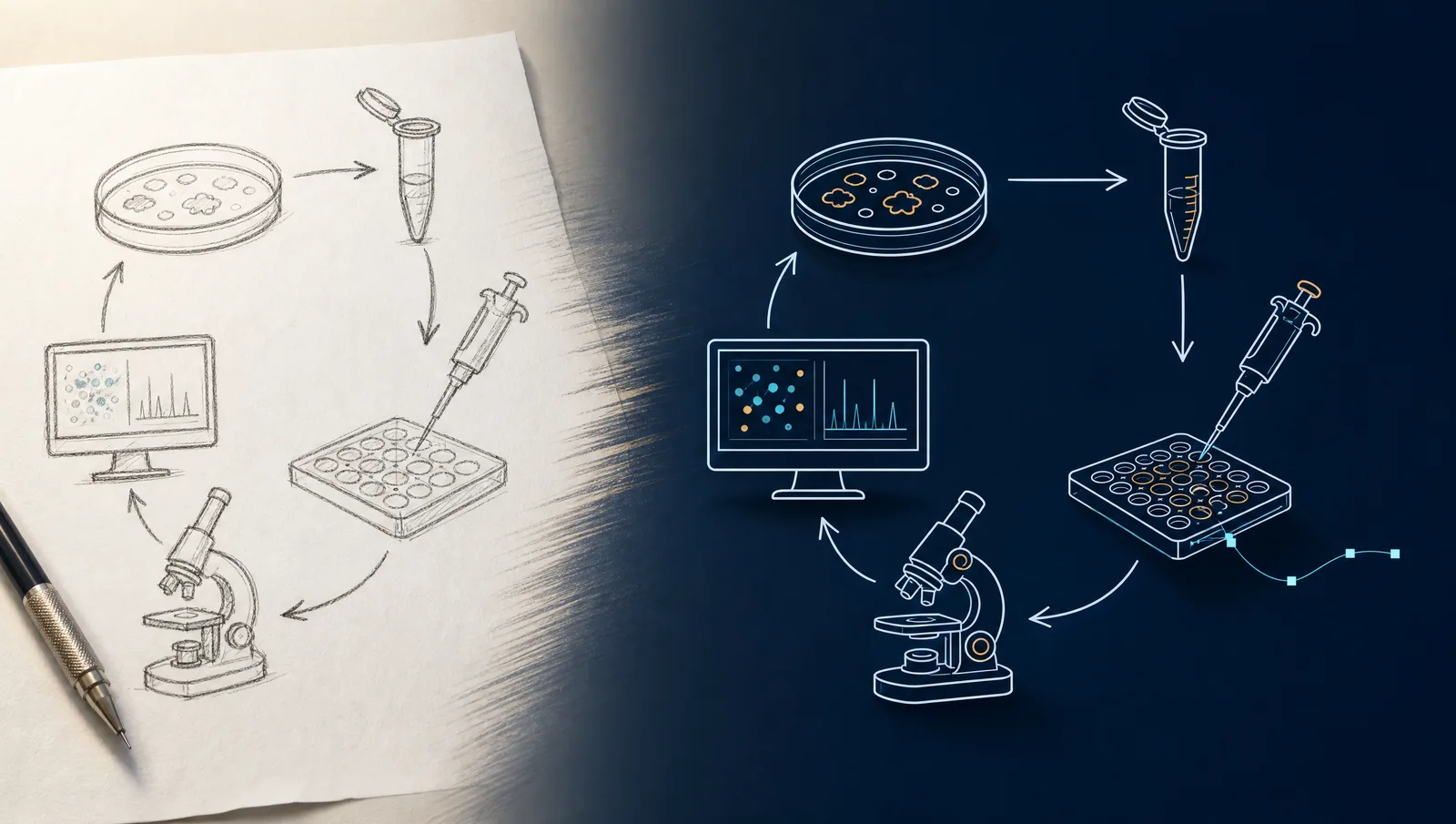
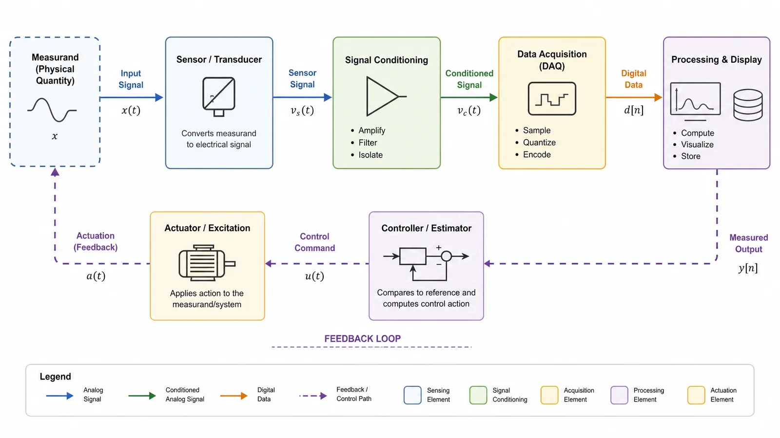
A methods figure flowchart shows how samples move through an experiment to produce the measurements you analyze.
Start with the relationship between inputs, procedures, controls, and outputs. A reader should be able to follow one sample from its origin to its final readout without guessing what an arrow means. The figure makes the structure of the methods visible; the written protocol supplies the detail needed to repeat them.
What belongs in a methods figure flowchart?
Include the information a reader needs to reconstruct the experimental logic: inputs, group allocation, major procedures, decision criteria, and measured outputs. Leave detailed operating instructions in the methods text or a linked protocol.
Use the table below as a drafting aid. These are editorial recommendations, not a reporting checklist from a journal. Your study design and the destination journal may require additional information.
| Element | Put in the diagram | Keep in the written methods |
|---|---|---|
| Input | Sample type and relevant source | Collection procedure and provenance details |
| Groups | Control and intervention labels | Allocation method and complete treatment specifications |
| Procedure | Major transformation or measurement | Equipment settings and full operating instructions |
| Decision | Criterion and labeled branches | Justification and handling of exceptional cases |
| Output | Named measurement or dataset | Analysis software, parameters, and statistical methods |
| Replication | Unit being repeated, when necessary to understand the design | Full sample-size rationale and replicate definitions |
Do not use a workflow to replace a study-specific reporting diagram. A clinical trial may need a participant-flow diagram with reconciled counts; a systematic review may need a study-selection diagram. A general experimental schematic does not establish compliance with either reporting standard.
Step 1: Extract the experimental logic from your protocol
Turn your approved methods into a short sequence of material-and-action statements before opening a drawing tool. This prevents attractive icons from determining the science.
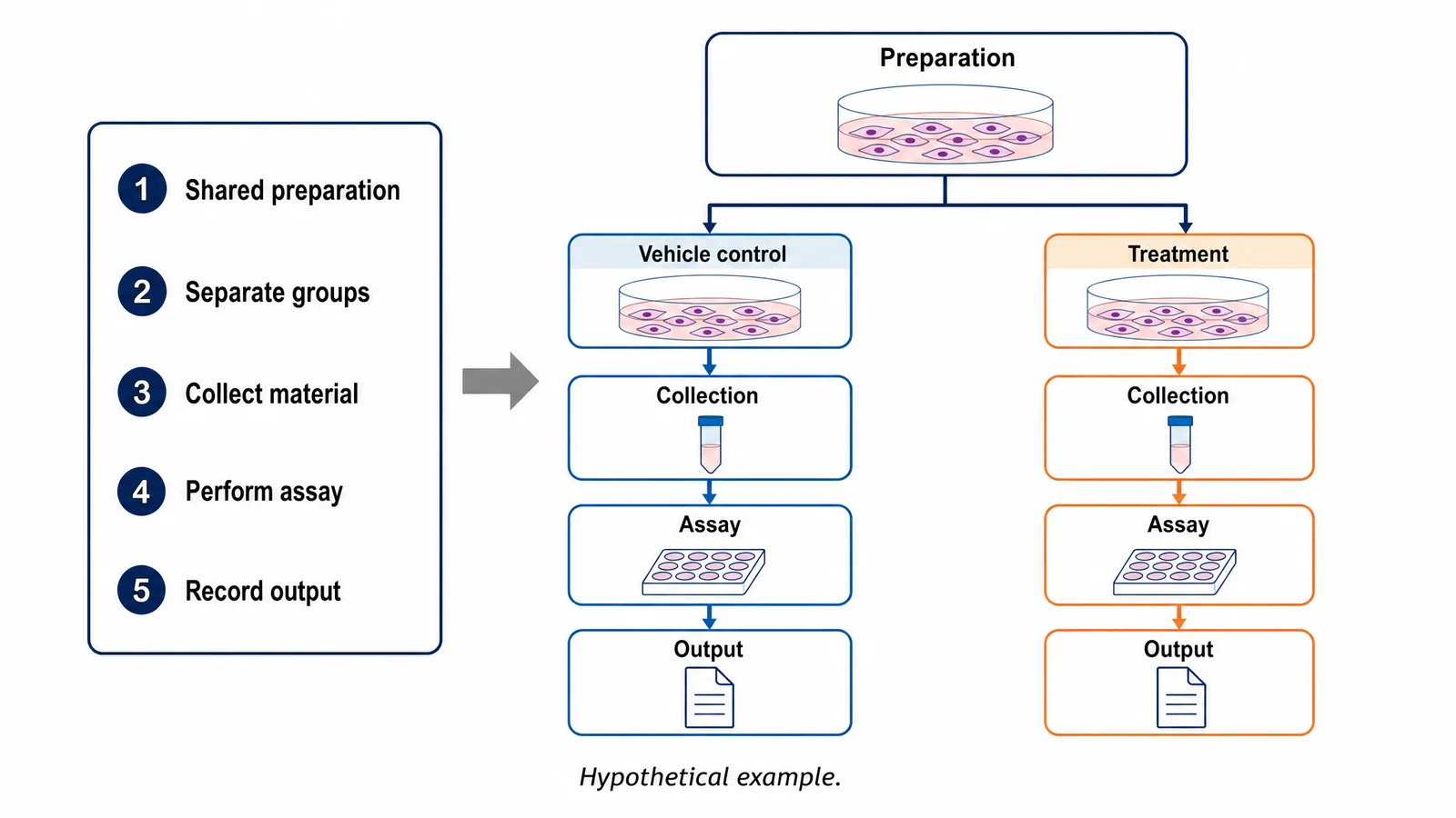
Read the methods paragraph by paragraph and identify the input and output of every major stage. In the hypothetical example, the sequence might be: prepare a cell population, allocate material to a vehicle-control group and a treatment group, collect the intended material, perform an assay, and compare the resulting measurements. The exact sequence must come from your own protocol. Do not add randomization, blinding, or a quality check simply because those labels make the drawing look rigorous.
Write each stage as a verb followed by an object. “Prepare cell suspension” is clearer than “Preparation.” “Measure fluorescence” is clearer than “Results.” If the method produces several different outputs, name them individually. A generic endpoint called “Analysis” hides whether the experiment measures cell number, protein abundance, image intensity, or something else.
Tip
Test your draft with a single sample. Read every arrow aloud as a sentence: “This material undergoes this action and produces this output.” If you cannot finish the sentence, revise the label or remove the arrow.
End this step with a plain-text outline that a coauthor can check. Corrections are much easier before color, spacing, and illustrations make the draft feel finished.
See AI Scientific Figure Generation in Action
Watch how researchers create publication-ready scientific figures from text descriptions.
Explore the ToolStep 2: Choose a layout that matches the design
Choose a linear layout for one sequence, parallel lanes for comparable groups, and branches for genuine decisions. Layout should encode the relationships you extracted in the previous step.
A left-to-right sequence works well when material moves through the same stages without splitting. A top-to-bottom sequence may fit a narrow manuscript column better. Neither direction is inherently more scientific. Choose one dominant reading direction and keep it consistent, including within any subpanels.
Use parallel lanes when control and treatment groups pass through comparable procedures. Align matching stages so readers can identify the single experimental difference without searching across the page. If the groups share an upstream preparation, draw that preparation once and show the split. If they undergo different preparation, separate those stages instead of suggesting a shared input.
Reserve decision diamonds for questions with explicit outcomes. “Quality acceptable?” is incomplete unless the criterion is defined in the protocol and the branches explain what happens next. Where no yes-or-no decision exists, use a normal process box. A diamond around every assay adds visual complexity without adding information.
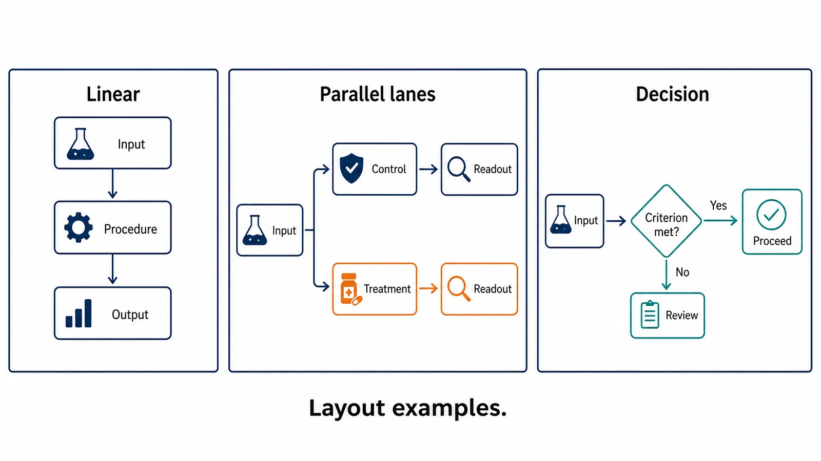
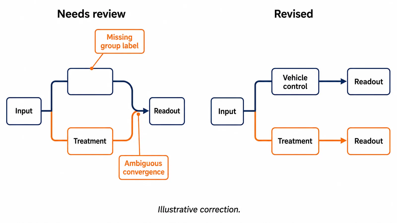
For the example in this guide, parallel lanes make the comparison visible: both groups receive comparable handling, with the intervention stated in the relevant lane. A separate measurement box can sit in each lane, or a shared box can follow a clearly labeled convergence. A shared drawing must never imply that samples were physically pooled when they were analyzed separately.
If your primary question is when work packages happen over months or years, you may need a research roadmap rather than an experimental flowchart. Keep scheduling information separate unless timing directly changes the experimental interpretation.
Step 3: Label samples, controls, arrows, and outputs
Use labels that identify the material, the operation, and the destination. Arrows should communicate one consistent relationship, usually progression or material transfer.
Start by naming the groups in the same way throughout the manuscript. If the text uses “vehicle control,” do not shorten it to “untreated” unless those conditions are actually equivalent. Preserve identifiers for specimens, time points, and assay outputs across the diagram, caption, and results panels. Small naming inconsistencies can make one experiment look like several unrelated ones.
Keep labels short enough to read at the intended display size, but do not remove the words that distinguish stages. “Protein extraction” and “RNA extraction” cannot both become “Extraction” when their distinction matters. An abbreviation may save space after you define it in the caption. A homemade abbreviation that appears only once usually adds more work for the reader than it saves.
For arrows, decide whether they mean time order, sample transfer, or information flow. If two meanings are necessary, use a distinct line style and explain it in the legend. Do not add a backward arrow merely to fill an empty part of the layout. A loop asserts that something is repeated and needs a specific explanation.
Place controls where they actually enter the experiment. A control added only at the analysis stage should not appear to have passed through earlier preparation. Conversely, a control that receives the full workflow should remain visible through that workflow. Add the readout next to the assay so readers can connect the method with the kind of evidence it produces.
Step 4: Draft the figure with a precise brief
Give the drawing tool the sequence, group structure, exact labels, and layout constraints together. A specific brief reduces ambiguity and makes the draft easier to review.
For an AI-assisted draft, it helps to separate the scientific content from visual preferences: first describe the stages and groups that appear, then how to arrange them. Asking the tool to preserve the supplied stages and not add unlisted steps or outcomes keeps the schematic close to your protocol, and SciFig FlowChart keeps every node editable so you can adjust details afterward.
Here is an illustrative brief you can adapt to your own protocol:
Draw an educational experimental workflow schematic on a white background. Begin with a shared cell preparation, then split into parallel lanes labeled Vehicle control and Treatment. In each lane show material collection, assay, and measured output in the same order. Keep the lanes separate through measurement. Use short black labels, aligned boxes, and clear arrows from left to right. Do not add sample counts, doses, timings, statistical results, or unlisted procedures. Mark the illustration as a schematic example.
This brief deliberately omits experimental parameters. For your actual figure, include the parameters that matter to the design so the schematic reflects them exactly; a model cannot know doses, sample sizes, or acceptance thresholds you have not supplied, and a plausible-looking number is still an invented number. Every label stays editable afterward.
Create Scientific Figures Now
Describe your scientific figure in natural language — get publication-ready illustrations in minutes.
Try FreeStep 5: Review scientific meaning before visual polish
Check the draft against the final methods text before adjusting typography or color. A clear diagram can still communicate the wrong experiment.
Trace every branch separately. Confirm where material is split, combined, excluded, or measured. Verify that the control and intervention labels remain attached to the correct paths. Look for a shared arrow that accidentally merges independent samples, a missing control stage, or a decision whose “no” branch disappears without explanation.
Then check all literal details against the source: group names, units, time points, sample counts, and abbreviations. If those details are not part of the example or protocol, they should not appear in the drawing. Visual consistency does not establish scientific correctness, so this pass applies equally to generated and manually assembled schematics; because SciFig schematics stay fully editable, you can correct any detail directly against the source.
Ask a coauthor to explain the workflow without reading your draft caption. Their explanation is a useful diagnostic. If they describe a different sequence or misunderstand where a control enters, revise the figure rather than adding another paragraph to defend an ambiguous drawing. Once the structure is clear, the caption can supply context and definitions.
Step 6: Write the caption and verify the exported file
Write a caption that names the workflow, explains its encodings, and identifies any schematic simplification. Then inspect the exported figure at the size readers will see.
Begin the caption with what the figure shows. Follow with definitions of abbreviations, group labels, line styles, and decision criteria that need explanation. Distinguish an illustrative example from a record of completed work. If the figure omits routine steps for readability, make that simplification clear without suggesting that the remaining boxes are a complete protocol.
For example: “Schematic overview of the experimental comparison. A shared preparation is divided into vehicle-control and treatment groups, which remain separate through collection and measurement. Arrows indicate progression through the procedures. Detailed experimental conditions are described in the Methods.” Adapt every statement to the actual design; this wording is not a substitute for checking it.
SciFig FlowChart exports native editable SVG, plus PNG, JPG, and PPTX. Keep the SVG to continue editing nodes and connectors.
Open the exported scientific figure in its destination document. Check clipping, arrowheads, special characters, label size, and image sharpness. Read the caption beside the figure one final time. The journal's current policy on AI-assisted images is a useful reference before submission.
Your methods figure flowchart is ready for coauthor review when its sequence, labels, caption, and exported appearance agree. Retain the approved version alongside the methods so later protocol revisions trigger a corresponding figure check.