The best free GraphPad Prism alternatives depend on the task: JASP for statistics, SciFig (free to start) for figures.
GraphPad Prism bundles three jobs into one license: running the statistics, turning result tables into publication graphs, and laying those graphs out as a scientific figure for a paper or slides. No single free tool replaces all three equally well, and that is why the most useful way to choose is by the job you actually do in Prism most weeks. This guide compares eight GraphPad Prism alternatives that are free to use or free to start, with what each one does, where it falls short, and how to move your data across.
Tip
"Prism" here means GraphPad Prism, the statistics and graphing software for scientists. Every tool below is free to use or free to start.
Quick Answer: Which Free Prism Alternative Fits Your Work?
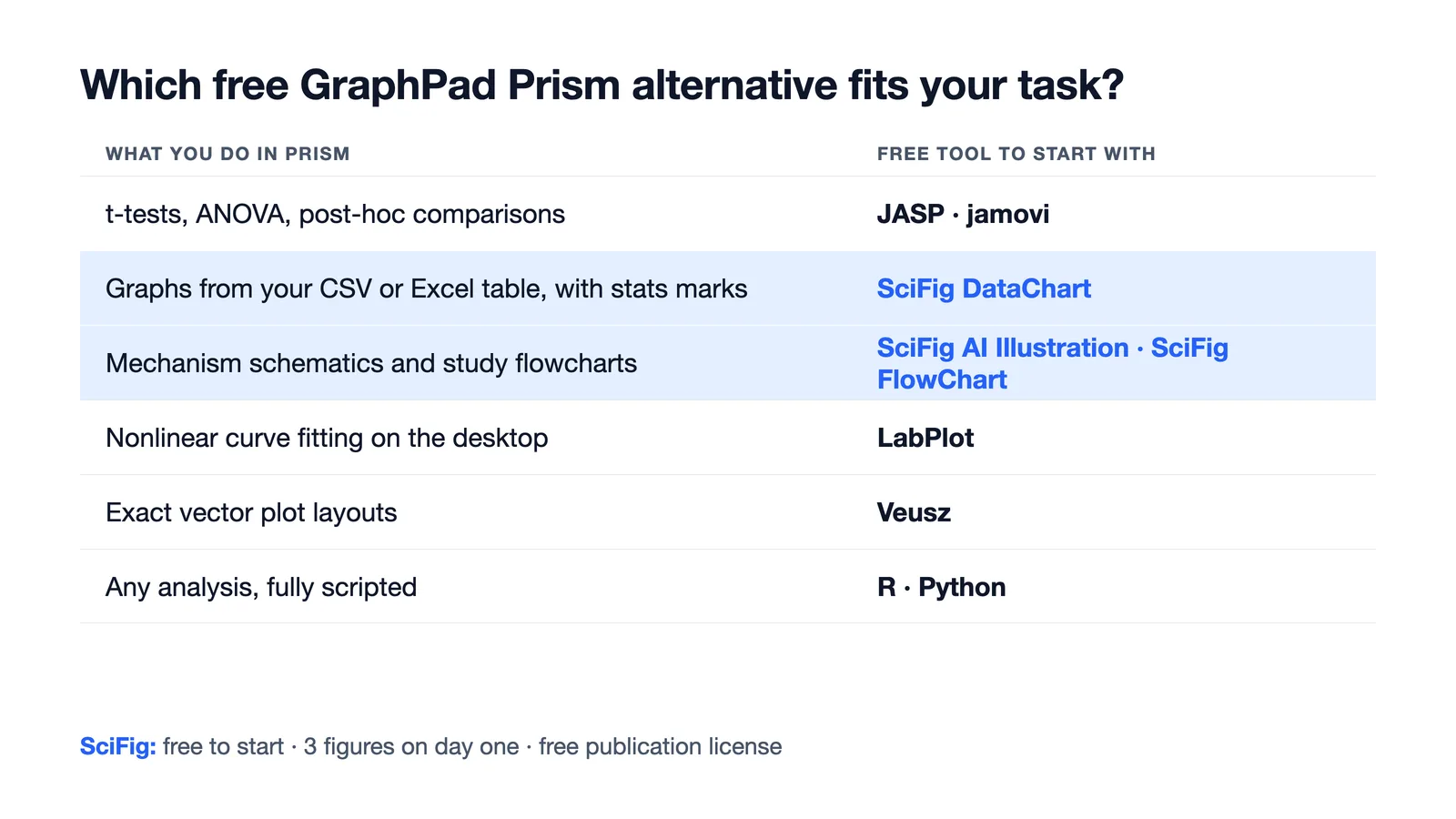
- Statistics with a Prism-like point-and-click feel: JASP or jamovi. Both are free, open source and run on Windows, macOS and Linux.
- Publication graphs straight from your data table, plus the figure around them: SciFig. Upload your CSV or Excel sheet to SciFig DataChart (charts and graphs from your data) and get the plot with its statistical annotations; build the mechanism schematic or study flowchart in the same place.
- Desktop graphing and curve fitting without code: LabPlot, with Veusz and SciDAVis as lighter options.
- Maximum flexibility and reproducibility: R with ggplot2, or Python with SciPy and seaborn, if you are happy to write code.
Free GraphPad Prism Alternatives at a Glance
| Tool | Best for | Statistics | Graphs | Coding needed | Platform |
|---|---|---|---|---|---|
| JASP | t-tests, ANOVA, regression, Bayesian tests | Broad, menu-driven | Standard statistical plots | No | Windows, macOS, Linux |
| SciFig | Graphs from your data table plus AI illustrations, flowcharts and vectorization, with a free publication license | SciFig DataChart: t-tests, ANOVA, non-parametric and post-hoc tests inside the chart | SciFig DataChart: 50 chart types from CSV/Excel, fully editable; exports PNG, PDF, EPS, TIFF and Python code | No | Browser |
| jamovi | Statistics with a spreadsheet view, SPSS-style | Broad, add-on modules | Standard statistical plots | No | Windows, macOS, Linux, browser |
| LabPlot | Scientific graphs and nonlinear curve fitting | Basic statistics and fitting | Highly customizable 2D plots | No | Windows, macOS, Linux |
| Veusz | Publication-quality vector plots | Minimal | Precise, scriptable layouts | Optional | Windows, macOS, Linux |
| SciDAVis | XY plots, error bars, routine fitting | Basic | Classic Origin-style plots | No | Windows, macOS, Linux |
| R + ggplot2 | Any analysis, fully reproducible | Complete | Unlimited, code-defined | Yes | Windows, macOS, Linux |
| Python (SciPy, seaborn) | Custom pipelines and automation | Complete | Unlimited, code-defined | Yes | Windows, macOS, Linux |
What GraphPad Prism Costs After the Trial
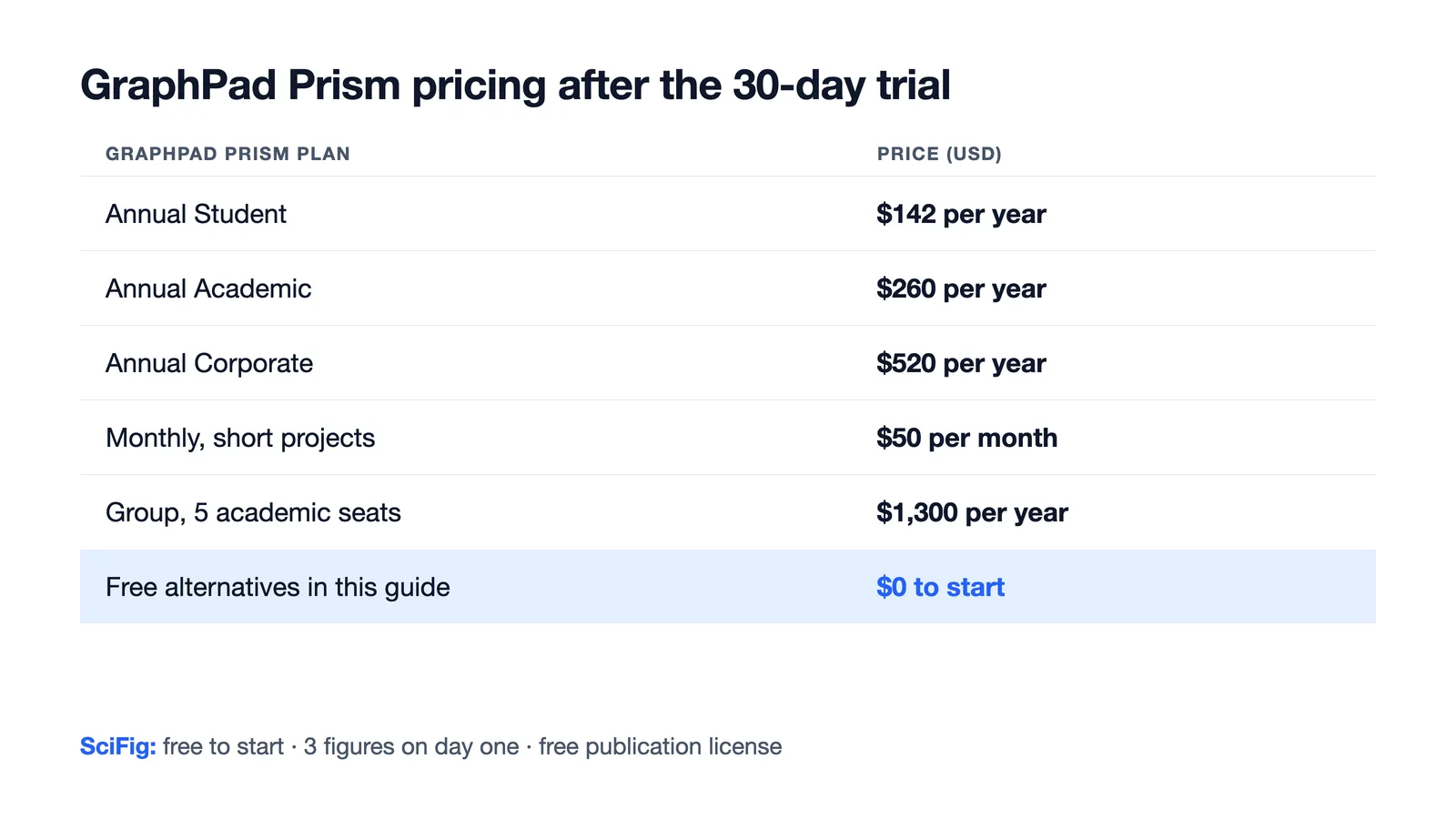
Prism offers a 30-day free trial with no card, and after it ends the installation keeps working as a viewer that opens and prints existing files but cannot edit or export them. There is no permanently free version for editing or analyzing data. Current prices:
| GraphPad Prism plan | Price |
|---|---|
| Annual Student | $142 per year |
| Annual Academic | $260 per year |
| Annual Corporate | $520 per year |
| Monthly (short projects) | $50 per month |
| Group, 5 academic seats | $1,300 per year |
For a lab, that is a recurring line item for every person who needs to open, re-run or edit an analysis. It is also why students can lose the ability to edit or re-run their thesis analyses when a university license ends.
Why Researchers Look for a Prism Alternative
The reasons are remarkably consistent across lab forums and statistics communities:
- The license outlives the budget. A student license ends at graduation, and a group subscription has to be renewed seat by seat.
- Linux and shared machines. Prism runs on Windows and macOS only, so cluster or Linux workstations need something else.
- Collaborators without a license cannot re-run or adjust your graphs.
- The graph is only one panel of the figure. Prism lays out graphs, but the mechanism diagram, workflow or graphical abstract that sits next to them has to be drawn somewhere else.
Keep the task you need most in mind as you read the tools below.
The Best Free GraphPad Prism Alternatives
JASP
JASP is the closest free match to Prism's guided statistics. You load a data file, pick an analysis from the menu, and results update live as you tick options: independent and paired t-tests, one-way and repeated-measures ANOVA with post-hoc comparisons, non-parametric tests, correlation and regression, plus Bayesian versions of most of them. Output tables follow APA style. Its plots cover the standard statistical views well, but fine control over a publication graph is limited, so many people run the statistics in JASP and build the final figure elsewhere.
SciFig
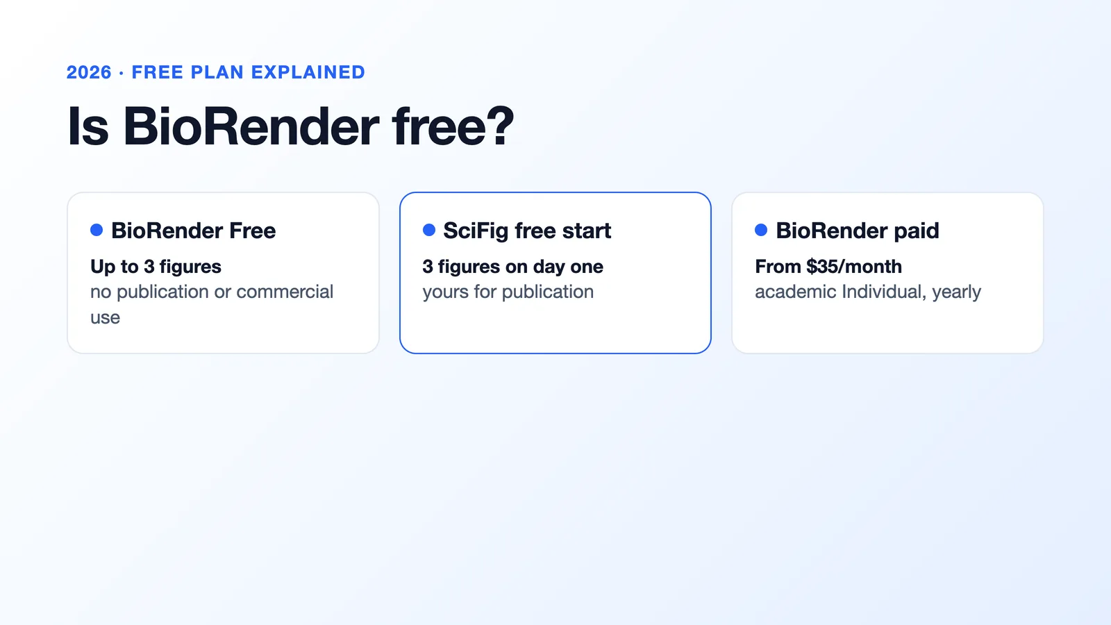
Start free, no card required: 150 credits on day one (3 figures), daily check-in credits that grow with your streak (up to 150 a day), up to about 44 figures in your first month. A free one-page publication license PDF covers papers and commercial use, and your work stays yours.
See AI Scientific Figure Generation in Action
Watch how researchers create publication-ready scientific figures from text descriptions.
Explore the Tooljamovi
jamovi offers the same breadth of point-and-click statistics as JASP, inside a spreadsheet you can edit directly, which feels familiar if you came from SPSS. Its module library adds mixed models, meta-analysis, power analysis and more, and every analysis can also be shown as R syntax, which helps when you later move to R. It runs on desktop or in a browser.
LabPlot
LabPlot is the strongest free desktop option for the graphing half of Prism. It handles XY plots with error bars, histograms, box plots and multi-panel worksheets, and it has a capable nonlinear curve-fitting engine with a built-in model library, so dose-response and binding curves are possible without code. It offers fewer statistical tests than JASP or jamovi.
Veusz
Veusz is a small, precise plotting program aimed at publication output. Graphs are built from nested widgets you can position exactly, the output is clean vector graphics, and documents can be scripted in Python. It does very little statistics, so pair it with JASP, jamovi or R.
SciDAVis
SciDAVis offers a classic worksheet-plus-graph workflow similar to older Origin versions: tables, XY and error-bar plots, and routine linear and nonlinear fitting. It is lightweight and dependable, though development is slower and biostatistics coverage is thin.
R + ggplot2
R covers every statistical method Prism has and many it does not, and ggplot2 produces any graph you can describe. The cost is learning to code. Packages such as drc for dose-response and survival for Kaplan–Meier analyses replicate common Prism workflows, and scripts make every analysis reproducible.
Python (SciPy, statsmodels, seaborn)
Python matches R for analysis and suits labs that already automate instrument data. SciPy and statsmodels cover the tests, seaborn and matplotlib draw the graphs. Like R, it rewards the time spent learning it.
Which Free Alternative Replaces Each Prism Task
| What you do in GraphPad Prism | Free alternative | Where SciFig fits |
|---|---|---|
| t-tests, ANOVA, multiple comparisons | JASP, jamovi | SciFig DataChart runs these tests inside the chart and marks significance |
| Bar, scatter and box plots with error bars | LabPlot, R | SciFig DataChart from your CSV or Excel table |
| Dose-response, IC50 and EC50 curves | LabPlot, R (drc) | SciFig DataChart fits 3PL or 4PL dose-response curves |
| Kaplan–Meier survival curves | R (survival), jamovi | SciFig Kaplan–Meier curve from duration and event columns |
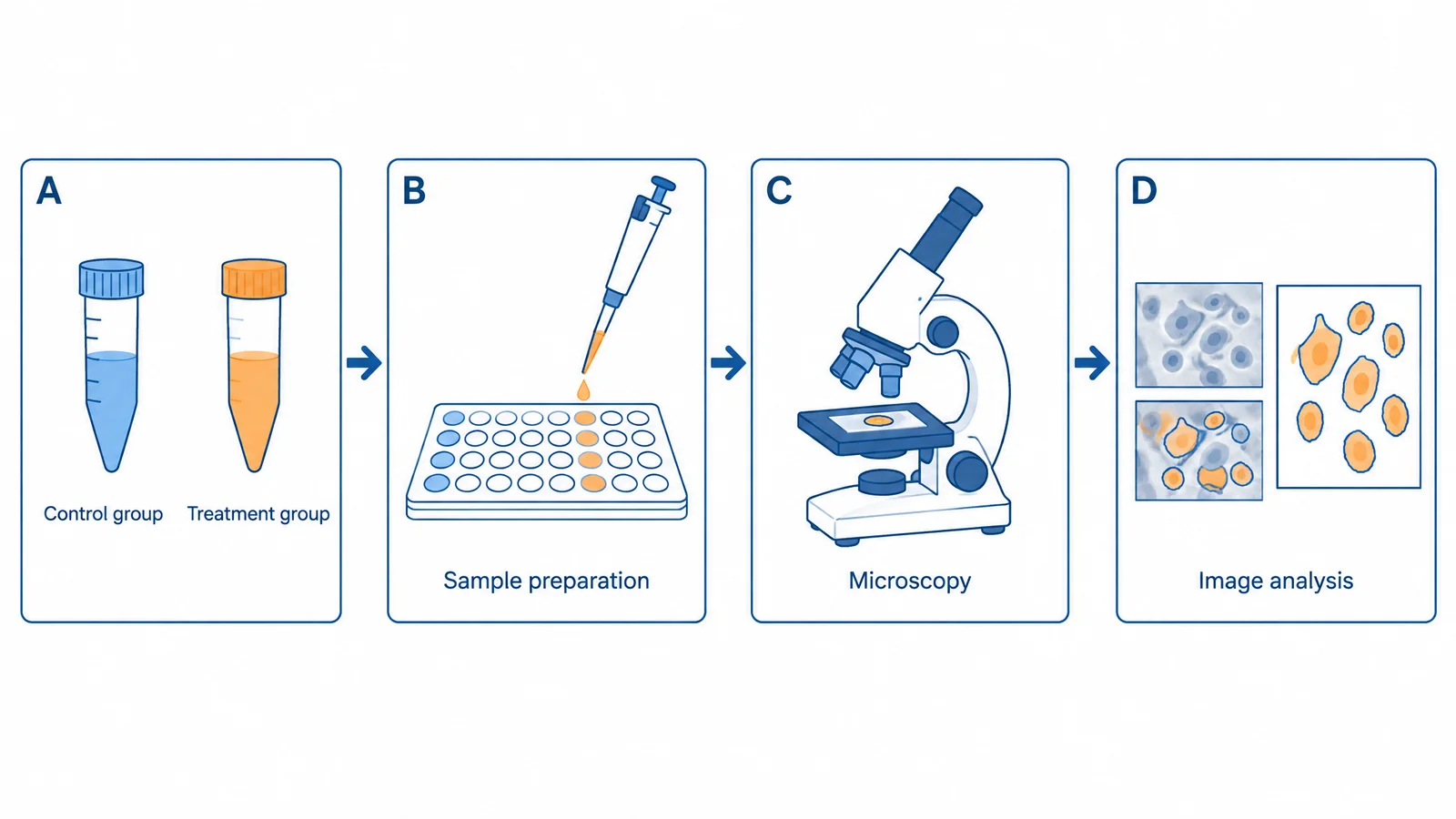
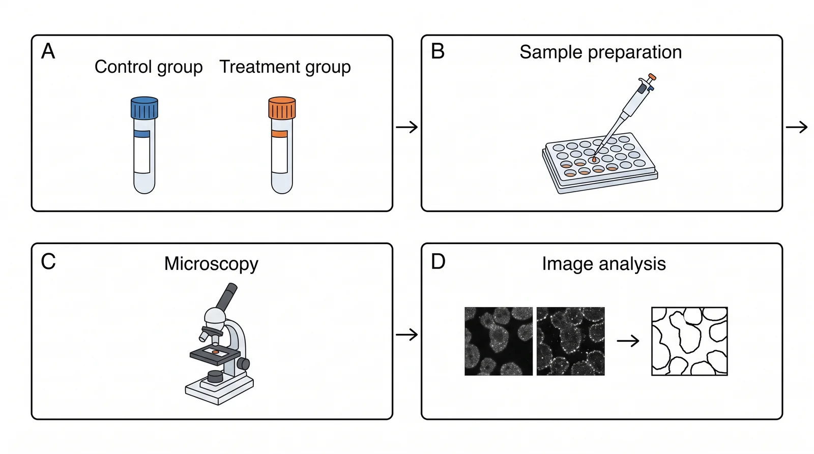
| Publication-ready figure with schematic panels | Veusz plus a vector editor | SciFig AI Illustration and SciFig FlowChart in the same workspace |
Many labs combine two tools: one for the statistics they report, and one for the figure that carries them.
Create Scientific Figures Now
Describe your scientific figure in natural language — get publication-ready illustrations in minutes.
Try FreeHow to Move Your Data Out of Prism
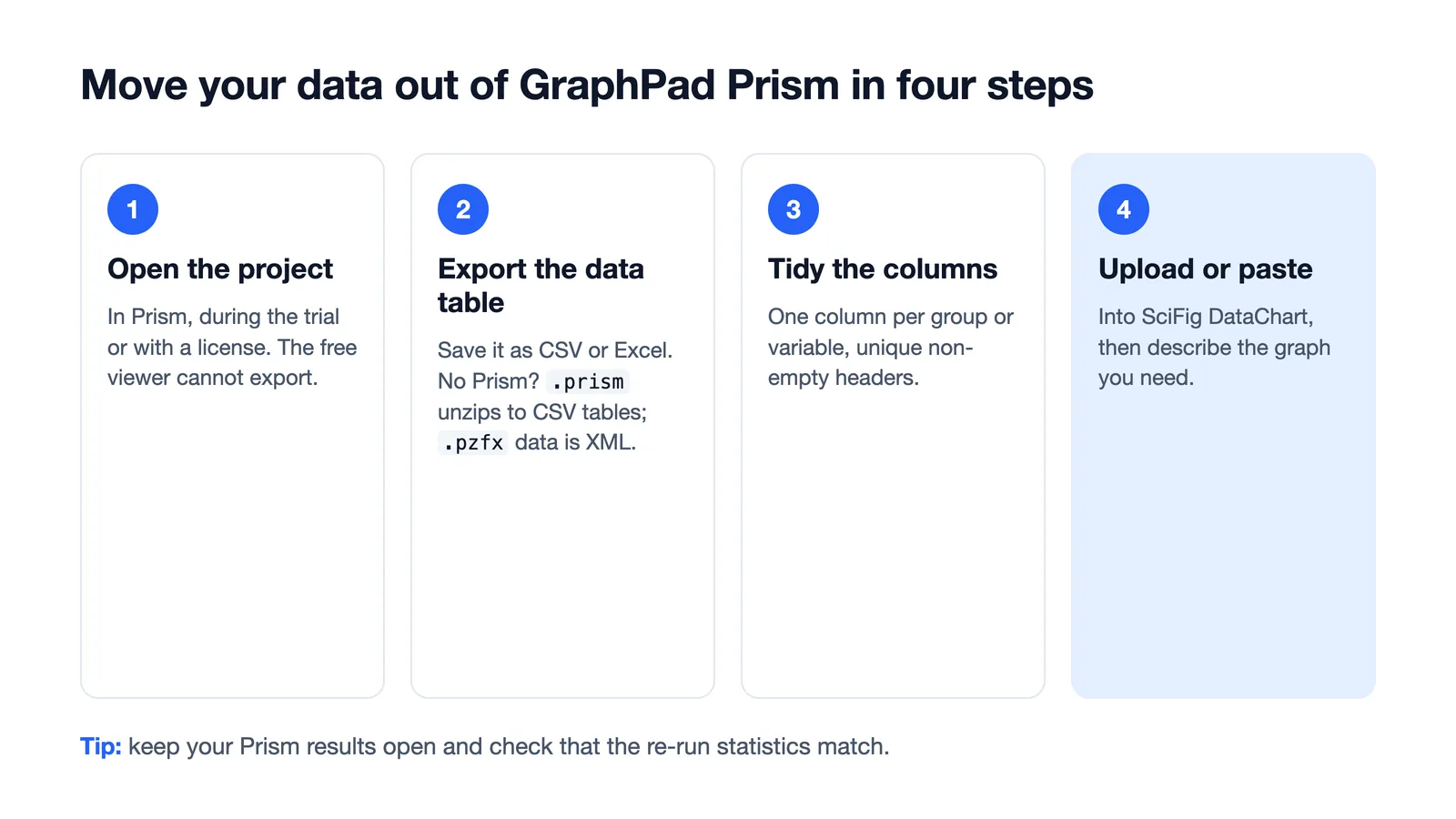
You do not need a Prism license to get your numbers out:
- Open the project in Prism while you still have a trial or license. The free viewer that remains afterwards can open and print projects but cannot export or copy data.
- Export the data table as CSV or Excel. Without a working Prism, read the file directly: a
.prismfile opens like a zip archive and stores each data table as CSV, and a.pzfxfile keeps its data tables in plain-text XML. Older.pzffiles can only be opened by Prism. - Tidy the columns: one column per group or variable, with unique, non-empty headers. Formulas are read as their saved values.
- Upload or paste the table into the tool you chose. In SciFig DataChart, upload the CSV or Excel file or paste it, then describe the graph.
None of the free alternatives open a Prism project with its analyses intact, so plan to re-run the tests once in the new tool and compare the results with your Prism output.
Where Prism Is Still Hard to Replace
Prism's strongest features are its curve-fitting depth and guided analysis: pick an equation and it fits the curve, compares models with an extra sum-of-squares F test or AICc, compares parameters between data sets, and updates results, graphs and layouts whenever the data change. R matches all of it with code; among point-and-click tools, LabPlot comes closest for fitting and JASP or jamovi for tests. Knowing this up front helps you decide which pair of tools to adopt.
Related Reading
Related reading: How to Make Scientific Figures: A Practical Guide (2026), 10 Best Scientific Illustration Tools in 2026, The Best Color Palettes for Scientific Figures (2026).