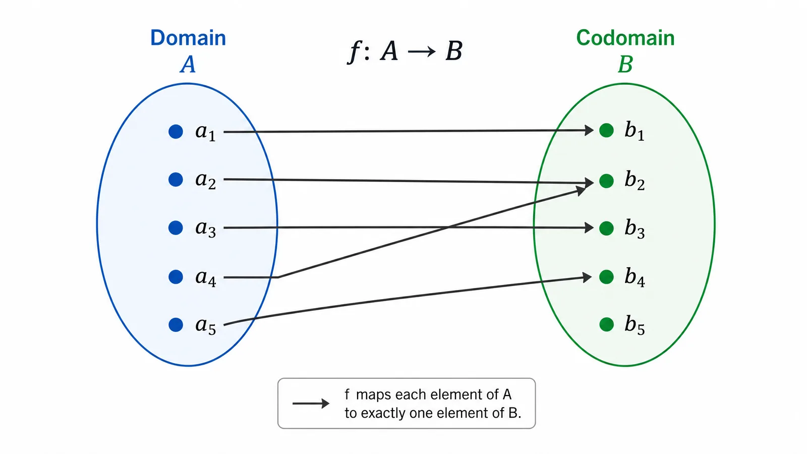
A mapping diagram shows how each input element maps to an output element.
It is drawn as two labelled sets with arrows running from elements of the domain to elements of the codomain. Its value in teaching is that it makes the definition of a function visible: every input has exactly one arrow leaving it, and that rule can be checked by looking.
The Parts
| Part | What it is | How to draw it |
|---|---|---|
| Domain | Set of all inputs | Left oval, elements listed |
| Codomain | Set of all permitted outputs | Right oval, elements listed |
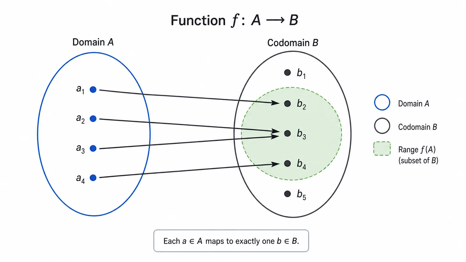
| Range / image | Outputs actually reached | Subset of codomain, often shaded |
| Mapping | The assignment itself | Arrows, domain to codomain |
The distinction between codomain and range is where students and diagrams both go wrong. The codomain is what you declare; the range is what actually gets hit. Shading the range inside the codomain oval makes the difference visible in one glance.
See AI Scientific Figure Generation in Action
Watch how researchers create publication-ready scientific figures from text descriptions.
Explore the ToolDrawing the Function Rule
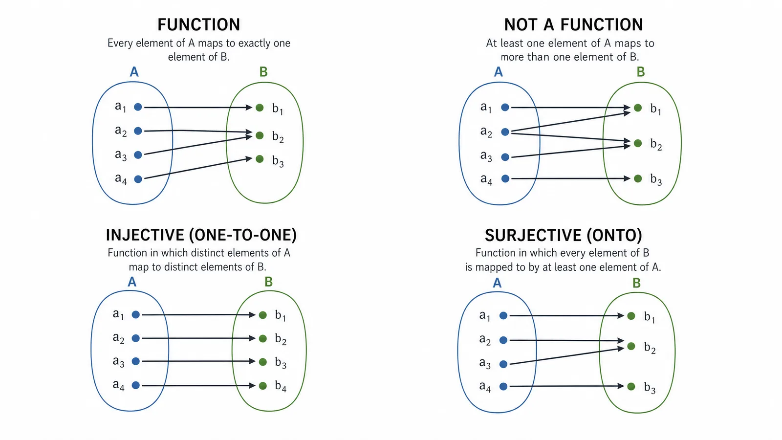
- No domain element without an arrow — otherwise the function is undefined there.
- No domain element with two arrows — otherwise it is a relation, not a function.
Note what is allowed: two domain elements may point at the same codomain element, and codomain elements may receive no arrows at all. Both are legal, and diagrams that avoid them teach the definition incorrectly.
Showing Injective, Surjective, and Bijective
These properties are far easier to see in a mapping diagram than to read in symbols:
- Injective (one-to-one). No codomain element receives more than one arrow. No arrowheads collide.
- Surjective (onto). Every codomain element receives at least one arrow. The range fills the codomain.
- Bijective. Both. Arrows form a perfect pairing with nothing left over on either side.
A useful teaching sequence is to draw one mapping and then modify it minimally — add an element, redirect one arrow — so students see each property appear and disappear.
Drawing Conventions
- Domain left, codomain right, consistently.
- Straight arrows with clear heads; avoid curves that make endpoints ambiguous.
- Even element spacing, so crossings are readable.
- Label both sets with names and, where relevant, set-builder notation.
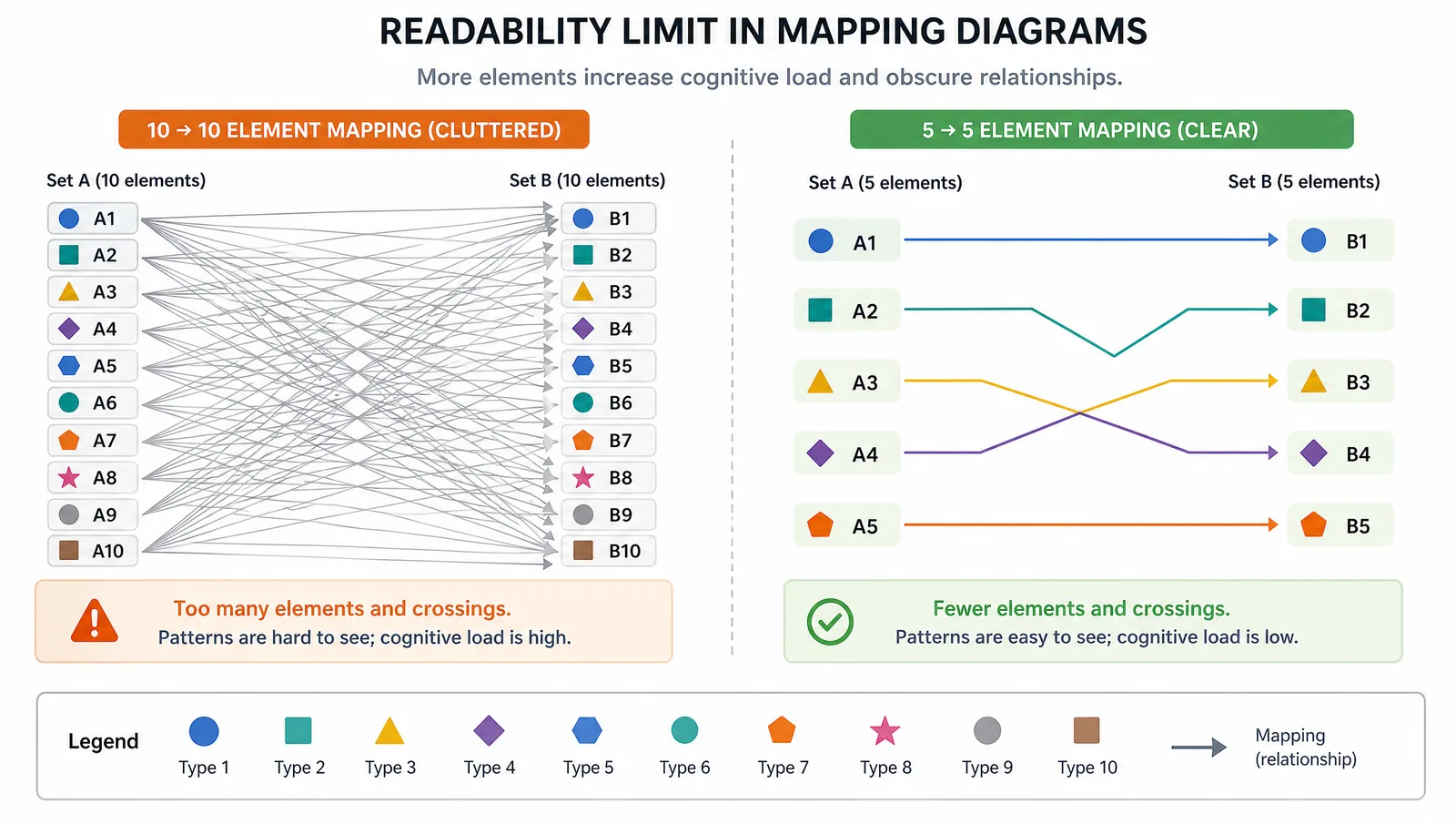
- Keep sets small. Beyond about six elements the arrows tangle and the diagram stops teaching. Use a formula or a table instead.
Tip
Mapping diagrams are a teaching device, not a scientific figure. They shine for small finite sets where the point is the definition. For continuous functions or large sets, a graph, a table, or the formula itself communicates far more.
Create Scientific Figures Now
Describe your scientific figure in natural language — get publication-ready illustrations in minutes.
Try FreeRelated Reading
Related reading: Visualize Research with AI Text-to-Figure, 5 Common Scientific Figure Mistakes AI Fixes.