
Heat Map Icon
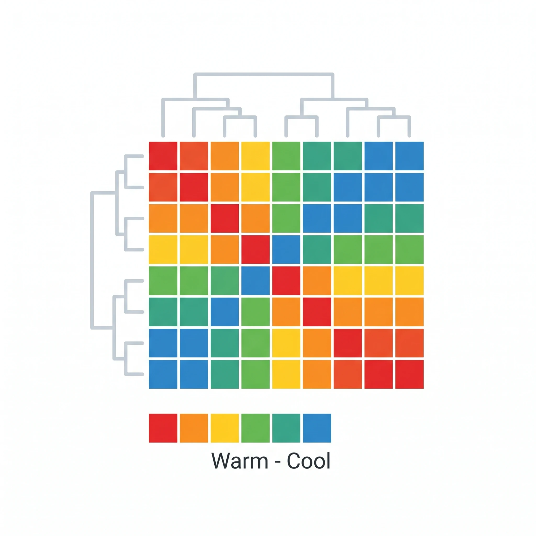
A clean, editable gene expression heat map icon — a clustered color grid ready for your data visualization figures.
Updated

Start with up to 150 free credits|No credit card required
Get up to 350 free credits on day one when you join through an invite.
What is Heat Map Icon?
A heat map is a data visualization that uses a color grid to show the magnitude of values, widely used for gene expression where rows are genes, columns are samples, and color shows expression level. This icon shows a clean clustered heat map with a color scale, ideal for genomics and data figures. With SciFig you describe the chart in plain language and generate an editable heat map icon you can recolor, relabel, and export as SVG or PNG.
Why this chart type earns its place
- It renders a matrix — thousands of gene × sample values — in one panel, where an equivalent set of bar charts would need dozens. Color carries magnitude so position can carry structure.
- Ordering is information. Rows and columns arranged by hierarchical clustering reveal co-regulated modules and sample groups; the same matrix in input order shows nothing.
- It is only trustworthy if the encoding is disclosed. A color grid without a scale bar, without stated units, and without the transformation applied (z-score by row? log2 fold change? raw TPM?) is uninterpretable, and reviewers reject it.
- It fails silently for colourblind readers when drawn in red–green, and it distorts perceived magnitude when drawn in a non-uniform ramp like jet or rainbow. Both are avoidable at drawing time.
- As a small figure element — inside a workflow schematic, a poster header, or a slide — a simplified color grid signals "expression matrix" without any of the data needing to be readable.
Parts to draw and label
- The color scale bar, with numeric endpoints and a stated quantity. For centred data (z-scores, log fold change) the bar must be diverging with zero pinned at the neutral midpoint; asymmetric limits are a common and serious error.
- The palette itself: a perceptually uniform sequential ramp (viridis, magma) for magnitude, or a colourblind-safe diverging ramp (RdBu, PuOr, blue–white–red) for signed data. Avoid red–green and rainbow.
- Dendrograms on the row and/or column margins, with the linkage and distance metric named in the caption (e.g. Ward's linkage on 1 − Pearson correlation).
- Row and column labels — gene symbols on rows, sample IDs on columns. When there are too many rows to label, label a curated subset with leader lines rather than printing unreadable 3 pt text.
- Annotation tracks: coloured strips above the columns for treatment, genotype, batch, or clinical group, each with its own legend. These are what let a reader see that a cluster is really a batch effect.
- Explicit treatment of missing values and outliers — a distinct gray for NA, and a statement of whether the scale is clipped (e.g. values winsorised at ±3).
Where it appears
- Transcriptomics: differential expression panels from bulk RNA-seq or microarray, and pseudobulk or marker-gene matrices from single-cell data.
- Proteomics and metabolomics abundance matrices, and correlation matrices where the grid is symmetric and the diagonal is by definition unity.
- Genomics beyond expression: mutation co-occurrence (oncoprint-adjacent), methylation beta values, ChIP-seq signal over regions.
- Screening data — dose × compound response grids from drug screens, CRISPR gene-effect matrices, plate-layout maps for well-level QC.
- Workflow schematics and graphical abstracts, where a simplified grid stands in as the analysis output at the end of a sequencing pipeline.
Heat Map Icon— templates & examples
How to make Heat Map Icon
Describe your figure
Tell SciFig what to draw in plain language — no design tools required.
Generate with SciFig
Get a clean, publication-ready figure that matches your description in seconds.
Edit & export
Vectorize it into editable SVG, relabel everything, and export for your paper, poster, or slides.
Related searches
- gene expression heat map icon
- heat map icon
- heatmap icon
- gene expression heatmap
- clustered heatmap
- data heatmap icon
Make figures for
Related pages
Data Visualization Icons
Browse more Data Visualization icons in SciFig's library.
All Icons
Browse every icon page in SciFig's library.
Flow Cytometry Plot
A clean, editable flow cytometry plot icon — a FACS scatter plot with quadrant gates, ready for your data figures.
AI Scientific Image Generator
Generate research figures from text
Graphical Abstract Maker
Summarize your study in one panel
Text to Diagram Generator
Turn text into a diagram
Scientific Poster Generator
Design a conference research poster
Frequently Asked Questions
Common questions about Heat Map Icon.

Ready to publish?
Make your own Heat Map Icon in minutes.
Start for freeFree to start · No credit card required · Built for researchers