
Flow Cytometry Plot
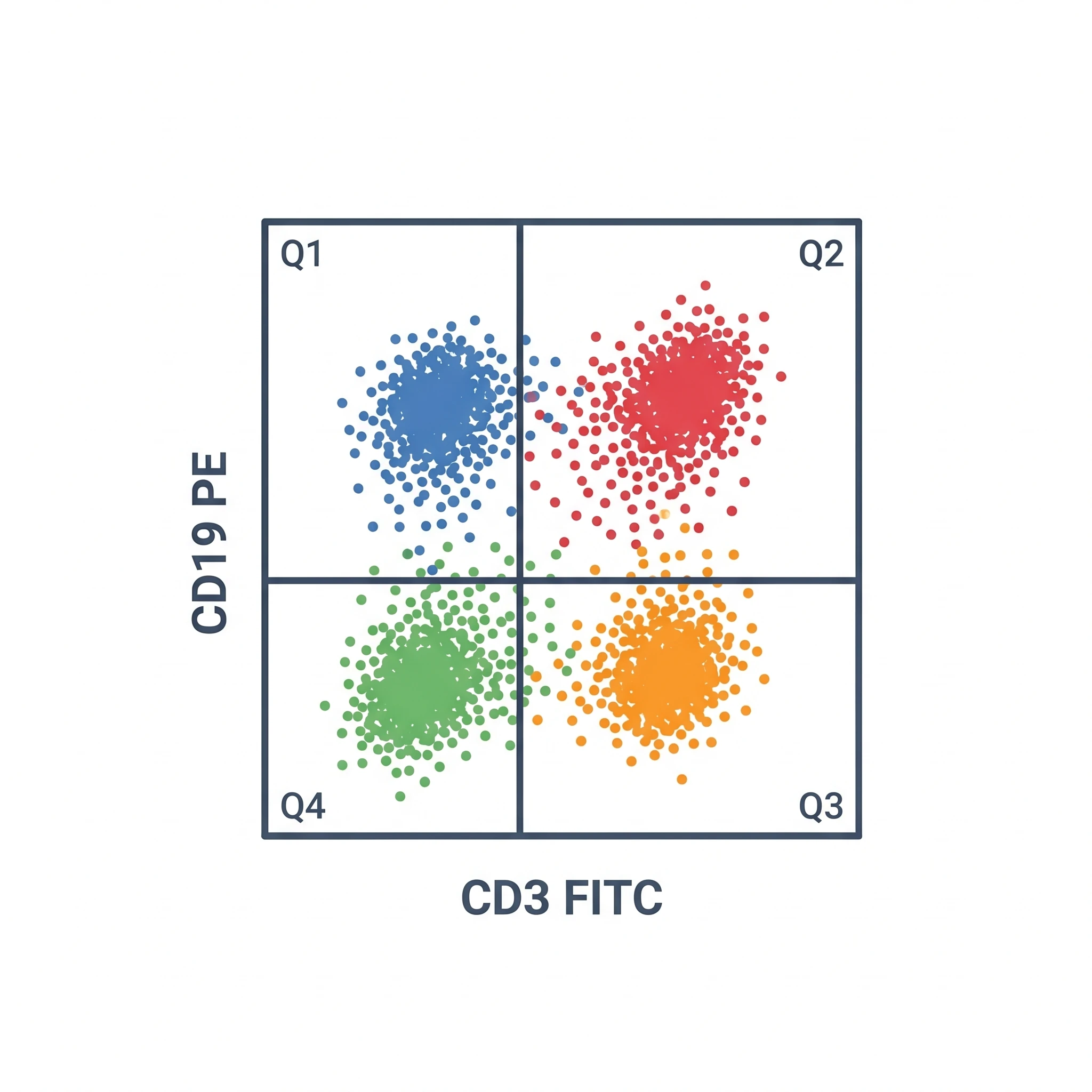
A clean, editable flow cytometry plot icon — a FACS scatter plot with quadrant gates, ready for your data figures.
Updated

Start with up to 150 free credits|No credit card required
Get up to 350 free credits on day one when you join through an invite.
What is Flow Cytometry Plot?
A flow cytometry plot, or FACS plot, is a scatter graph that displays thousands of cells by two measured parameters, with quadrant gates separating populations such as positive and negative cells. This icon shows a clean dot-plot with axes and quadrant gating, ideal for immunology and methods figures. With SciFig you describe the plot in plain language and generate an editable flow cytometry plot icon you can recolor, relabel, and export as SVG or PNG.
Why the plot is drawn rather than screenshotted
- Analysis-software exports carry gray backgrounds, low-contrast axis text, and instrument-specific chrome; at journal reduction the gate boundaries and quadrant percentages are the first things to become unreadable.
- A schematic version can show the gating logic — parent → child hierarchy — which a single exported panel cannot, and that hierarchy is what reviewers actually check.
- Reporting standards (MIFlowCyt) expect that gates, the population they were drawn on, and the controls used to place them are all visible or stated; a drawn panel makes room for exactly those labels.
- In a workflow or graphical abstract you need the idea of a gated scatter, not the data — a stylised cloud with a gate communicates "we sorted on this marker" in a figure element 30 mm wide.
Elements the panel must carry
- Both axes labeled with parameter and fluorophore, not just the detector ("CD3 BV421", not "V1-A"), plus the scale type. Fluorescence axes should be biexponential/logicle, not pure log — a log axis piles negative-population events against the axis and hides them.
- The plot type, chosen to match the event count: a dot plot for sparse data, a density or contour plot (with outlier dots shown) once populations saturate, and a histogram for a single parameter.
- Gates with their population name and frequency printed inside or beside them, and a stated denominator — "% of parent" and "% of CD45+" are different numbers and must not be confused.
- Quadrant crosshairs when the readout is double-positive / single-positive / double-negative, with all four percentages shown so they sum to 100.
- The FSC/SSC entry plot: forward scatter approximates size, side scatter internal complexity. This is where debris is excluded and where the FSC-A vs FSC-H doublet-discrimination gate belongs.
- Evidence that gates were placed on something: FMO (fluorescence-minus-one) or isotype control panels shown alongside, and a note that compensation or spectral unmixing was applied — spillover, uncorrected, produces diagonal artefacts that look like real double-positive populations.
Where the panel is used
- Immunophenotyping figures: T/B/NK/myeloid lineage gating, memory and effector subsets, activation and exhaustion marker panels.
- Sorting method schematics (FACS), where the drawn gate defines exactly which population was collected for downstream sequencing or culture.
- Apoptosis and viability assays — the canonical Annexin V vs PI/7-AAD quadrant plot, with viable, early apoptotic, late apoptotic, and necrotic quadrants.
- Cell-cycle and proliferation panels: DNA content histograms (G0/G1, S, G2/M) and CFSE or CellTrace dilution peaks.
- Supplementary gating-strategy figures, which increasingly must be provided in full as a serial chain of parent-to-child panels.
- Teaching slides and SOPs explaining compensation, spillover, and why a control defines a gate boundary.
Flow Cytometry Plot— templates & examples
How to make Flow Cytometry Plot
Describe your figure
Tell SciFig what to draw in plain language — no design tools required.
Generate with SciFig
Get a clean, publication-ready figure that matches your description in seconds.
Edit & export
Vectorize it into editable SVG, relabel everything, and export for your paper, poster, or slides.
Related searches
- flow cytometry plot icon
- facs plot
- flow cytometry dot plot
- facs graph
- cytometry quadrant plot
- scatter plot gating
Make figures for
Related pages
Data Visualization Icons
Browse more Data Visualization icons in SciFig's library.
All Icons
Browse every icon page in SciFig's library.
Heat Map Icon
A clean, editable gene expression heat map icon — a clustered color grid ready for your data visualization figures.
AI Scientific Image Generator
Generate research figures from text
Graphical Abstract Maker
Summarize your study in one panel
Text to Diagram Generator
Turn text into a diagram
Scientific Poster Generator
Design a conference research poster
Frequently Asked Questions
Common questions about Flow Cytometry Plot.

Ready to publish?
Make your own Flow Cytometry Plot in minutes.
Start for freeFree to start · No credit card required · Built for researchers